
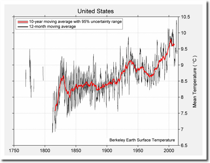
Berkeley Earth’s US temperature graph shows an impressive hockey stick.
In 1989, NOAA said the US had not warmed over the past century. Berkeley Earth showed nearly 1C warming during that same period.
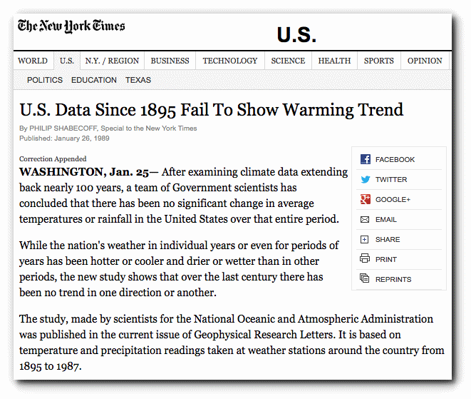
U.S. Data Since 1895 Fail To Show Warming Trend – NYTimes.com
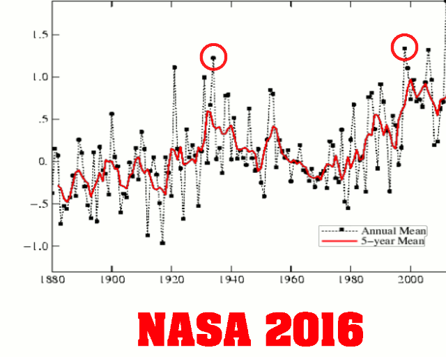
In 1999, NASA showed the same thing – little or no net warming since 1895, with the 1930s as the hottest decade.
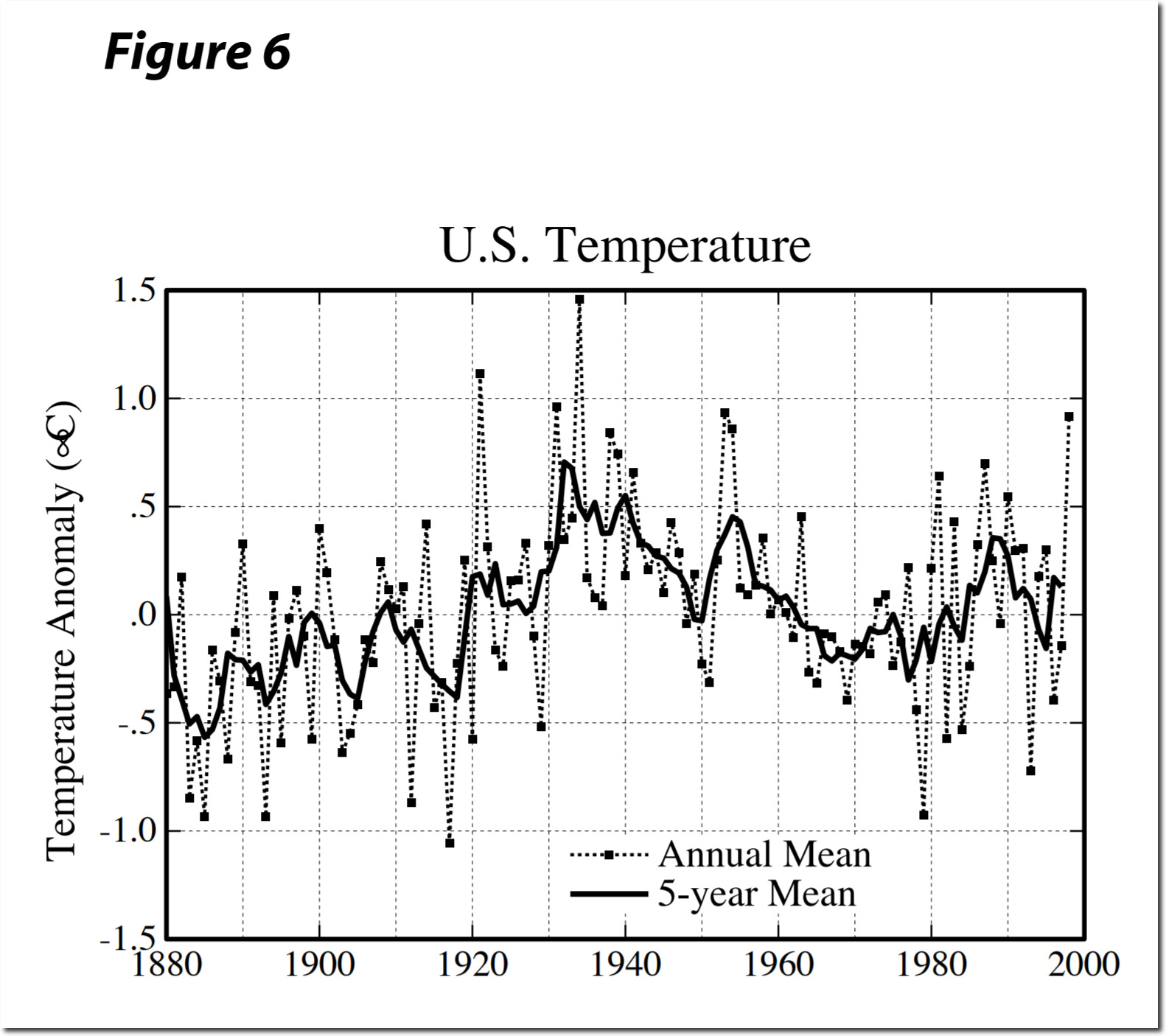
https://pubs.giss.nasa.gov/docs/1999/1999_Hansen_ha03200f.pdf
The USHCN raw data shows a cyclical pattern with no net warming over the past 80 years.
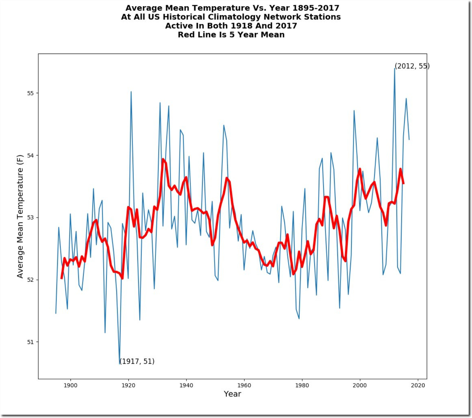
The graph below overlays The USHCN data and the Berkeley Earth data at the same X-Y scale. Their Y-axis temperatures are ridiculously low, so I normalized the Y-axis to the left side of the graph.
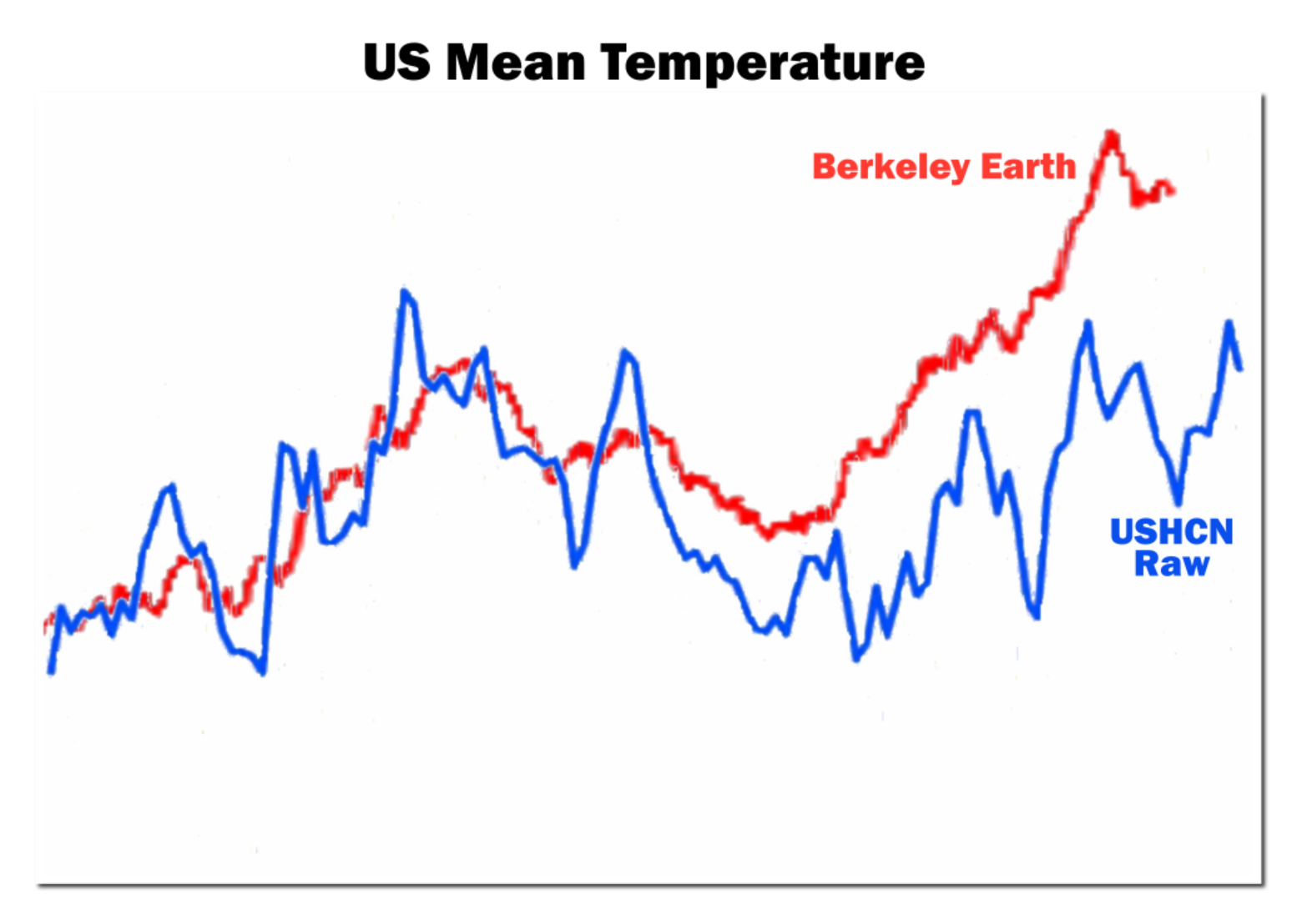
The USHCN raw temperatures closely match the NASA 1999 US temperature graph. But that didn’t fit the global warming agenda, so NASA altered the data.
However, NASA data tampering pales by comparison to the garbage Berkeley Earth is producing,
