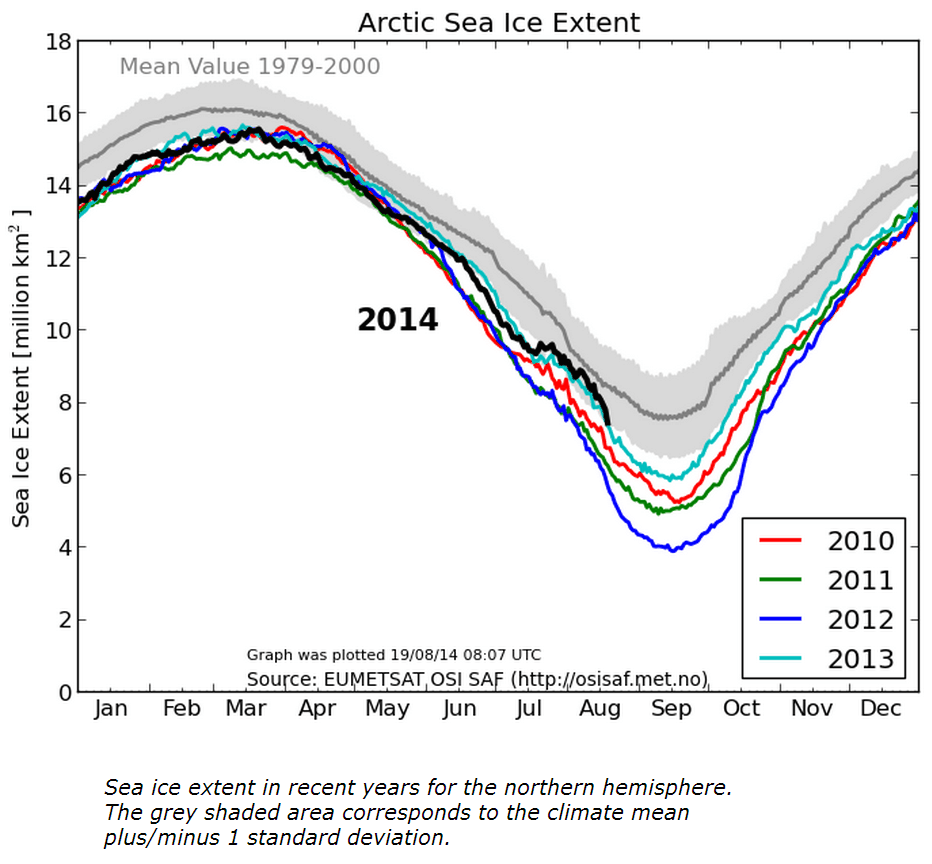
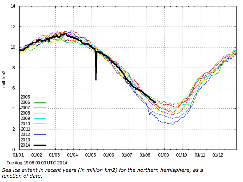
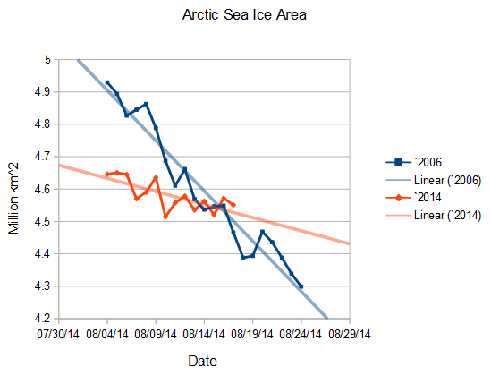
Graphs which plot 15+% concentration ice show Arctic ice extent dropping precipitously, while 30+% concentration ice and ice area aren’t dropping at all.
30% ice is flat, and just below 2006.
The reason this is happening, is because the low concentration ice is compacting. This reduces its extent, but doesn’t affect the area, and actually increases the extent of higher concentration ice. Bottom line is that the ice isn’t melting much, and hasn’t been for about a week.
The colored maps I generate use approximately 30% concentration ice, because it is a better indication of ice melt/freeze than the 15% graphs used by NSIDC and others.


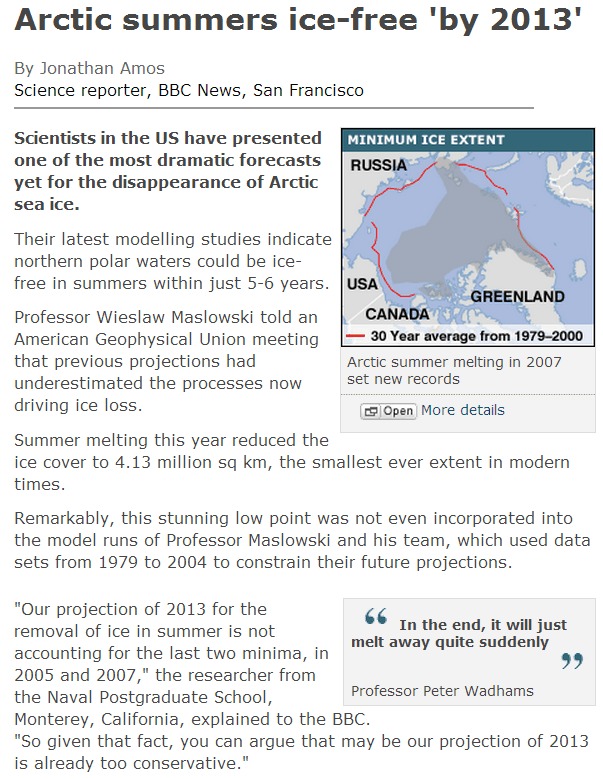
I predict in the end Professor Peter Wadhams will just melt away quite suddenly. (I could be wrong.)
+1
or melt into another scam 🙂
when people start switching the metric they use to measure anything you know they are not interested in the long term observations as they do not provide the answer they are looking for . the next arctic summer will be interesting , have this year and last been a “blip” in a steady decline or a true beginning of increasing ice year on year along with the oceanic oscillations. i know what my money is on.
Can you please explain the difference between 15+% concentration and 30+% concentration?
As analogy, would a 15% concentration of ice in my glass of of ice water mean that 15% of the volume (as a substitute for Arctic Ice surface area) in my glass is ice, leaving the remaining 85% as water?
Think of it as looking down from above. Water is blue, and ice is white. Imigine chips of ice even spread out so that what you see is 85% blue and 15% white.
In terms of “area” only 15% is covered, for only 15% is white.
In terms of “extent,” 100% is covered with 15% extent.
Confused yet?
It took a while for my nind to grind through, but I believe I’ve got it.
So there’s a gradient of ice concentration (measured as the observed ratio of surface coverage of ice vs water I’d assume) from 0% to 100%.
For each step in the gradient, there’s an area associated with it, the gradient areas summing to the total of the observed area.
Oh Steven, in your second graph what happened to the fuzzy grey mean line you have in the first graph? ( Mean Value 1979-2000) I bet the faithful didn’t even notice.
Steve has been referring to these two graphs for a while. He generates neither of them and therefore hides nothing.
And also note that he included the 15% graph, rather than cherry-picking the one which is arguably the more favorable to the two.
And as for faith, I’m an electrical/computer engineer (which if you know anything means a HELL of a lot of math and science ) so my decisions and opinions aren’t faith-based.
It takes a lot more than someone waving their hands and saying “Hallelujah! Praise the Holy 97% and pass the rattlesnake!” to convince me of something.
Bingo. An engineer can’t just get rid of something they can’t explain. If climate scientists were engineers, buildings and bridges would be collapsing all over the world.
I actually don’t work for the Danish Meteorological Institute, thanks.
I swear, in the old speculative debate about paid blog detractors I often wonder if there are also commenters hired to make the host look good.
One graph was plotted at 8:07 (UTC) & the other at 8:00:03 (UTC).
What happened to the missing 7 minutes?
WHAT IS STEVEN HIDING?!
The 15% ice is falling but still above 2013, which is a very good result IMO.
NORSEX also shows 2014 equal to 2013,
http://arctic-roos.org/observations/satellite-data/sea-ice/observation_images/ssmi1_ice_ext.png
The graphs are showing directly now, not only the address as before…
Thanks wordpress! 🙂
I noticed in the attached article that the nutty prof was giving his doom and gloom prophecy at the AGU. The same AGU that selected admitted fraudster Peter Gleick to head their ethics committee. What is it about AGU that attracts these bucketheads? Or what is it about these bucketheads that attracts the AGU? Got to be the powers-that-be at AGU. Got to research that…