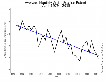
Arctic ice propaganda at NSIDC depends on graphs like the one below, which cleverly start at peak ice in 1979, and create the deceptive appearance of a linear decrease in ice – intended to fool the reader into believing it is due to CO2 emissions.

But they are hiding the Nimbus 5 microwave satellite data, which goes back to 1972 and was included in the 1990 IPCC report. The Nimbus 5 data completely wrecks their story, because it shows that ice in 1974 was no more extensive than it is today, and that NSIDC cherry-picked 1979 as their start date.

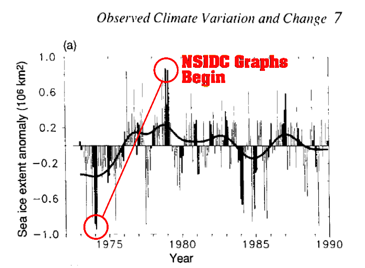
Below is an image from the Nimbus 5 satellite, taken in January 1976 – which shows how detailed the imagery was. NSIDC has no excuse for not using it. It was used in both the IPCC FAR and SAR reports.
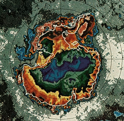
Also interesting to note how much Antarctic sea ice has increased since 1976. The gain has been massive.
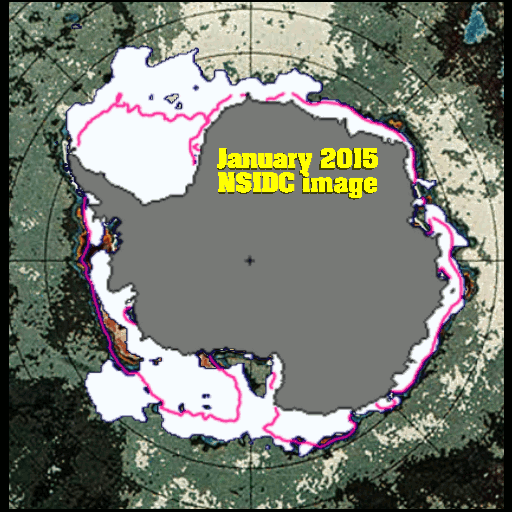
There is probably more sea ice on Earth now, than there was in the mid-1970s – which was the peak of the ice age scare.

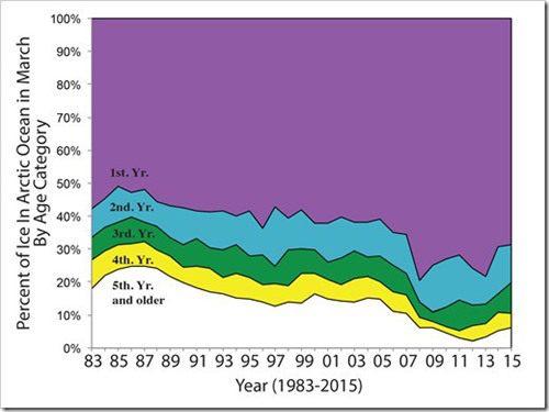
NSIDC also failed to include this graph in their April Sea Ice News – which they normally do in April. Paul Homewood had to make a special request to obtain it.

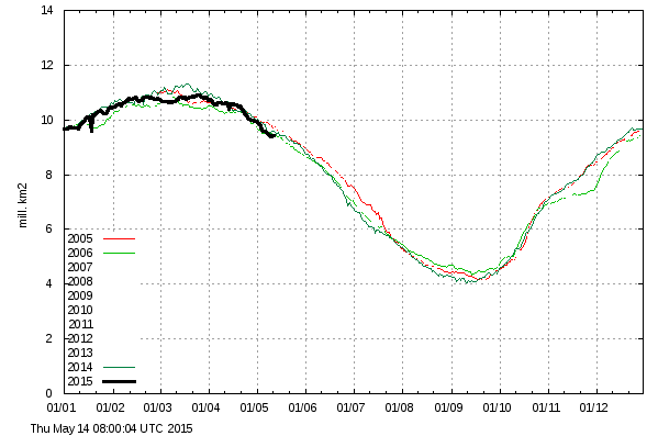
Arctic sea ice extent in 2014/2015 has been essentially identical to 2005/2006

Ocean and Ice Services | Danmarks Meteorologiske Institut
NSIDC knows that Arctic sea ice is recovering, but they are hiding the information from the public.
It is stunning to think about the level of propaganda here. Sea ice on earth has increased since the 1970s ice age scare, yet we are being led to believe that Earth is overheating and the ice caps are disappearing.
[youtube=https://www.youtube.com/watch?v=0iYAjyTcaFI]