
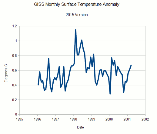
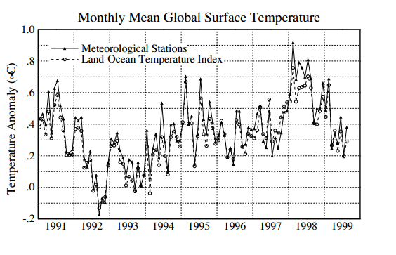
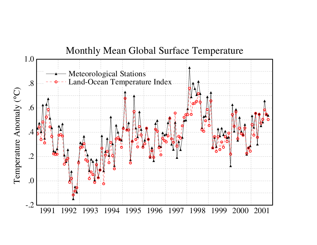
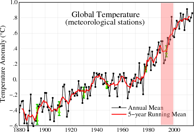
In my previous post, I showed the spectacular data tampering at GISS during the 1990’s. But it is much worse than it seems. GISS publishes a data set called Fig C which keeps the monthly temperature anomalies over a certain time window.
The animation below shows all of the overlapping months reported in the 2001 and 2015 data sets. As you can see, every single month except one has been adjusted upwards. The odds of that happening randomly are very close to zero.
I am reminded every day by alarmists that Anthony Watts and Judith Curry have criticized my work exposing this tampering, and I would appreciate these highly respected skeptics clearly setting the record straight about what they believe is incorrect about this analysis.


