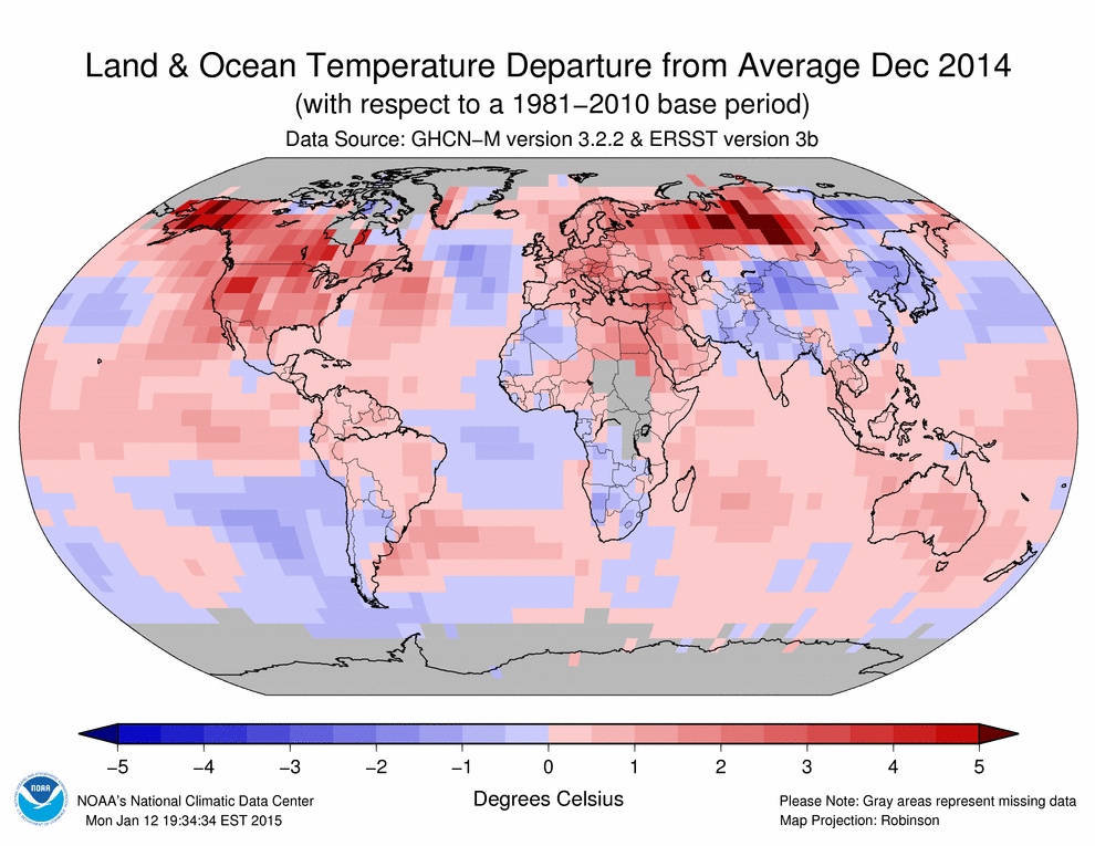
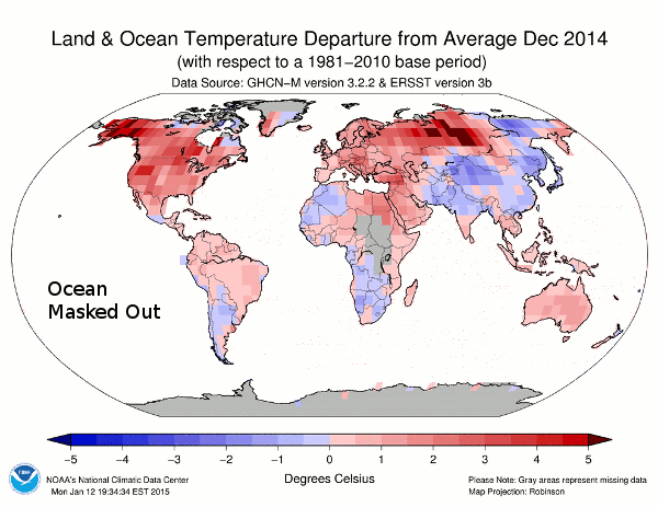
NCDC publishes lots of bright red maps like this one, where most of the surface temperatures are fake.
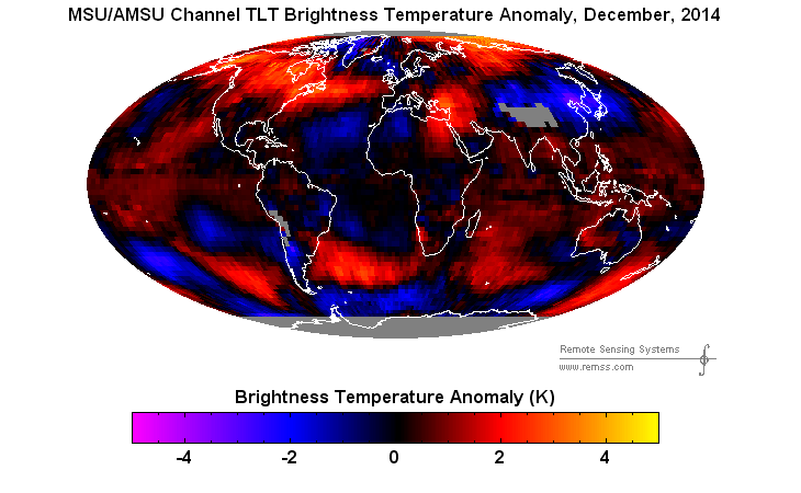
The animation below flashes between the measured and reported data. In December, 2014 they turned Saudi Arabia red hot without a single thermometer reading in the country, despite the fact that most of the measured data in the region was below normal.
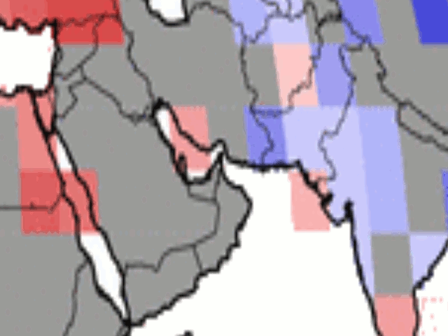
Satellite data showed that most of Saudi Arabia was cooler than normal in December
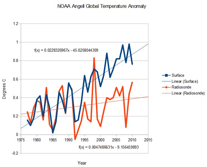
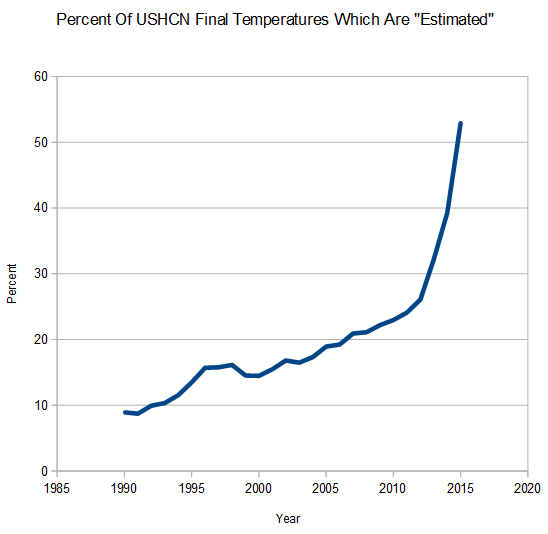
NCDC creates fake temperatures for the majority of the land surface using an algorithm which skews temperatures upwards, then reports a record temperature by 0.02 degrees.
Scientific malfeasance doesn’t get much worse than this.

Table 1.1—Summary of Receipts, Outlays, and Surpluses or Deficits (-): 1789–2020