Disrupting the Borg is expensive and time consuming!
Google Search
-
Recent Posts
- One Atomic Bomb Per Hour
- New Video : Analyzing Oil And Gas
- Is Antarctica Melting?
- High Speed Analysis And Visualization
- El Nino To The Rescue?
- Fake News Update
- Growth Of Antarctic Sea Ice
- 65 Years Of Progress!
- El Nino To The Rescue?
- Worst March Drought On Record
- ChartGL Process Control Demo
- The Biggest Money Laundering Scam
- Drought In The Headwaters Of Lake Powell
- Unrealistic Expectations Of Water Availability
- Did Bill Gates Do This?
- Worst March Drought On Record In The US
- The Real Hockey Stick Graph
- Analyzing The Western Water Crisis
- Gaslighting 1924
- “Why Do You Resist?”
- Climate Attribution Model
- Fact Checking NASA
- Fact Checking Grok
- Fact Checking The New York Times
- New Visitech Features
Recent Comments
- Crispin Pemberton-Pigott on One Atomic Bomb Per Hour
- william on 65 Years Of Progress!
- arn on One Atomic Bomb Per Hour
- Gordon Vigurs on One Atomic Bomb Per Hour
- Bob G on One Atomic Bomb Per Hour
- Robertvd on One Atomic Bomb Per Hour
- czechlist on One Atomic Bomb Per Hour
UHI Contamination?
Posted in Uncategorized
30 Comments
On The Air
Posted in Uncategorized
7 Comments
Hot Times In Bathurst During The 19th Century
The Bathurst, NSW gaol kept temperature records from 1858 to 1983. Temperatures declined steadily during that period, as did the frequency of 100 degree days – which used to be quite common.

Posted in Uncategorized
15 Comments
No Change In Arctic Ice Extent For Ten Days – Just Below The 2006 Minimum
Posted in Uncategorized
20 Comments
More From Australia’s Hellishly Hot Past
January of 1896 was the hottest month in Australia’s history, with many consecutive days over 120 degrees at Gundabooka – near Bourke. Mark Twain joked that it was very close to hell.
Summer temperatures in Bourke have plummeted since the 1870’s.
During the year 1900, nearly one day out of four in Bourke reached 100 degrees. The frequency of 100 degree days has decreased by two thirds.
Posted in Uncategorized
16 Comments
Anything For You, Zeke
Zeke insists that temperature anomalies will produce different patterns for the US than absolute temperatures. So I tried it out.
The anomaly graph is almost identical. This is calculated by averaging the daily anomalies of the min/max thermometer readings from each station relative to the monthly mean for that station.
I expected this result, because the US has an excellent, consistent temperature record – with a large enough sample size so that errors cancel out.
Posted in Uncategorized
10 Comments
Ban Assault Phones
Deadly cell phones in the hands of teenagers kill thousands of people every year, and injure hundreds of thousands. If CNN devoted an hour to every cell phone massacre, that would be all they covered 24X7.
The number of people killed in distraction-affected crashes decreased slightly from 3,360 in 2011 to 3,328 in 2012. An estimated 421,000 people were injured in motor vehicle crashes involving a distracted driver, this was a nine percent increase from the estimated 387,000 people injured in 2011.
http://www.distraction.gov/content/get-the-facts/facts-and-statistics.html
It is clear that high capacity phones must be banned. Only six texts per day can be permitted.
Posted in Uncategorized
7 Comments
Pattern Matching Quiz
Something is similar, and something is different about these two pictures.
2014
2007
Extra credit picture
Posted in Uncategorized
21 Comments
Some Progress With Australia
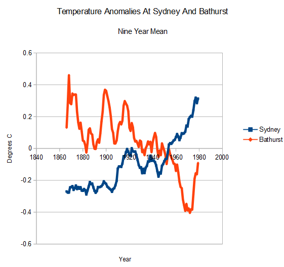
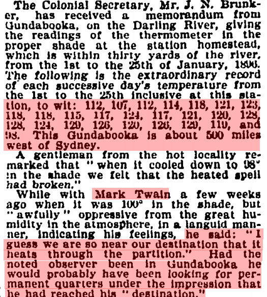
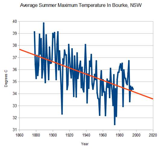
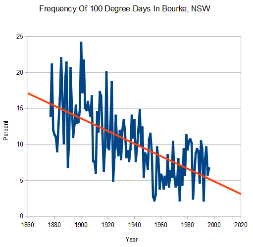
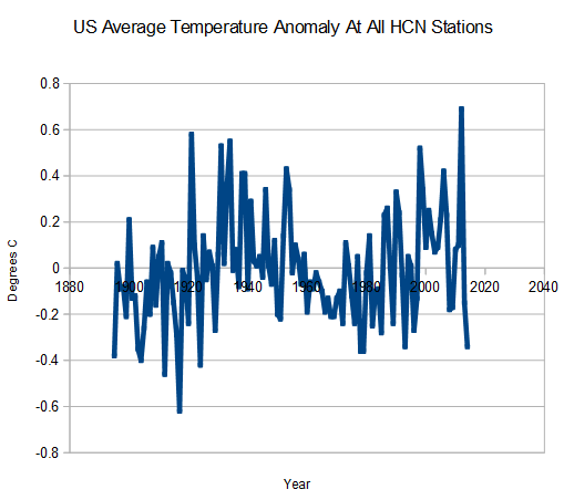
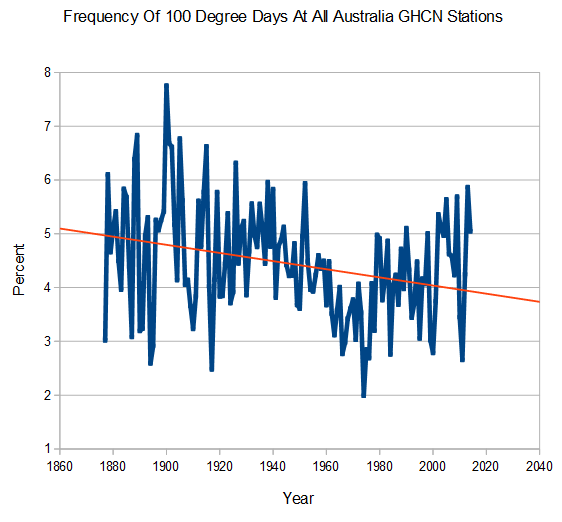
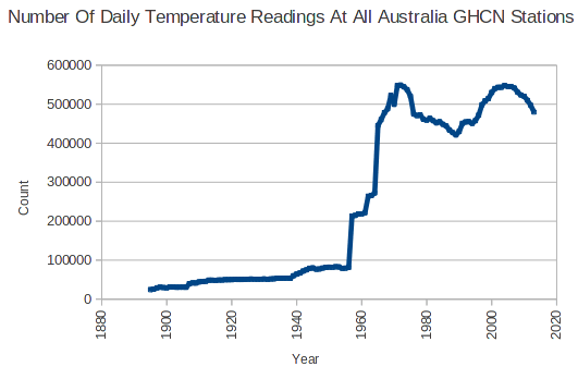
The absolute temperature graphs I posted earlier show that there are some serious discontinuities in the Australian temperature record. There was a huge increase in the number of temperature readings, immediately after 1956.
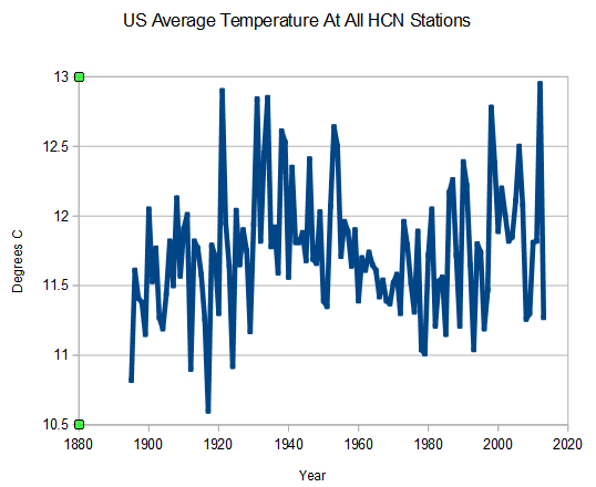
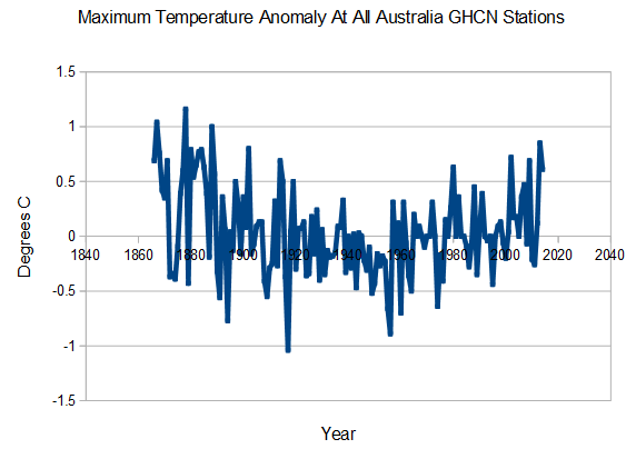
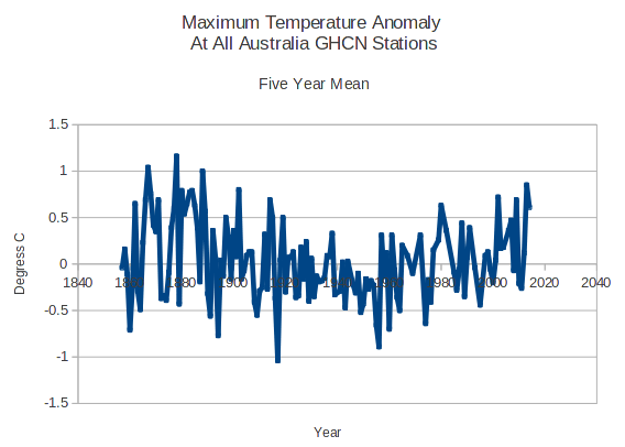
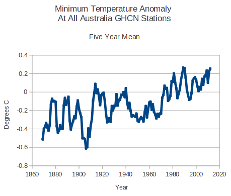
Because the Australian record is so fragmented, I tried generating anomaly graphs (daily anomaly from the monthly mean at that station.) Here are a couple of interesting graphs, for maximum and minimum anomalies.
The maximum anomalies peaked in 1878, declined until the 1950s, and have been rising ever since.
Minimum anomalies have been rising steadily for the entire temperature record. Possible UHI effects.
What does it mean?
Posted in Uncategorized
13 Comments


