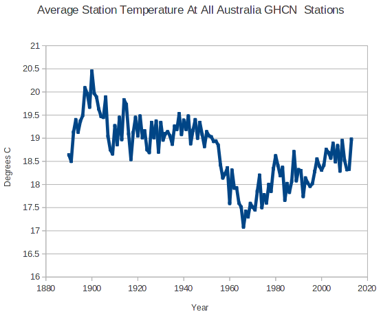
My previous analysis of Australia was incorrect. I wasn’t properly differentiating between stations with only precipitation data, and those with temperature data. That caused me to include stations with no temperature data in 1895.
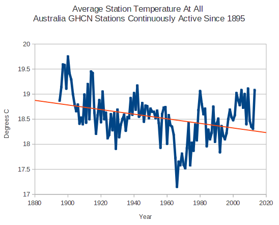
The graph below shows the average station temperature at all 1650 Australia GHCN stations with temperature data. It creates the impression that Australia has cooled dramatically
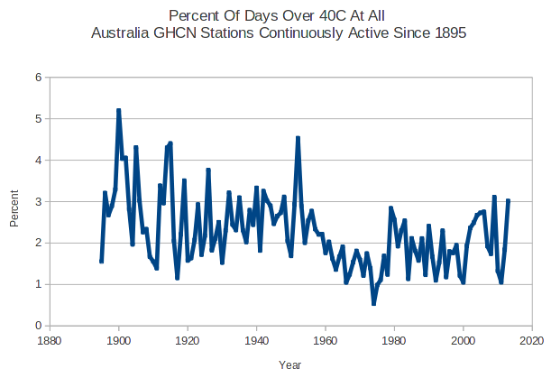
But if I look at only the eight stations which have temperature records from both 1895 and 2014, it looks completely different. A large discontinuity around 1960.
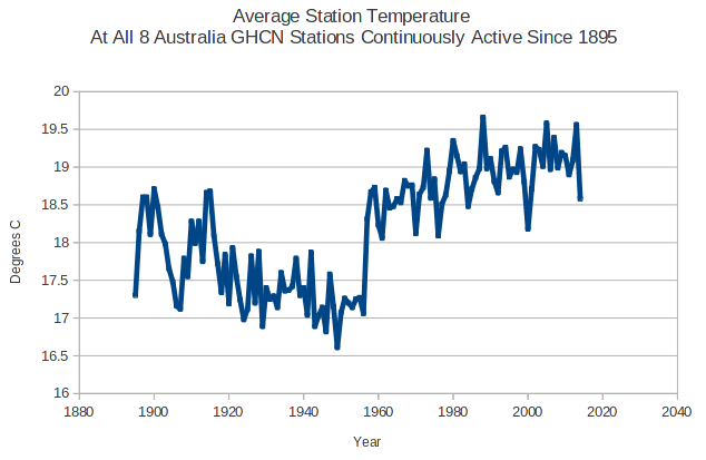
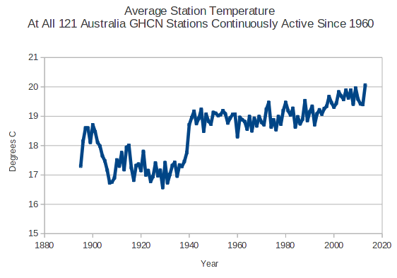
I see a different discontinuity (at 1940) if I filter by stations active since 1960.
The only thing I can infer from this is that Australia cooled after the 1890s and has warmed recently. I doubt that there is a valid way to make sense out of this data set. You could probably come to any conclusion you want by picking the right set of stations.