



Disrupting the Borg is expensive and time consuming!

Google Search
-
Recent Posts
- One Atomic Bomb Per Hour
- New Video : Analyzing Oil And Gas
- Is Antarctica Melting?
- High Speed Analysis And Visualization
- El Nino To The Rescue?
- Fake News Update
- Growth Of Antarctic Sea Ice
- 65 Years Of Progress!
- El Nino To The Rescue?
- Worst March Drought On Record
- ChartGL Process Control Demo
- The Biggest Money Laundering Scam
- Drought In The Headwaters Of Lake Powell
- Unrealistic Expectations Of Water Availability
- Did Bill Gates Do This?
- Worst March Drought On Record In The US
- The Real Hockey Stick Graph
- Analyzing The Western Water Crisis
- Gaslighting 1924
- “Why Do You Resist?”
- Climate Attribution Model
- Fact Checking NASA
- Fact Checking Grok
- Fact Checking The New York Times
- New Visitech Features
Recent Comments
- conrad ziefle on One Atomic Bomb Per Hour
- Timo, Not that one on One Atomic Bomb Per Hour
- Bob G on One Atomic Bomb Per Hour
- Bob G on One Atomic Bomb Per Hour
- Crispin Pemberton-Pigott on One Atomic Bomb Per Hour
- Crispin Pemberton-Pigott on One Atomic Bomb Per Hour
- william on 65 Years Of Progress!
- arn on One Atomic Bomb Per Hour
- Gordon Vigurs on One Atomic Bomb Per Hour
- Gordon Vigurs on One Atomic Bomb Per Hour
NCDC Disappears
Posted in Uncategorized
17 Comments
USHCN Adjustments
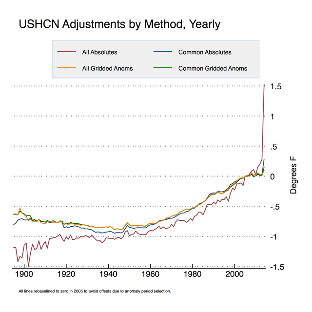
Anthony Watts posted his take on the USHCN adjustments. Here is my take on his take. Anthony’s graph shows my method in red.
The spike in 2014 is due to USHCN fabricating temperatures in their adjusted version. The adjusted version includes a lot of May temperatures from stations which USHCN doesn’t have any data for. May is a warmer month than January-April, so the USHCN final average gets elevated relative to the raw average, because the final version includes more (imaginary) May station data. If USHCN didn’t fabricate temperature data, this spike wouldn’t exist.
My method takes the average of all monthly readings at all stations in a given year, and subtracts the average of the raw data from the average of the final data. I assume a Monte Carlo distribution of missing data, which is probably a safe assumption for a large data set. This shows the total amount of adjustment for all of the USHCN temperature gymnastics. Zeke wants me to take the average of all of the individual station deltas. My approach is probably more meaningful because it also shows the effects of station loss.
Note in Anthony’s plot, that my approach and his approaches are roughly parallel from 1930 to 1995. After 1995, my approach shows a sharp increase in slope while his tails off. Not coincidentally, since 1995 the number of stations has dropped dramatically. It is possible that stations which showed less warming (or more cooling) disappeared selectively after 1995. Whatever it is, this an important piece of information and should not be hidden by the methodology. I don’t know exactly why the methodologies diverge after 1995, but the fact that the break is coincident with a drop off in stations strongly hints at a possible correlation.
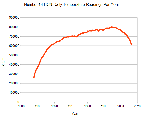
Gridding would provide a better average for the whole country than what I am doing, but that isn’t my intent. I’m just showing the average adjustment across all stations.
Zeke says “everybody uses anomalies” but that isn’t correct. NCDC publishes absolute temperatures for their US temperature data, and most of my comparisons are HCN raw vs. NCDC published.
As I showed yesterday, my approach to raw data (blue below) is pretty close to Hansen 1999, except for the USHCN V1 adjustments – which were much smaller than the V2 adjustments.
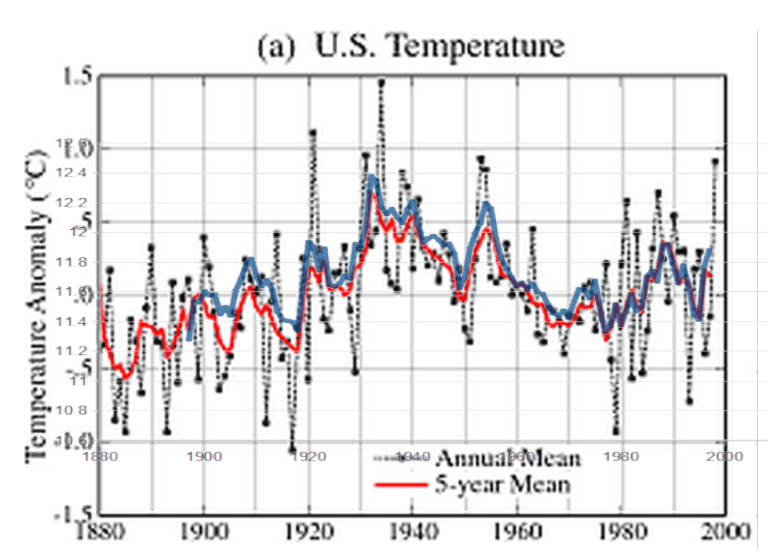
No matter how you look at it, USHCN and NCDC are cooling the past – when they should actually be cooling the present due to UHI.
Posted in Uncategorized
40 Comments
What If This Happened Now?
In September 1961, Obama was one month old.
During that month, Texas was hit by hurricane Carla – considered by some to be the most intense storm to ever hit the US. At the same time, Ireland was hit by Hurricane Debbie. And a few days later New England was hit by Hurricane Esther.
If this happened now, Obama would say it was unprecedented.
Posted in Uncategorized
9 Comments
A Solar Powered Civilization
The Anasazi were 100% solar powered, and in harmony with nature.
Of course they went to bed early, because there wasn’t any light after the sun set.
They had a very low CO2 footprint, and resorted to cannibalism when an 80 year long drought wiped them out in the 13th century.
Apparently Gaia was not impressed by their low CO2 footprint, or their commitment to solar energy.
Posted in Uncategorized
9 Comments
Me Vs. Hansen Vs. NOAA
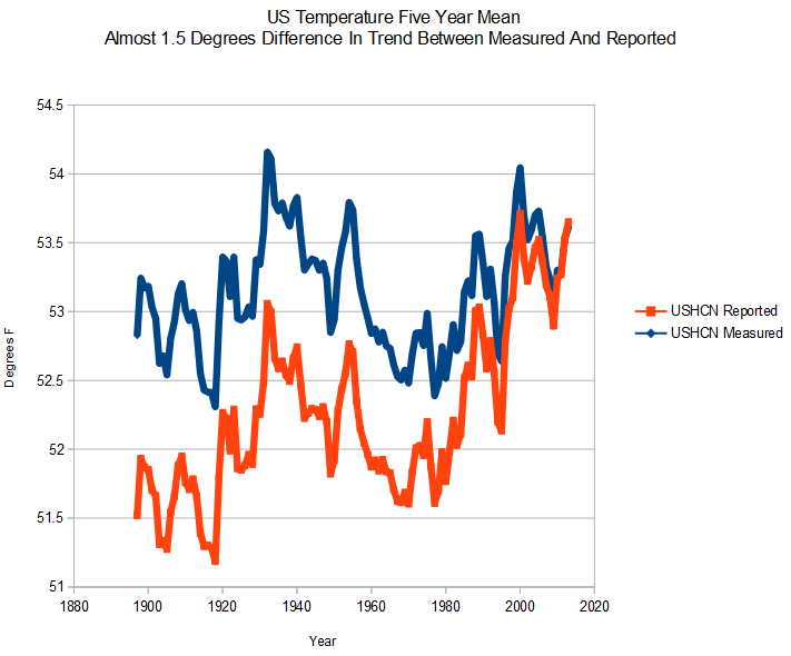
Nick is concerned that I show a US cooling trend since 1920, when other sources show warming. He thinks there might be something wrong with my GHCN/USHCN software.
The graph below has two trends on it. Both were created with my software. The only difference in how they were generated is that one uses the raw USHCN data set, and the other uses the final USHCN data set. The discrepancy is due to the USHCN V2 adjustments.
The next graph shows my calculated GHCN HCN daily trend in blue, on top of Hansen 1999 in red. The discrepancy is much smaller, and is due to the USHCN V1 adjustments.
There is nothing wrong with my software. NOAA/NASA are tampering with the data. As for Best/Muller/Mosher, the quotes below pretty much sum it up.
By Richard Muller on December 17, 2003
Let me be clear. My own reading of the literature and study of paleoclimate suggests strongly that carbon dioxide from burning of fossil fuels will prove to be the greatest pollutant of human history. It is likely to have severe and detrimental effects on global climate. I would love to believe that the results of Mann et al. are correct, and that the last few years have been the warmest in a millennium.
Medieval Global Warming – Page 2 | MIT Technology Review
11/03/11
“It is ironic if some people treat me as a traitor, since I was never a skeptic“
Richard Muller, Climate Researcher, Navigates The Volatile Line Between Science And Skepticism
Why anyone in the skeptic community trusted Muller – is beyond my comprehension.
Posted in Uncategorized
55 Comments
Look Who The US Is Supporting In The Ukraine
[youtube=https://www.youtube.com/watch?v=NKuDzXAgdf4&feature=youtu.be]
Posted in Uncategorized
40 Comments
President Tells Californians That They Can See Global Warming From Their Wal-Mart
“Here in California, you’ve seen these effects firsthand,” Obama told the audience at a Mountain View Wal-Mart. “
Obama Attacks ‘Climate Deniers’ For Debating ‘Fact’ | The Daily Caller
In 1999, My kids liked to go to the Mountain View Wal-Mart – and make fun of the Britney Spears merchandise. But we never saw any global warming while we were there. The weather in Mountain View ranges from perfect, to just slightly less than perfect.
Posted in Uncategorized
14 Comments
Weird Looking Death Spiral
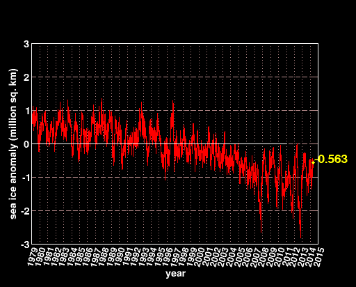
Climate experts say the Arctic is in a “death spiral.” More rational people might say that Arctic ice area is right about where it was 10 years ago.
Posted in Uncategorized
9 Comments
First Foursome Of The Year Hits The Links
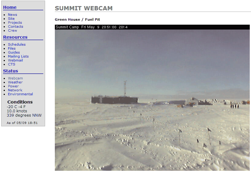
The weather has warmed to -20C, and eager golfers are heading out to the links in Greenland. The course is still looking a bit rough after the winter.
Posted in Uncategorized
8 Comments
President Obama Predicts 10 Degrees Warming By 2100
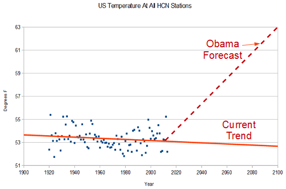
If we take no additional action, U.S. temperatures will rise 5 to 10 degrees by the end of the century.
US temperatures have been declining for 90+ years, and the US is having the coldest start to the year on record. Obama’s forecast defies all logic and veracity.
Posted in Uncategorized
12 Comments