
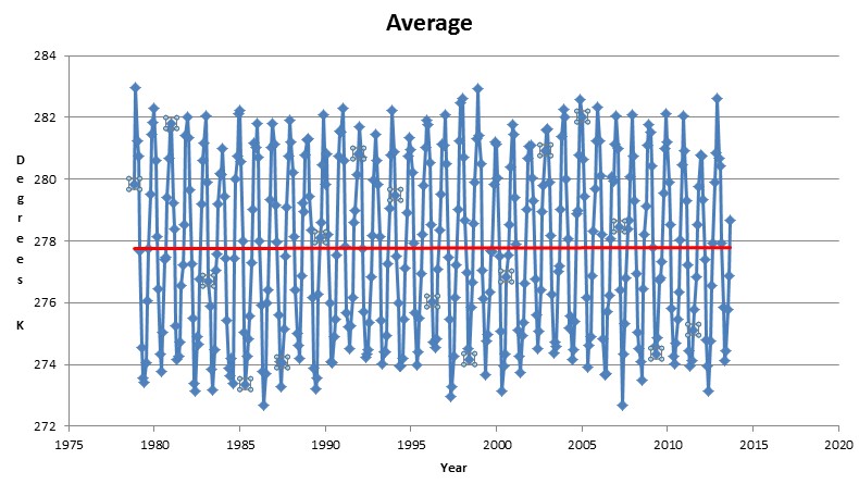
Center of Australia
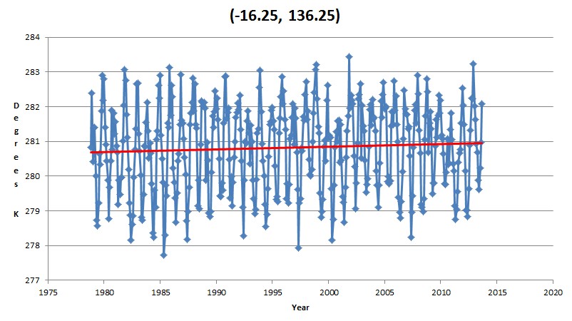
Southeast Queensland
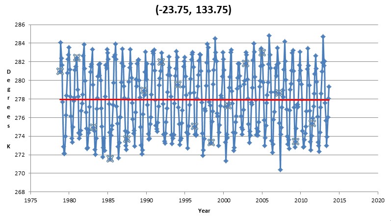
NT near Gulf of Carpentaria
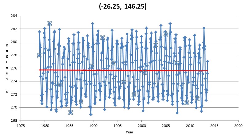
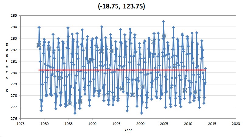
Northwest WA
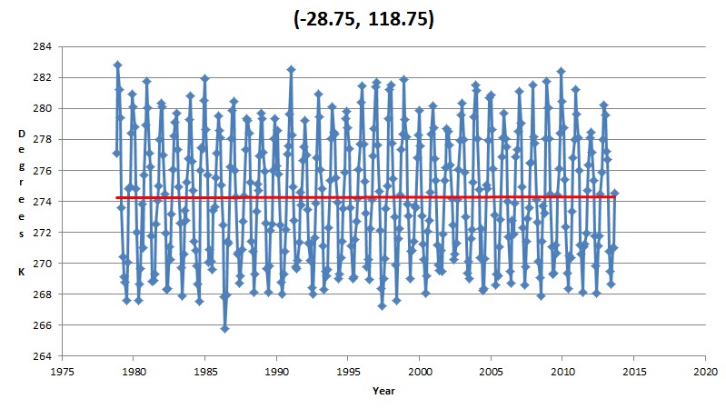
Southwest WA
ftp://ftp.remss.com/msu/data/netcdf/rss_tb_maps_ch_tlt_v3_3.nc
Center of Australia
Southeast Queensland
NT near Gulf of Carpentaria
Northwest WA
Southwest WA
ftp://ftp.remss.com/msu/data/netcdf/rss_tb_maps_ch_tlt_v3_3.nc

These data sets are in direct contrast to all the BOM climate PR statements over the past couple of years. The Australian BOM has become an evangelical instrument of the CAGW religion, probably since they are the only employer of people with climate degrees, besides Universities. “Extreme” and “exceptional” are their two favourite words, because average and normal don’t scare politicians into giving them money.
http://www.bom.gov.au/climate/current/statements/
Good News Everyone: BOM says no cyclones in Queensland this wet season.
Rainfall prediction is for extreme drought. By March we’ll see whether their disaster prayers are answered.
http://www.bom.gov.au/climate/ahead/rain.naus.shtml
10 days after BOM predicting low rainfall in Queensland, the state gets pounded by heavy widespread rain. FAIL!!!
Forecasting for 10 days is impossible, but 100 years is easy.
And in the spirit of Melbourne Cup Day, the race that stops a nation, the BOM comes out with their rainfall forecast accuracy statement. I predict Number 7 in Race 7. At about 3:00 EDST. We’ll see who is a better reader of tea leaves.
http://www.bom.gov.au/climate/ahead/rain.naus.shtml#tabs=Outlook-accuracy
Has anybody actually looked at regional temperature trends from RSS and GISS or HADCRUT to see if they are consistent? It seems like this should have been done by someone. In all cases the RSS trend should be positive and larger than the surface trend by at least 20%.
http://stevengoddard.wordpress.com/2013/05/10/giss-rapidly-diverging-from-rss/
Doh!
Thanks.
It’s all about the number of stations
http://www.uoguelph.ca/~rmckitri/research/nvst.html
WOW! What a heat wave!
Since to haven’t removed the annual cycle and your time series are asymmetric how does this analysis have any meaning at all?
For instance your data has a dynamic range of 10 degrees, 30 cycles. And it approximates a noisy sinusoid of zero phase.
A linear regression of 30 cycle of 10* sin(year) has a slope of – 0.0009 / month or -0.36 degrees over 30 years due solely to the choice of start and end points.
To me your flat regression lines demonstrate the presence of quite high trends that have been hidden by a naive regression.
Homer, that is the entire satellite record. I have no tolerance for statistical bullshitters.
So what? Whether you have cause for self loathing or not, all you need to do, is check my claim with a spread-sheet or R or whatever takes your fancy. A Real Scientist would!
If indeed you have found something which sharper minds than ours have missed then surely it will persist in an analysis of the anomalies.
Most people who refer to themself as plural are in need of psychiatric help.
“Most people who refer to themself as plural are in need of psychiatric help.”
A common jibe, based on ignorance.
We can continue to trade insults or one of us can do the heavy lifting and report back. Looks like that’s me, since you didn’t understand the point I was making.
Hansen’s forecasts should have produced 1-2 C warming over the interval.
Now run off, do your heavy lifting and come back with a proof that your bullshit theory is working.
First of all – Hansen. I assume this refers to a faux-analysis I saw which takes the 1988 scenario-A, upper bound thereof, turns it into a linear projection and then purports to have shown that history does not agree with Hansen! But that’s a daft disproof by any standards because (a) the temperature trajectories for now, even back then were not linear, and (b) scenario A was a worst case. (cx) IPCC summaries over that last four reports give a lower rise in the 1979-2013 period.
But what Hansen says (or his straw man says) is not relevant to the question of whether RSS shows no trend.
I note the nc file pointed to is a reanalysis at 2degree resolution so it has limited application to Australia and as it’s not CF1.0 compliant the only tools I have are unhappy about it.
My bullshit theory was that if you has computed trends after accounting for the annual cycle you would have gotten different results, since it is invalid to simply report trends on annually varying data without doing so.
I can think of four methods.
Simple – and what I’ve done for now, is compute an overall trend for the segment bounded by the first January to the last January. This will mean the superposed annual cycle can be approximated by a cos function, and if you check me, youi’ll find that the linear trend of a whole number of cycles of a cos function is always zero, whereas for a sin function it is not.
Better – compute the annual cycle and subtract it, then do the trend on anomalies.
You can computed the trends of individual months – roughly equivalent – ‘cos the mean of the monthly trends should converge on the mean annual anomaly trend.
My favourite – try symbolic regression with CurveFit or a similar approach.
I’m on the road until the end of the week when I’ll have more time. So all I have for you is a data-thief extract of your “average” graph, and I’m not sure I trust it, there are missing months.
If I do a repeat of your “Average” graph I get an overall trend of 0.0057K/yr for 33 year rise of 0.188K, which is certainly less than observed at ground.
If I compute the same from the first to the last January value, I get a trend of 0.013K/yr for a rise in 33 years of 0.429K which is not out of line at all.
I also did month by month trends with positive trends in the summer months and negative in the winter, but there is a pattern in these that suggests I may simply have a data alignment artifact so I make no claims.
OK. Centre of Australia from the posted data.
For the full series the trend I get is -0.0007 K/yr for a 33 year change of -0.023K
For the monthly cycle over the same period I get -0.006 K/yr for a change of -0.198K
For the anomaly I get a positive trend of 0.0053K/yr for a 33 year rise of 0.17K.
For a January to January segment I get a positive trend of 0.0024K for a total rise of 0.08K.
In no cases are these statistically significant figures.
This supports my point that when the data has a strong annual cycle, you will get very different results if you eliminate the annual cycle as best you can and if not, strongly varying results depending on the end points (and this variation will itself be cyclic).
But the variation in the anomaly says that no strong conclusion can be drawn about this location, neither that it has a trend, nor that it does not.
Now I further predict that if you adjust the “average” trend of 0.0057K/yr by subtracting the effect of the annual cycle of you will get a positive trend of 0.012K/yr for a 33 year rise of 0.4K.
It will be interesting to see what you get.
Any defense of Hansen is daft. The worst, scenario A case in emissions, is what happened. The actual result is below his best case, full implementation of activist political CO2 reduction goals; scenario C. The emissions continued as scenario A, the atmospheric GHG content continued along B lines, the observation of T is below scenario C. Hansen is wrong.
Now you made a big deal of the start and stop points of a thirty plus year graph. Steve’s point was THERE IS NO WARMING TREND. Your own conclusion was,
“For the full series the trend I get is -0.0007 K/yr for a 33 year change of -0.023K
For the monthly cycle over the same period I get -0.006 K/yr for a change of -0.198K
For the anomaly I get a positive trend of 0.0053K/yr for a 33 year rise of 0.17K.
For a January to January segment I get a positive trend of 0.0024K for a total rise of 0.08K.
In NO CASES WERE THESE TRENDS STATISTICALLY SIGNIFICANT figures.
So your point was???
Jiminy’s point was …..insignificant.
David A. Are you talking about Hansen’s circa 1988 paper? This is a different and possibly worthwhile debate, but it has nothing to do with whether RSS has no trend, and if I recall correctly his paper made no prediction about lower troposphere temperatures and trends.
Now lower troposphere temperatures are not surface temperatures, they are (a) atmosphere only and (b) loosely speaking an average of the air column between 750 and 1000 HP (I’ll accept correction on this) , and I would expect their trends to be lower by 10 to 20% for what amounts to simply geometric reasons (there is a point still higher in the atmosphere where there is expected to be no trend).
The trend in the BoM *annual* continental surface temperature over 1979 t0 2012 is 0.0066K/yr. I get 0.0053K/yr for the anomaly trend (above) for RSS (Pr=0.268). This fits my prior expectations, even despite one .
My point was that RSS does not have a zero trend, it has pretty much the trend you’d expect given the surface temperatures. It’s statistical significance is a different matter. The concept is so abused as to be deceptive.
This fits my prior expectations, even despite one being annual and one monthly and one a big (250Km sq) pixel and one a continental average.
Any defense of Hansen is needless; in fact any mention is irrelevant. This is about RSS.
You also misunderstand the relevance of the Goddard claim, which is not that there is no warming, but that RSS shows no warming (in contrast to surface records and other reports of satellite observations).
Remember, due to the nature of the data used, I looked only at the average of a 200km square(ish) grid and not at surface but the lower troposphere (which as it is an average of a couple of kilometer thick slice of atmosphere is expected to have a lower trend – for what I think are obvious reasons). Look at the data file provided.
My extraction code is …
#!/bin/env python
import Nio
import numpy as np
nc = Nio.open_file(‘rss_tb_maps_ch_tlt_v3_3.nc’,’r’)
ncv=nc.variables[‘brightness_temperature’][‘months|: latitude|-23.75 longitude|133.75’]
t=nc.variables[‘months’][:]
for i in range(len(t)):
print t[i], ncv[i]
And you also misunderstand my purpose.
I have raised this issue with climate scientists as well, and will continue to object anytime anyone makes the error of believing trends in raw annually varying data.
All temperature data from every source is evaluated using the same technique. What on earth are you talking about?
Unicorn Farts!
Not sure what you mean.
UAH and RSS are derived from the same data but give different values due to different heuristics (yes … they are models…so what)
Read section 5 of …
http://images.remss.com/papers/rsspubs/Mears_JTECH_2009_TLT_construction.pdf
Check the doco.
http://www.climate4you.com/GlobalTemperatures.htm#MSU%20RSS%20MaturityDiagram
http://images.remss.com/papers/msu/MSU_AMSU_C-ATBD.pdf
Clearly the thermometer records at ground level are different.
jiminy says:
November 17, 2013 at 10:17 pm (Jiminy, my responses will be in ( ) and caps for distinction, not for shouting…
Any defense of Hansen is needless; in fact any mention is irrelevant. (THEN YOU SHOULD NOT HAVE SAID THE USE OF HANSEN’S OWN CHART IS ” a daft disproof “. SO NO, MY COMMENT WAS RELEVANT AND QUICKLY SUMARISED HANSEN’S GREVIOUS ERRORS.
This is about RSS.
You also misunderstand the relevance of the Goddard claim, which is not that there is no warming,
but that RSS shows no warming, in contrast to surface records and other reports of satellite observations. (REALLY/ DID YOU READ THE TITLE OF THE POST? THE ENTIRE POST WAS AN ASSERTION THAT RSS SHOWS NO WARMNG. THAT IS A PERIOD AT THE END OF THE STATEMENT.
Remember, due to the nature of the data used, I looked only at the average of a 200km square(ish) grid and not at surface but the lower troposphere (which as it is an average of a couple of kilometer thick slice of atmosphere is expected to have a lower trend – for what I think are obvious reasons). Look at the data file provided. (SPEAKING OF NOT RELEVANT. BTW, THE INCREASING DIVERGENCE BETWEEN RSS AND GISS IS RELEVANT.
THEN YOU SHOULD NOT HAVE SAID THE USE OF HANSEN’S OWN CHART IS…
Nor did I. I claimed that a summary on a blog was what I had seen and that (dis) proof was daft.
REALLY/ DID YOU READ THE TITLE OF THE POST?
Yes. I disagree with the title. My writing looks sloppy in retrospect. Goddard makes no comparison – I can be read as saying he did.
SPEAKING OF NOT RELEVANT. BTW, THE INCREASING DIVERGENCE BETWEEN RSS AND GISS IS RELEVANT.
I agree – I expect some divergence as I have stated, although (without running my own numbers) not as much as the graph shows.
UAH has warming in Australia from 1979 to present at 0.16C/decade, in line with BOM.
http://www.nsstc.uah.edu/public/msu/t2lt/uahncdc_lt_5.6.txt
If you have done this correctly, Steve, then it seems RSS is the odd man out. Would you be interested in a new post comparing data sets?
The vertical scale is so large that it would be difficult to see a 0.16C/decade trend. I note your post has neither trend estimates nor uncertainy estimates, and it appears you haven’t corrected for the annual cycle. A new post filling in the blanks would be a credit to the topic.
jiminy, my summary is not daft, so instead of insults, be specific…”The worst, scenario A case in emissions, is what happened. The actual result is below his best case, full implementation of activist political CO2 reduction goals; scenario C. The emissions continued as scenario A, the atmospheric GHG content continued along B lines, the observation of T is universally below scenario C. Hansen is wrong.
Concerning your assertion that the troposphere should warm more slowly, consider that calculations with GCMs show that the lower troposphere warms about 1.2 times faster than the surface. For the tropics, where most of the moist atmosphere is, the amplification is larger, about 1.4
Your earlier post stated…”OK. Centre of Australia from the posted data.
For the full series the trend I get is -0.0007 K/yr for a 33 year change of -0.023K.” from that, how do you get to… “Now I further predict that if you adjust the “average” trend of 0.0057K/yr by subtracting the effect of the annual cycle of you will get a positive trend of 0.012K/yr for a 33 year rise of 0.4K.” An assertion without evidence. It appears to me that the RSS graphs used are only one month short of a complete annual cycle for 33 years. The first year starts with almost 1/2, or six months of up, then six full months of down, the last year has the entire bottom 1/2 of the cycle. I see there may be one month out of 100 data points in the entire cycle missing. I do not think completing the cycle one hundred percent will give you what you claim.
“Hansen is wrong. ” As I said, an interesting debate perhaps, but utterly irrelevant to the point. Point me at the site you posted on.
” GCMs show that the lower troposphere warms about 1.2 times faster than the surface”. Easily tested. Actually I don’t doubt that’s true, globally, but Australia is moisture bounded and the Clausius-Clapeyron relation merely increases water vapour deficit under warming – on average.
What does a climate model actually say? CNRM CM3, SRES A2, for 2001 to end 2049 – monthly averages; variable TA (Temperature of Atmosphere as pressure levels) and TAS (Temperature at Surface).
I extracted 1000 HP and 850 HP values being lower troposphere as before ( latitude|-23.75 longitude|133.75).
Trends.
TAS 0.022K/yr
TA(1000) 0.0205K/yr
TA(850) 0.0197 K/yr
Not out of keeping with what I said, nor RSS, nor GISS.
Last point – and the only one I hang my hat on.
You really, really need just to do the numbers to see the problem.
Here are the 12 monthly vlaues that make up the annual cycle.
1 283.021
2 282.4417143
3 280.6855143
4 277.6521429
5 274.7172571
6 272.9999143
7 273.4957429
8 274.4629429
9 276.3398857
10 278.0677429
11 279.7985882
12 281.5094
Just cut them into a spreadsheet, copy them 33 times, then do 12 successive regressions of 396 values, shifting up by one month at a time, and look at the results.
The trends will vary much more than you seem to realise.
@jiminy
According to Roy Spencer:
“if the satellite warming trends since 1979 are correct, then surface warming during the same time should be significantly less, because moist convection amplifies the warming with height.”
@slimething
Just above I made a point about Australia being water bound in response to David A who made a point GCMs and their predictions. “… consider that calculations with GCMs show that the lower troposphere warms about 1.2 times faster than the surface ….”.
I tested that assertion against one of two GCMs I have with columnar temperature data.
I found as reported and as anyone can verify that at the location I reported, David A was incorrect, but I had said that I thought the assertion was correct globally.
Important to note the discussion remains about whether RSS actually gives a zero trend on observations. It doesn’t – that’s due to an unrecognised bias in the failure to account for the annual cycle.
As the atmosphere warms it can hold more water vapour, and that amplifies warming in a limited positive feedback. This is the basis for what you quote Spencer as saying.
I reckon that’s fine but it’s not gonna happen if there is no more water evaporating to become moist convection – for example much of Australia.
Also remember land warms faster than ocean, but 70% of the Earth is ocean
If Spencer is correct then the tropics is where you should see the effect, if I’m correct it should be seen more strongly where there is more ocean.
So I have averaged from the same file as before by latitudes (a) the tropics -23 to + 23 degrees, (b) the northern extra-tropics 23 to 60 degrees, (c) the southern extra-tropics -23 to -60 degrees and (d) the full -6- to 60 degree band. Surface temperature trends, 1000 HP and 850 Hp trends.
Band, Surface, 1000 HP, 850 HP all in Kevins / yr
a) , 0.0205 , 0.0195, 0.023 : As per Spencer
b) , 0.0238 , 0.0221, 0.024, : Only just as per Spencer
c) , 0.0139 , 0.0138, 0.0172 : As per Spencer – more ocean lower trends but bigger effect than b
d) , 0.0195 , 0.0185, 0.0215 : as per Spencer
Seem reasonable? Where there is more “moist” there is more moist convection and more amplification. In the arid interior of Australia there is no more moist and no real amplification.
OK so now answer me. Does anyone have the cojones to actually do their own numbers and then report back? Especially if they thought I was wrong until they tested my “bullshit theory?”
Important to note the discussion remains about whether RSS actually gives a zero trend on observations. *Over Australia*
The US is largely water bound.
http://kenskingdom.wordpress.com/2010/02/05/giss-manipulates-climate-data-in-mackay/
Introduction
Despite its assurances, GISS has adjusted the temperature records of two sites at Mackay to reverse a cooling trend in one and increase a warming trend in another. This study presents evidence that this is not supportable and is in fact an instance of manipulation of data.
http://joannenova.com.au/2012/03/australian-temperature-records-shoddy-inaccurate-unreliable-surprise/
The BOM say their temperature records are high quality. An independent audit team has just produced a report showing that as many as 85 -95% of all Australian sites in the pre-Celsius era (before 1972) did not comply with the BOM’s own stipulations. The audit shows 20-30% of all the measurements back then were rounded or possibly truncated. Even modern electronic equipment was at times, so faulty and unmonitored that one station rounded all the readings for nearly 10 years! These sloppy errors may have created an artificial warming trend. The BOM are issuing pronouncements of trends to two decimal places like this one in the BOM’s Annual Climate Summary 2011 of “0.52 °C above average” yet relying on patchy data that did not meet its own compliance standards around half the time. It’s doubtful they can justify one decimal place, let alone two?
We need a professional audit.
You really want to do a proper audit then be prepared to pay, and do a heap of work.
There are more than 4000 temperature stations that have reported at some stage, and more than 7000 rain gauges.
The data are written on faded paper – sometimes inside moth bellies by now – on magnetic tape – in all sorts of places.
There are 700 entries per year for temperature alone. And rainfall, wind (multiple systems).
At some stage rainfall was measure in points, then in points and converted to mm and then in mm. Some times it was measured in points converted to mm, reported to BoM by phone who dutifully converted it to mm a second time in pen and ink.
Transcription errors abound, gauges change states. Weekends mysteriously have identical saturday and sunday records. Anything you can dream of happens.
You then compare them to all of the other sources, cross validate as best you can, and finally your harshest critics trash you over the things you haven’t found and simultaneously demand the raw values!
I don’t envy your task.
You have a processional body, and they are bound under oath to be impartial – get over it.
No. I’m not BoM.
Jiminy says, “Last point – and the only one I hang my hat on. Jiminy, some folk like you are standing so far into the trees, you simply cannot see the forest. You already hung your hat…”In NO CASES WERE THESE TRENDS STATISTICALLY SIGNIFICANT figures.” Quite affirming the title of this post, no matter how one slices and dices the trend.
Speaking of not seeing the Forest regarding Hansen, a conversation you started btw, my simple summary above, in comments here, is all that is needed, and nothing said in those few sentences is disputable.
Concerning the issues with record keeping, that is what error bars are for, and, btw, contributes to the not statistically significant aspect of a graph. Diving so deep into such things causes one to lose the forest for the trees. I am not certain about the average moisture content of Australia, but yes the hot spot globally for the CAGW claims is missing for the most part. If the arid area is so great, then the surface trend is suppose to be great also, like the models say for both polar regions. The regional predictions are known fails, the global predictions all run way to warm. The IPCC use of the ensemble model mean, of models consistently wrong in the same direction, is inane.
The takeaway is that CO2 saves the planet about 15% of the water used globally for crops, and CO2, at 400 PPM, grows about 15% more food , on the same amount of water and land as a 280 PPM world. No dangerous warming is happening, and the warming appears to have stopped. hurricanes and droughts and severe storms are not increasing, SL is not accelerating, and recent peer review literature shows that it is slowing down to 1mm per year, and that my friend, is no trend.
The best way to reduce populations, save water, clean up the environment, is to make energy inexpensive and abundant. CAGW proponents are doing the opposite, and the result is devastating, likely ending in global war. Step back from you minutia, and see the forest.
The ONLY point under dispute is about whether or not the failure to account for the annual cycle hides a trend. I say the numbers say it does.
I find it telling that you continue to use words rather than numbers. Just test my assertion. Please do the numbers.
Statistical significance – I want your commitment to a simple question. Should one always regard a trend that lacks statistical significance as zero?
Hansen – Goddard introduced him. I was referring to a faux – analysis I saw quite a few months ago on a web site known (except by it’s denziens) for especially poor science.
“The best way to reduce populations, save water, clean up the environment, is to make energy inexpensive and abundant”. Agreed. And I’d add to make it so once cheap energy sources are gone.
Minutia – the path to disinformation is littered with minutia, intentionally or sloppily, overlooked. Then you start to believe things like those you list without being critical. Eventually you confuse the terms “sceptical” with “uninformed”. Always do the numbers yourself. Always. And then invite criticism.
PS I have to say standard theory long ago predicted that the Arctic would warm much faster and sooner than the Antarctic and that the flow of energy south would even reduce a bit. In this the models have not been good. They severely underestimated Arctic summer ice loss.
Typo: You have a professional body, and they are bound under oath to be impartial – get over it.
And I might add. BoM feeds of all are available daily and within hours of being processed. There must be hundreds of copies of archives of BoM data going back many years in Australia alone. Every state body with an interest in weather, e.g. the various Departments of Agriculture, potentially have copies. To assert that BoM routinely tampers with weather data to drive climate change agendas requires there to exist a massive conspiracy that goes back decades, involves farmers by the thousands systematically reporting false data and has never had a whistle blower.
Mistakes – sure. Inadequate methods – sure – at times. Political interference – at times I reckon – currently it’s more likely than ever.
Jiminy says…
“The ONLY point under dispute is about whether or not the failure to account for the annual cycle hides a trend. I say the numbers say it does.”
—————————————————————————————-
It is not the ONLY point. My simple three or four sentence comments about Hansen’s work fairly well check mate that work as grossly wrong on several fronts. Any defense of Hansen is “daft”
BTW, I understand that any annual trend with a rhythmic variable will, if for instance the warmest six months of the first annual cycle is the first part of the trend, and the coolest six months is at the end of said trend, give a false influence on that trend. However if the trend is long, 33 annual cycles, and also clearly fairly flat, in fact so flat that by simply cherry picking different parts it is easy to produce a small cooling, or warming, then it is sophist to over analyze.
—————————————————————————-
Jiminy says.
“…it is telling that you continue to use words rather than numbers. Just test my assertion. Please do the numbers….Statistical significance – I want your commitment to a simple question. Should one always regard a trend that lacks statistical significance as zero?”
—————————————————————————————————————————-
For the second part, are you funning me Of course not, a minor variance in many things is critical, Hell, a minor variance in the fundamental forces of the cosmos, condemns it to rapid entropy and annihilation of most all evolved states of matter. However when political yahoos want to control the world over predicted catastrophic global warming, and all the observations show them to be fubar, then yes, minutia will not save their theory. The C, the G, and the W are missing in CAGW, and the A is looking quite minor.
—————————————————————————-
Jiminy says.. Goddard introduced him. I was referring to a faux – analysis I saw quite a few months ago on a web site known (except by it’s denziens) for especially poor science.”
=================================================================
Goddard introduced him, and you defended. As I said, my simple paragraph is conclusive. You are welcome to argue against it. We can go as detailed as you want. But in the words of Cook,
speaking about another alarmist named Mann, “You are increasingly defending the indefensible.”
==================================================
Jiminy says, quoting me, “The best way to reduce populations, save water, clean up the environment, is to make energy inexpensive and abundant”. Agreed. And I’d add to make it so once cheap energy sources are gone.
—————————————————————————————-
Sorry, I do not understand your sentence. Cheap energy is available now, and in the future.
======================================================
Jiminy says..Minutia – the path to disinformation is littered with minutia, intentionally or sloppily, overlooked. Then you start to believe things like those you list without being critical. Eventually you confuse the terms “sceptical” with “uninformed”. Always do the numbers yourself. Always. And then invite criticism”
==============================
This point was asserted and well answered already above. Again, when all the models run warm, they are informative. Informative of something basic wrong in the models. The most basic thing wrong in the models is the C.S. to CO2. Clearly high. One can argue the details…Was that a hit or an error? But when the score is 39 to zip in the ninth inning, it is purely academic.
=============================================
Jiminy says…
PS I have to say standard theory long ago predicted that the Arctic would warm much faster and sooner than the Antarctic and that the flow of energy south would even reduce a bit. In this the models have not been good. They severely underestimated Arctic summer ice loss.
===============================================
Standard theory? Who’? I know of one paper, maybe just an article; which made that assertion.
Both Hansen and the IPCC had both polar regions warming much faster then the rest of the globe. I suggest you not hold your breath regarding the arctic sea ice. The north just had the coolest summer in the satellite record. The ocean currents, the jet streams, they are a changing my friend, just like they always have. Somehow the alarmist are just discovering these things. So sea ice, your last Canary, is looking like it is about to fly away, just like all the other ones.
http://suyts.wordpress.com/2013/11/19/the-horrid-demise-of-global-sea-ice-for-nearly-14-years/
Jiminy, earlier you quoted my caps as follows…BTW, THE INCREASING DIVERGENCE BETWEEN RSS AND GISS IS RELEVANT.
I agree – I expect some divergence as I have stated, although (without running my own numbers) not as much as the graph shows.
===============================================
Jiminy, that was a global graph, and globally the troposphere was expected to warm
more then the surface. So your theory of less, is about as alone as the one guy who said the
South pole would not lose as much sea ice as the north. ( It is not losing any, it is gaining , a lot.)
The divergence between the data sets is increasing more then ever. Also, btw, the US receives their weather reports in the same way as down under, and that has not stopped them from being manipulated beyond reason http://stevengoddard.wordpress.com/data-tampering-at-ushcngiss/
“However if the trend is long, 33 annual cycles, and also clearly fairly flat, in fact so flat that by simply cherry picking different parts it is easy to produce a small cooling, or warming, then it is sophist to over analyze.”
Thank you. Save for the sophist part we are in agreement. I don’t think it at all sophist to hammer a point for ten days if at then someone starts to see my point. As it happens, right now happens to be close to the nadir – six months ago and in six months (in fact most months) time the trends would have appeared positive. I’ve done the numbers.
———————————————————————————————————-
“Of course not, a minor variance in many things is critical,…”
Ah good … and sad. Good – because I agree. Sad because I was about to prove unicorns exist. [Note to bystanders – I was about to abuse a Bertrand Russell proof]
———————————————————————————————————–
“Jiminy, that was a global graph, and globally the troposphere was expected to warm”
Ah. Then I’m hoist on my own do the numbers petard. The trend now makes sense.
The graph was given in response to a request for regional divergence in the context of Australia only, and labelled “Divergence of GISS LOTI from RSS…” (which I took to be RSS – GISS). Doing the numbers myself may have prevented me from being caught by these twin deceptions.
I enjoy the irony of your citing this evidence of G and W, conjoined with a claim that they don’t exist. Persist, sir, and a plague of unicorns may yet appear.
Whether one should be held to the detail of a draft work, long known to be crude, to the point where thousands of refinements and now tens to hundreds of (somewhat) independent re-implementations have been performed, is truly debateable. But not in this forum or this thread where further debate would be a hijacking and rude. Take my invite and point me at your work.
O crap. It must be RSS – GISS because it’s the divergence that’s positive. I fooled myself. Hoist again! I’m wrong – there was only one deception. I need to apologise. Mea culpa.
Jiminy, I am not certain what the one deception was. (Unless you mean the use of a global chart to the regional question?) Twas not a deception however so much as a broad answer, and very cogent for showing evidence of other factors beyond CO2 in the surface record producing the warming in the divergent GISS record. The link I gave you to various and nefarious (IMV) adjustments to GISS, particularly the US adjustments, coupled with the surface warming not following the proper predicted IPCC physics, coupled with the failure to match the predicted degree of warming from GCMs at BOTH surface and troposphere, is all indicative of a political ideology disguised as a scientific theory.
As far as Mr. B Russell, well he, like other prominent atheist now, should have studied a little more academic philosophy before making arguments which were made before him, and better, and yet also refuted far better in the past.
I am not doubting your pointing out potential trend errors in a cyclical annual cycle; just saying that over 33 cycles they are fairly mitigated, as only the start and stop points carry the influence. Yes, it was valid of you to point this out. (I would think that the simplest solution is to take a global mean for each year, and trend from those numbers.) However then one would see how minor and meaningless the trend is, as one could make ascending and descending graphs from numerous different points; leading credence to the validity of calling the trend statistically meaningless.
And yes, the theory is Catastrophic Anthropogenic Global-Warming, and no, for some time now the “C” the “G” and the “W” are MIA. (Actually the “C” has never surfaced) This leaves the “A” to be a lone wolf doing not much of anything.
I have no desire to go into detail over the alarmist papers of someone like Hansen, who is activist first, and scientist no more. My simple three sentences on this matter is the summary of all the debate, however detailed. Emissions were A, so the worst anthropogenic factor happened, atmospheric accumulation of GHG was “B” so the earth absorbed from the atmosphere FAR more then Hansen thought it would, the global mean T is below scenario “C”, despite zero effective reduction in anthropogenic emissions. Hansen has also predicted absurd alarmist predictions of SL rise, which are further off then his already failed global mean T predictions. Here is a good link to much of his failed work. The good work he did was decades ago. He has regressed. http://stevengoddard.wordpress.com/hansen-the-climate-chiropractor/
“the one deception “: was in fact giving the global average in response to a regional question. The assumption that regional response can be adequately represented by global averages is simply deceptive – and I mean the word in a more or less logical context. One is alwas one’s own principal deceiver after all.
” Mr. B Russell” : I’m not concerned about his atheism. That’s another temptation to argue ad hominem. Just as arguing about Hansen’s motives is. However I was wrong again. I was inspired by what I remember of Raymond Smullyon’s proof of the existence of Unicorns, probably in “What is the name of this book?”.
On errors on cyclic data, it’s not just about the first and last cycles in the series. Think of the relative positions about the mid point of the ups and downs of two cycles, three cycles etc. But the reals message, surely is, if you are going to isolate *any* component of a time series, you first have to eliminate *all* the known knowns as best you can, especially so if you are going to assume normally distributed noise and use OLS because OLS comes with a built in assumption that your signal can be cleanly separated into just two components. Annually varying data with a possible linear trend fails this assumption. The failure is telling. And what’s more the really interesting part of the story of Australia’s tropospheric temperature variability was missed in this thread. Look at the anomalies. They are just fascinating.
Now I don’t intend to get involved further on this thread.
I noticed you did not follow my suggestion and plot the annual mean for each complete year in the cycle. The trend is not statically significant for a good reason. It is essentially flat.
It is best if you do not defend Hansen, or offer any rebuttal to my simple facts about his predictions. Sufficient unto the day are the errors you have admitted.
Raymond Smullyon’s…”…But it is impossible for existent unicorns not to exist. Hence they do.” Not certain what your message here was.
A couple of other examples of why Hansen is no longer a scientist…
http://stevengoddard.wordpress.com/2013/11/08/hansen-spewing-nonsense-is-almost-dead-certain/
http://stevengoddard.wordpress.com/2013/10/09/hansen-1986-five-degrees-warming-by-2010-2/
Steven,
Your responses to comments disagreeing with you demonstrate that you are nothing more than a rude and ill informed blogger. All the graphs you present above are clearly weighted to produce the answer you want. The fact that you are unwilling to correct them to remove the bias indicates your lack of integrity.
Furthermore if you had any scientific credibility you would discuss global figures not cherry-pick local figures that might support your ill informed opinions.
Anyone who could read this blog and come to that conclusion clearly has their head up a very dark location.
Back to the non skeptical science señor David.
Integrity, truth and honesty are indeed found here, not there, and you seem more comfortable with an absence of these.
OK. It’s now some 5 months further on. If Goddard’s method was at all useful the results should not have changed much.
Applying the Goddard method to the latest brightness temperature data over the full satellite record (same URL as posted above).
Trends at what was called “Centre of Australia”, longitude=133.75, latitude=-23.75,
MonthlyTrend Annual Century Sat Era
0.0004361 0.0052332 0.523319993 0.189267397
Using an anomaly method as I suggested,
MonthlyTrend Annual Century Sat Era
0.000327202 0.003926423 0.392642292 0.142005629
Goddard didn’t publish numbers, instead using a trick straight out of “How to Lie Using Statistics”
My (not disputed) response was
———————————————————–
“OK. Centre of Australia from the posted data.
For the full series the trend I get is -0.0007 K/yr for a 33 year change of -0.023K
[
Not repeated:
For the monthly cycle over the same period I get -0.006 K/yr for a change of -0.198K
]
For the anomaly I get a positive trend of 0.0053K/yr for a 33 year rise of 0.17K.”
————————————————————–
The “Goddard Result” is wildly different from what it was then (in fact it’s even higher than my initial anomaly method’s result), and my bullshit theory says why.
The anomaly method result is in fact a little lower, but not wildly.
I hope this helps clarify why doing your own numbers helps, and why you *must* use some method of correcting for the annual cycle.
Using winpython
f = netCDF4.Dataset(‘rss_tb_maps_ch_tlt_v3_3.nc’, ‘r’)
temp = f.variables[‘brightness_temperature’][:]
>>> f.variables[‘latitude’][26]
-23.75
f.variables[‘longitude’][53]
133.75
temp[::, [26], [53]]