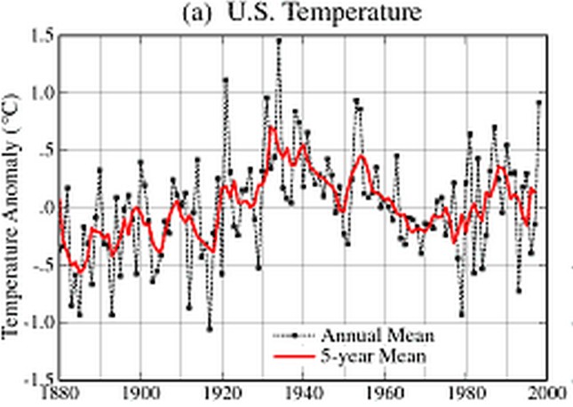
The 1999 NASA version of US temperatures showed a sharp decline from the 1930’s to the 1990’s.
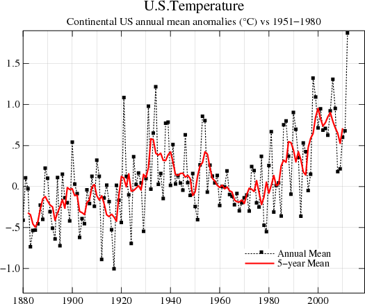
The current version shows an increase from the 1930’s to the 1990’s. The past magically changed!
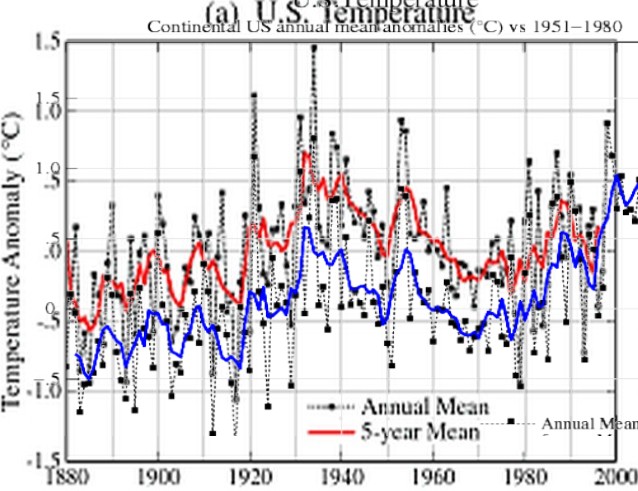
The next graph shows the current version in blue, and the 1999 version in red – normalized to 1998. They have dramatically cooled the past to create the false impression of a warming trend, and eliminate the hot 1930’s.
- NASA Official: Gavin A. Schmidt


Reblogged this on The Firewall.
Perhaps we should begin referring to AGW climate researchers as “temperature Picassos” They have turned the “adjustment” of raw temperature readings into an art form. With hundreds of billions of dollars of “climate change” funding at stake, the quest for the next big research grant has become their No. 1 priority. The scientific method be damned. Their shoddy, manipulative work deserves a not-so-lofty place alongside Piltdown Man and Lysenkoism.
Gavin’s favorite modern day Hero was Anita Dunn and it appears they both share the same prescriptions and Psychiatrist (-:
These days neurotic behavior and downright psychosis is the new normal for the Progressive mind…
A funny thing here is that the more they cool the 30´s the more extreme it gets because of the numerous highest ever temperature recordings measured in the 30´s.
I use the disconnect between “the 1930s were not as hot as today” belief and the “even a little warming loads the dice toward more extremes” as a teaching tool for warmists.
“So the 1930s were cooler than today?”
“Yes.”
“And warmer averages make extreme temperatures more common?”
“Yes.”
“So the 1930s could not have had more extreme highs than today, right?”
“Yes.”
“What would you think if that were not true?”
That chart just blows my mind how they can hide it with selecting a slightly different date. WOW