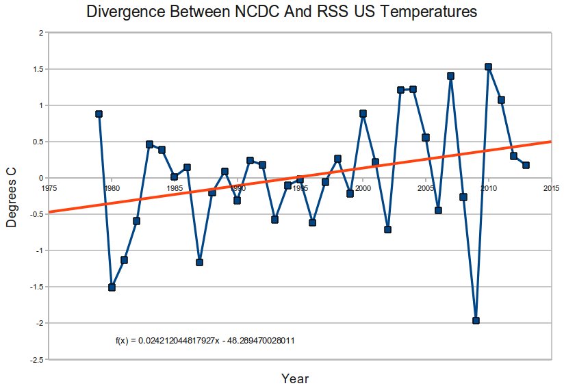
The graph below plots the difference between adjusted NCDC US temperature anomalies and RSS US temperature anomalies. NCDC shows a strong US warming trend, and RSS shows no US warming trend. NCDC and RSS are diverging at an astonishing 2.4ºC per century.
Climate at a Glance | Time Series
rss_monthly_msu_amsu_channel_tlt_anomalies_land_and_ocean_v03_3.txt
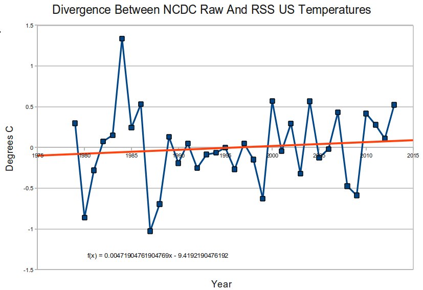
The divergence between the raw NCDC data (US HCN) and RSS satellites is much smaller (see graph below) – indicating that not only are the NCDC adjustments wrong, but they are actually going the wrong direction.


There are a few trails of teeny black ants around my yard. Normally I just leave them alone. Yesterday, I noticed they made a line to my door, which was taking their liberty a bit too far.
I got the fly spray and blew them all back. There were many casualties.
Today, some of them are carrying placards protesting against climate change.
Excellent and conclusive, Steve. Well done. I love your adjustment graphs more than anything. Keep hammering away at that wall and eventually it will fall in.
Well, it is the National Centre for Data Correction isn’t it!
Reblogged this on Tallbloke's Talkshop and commented:
Adjustments…
Steve Goddard exposing NCDC malfeasance.