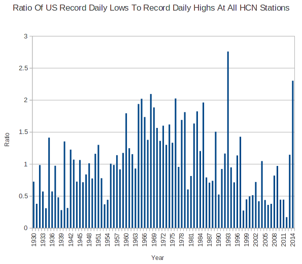
According to NOAA, the US is experiencing a just below average temperature year – despite the fact that their own thermometer data shows 2014 as one of the coldest on record.
Here is another proxy which demonstrates that their claims are incorrect. The ratio of record daily minimums to record daily maximums in the US is the second highest since 1930. Only 1993 was higher, and that was due to volcanic dust from Mt. Pinatubo blocking the sun.


Reblogged this on the WeatherAction Blog.
Criminals. That’s all – just, criminals.
If this is a plot of ratios, why does the vertical axis read percentage?
What does USCRN show, or is data not available yet?