
Disrupting the Borg is expensive and time consuming!

Google Search
-
Recent Posts
- Analyzing The Western Water Crisis
- Gaslighting 1924
- “Why Do You Resist?”
- Climate Attribution Model
- Fact Checking NASA
- Fact Checking Grok
- Fact Checking The New York Times
- New Visitech Features
- Ice-Free Arctic By 2014
- Debt-Free US Treasury Forecast
- Analyzing Big City Crime (Part 2)
- Analyzing Big City Crime
- UK Migration Caused By Global Warming
- Climate Attribution In Greece
- “Brown: ’50 days to save world'”
- The Catastrophic Influence of Bovine Methane Emissions on Extraterrestrial Climate Patterns
- Posting On X
- Seventeen Years Of Fun
- The Importance Of Good Tools
- Temperature Shifts At Blue Hill, MA
- CO2²
- Time Of Observation Bias
- Climate Scamming For Profit
- Climate Scamming For Profit
- Back To The Future
Recent Comments
- Bob G on Analyzing The Western Water Crisis
- arn on Analyzing The Western Water Crisis
- Bob G on Analyzing The Western Water Crisis
- Bob G on Analyzing The Western Water Crisis
- Bob G on Analyzing The Western Water Crisis
- Hank Phillips on Analyzing The Western Water Crisis
- Hank Phillips on Analyzing The Western Water Crisis
- Hank Phillips on Analyzing The Western Water Crisis
- Hank Phillips on Analyzing The Western Water Crisis
- Bob G on Analyzing The Western Water Crisis
Reblogged this on wwlee4411 and commented:
MEANING: Zero signs of “Global Warming”/”Climate Change.”
May this be the death spiral to sixty-nine years of government deception .
https://dl.dropboxusercontent.com/u/10640850/WHY.pdf
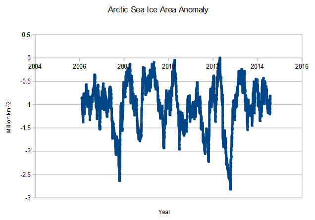
What does that graph actually show Tony? You’re not very specific!
Daily CT area anomaly since 2006? Wouldn’t just comparing anomalies on this date be clearer?
Well, Jim, by analysing the text often called the ‘title’ of the graph, I think we can be fairly sure it’s something to do with the Arctic sea ice area anomaly. A quick look at what we often call the ‘axis labels’ makes us think that this ‘anomaly’ is plotted against time, given in ‘years’ and in units of ‘million km^2’. There maybe some difficult interpretation here since ‘years’ are fairly familiar in terms of time, but what’s that funny little symbol ‘^’ in the y-axis measurement? I’m here to tell you, Jim, that ‘km^2’ is nothing more than square kilometres – a measurement of area.
It shows that the Death Spiral Theory is so cutting edge, it’s hard to prove. That is one of the recurring patterns in climate science:
On the subject of recurring patterns, I once overheard a man telling another man:
“You called me an idiot? What did you mean by that?”