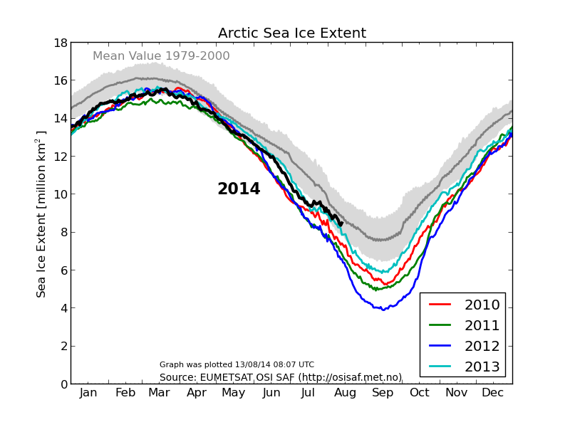
Al Gore predicted an ice free Arctic in 2014. He was close, and it appears that he will only miss by a little more than the area of Antarctica
Disrupting the Borg is expensive and time consuming!
Google Search
-
Recent Posts
- Analyzing The Western Water Crisis
- Gaslighting 1924
- “Why Do You Resist?”
- Climate Attribution Model
- Fact Checking NASA
- Fact Checking Grok
- Fact Checking The New York Times
- New Visitech Features
- Ice-Free Arctic By 2014
- Debt-Free US Treasury Forecast
- Analyzing Big City Crime (Part 2)
- Analyzing Big City Crime
- UK Migration Caused By Global Warming
- Climate Attribution In Greece
- “Brown: ’50 days to save world'”
- The Catastrophic Influence of Bovine Methane Emissions on Extraterrestrial Climate Patterns
- Posting On X
- Seventeen Years Of Fun
- The Importance Of Good Tools
- Temperature Shifts At Blue Hill, MA
- CO2²
- Time Of Observation Bias
- Climate Scamming For Profit
- Climate Scamming For Profit
- Back To The Future
Recent Comments
- Bob G on Analyzing The Western Water Crisis
- arn on Analyzing The Western Water Crisis
- Bob G on Analyzing The Western Water Crisis
- Bob G on Analyzing The Western Water Crisis
- Bob G on Analyzing The Western Water Crisis
- Hank Phillips on Analyzing The Western Water Crisis
- Hank Phillips on Analyzing The Western Water Crisis
- Hank Phillips on Analyzing The Western Water Crisis
- Hank Phillips on Analyzing The Western Water Crisis
- Bob G on Analyzing The Western Water Crisis


NASA GISS is working hard on implementing “adjustments” to display the “true” extent.
Al would have nailed it had Hansen rolled a six.
What is the difference in the data for this graph and what Sunshine Hours uses? They don’t appear to be the same data. This is one of the topics that sometimes confuses me with what seems to be many different data sources for Ice extent or concentration or volume and such.
You would think that they’d be anxious to show how much worse it is by updating their chart.
Instead of using the 1979-2000 range, be brave and go for 1979-2010 averages.
If they’re right in the “it’s much worse” meme, then the change in average will make that 2012 line fall even farther out of the range.
If they’re wrong, then the 2012 line gets closer to the average.
They just want to make sure the current values are as far away from average as possible.
Want to see something fun…use 1979 to 2013.
Each dataset uses a different mean value, with DMI’s being the ‘toughest’, as they are still using 1979-2000 for the base period.
The fact that 2014 is approaching the mean of the 1979–2000 data is stunning. If the mean were based on all data from 1979–2013, I have no doubt that 2014 would be well above the calculated mean. But, then again, we’re dealing with climate “science”…
You mean “settled science” right?
Because with all the constant and unending movement of the goalposts, I’m having a hard time figuring out exactly what is “settled” about climate “science”….
Max you are a genius.
Missed it by that much …
Sorry about that, Chief.
Arctic, did I say Arctic? I meant my Attic will be ice-free by 2014. — Al.
(NASA is adjusting the text of my speech as we speak.)
😆
+1
How many Manhattans is that?
3.8 Hansens worth.
Great! Now I have to do the calculations between Hansens and Manhattans!
ROTFL!
😆
I might be going out on a limb so to speak, I am no Climate Scientist, but, it looks to me like an ice-free Arctic this year is looking increasingly unlikely given that there is still something like what, 8 million square km yet to melt… What happened?
What happened to the Arctic Death Spiral? It seemed like such a sure thing just a few short years ago. What has become of the consensus that is Climate Science? If we don’t get a Death Spiral soon, well, those top-notch scientists will become a laughingstock – for a short while, and then they will be utterly forgotten.
Oh my.
It’s not just the Arctic death spiral, global warming was supposed to melt ice at both poles. Don’t much about Antarctica anymore though. Wonder why?
When the Summer melts ends in a few weeks, the size of the unmelted area would rank as the 7th largest nation on the planet.
http://en.m.wikipedia.org/wiki/List_of_countries_and_dependencies_by_area
Thank you Al Gore for once again proving you are in a Moron Class of your own.
Reggie!
Reggie!
Reggie, quick we got a problem…
🙂
Harsh… I mean, he’s already an out-of-office politician… there’s a worse class than that? (Besides the ones that are still in office making our lives more miserable.)
You must belive in Algore even though all of his predictions are spectacularly wrong. You don’t want to considered a denier?
Al can’t talk right now.
He’s talking to the Chief on his shoe phone in his cone of silence.