
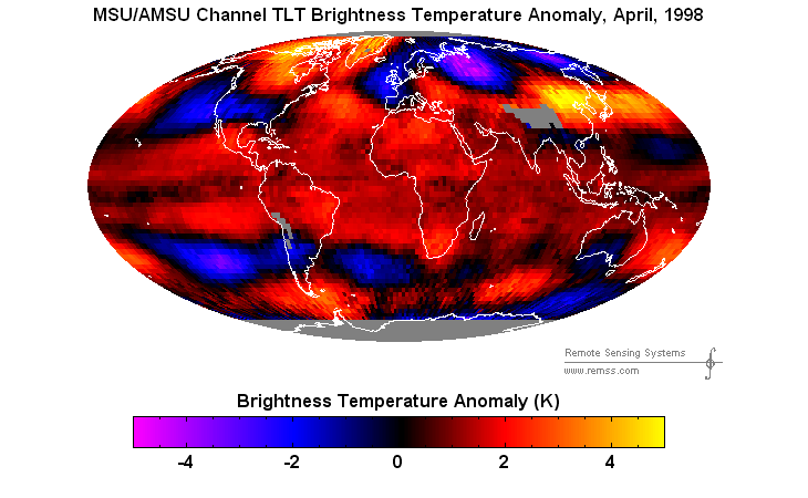
NASA and NOAA will declare 2o15 to be the hottest year ever, because they have been instructed by the White House to do that.
To see how big a lie they are telling, compare April 2015 vs. April 1998

NASA and NOAA will declare 2o15 to be the hottest year ever, because they have been instructed by the White House to do that.
To see how big a lie they are telling, compare April 2015 vs. April 1998

Do we really have the ability to measure the earth’s temperature accurately?
Satellite readings are complicated and can be made to sound very complicated. However the issues are consistent and regularly tested against weather balloons for verification. They are far more accurate then the surface record and the many inconsistencies due to station moves, number of stations, changing of methods, UHI, questionable artic adjustments, poor SST records, etc.
and a homogenization process which, it seems, has a built in bias.
There is almost no adjustment for UHI, even though locations have been
gradually surrounded by various structures.
I think Tom Karl was an originator of the process, I am not sure if it
has been peer reviewed, and I am not sure where it is specifically
laid out, or if it is continually in adjustment.
Verification by weather balloons, as you indicate is important.
Noting that Roy Spencer regularly plots the two temp records
together.
Another good question is: Even if we can say we can get accurate measurements of planetary temperatures now. What does that say about accuracy going back in time? In fact, we can’t say we have any kind of real precision beyond the 20th century going back, and only hope and faith for the last half of the 19th century and only for some parts of the most civilized places. In terms of really knowing historic temperatures, we’re too ignorant to know how ignorant we are. But our noisy climate alarmism community does not have any shortage of confidence in their ability to predict the future in spite of the scarcity of good, accurate data. How old is this planet again? Do we really think we are soooooo much smarter than the global cooling lemmings 40 years ago?
The ClimAstrologists try to make us believe the scientists a hundred years ago were half-brained nit-wits when the opposite seems to be the case. A hundred years ago the scientists were careful honorable men taking painstaking care. Today we have nitwits letting a computer do their thinking for them. They do not rely on the original hand written data to determine station moves or other changes. Instead they use a computer program to ‘detect specific breakpoints’ supposed changes at the station.
Here is an example: http://berkeleyearth.lbl.gov/stations/163049
about which Zeke Hausfather wrote “Here is Reading, MA, for example [URL] The station has had three document station moves and two documents TOBs changes in its history, as well as a number of other notable undocumented step changes relative to surrounding stations.”
What is interesting is the data that Berkeley BEST calls “raw’ is not even raw data!
Zeke says “In the Berkeley approach every attempt is made to use first reports. We avoid the term “raw” data because one can never know that data that purports to be “raw” is in fact “raw.”
However recovery of truly raw data from Europe by Frank Lansner demonstrated that BEST is not using raw data. Further, the results demonstrated that BEST has a bias for coastal stations, just like GISS. link Coastal stations are influenced by the ocean temperature oscillations while interior stations in the shadow of mountain ranges. Frank explains the difference in trends in the link.
……..
Getting back to the scientists from a hundred years ago, I thought it quite interesting that Willis Isbister Milham was talking about 20 years of hourly data in 1918.
On page 68 he says a thermometer in a Stevenson screen is correct to within a half degree. It is most in error on still days, hot or cold. “In both cases the indications of the sheltered thermometers are too conservative.”
on Page 70
“The Ventilated thermometer which is the best instrument for determining the real air temperature, was invented by Assman at Berlin in 1887…will determine the real air temperature correctly to a tenth of a degree.”
So obviously there was efforts made to determine both the error of the instruments and the best method for getting a ‘true’ reading.
Meteorology: A Text-book on the Weather, the Causes of Its Changes, and Weather Forecasting By Willis Isbister Milham (1918)
Milham also states there are 180 to 200 ‘regular weather stations ordinarily in the larger cities, 3600 to 4000 coop stations and 300 to 500 special stations.
A paper in The American Meteorological Journal, Volume 8 from 1891 also mentions the Richard Freres thermograph and shows the care taken to get the best data given the instruments available.
There are a lot of ‘tricks’ pulled by the ClimAstrologists.
On Thermometer resolution, and ERROR
The very first one is not showing error bars like this for CO2. The chart was made by Ernest Beck. Note the sudden increase in error during ‘modern times’ and the increase in CO2 during the 1940s warm blip. (ocean outgassing)
http://www.biomind.de/realCO2/bilder/CO2back1826-1960eorevk.jpg
This paper estimate error bands:
http://www.eike-klima-energie.eu/uploads/media/E___E_algorithm_error_07-Limburg.pdf
Other good references:
http://pugshoes.blogspot.se/2010/10/metrology.html
http://strata-sphere.com/blog/index.php/archives/11420
Then there is the “Urban Island Heat” effect.
The ‘adjustment applied’
https://stevengoddard.files.wordpress.com/2015/02/screenhunter_6674-feb-01-23-16.gif
NOAA and a rebuttal by Steve McIntyre in this comment.
https://stevengoddard.wordpress.com/2014/09/17/fake-adjustments-from-fake-scientists/#comment-424001
They reckon the UHI in Peking is at least 3’C,
http://www.dailymail.co.uk/sciencetech/article-3002906/Electric-cars-combat-urban-heat-problem-study.html
E.M. Smith’s summary post: https://chiefio.wordpress.com/2012/06/20/summary-report-on-v1-vs-v3-ghcn/
The EFFECT:
https://chiefio.wordpress.com/2010/01/08/ghcn-gistemp-interactions-the-bolivia-effect/
Roy Spenser on Heat Island Effect
paper: http://www.drroyspencer.com/2010/03/the-global-average-urban-heat-island-effect-in-2000-estimated-from-station-temperatures-and-population-density-data/
Las Vegas: Poster Child for the Urban Heat Island Effect – a good demonstration
http://www.drroyspencer.com/2014/06/las-vegas-poster-child-for-the-urban-heat-island-effect-updated-corrected/
Not correcting for UHI was not enough to keep up the ‘warming’ needed by the politicians. So another trick pulled was:
The March of the Thermometers
Station Drop Out is a BIG cause of data manipulation especially when the stations dropped are rural stations.
https://diggingintheclay.files.wordpress.com/2010/04/canadadt.png
(Note dT is the change in temperature)
“The GIStemp use of the records in GHCN v2.mean starts in 1880, and many of the stations that commence in the period 1880-1900 are still active until 1989/90, but only four of these survive in the current set for 2009.”
https://diggingintheclay.files.wordpress.com/2010/04/canadascatter1.png
See my comment for links and a fuller explanation.
Then there is the all purpose excuse:TOBS (time of observation)
Instructions were written and given out to the US observers in 1882. There were two thermometers, one max and one min.
For the maximum thermometer they state:
“…When a maximum thermometer is not read for several hours after the highest temperature has occurred and the air in the meantime has cooled down 15° or 20°, the highest temperature indicated by the top of the detached thread of mercury may be too low by half a degree from the contraction of the thread….”
https://archive.org/stream/instructionsforv00unitrich#page/20/mode/2up
That would indicate the max thermometer should be read just after the heat of the day and any adjustment for reading at the wrong time of day should RAISE the maximum temperature not lower it!
Zeke Hausfather says:
Steve addresses the TOBS issue in another manner:
https://stevengoddard.wordpress.com/?s=tobs
The biggest lie from Zeke is: “For example, MMTS sensors tend to read maximum daily temperatures about 0.5 C colder than LiG thermometers at the same location. There is a very obvious cooling bias in the record associated with the conversion of most co-op stations from LiG to MMTS in the 1980s…“
First one of the moves was closer to the buildings when they installed the electronic temperature Systems. Less digging and less wire.
Second the conversion from liquid in glass thermometers to thermistors is the conversion from a slow responding instrument (due to the amount of mass) to a very quick responding system.
Third the new electronic measurement system produced warmer temperature readings: a whopping mean of 0.93°C warmer (NOT 0.5 C colder) in an actual 8.5 year side-by-side test!
Trausti Jónsson, a senior climatologist at the Icelandic Met Office, wrote Paul Homewood in 2012, ““The GHCN “corrections” are grossly in error in the case of Reykjavik”. GISS made Reykjavik’s warm 1940 period disappear by reducing the real temperatures by up to nearly 2 degrees. Jónsson wrote that he was unaware that NOAA made corrections to Iceland’s historical data, did not agree with them, and refused to modify Iceland’s own historical temperature records. [H/T policycritic comment made January 18, 2015 at 4:02 am]
Oh and the biggest laugh of all?
The MMTS sensors used have an accuracy of “generally” +/-0.5°F according to NOAA so like so many of these trends it’s still in the noise… especially if it is based on “average” temperatures. So the new State of the Art MMTS are no better than the thermometers used by Willis Isbister Milham in 1918!!!
MMTS Specs:
http://www.srh.noaa.gov/srh/dad/coop/specs-1.html
We don’t need too…when water vapour decreases in the atmosphere its cooling. When it increases, its warming.
Since the late 1930s its been slowly declining through the mid levels.
By their very own standards AGW if falsified. The earth is doing what it always does, regulates itself through warm and cool spells.
Thank you, Steven, for using your analytical ability and your communication skills for the benefit of humanity.
The LIES are far bigger and more connected to tyrannical control of the public and rule-by-deception than any of us wanted to admit.
Almost every federal agency and innocent school teachers now promote the lies: AGW is the fourth in a series of MAJOR LIES invented after nations (UN) and national academies of science (NAS) were united on 24 Oct 1945 into an Orwellian Ministry of Consensus Science Truths to forbid public knowledge of Neutron Repulsion – the major source of energy in cores of heavy atom, some planets, ordinary stars, galaxies and the universe:
1. SSM- standard solar model
2. SNM- standard nuclear model
3. BBC- Big Bang cosmology model
4. AGW- anthropologic global warming
One suggestion for society’s escape from this “Seventy-year Old Matrix of Deceit“ is a series of short papers for the teachers of future generations:
https://dl.dropboxusercontent.com/u/10640850/Introduction.pdf
Your comments, corrections or criticisms would be appreciated.
I’m probably going to get beaten up for playing devil’s advocate here, but since the graphics above depict temperature anomalies, not actual temperatures, wouldn’t a baseline shift upwards in the average potentially reduce the reported anomalies while the actual temperatures could still be the “hottest ever”? It just seems that absolute temperatures, not anomalies, should be used to make the argument. Admittedly, the baseline shift would have to be dramatic, but the discrepancy would exist nonetheless.
It is also possible that I’m just too dumb to appreciate all of the nuances in this claim 🙂
No. A baseline shift will not affect the shape of the curve.
Understood. I was speaking about the satellite brightness temperature anomaly graphic. The visual anomaly depiction would change, no?
Sorry for not being more specific.
Hopefully they won’t do that.
It is still a very astute question to ponder….
What is the ‘anomoly’ reference being used, is it a rolling average over a fixed period ?
I think they use 1979-2000
Not applicable to 1998, as 1999 and 2000 hadn’t happened yet. 😉
I just noticed that the satellites do not collect brightness data over the Northern India/Nepal area? Why is that? I can understand missing data at the poles, but does the altitude or ruggedness of the Himalayan area interfere with satellite measurements?
I think it’s do with altitude. I understand RSS don’t go as far as UAH because of Antarctica’s high altitude
They don’t do the Andes or the Himalayas, because the elevation of the ground surface is above 14,000 feet where they take the temperature.
Seriously? I see the entire troposphere and stratosphere data on the RSS site.
Look at the gray areas on their TLT maps above.
No, like the polar regions, it’s the snow and ice.
I retract that. Since Greenland is shown, it can’t be the ice. But the north pole certainly isn’t above 14000 feet. Why is it missing?
The total amount of energy received per second at the top of Earth’s atmosphere (TOA) is measured in watts and is given by the solar constant times the cross-sectional area of the Earth. Because the area of a sphere is four times the cross-sectional area of a sphere, the average TOA flux is one quarter of the solar constant, and so is approximately 340 W/m²). Since the absorption varies with location as well as with diurnal, seasonal, and annual variations, numbers quoted are long-term averages, typically averaged from multiple satellite measurements.
Of the ~340 W/m² of solar radiation received by the Earth, an average of ~77 W/m² is reflected back to space by clouds and the atmosphere, and ~23 W/m² is reflected by the surface albedo, leaving about 240 W/m² of solar energy input to the Earth’s energy budget.
Past and future of daily average insolation at top of the atmosphere on the day of the summer solstice, at 65 N latitude. The green curve is with eccentricity e hypothetically set to 0. The red curve uses the actual (predicted) value of e. Blue dot is current conditions, at 2 ky A.D.
http://upload.wikimedia.org/wikipedia/commons/thumb/9/90/InsolationSummerSolstice65N.png/600px-InsolationSummerSolstice65N.png
http://en.wikipedia.org/wiki/Insolation
Current absorption of solar radiation on the surface is about 237 W / m ^ 2.
http://www.ospo.noaa.gov/data/atmosphere/radbud/gs19_prd.gif
Click graf.
Due to the poor solar cycle reduces the amount of solar energy, mostly in the UV range.
A little something I found on the UV changes-
UV Solar – Reconstruction of solar UV irradiance since 1974 (2009)
Solar radiation at 130–175 nm (Schumann-Runge continuum) is completely absorbed in the thermosphere. Over activity cycles 21–23, solar radiative flux in this spectral range varied by about 10–15% (Figure 5a), i.e., by more than a factor of 100 more than solar cycle variations in the solar total energy flux (total solar irradiance). In the oxygen Schumann-Runge bands (175–200 nm) and Herzberg continuum (200–242 nm), important for photochemical ozone production and destruction in the stratosphere and mesosphere, solar irradiance varied on average by about 5–8% (Figure 5b) and 3% (Figure 5c), respectively. In the Hartley-Huggins ozone bands between 200 and 350 nm, solar radiation is the main heat source in the stratosphere. At these wavelengths, the amplitude of the solar cycle variation is of the order of 1%, which is still an order of magnitude stronger than variations of the total solar irradiance.
The complete data set of the reconstructed solar irradiance at 115–400 nm over the period 1974–2007 is available as auxiliary material and at
http://www.mps.mpg.de/projects/sun-climate/data.html
http://onlinelibrary.wiley.com/doi/10.1029/2009JD012375/pdf
TSI treats all energy the same. Here is an experiment if you believe that. Take a 300W UV bulb as shown here.
http://www.amazon.com/ULTRA-VITALUX-OSRAM-MEDICAL-TANNING/dp/B003XVSWP8%3FSubscriptionId%3DAKIAIEDFXB5DHMOGA7XQ%26tag%3Dtodaywp-20%26linkCode%3Dxm2%26camp%3D2025%26creative%3D165953%26creativeASIN%3DB003XVSWP8#customerReviews
Take 300W of IR bulb ( http://www.wag.com/reptile/p/zoo-med-labs-bulb-heat-infrared-121594?utm_source=Wag_SG&utm_medium=PDP_SG&utm_campaign=wa-sg-to-mobile&noappbanner=true ).
In a well ventilated room put the UV 4 feet to one side and the IR 4 feet to the other. Set between the 2 for an hour and see if you have the same reaction on each side. (Note solercane not included).
Human skin & ocean surface are quite similar.
Also, changes in the solar spectrum, in particular in the UV, could enhance this influence by affecting stratospheric chemistry: most importantly the balance between ozone production and destruction. Although the UV radiation shortward of 400 nm contributes only about 8% to the magnitude of the total solar irradiance, it is responsible for about 60% of the variation of the total irradiance.
It may be a hot summer in the central and eastern US, due to weak El Niño.
http://weather.gc.ca/data/saisons/images/2015050400_054_G6_global_I_SEASON_tm@lg@sd_000.png
The ice in the Arctic is increasing due to the negative change of AMO.
“The PIOMAS project attempts to measure the “volume” of the arctic sea-ice. This is difficult and has been an elusive piece of data to obtain, and the PIOIMAS project is critisized for various reasons, but likely is our best attempt so far. I find the above graph interesting for it suggests the sea-ice has been thickening the past few years. (The current year is the red line.)
Of course, “average thickness” is a bit of a ridiculous concept, as the thickness of the ice varies greatly. The Laptev Sea, which exports a lot of ice due to winds howling off shore from Siberia, can have open water when it is -40°, and often has only a skim of ice less than a foot thick which will melt easily in the summer sunshine, but all that exported sea-ice tends to be carried by cross-polar flow and crunch up against the north coast of Canada, where the ice can be twenty feet thick.”
https://sunriseswansong.files.wordpress.com/2015/04/ice-thickness-april-28-bpiomas_plot_daily_heff-2sst-1.png?w=700
https://sunriseswansong.wordpress.com/category/arctic-sea-ice/
“April 24, 2015 — I believe in one of my first blog posts I mentioned that we were working in an area of high accumulation (snowfall) on the Greenland Ice Sheet. I would like to change that to an area of VERY HIGH accumulation! Actually Southeast Greenland does receive the largest amount of snowfall on the entire ice sheet. In previous years we have experienced storms dumping over a meter of snow. This year we had one of those storms bringing well over a meter of snow and then 3 hours after the first storm ended we got a second, bigger storm, pushing our 5 days snow total to nearly 3 meters of snow.
The amount of snow is best summed up by a dinner conversation in our cook tent where Olivia, being on the ice sheet for the first time, asked Clem, Josh and I, ice sheet veterans, what the biggest storm we had ever been in was like. We all responded, in unison,” this is the biggest storm we have ever been in!” While the weather was not particularly cold or windy, it just kept snowing. The low wind made it possible for us to continue science measurements through the storm in a special tent, with no floor, providing both shelter and access to the snow.”
http://earthobservatory.nasa.gov/blogs/fromthefield/2015/04/25/wow-that-was-a-lot-of-snow/
It occurred to me that John Cook is not a scientist. He’s a “communications” PR mouthpiece and psychology brainwasher studying Orwell.
Before he got his present climate propaganda position at the University, John Cook in his own words (from his old “About Skeptical Science” page) …
“I’m not a climatologist or a scientist but a self employed cartoonist and web programmer by trade”
http://www.populartechnology.net/2012/03/truth-about-skeptical-science.html
This is the caliber of half-baked swine the CO2-alarmism community have on their side purveying the 97% consensus lie.
My apologies to swine everywhere for the crass metaphor.
Slightly OT but this work on Maine temps needs a wider audience
http://notrickszone.com/2015/05/02/151-degrees-of-fudging-energy-physicist-unveils-noaas-massive-rewrite-of-maine-climate-history/#sthash.4EzawF1z.G4C18qsf.dpbs
I think this has not shown much change. Hurricane are confined to certain areas. When that changes wake me up.
https://www.google.ca/search?q=global+hurricane+map&client=safari&hl=en&source=lnms&tbm=isch&sa=X&ei=SCNIVcqXKoSxogTZtIGgBw&ved=0CAYQ_AUoAQ&biw=320&bih=460&dpr=2#imgrc=Yk_lyeybiWLjfM%253A%3B8ctypkDoNo70CM%3Bhttp%253A%252F%252Feoimages.gsfc.nasa.gov%252Fimages%252Fimagerecords%252F7000%252F7079%252Ftropical_cyclone_map_lrg.gif%3Bhttp%253A%252F%252Fearthobservatory.nasa.gov%252FIOTD%252Fview.php%253Fid%253D7079%3B920%3B632
Tom Nelson shows NOAA lowered past global temperature by more than 4F since 1997.
l
62.45 — 58.24 = 4.21°F in 17 years or 0.25°F/year
So much for our ‘State of the Art’ weather stations.
https://media2.stickersmalin.com/produit/100/stickers-devil-smile-R1-143760-2.png
The tonmelson blog post is gone