
NSIDC begins their Arctic sea ice graphs in 1978-1979 – which creates the impression that Arctic sea ice is steadily declining.
Arctic Sea Ice News and Analysis | Sea ice data updated daily with one-day lag
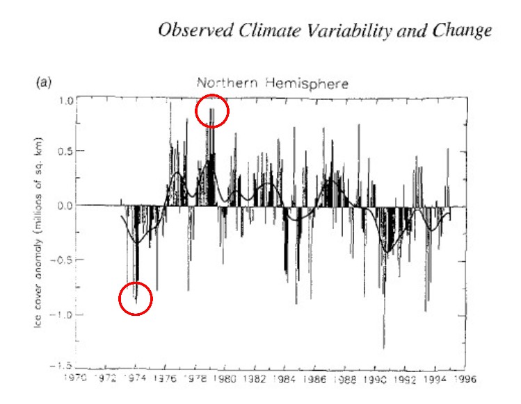
They ignore satellite data prior to 1978, which shows that Arctic sea ice extent was two million km² lower in 1974. The graph below was in the 1995 IPCC report.
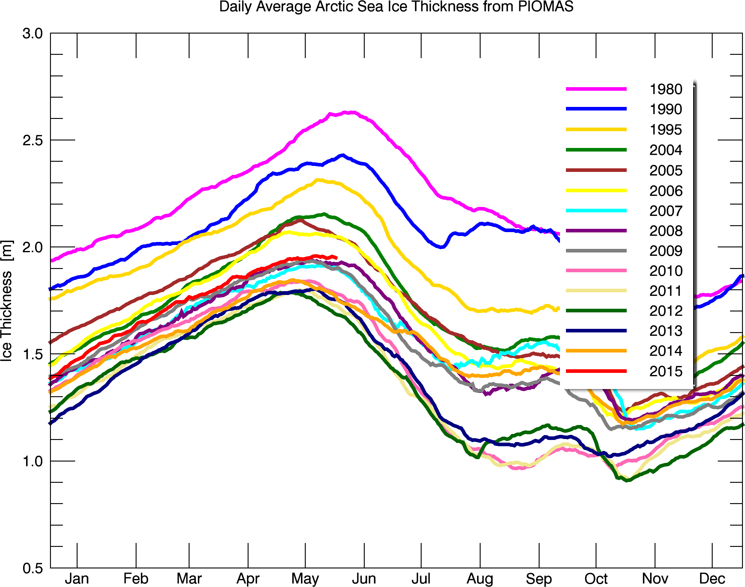
The Arctic is not melting down. Arctic sea ice is currently the thickest since 2006, and thickness is about the same (2 meters) as it was 75 years ago.
Bpiomas_plot_daily_heff.2sst.png (2488×1960)
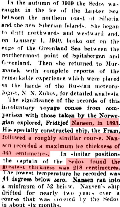
Papers Past — Auckland Star — 14 December 1940 — WARMER ARCTIC

For 500 years, mankind has lived in FEAR OF REALITY.
The current AGW scare is a continuation of an irrational response almost 500 years ago to the report by Copernicus in 1543 that Earth and the other planets all orbit a giant fountain of energy at the gravitational center of the solar system.
Precise measurements and observations on the Sun and other parts of the solar system show that this fountain of energy is the Creator, Destroyer & Sustainer of every atom, life and planet in the entire Solar System [1].
The fountain of energy in the Sun’s core is powered by neutron repulsion, the source of energy in cores of
1. All atoms heavier than 150 amu, like Uranium
2. Some planets, like Jupiter
3. Ordinary stars, like the Sun
4. Galaxies, like the Milky Way
5. The now expanding Universe
Mankind cannot control, but must not ignore or live in fear of the benevolent and powerful solar pulsar that created and sustains every atom, life and world in the solar system today.
References:
1a. “Solar Energy,” Adv. Astron. (submitted 1 Sept 2104; published privately 17 Mar 2015)
https://dl.dropboxusercontent.com/u/10640850/Solar_Energy.pdf
1b. “Supplement for Teachers” (published 30 Mar 2015) https://dl.dropboxusercontent.com/u/10640850/Supplement.pdf
1c. “Intro: Science for Teachers” (published 23 May 2015)
https://dl.dropboxusercontent.com/u/10640850/Introduction.pdf
There is no crisis if the charts start in 1974. No crisis equals no funding. I don’t think you have to be a genius to see that rather obvious fact. You have to be very naive to believe that the huge cash cow of Government funding is not influencing the “scientists”.
Yes, Andy DC, federal research grants go to support FEAR OF REALITY !
Reblogged this on Centinel2012 and commented:
When looking at charts and graphs its always good to make sure the starting point is valid (has been cherry picked) for the purpose of the chart.
When looking at charts and graphs its always good to make sure the starting point is valid (has been cherry picked) for the purpose of
the chart.scaring the crap out of the tax paying public so we can manipulate them, decreasing their freedom and extracting even more money.There fixed it.
Where’s the data from 75 years ago about arctic ice thickness?
Auckland Star, 14 December, 1940.
https://media2.stickersmalin.com/produit/100/stickers-devil-smile-R1-143760-2.png
I still like your gator’s grin better.
Where and how did they measure thickness back then? Was there even a single point measurement, or nothing?
Obviously there was more than nothing, which anyone (well, almost anyone) can gather by actually reading the material provided above. But then logic is not your strong suit, so I am spelling this out and typing slowly for you, and you are welcome.
https://www.youtube.com/watch?v=Rfyqka2TC48
In 1979, in Slyder Fjord (Eureka), the ice got damn thick. I recall someone there indicating that it was very much thicker than the year before. In addition, in Feb. ’79, Eureka set the coldest mean month temperature in North America at -47.9C…I missed it thankfully by 1 month, as I arrived in March 🙂
Oh that Auckland Article is such an Inconvenient Truth…
95′ IPCC graph as well… how many times are skeptics confronted with an Arctic Ice Record conveniently baselined in 1979…
Steve – you noted that, “They ignore satellite data prior to 1978, which shows that Arctic sea ice extent was two million km² lower in 1974.”
Curious then, isn’t it, that DMI begins their chart of mean values for Arctic Ice Extent in 1979 and ends it in the year 2000? More appropriate analysis might be a 10-, 20-, or 30-year running average through 2014, rather than restricting the mean to those years… Updated analysis might even show the 2015 extent well within the mean ± 1 SD, if not above it.
http://ocean.dmi.dk/arctic/icecover.uk.php