
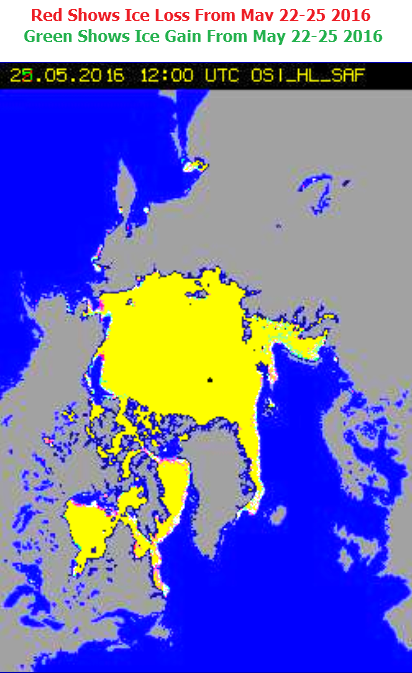
DMI continues to show rapid melting of Arctic sea ice.
Ocean and Ice Services | Danmarks Meteorologiske Institut
Their maps show the exact opposite. Arctic sea ice coverage is hardly changing at all.
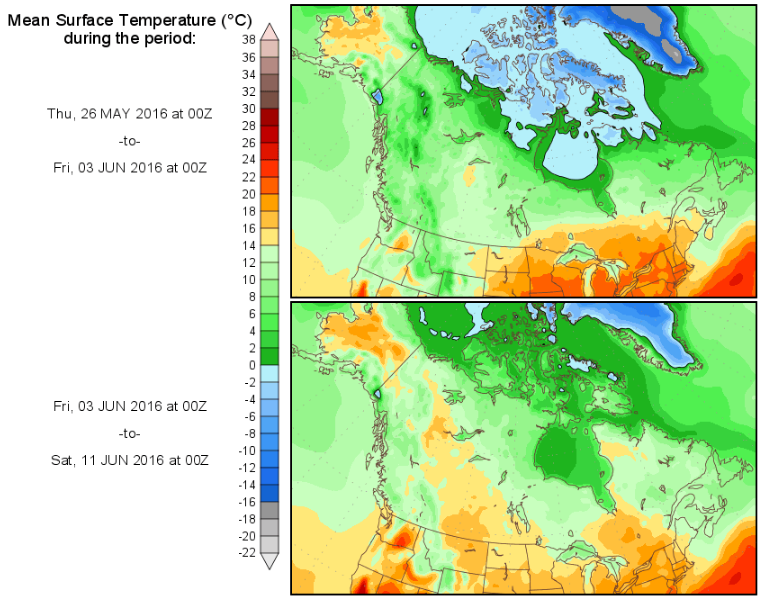
Temperatures have been below freezing in the Arctic Basin for many months. Why would the ice be melting?
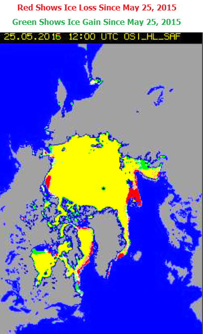
Equally as troubling is that they show a lot less ice than last year, when in fact there is more ice than last year.
As far as I can tell, there are no government agencies in any country – which are not vested in the climate scam.
