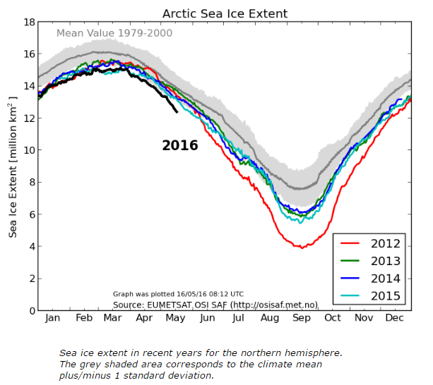
The DMI graph shows Arctic sea ice extent falling rapidly.
Ocean and Ice Services | Danmarks Meteorologiske Institut
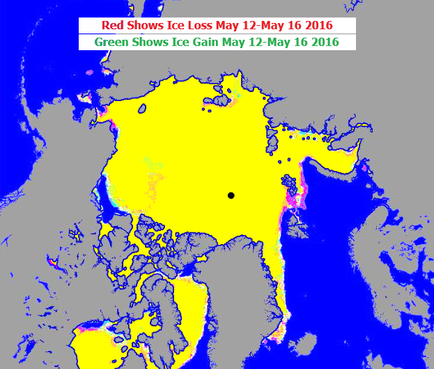
But their maps don’t. The DMI maps actually show extent increasing in the Beaufort Sea, and little loss elsewhere.
OSI_HL_SAF_201605161200_pal.jpg
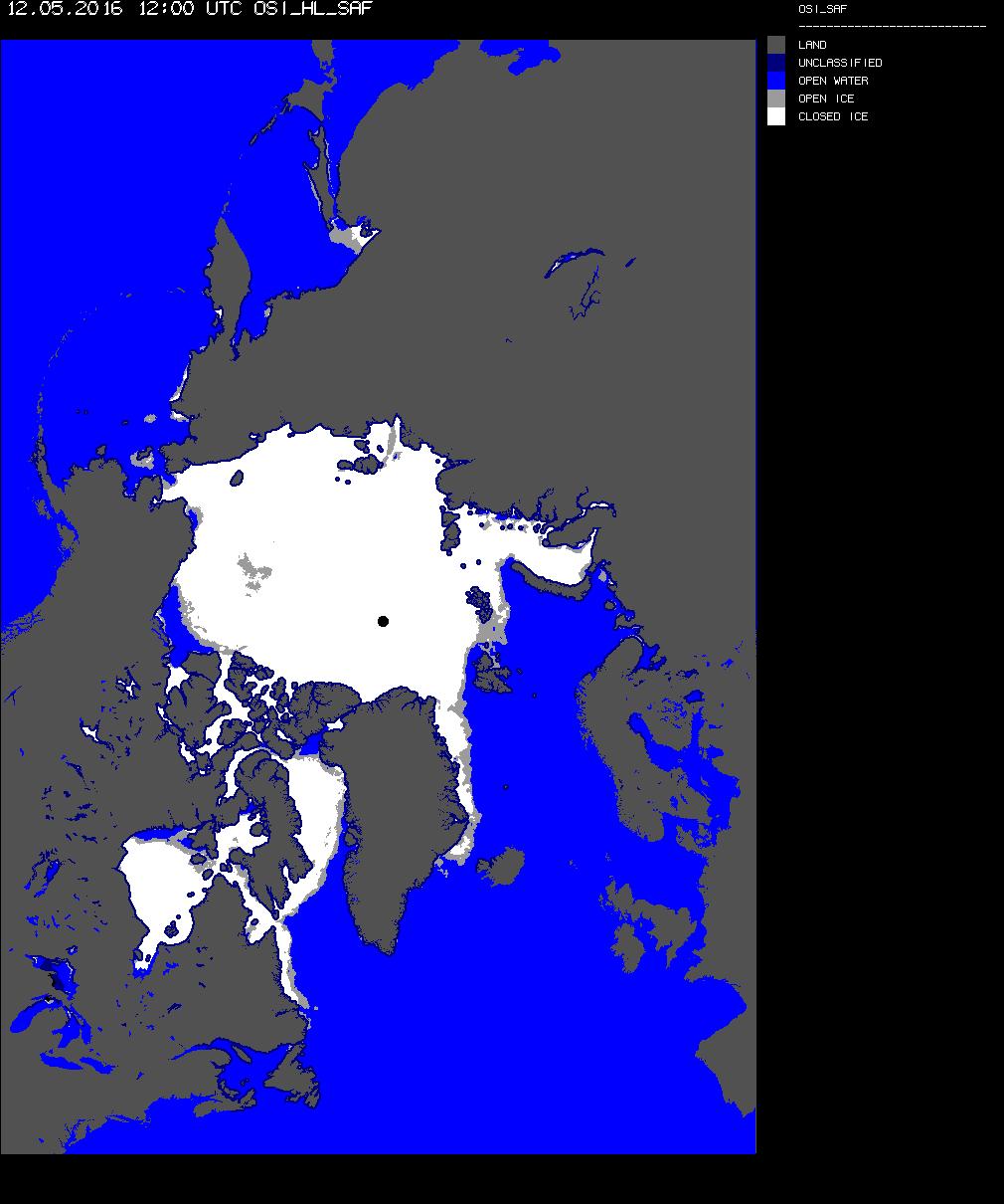
OSI_HL_SAF_201605121200_pal.jpg
Just more BS from the team.
Very suspicious. This shows ice age has arrived LOL http://arctic.atmos.uiuc.edu/cryosphere/IMAGES/seaice.anomaly.arctic.png
lol.. I reckon someone is having some ice measurement issues :-)
Either that, or all the semi-ice from effects of the El Nino and the recent strong Arctic gyre, has suddenly solidified.
The NSIDC has an interesting archive of DMI Arctic ice charts for 1893-1956. Is there any way to compare them to current satellite maps?
https://nsidc.org/data/docs/noaa/g02203-dmi/
ftp://sidads.colorado.edu/DATASETS/NOAA/G02203/
Isn’t it …”funny”…how, when Arctic Sea Ice showed itself to be well above normal (not in line with AGW, aka “Climate Change,” AAUUGHHH!), all of a sudden this “artifact” was blamed the introduction of a “new high resolution coast mask” corrected by a new algorithm that now showed decreasing ice levels…
Just sayin’
Source: http://ocean.dmi.dk/arctic/iceextent_disagreement_is_an_artifact.uk.php
It only showed above normal on one of their graphs, the one they recommended people not to use but Tony did…..
You can take your tinfoil hat off now.
Andy
I’m confused now ;) : http://arctic.atmos.uiuc.edu/cryosphere/arctic.sea.ice.interactive.html
The satellites are messed up these days. Only MASIE can be trusted. It shows extents are down but the melting is all in the marginal seas.
https://rclutz.wordpress.com/2016/05/16/arctic-marginal-ice-melting-may-15/
Thanks Ron … does DMI use MASIE or is DMI all FUBAR?
How can u tell when GLO-BULL warming alarmists are lying … their lips are moving or they are posting on blogs ;-)
Stewart, DMI uses passive microwave sensors on satellites to discern ice edges. MASIE uses multiple sources, including the same sensors, plus satellite imagery and ship observations.
More on the differences here:https://rclutz.wordpress.com/2016/02/27/noaa-is-losing-arctic-ice/
One satellite has an issue only, not all satellites are messed up. Cryosphere will likely move to the other satellite like NSIDC did.
Andy
Marcellus explains this situation, at the start of “Hamlet”:
“Something is rotten in the state of Denmark.”
This is akin to, “something smells fishy here.”
I get the feeling all is not well in the back corridors of academia. There is confusion and bungling. Perhaps some know it is time to get out while the getting is good. Or perhaps “a fish rots from the head down,” (which was originally “a fish stinks from the head down”)
The foul ups used to mostly involve the temperature records. Now it seems to be spreading. It will be an interesting summer.
Keep up the good work. I love those maps that show where the ice has grown and where it has shrunk.
Just more BS from the team.
Yes. Yes it is. But this BS told over and over by “authoritative experts” and government agencies becomes “the received truth”. The media faithfully records the government pronouncements as gospel truth and tells the man in the street that “We are Doomed” — unless you let us control your life totally.
We are losing this propaganda war. We have truth, they have all the tools. (I hope I am just having a pessimistic day)
PS: I like the new site.
“Every picture tells a story don’t it” !
To too many, reality is a foreign language !!
Now if someone could just email Me these/those above Arctic Satellite images, I can “wipe” out all of the Ice and prove through my now “enhanced” Satellite images that that the Arctic Ice doesn’t exist anymore, and until You go there to prove Me wrong, then by “default”, I AM RIGHT !!!!!
And then “I” have the “pictures” to “prove” it !
Trust Me…
Pingback: ARCTIC SEA ICE –Brouhaha– | Sunrise's Swansong
What’s the pixel count for red/green/yellow in that overlay picture? By eye there seems to be considerably more red than green, i.e. there is net loss, particularly around Svalbard.
Also, why not compare over a slightly longer time frame than a single day, to minimise the impact of day-to-day noise? You won’t get exactly the same result from pixel-counting that they show on the graph unless you also do the correct projection to correct for differing area per pixel, but it should be close enough.
Good job posting (bringing in) these Satellite photos !
These are the “exact” same photos that I have been downloading for years, and they are the “exact” same photos that NSIDC suddenly washed away a month ago because the “current” Arctic Ice has completely recovered, and so how can they keep lying out their @$$ when a “reasonable” and some what educated person could “see” that they are lying instead of “hearing” them lying ???
Let Me make it clear
If You like your Ice, You can keep your Ice…
Keep PostingOn
Perhaps the maps are BS and the maps are wrong? ;)
Andy