Three days ago, scientists were stunned by the imaginary Arctic meltdown and pre-announced a record low for 2016.
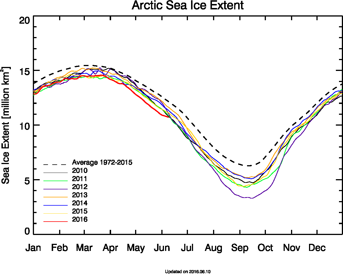
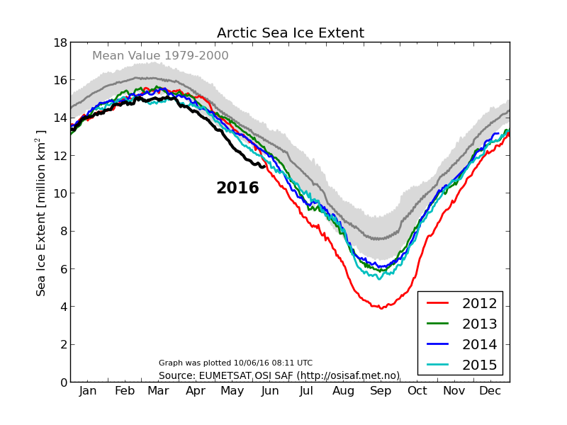
I have been blogging for several weeks that the widely reported 2016 Arctic meltdown is not occurring. Graphs from government agencies are finally getting caught up to reality. Melt has been very slow over the past month and will continue to be slow for at least another week.
extent_n_running_mean_amsr2_previous.png (1201×962)
Ocean and Ice Services | Danmarks Meteorologiske Institut
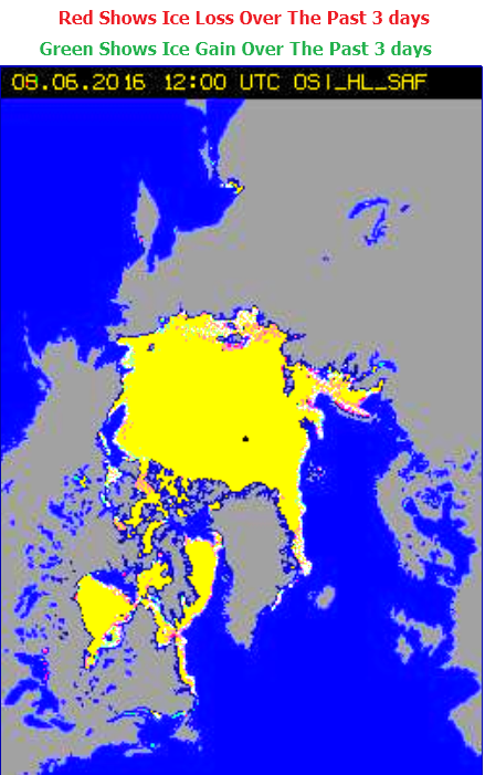
Ice loss continues to be very slow.
If you want to know what is going on with the climate, the last people you should listen to are government funded scientists.
Looking at the mean data from the standpoint of statistical analysis, using 1979-2000 as the standard makes now sense at all in light of the naturally changing climate, especially because we were coming out of a “global cooling” period at that time (1979).
Wouldn’t it make more sense to use a 30-year running average ±SD. This year’s data would fall well within the error limits, if not come close to the mean.
Great point, Bob! We are dealing with an ice cycle that is probably close to 60 or 70 years. Lacking good data for that long, the least, the very least, that should be done is to use all of what we do have, approximately 37 years worth.
The second graph shows the 1981 -2010 average and the gray on either side is 2 standard deviations. Even with the melt coming closer to the 2012 level it’s more than 2 SD less ice than the mean.
WRONG AGAIN, Craig.. but we are getting used to that.
“Sea ice extent in recent years for the northern hemisphere.
The grey shaded area corresponds to the climate mean plus/minus 1 standard deviation.”
? The second graph shows 1970 to 2000 according to the label.
Yep, I didn’t notice.. thought it was using 1980-2010
This makes the current level look even more NORMAL, in fact, one could say that the level is probably quite a bit above where it would be expected to be.
I’ve tried to overlay the 1979-2000 period in yellow.
As you can see this only takes in basically only the bottom half of the AMO cycle, so the current position (blue dot) would be probably more than 2sd from the 1979-2000 mean.
going to post the pic in a new post down the bottom of the thread so y’all can see it
Sorry, I was looking at the nsidc.org sea ice extent.
Arctic temperatures and sea ice are linked pretty closely to the AMO
At the moment we are just coming off the peak of the AMO cycle. There should be less sea ice than at the trough, which just happened to be in 1979 when Arctic sea ice worriers all like to start.
ps shaded blue is the 1979-2010 period, blue dot is approximately ‘now’
Using the 1979-2000 period only covers the first 2/3 of the upward leg of the AMO so over-estimates the probable longer term average of sea ice..
What the graph above tells us is that current Arctic sea ice levels are almost exactly where they should be for the phase of the AMO, just outside 1 SD below the average.
There is absolutely NO global warming signal in the current sea ice levels.
Andy, I love that graph….thanks for making it
I second that. In addition the AMO is actually cogent and correlated to NH T.
https://notalotofpeopleknowthat.files.wordpress.com/2014/08/mean12.png
Look how well unadjusted Reykjavik temperatures follow the AMO.
Someone else has noticed the meaningless mean.
Fear and loathing within the climate community!
Their solution is to destroy the economy, give control to bureaucRats and DemocRats, tell us all how to live.
1/3 of the Netherlands is already below sea level and they seem to have dikes and mitigation figured out pretty well.
This guy in Texas found an instant dam online and saved his house from flooding. Just guessing, but he’s probably not a big government Liberal?
http://www.usatoday.com/story/news/politics/onpolitics/2016/06/10/trump-uses-obama-08-ad-attack-clinton/85698490/
Dang wordpress!
Here’s the link to the instant dam.
http://videos.usatoday.net/Brightcove2/29906170001/2016/06/29906170001_4934572872001_4934397318001.mp4
I get a few kicks out of jousting with the folks at Peter Sinclair’s ClimateCrocks blog about their inability to prove skeptic scientists are paid industry money to lie. But I’ve been ignoring Peter’s fundraising ads for some Dark Snow project. Didn’t look at the site ’til today. What do you suppose is the stuff in the pic here? http://darksnow.org/mission/ First I’ve heard of that being a problem, I remember when it was a solution put to Stephen Schneider to speculate about over solving global cooling (5:56 point here https://www.youtube.com/watch?&v=nprY2jSI0Ds#t=356 ).
As soon as Sinclair is involved…
… you KNOW there is almost certainly some sort of SCAM happening.
One has to wonder. From Sinclair’s love affair with all things Oreskes, he could be quite a gullible guy. Myself, I’ve tended to spot photos of glaciers and icepacks that are all glisteningly white, so it makes me wonder if the Dark Snow photo is one of a local field of pebbles sprayed across the snow and subsequently photoshopped to the horizon, or if it was the aftermath of some area that was under an Iceland volcanic dust plume, either of which are being portrayed as fossil fuel particulates in a mega-positive feedback melting of ice/snow. That latter notion of the Dark Snow project defies logic, I’d think. With that much particulates floating around, it ought to block the sun, thus causing the snow/ice to melt slower, not quicker.
. . and average sea ice thickness?
http://psc.apl.uw.edu/wordpress/wp-content/uploads/schweiger/ice_volume/Bpiomas_plot_daily_heff.2sst.png
Above all years since 2010, except 2015.
Quite remarkable considering the battering it took from the El Nino.
An aside – for fun. Attached is Fairbanks – temps from CAG. Don’t hear much about that 37 year cooling trend, do we?
I’m so thankful that you do what you do , Steve… I’m not sure anyone else has the capability you do.
Its all the historic REALITY that is so , so good. :-)
The problem is, almost no one can discern reality from propaganda anymore… even the pros get it wrong and succumb to marketing hype. Tony is a true scientist and accepts nothing at face value unless it matches observations. Pullingbackthecurtain needs to be required subject matter in the USA. .. doesn’t do ice but you know what I mean.
Thanks Michael!
Here’s the AMO with the 1979-2000 period in yellow.
Here’s the AMO and Arctic sea ice extent for 1948 to 2008. It doesn’t look like the sea ice is following the AMO.
I second Michaels commentss re SG
Ice extent seems to be a poor metric, how much loss or gain of area, is due to temperature change & how much due to the effects of wind and currents?
If we look at sea ice mass instead, 2016 is above all years since 2010, expect 2015.
By itself the sea ice extent (or even the ice mass) doesn’t prove anything. It will affect the albedo with less ice to reflect energy and more open sea to absorb it. The scientist quoted in the Post story Tony linked to put it this way:
“Granted, [Mark] Serreze says we still can’t be sure that 2016 will set an all-time-low sea ice record, besting 2012 — that still depends on summer weather.
‘All we can say is that we are on a very bad footing,’ he said. ‘However, this is also part and parcel of a longer trend … we’ve always known that the Arctic would be the place most sensitive to climate change, and that’s what we’re seeing.'”
It is interesting that Tony says the DMI is “getting caught up to reality” because the 2016 melting has slowed down but was committing fraud when the melt as far above last year. Why did they change their “lying” ways?
Tony showed graphic after graphic trying to prove the sea ice this year wasn’t melting faster than 2015. The fact is that the Arctic was warmer for most of May 2016 than in 2015 so more melt was expected.
If it’s -10C, rather than -20C, it doesn’t matter a toss. The duration that temperatures are above -2.2C (Freezing point of sea water) that matters.