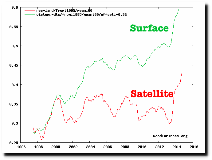
Satellite temperatures are infinitely better than the fake surface temperatures produced by NASA and NOAA.
Wood for Trees: Interactive Graphs
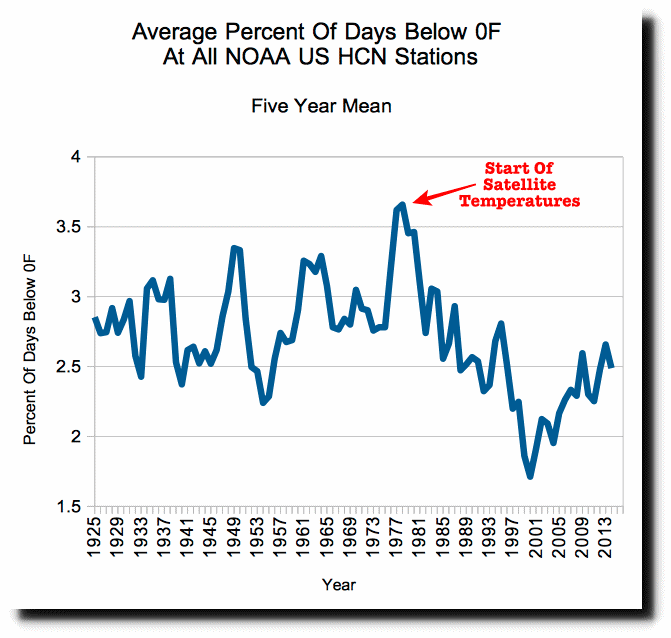
But there is a huge problem with satellite temperatures. They start in 1979, which was the coldest period of the last 90 years in the US. The frequency of below 0F (-18C) nights peaked in 1979, and then dropped in half by the year 2000, before starting to increase again.
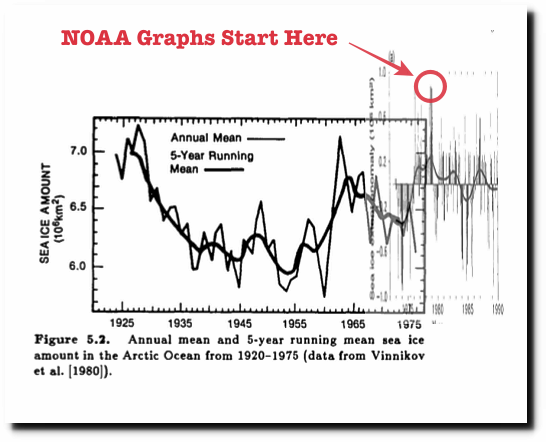
1979 was also the peak Arctic sea ice extent of the last 90 years.
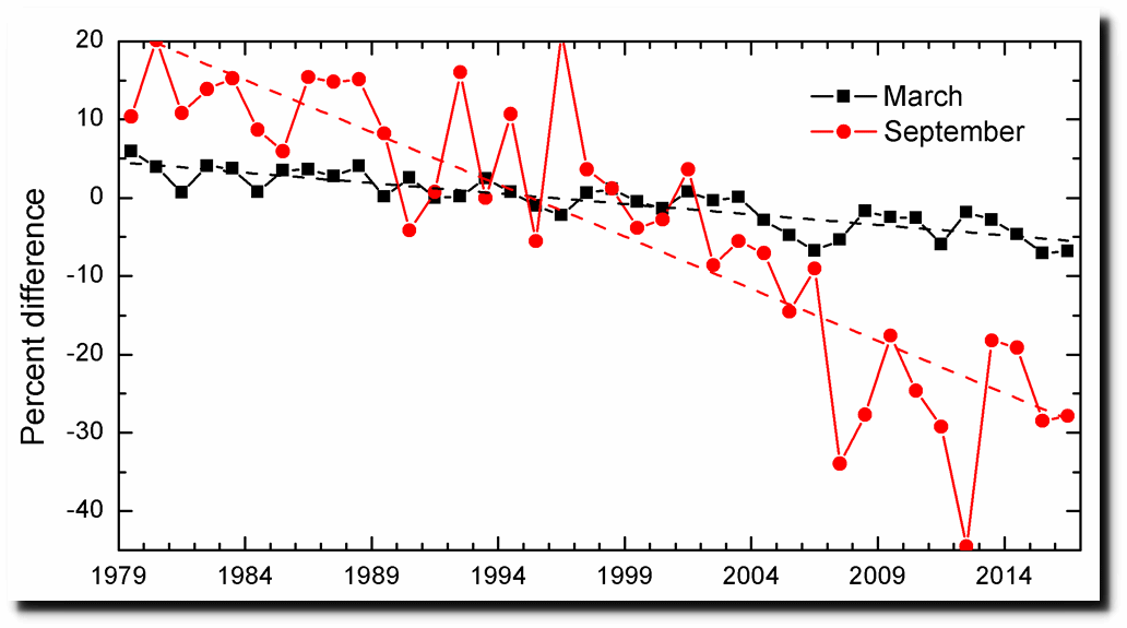
Visualizing Government Arctic Sea Ice Fraud | The Deplorable Climate Science Blog
NOAA has sea ice satellite data from before 1979, but they hide it because it wrecks their Arctic sea ice melting scam.
ftp://ftp.oar.noaa.gov/arctic/documents/ArcticReportCard_full_report2016.pdf
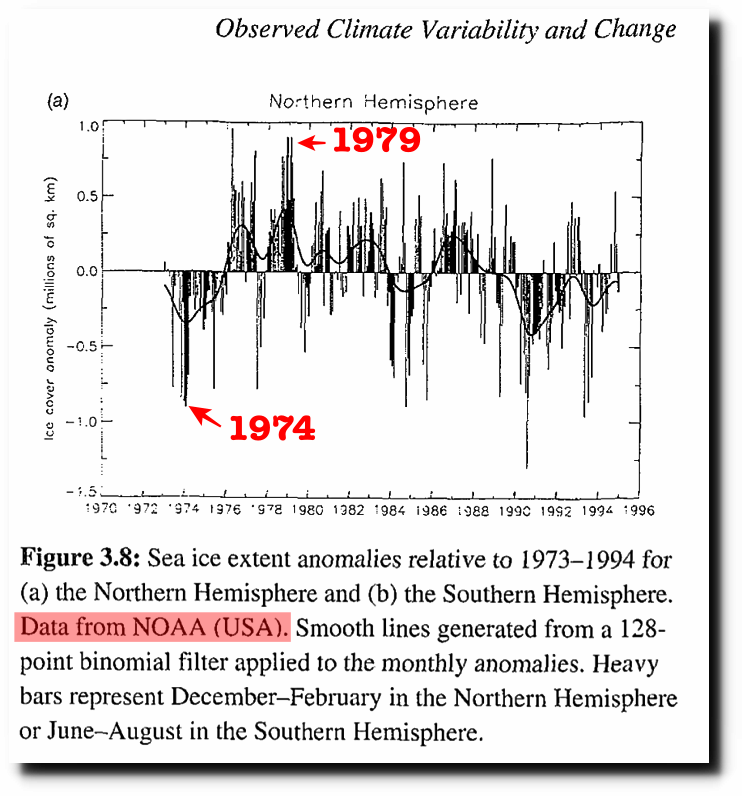
The graph below is from the 1995 IPCC report. Sea ice extent was almost two million km² lower in 1974 than it was in 1979.
https://www.ipcc.ch/ipccreports/sar/wg_I/ipcc_sar_wg_I_full_report.pdf
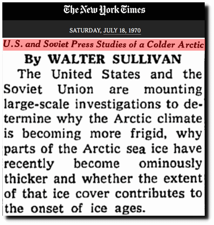
But the scam gets worse because the Arctic had already cooled dramatically by 1970. Sea ice had become ominously thicker.
U.S. and Soviet Press Studies of a Colder Arctic – The New York Times
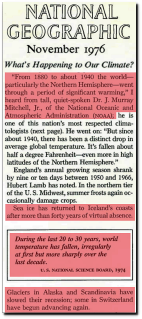
Glaciers were expanding by 1976.
National Geographic : 1976 Nov, Page 575
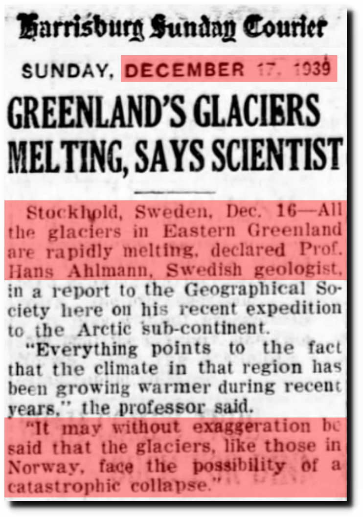
Forty years earlier in 1939, glaciers were facing “catastrophic collapse.”
17 Dec 1939, Page 15 – Harrisburg Sunday Courier
Because satellite data typically begins at the coldest and iciest period of the last 90 years, the upwards trend since 1979 is very misleading. I see little or no evidence that Earth is warmer now than it was in 1940.

