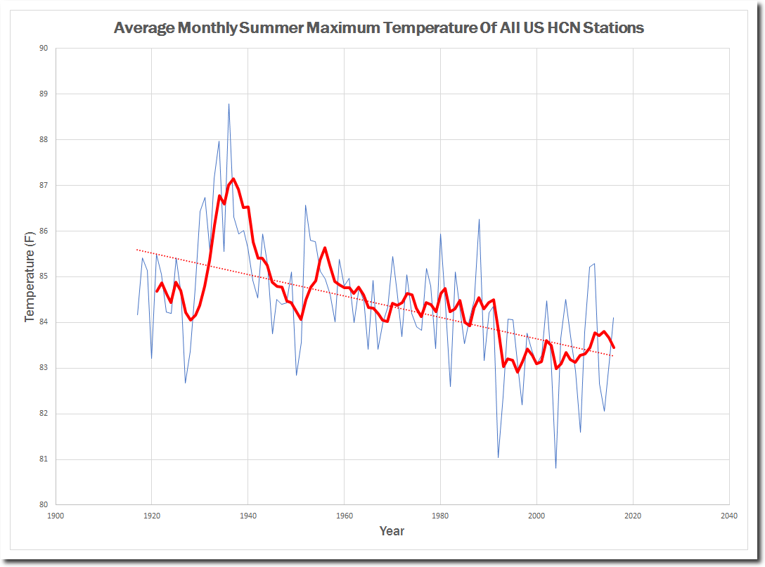
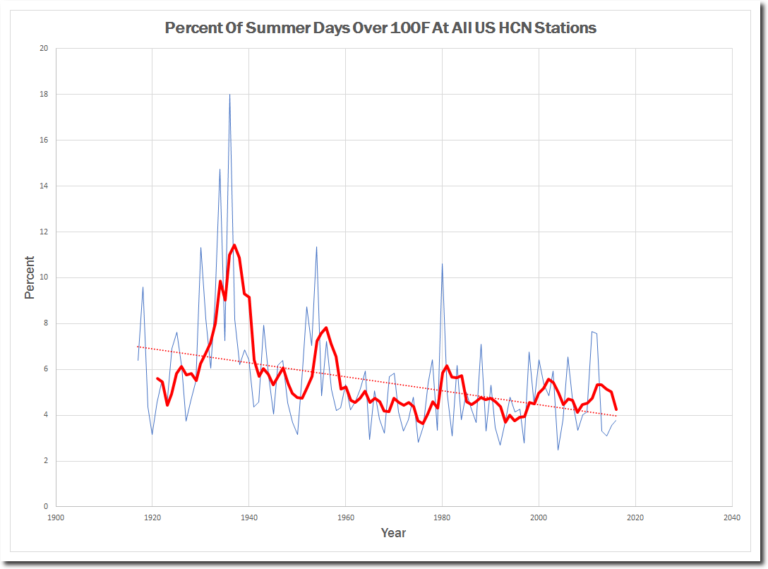
Some exciting news. I am about to release a brand new python based version of my GHCN software, which replaces the C++ code. The code size is very small, and is easy to understand and verify. It will be devastating for climate fraudsters at NASA, NOAA and Berkeley Earth. Here are my first graphs from it. I’m still verifying the software, so there may still be errors in the code.
Disrupting the Borg is expensive and time consuming! Please help with a gift by clicking the button below.
-
Recent Posts
Recent Comments
- Robertvd on Killing Cows To Save The Climate
- Gordon Vigurs on Killing Cows To Save The Climate
- Disillusioned on Killing Cows To Save The Climate
- Disillusioned on Rewriting The Arctic
- Disillusioned on President Eisenhower’s Warning
Archives
- June 2023
- May 2023
- April 2023
- March 2023
- February 2023
- January 2023
- December 2022
- November 2022
- October 2022
- September 2022
- August 2022
- July 2022
- June 2022
- May 2022
- April 2022
- March 2022
- February 2022
- January 2022
- December 2021
- November 2021
- October 2021
- September 2021
- August 2021
- July 2021
- June 2021
- May 2021
- April 2021
- March 2021
- February 2021
- January 2021
- December 2020
- November 2020
- October 2020
- September 2020
- August 2020
- July 2020
- June 2020
- May 2020
- April 2020
- March 2020
- February 2020
- January 2020
- December 2019
- November 2019
- October 2019
- September 2019
- August 2019
- July 2019
- June 2019
- May 2019
- April 2019
- March 2019
- February 2019
- January 2019
- December 2018
- November 2018
- October 2018
- September 2018
- August 2018
- July 2018
- June 2018
- May 2018
- April 2018
- March 2018
- February 2018
- January 2018
- December 2017
- November 2017
- October 2017
- September 2017
- August 2017
- July 2017
- June 2017
- May 2017
- April 2017
- March 2017
- February 2017
- January 2017
- December 2016
- November 2016
- October 2016
- September 2016
- August 2016
- July 2016
- June 2016
- May 2016
- April 2016
- March 2016
- February 2016
- January 2016
- December 2015
- November 2015
- October 2015
- September 2015
- August 2015
- July 2015
- June 2015
- May 2015
- March 2015
- January 2015
Extemely interesting, cant wait :-) Thanks!!
K.R. Frank Lansner
Time to publicly debunk UN climate science now !
Sample comparison for avg high max between July 1930-36 and 2011-17. Not even close!
Nice … good work Brian.
Great job Brian!
Brian, can you get the scale bar to stay the same.?
No, map generator does that, and I can’t change it. Sorry. It is the same scale just labeled different when a new color is added on either end.
I know its the same scale. :-)
This is made from two images, isn’t it. Couldn’t you cut/paste the scale of one and put it onto the other before you animate it?
I’m currently using your ‘Pulling Back the Curtain’ v1.10. The climate freaks hate it :)
Just one question, what is the ‘base-period’ for Aussie GHCN stations?
It’s good to see climate freaks behave rationally, for the sake of novelty.
These are beautiful graphs, simply presented and well labeled and gets the point across to a wide audience
Cool. Can’t wait to download and try it out. If you want to crowdsource debug or code checking assignments, we may be able to look for errors.
Tony,
Do you never rest? You are awesome, a one-man wrecking crew destroying the warmunist data-fakers.
Thanks for all you do.
Griff owes you some money. We all do; so hit the tip jar!
It is totally unfair to plot graphs of raw data.
You did not give those crooks time to insert adjustments designed to create a warming trend.
No worries, GC. They’ll fix it in the code when they get their mitts on it.
It is totally unfair to plot graphs of raw data.
The climate freaks hate it.
I posted a TEMPARATURE (not anomalies) graph on FB recently and a climate warrior asked me “what is the base-period for the above graph?”
They have NFI what an absolute TEMP graph is!
They have NFI. Period.
If they did they wouldn’t be liberals.
Leftists.
Tony,
Here is data for Sydney and Melbourne in that nice place Australia that you visited.
It might be useful to check against your analytical software.
The data give a comprehensive view of heatwaves and hot days for these 2 cities that together house about half the population here.
The glaring conclusion is that there is no evidence of significant warming from this study. The official line states that there is.
Please email me at sherro1 at optusnet com au if you need more.
It is well worth a look. Geoff.
http://www.geoffstuff.com/isithotorisitnot.xlsx
nice work, Geoff …
(tiny remark, in graph 4 title, “1859” instead of 1959 …)
thanks for the excel !
A VERY interesting article at JoNova.
And you thought US temperature data was iffy !!
http://joannenova.com.au/2017/08/another-bom-scandal-australian-climate-data-is-being-destroyed-as-routine-practice/
Wow.
Inconvenient data …
Wait.. So your telling me the Earth has actually been getting colder over the past century? We really do live in opposite land.
Unless you are 100 years old and a very good memory or have studied history like I have, you have no way of knowing what temperatures were like 100 years ago. You are relying on graphs generated by a dozen people at government agencies – which is not science.
Matt:
First off, these are US stations.
The data is correct. Almost all of the “warming” is warmer WINTER temperatures and warmer SUMMER NIGHT TIME LOWS.
Daytime summer high temperatures don’t begin to approach the 1930s “Dust Bowl” era.
But if you take an average of each day of the year (and toss in a few adjustments), you can make claims like HOTTEST YEAR EVAH!!!
Matt, can you show us data from your “land”?
President Trump being investigated for collision while Clintonestas walk free uninvestigated. The trace gas CO2 is an “imminent” threat to all life on earth. Yes.. we can keep the sea levels from “ever” rising.. (or falling) “ever” again, based solely on regulating levels of the trace gas co2, or are you a sea-level change denier? Plate tectonics denier? Miami will be under 40 feet of water by 2100. All the opposite land of actual reality., Need I say more?
tonyheller, David Jay,
Thank you for the clarification. Is no wonder why the public is so easily manipulated by these “graphs” when the details and nuances are not completely taken into context.
Thanks Tony (and the others) for putting what I have known for a long time in a coherent, very understandable format. Every American needs to know that they have scammed blind by fake scientists, fake politicians and the fake media. This could be a big game changer if this information is widely disseminated.