ftp://ftp.ncdc.noaa.gov/pub/data/ghcn/daily/figures/station-counts-1891-1920-temp.png
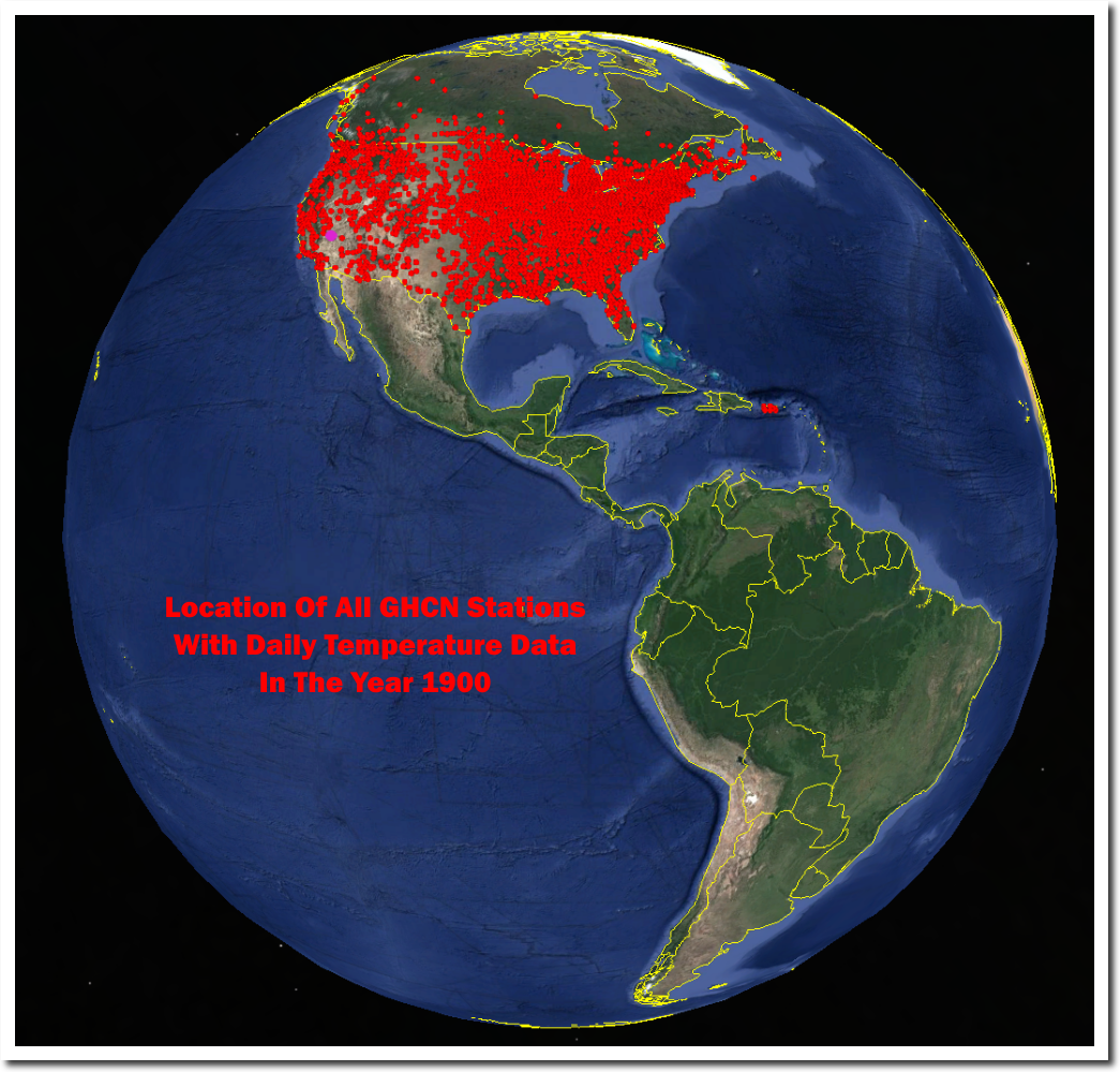
NOAA has no daily temperature data from Central or South America, or most of Canada from the year 1900, But they claim to know the temperature in those regions very precisely. Same story in the rest of the world.
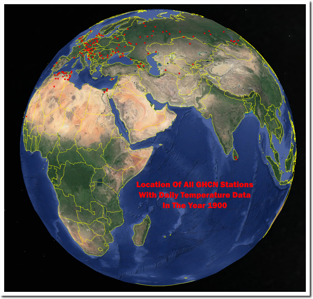
Despite not having any data, all government agencies agree very precisely about the global temperature.
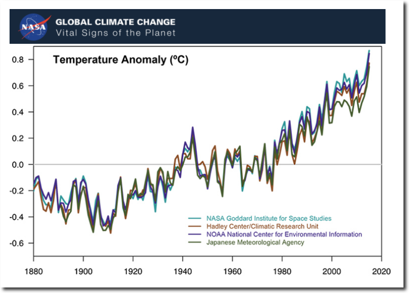
Climate Change: Vital Signs of the Planet: Scientific Consensus
The claimed global temperature record is completely fake. There is no science behind it. It is the product of criminals, not scientists. This is the biggest scam in history.
This is my major concern too; not the ‘basic physics’ (which implicitly
require an ‘all else being equal’ caveat).
I understand that we can arbitrarily improve our estimate of the
standard error of the mean of a series of measurements – providing
that the samples are I.I.D and conform to the central limit theorem
(i.e. as number of samples increase they tend to a normal
distribution). Is this really true for temperatures? – which by
definition are regionally and temporally correlated.
Clive Best has done some good work (at least I think so) with a
spherical triangulation method which eliminates regional sample
bias: http://clivebest.com/blog/?p=8014
However, I think a basic audit of the homogenized temperature
record is needed as a minimum first step. It needs to be very clear
why station data is being adjusted and why apparently valid station
data is being rejected in favour of estimates.
“(i.e. as number of samples increase they tend to a normal
distribution). Is this really true for temperatures?”
Actually no it is not if you think about it.
If you measure the length of a board, one time vs 100 times, then yes you can improve the estimate of the standard error of the mean.
HOWEVER that board is exactly the same (if at the same temp and humidity) for each measurement, therefore it is repeated measurement of the same thing.
What about temperature?
Essentially you can not make repeated measurements with the same equipment of the same sample of air under the exact same conditions.
The sleight of hand is one of the biggest lies in ClimAstrology. A first year Statistic teacher would slap your hands for pulling this stunt.
They try to get around it by using ‘anomalies’ but you still have ONE measurement per time/area so you are not going to improve the error beyond that of the worst of the measuring devices.
Given that the best data set in the world which is from the USA; 64.4% of the data has an error of greater than 2° C and 6.2 % has an error greater than 5° C.
Dr. William M. Briggs is an Adjunct Professor of Statistics at Cornell and knows a heck of a lot more about this than I do.
Confidence Interval Interpretation
Netherlands Temperature Controversy: Or, Yet Again, How Not To Do Time Series
<blockquote"Today, a lovely illustration of all the errors in handling time series we have been discussing for years. I’m sure that after today nobody will make these mistakes ever again. (Actually, I predict it will be a miracle if even 10% read as far as the end. Who wants to work that hard?)….
…The record of De Bilt is on line, which is to say the “homogenized” data is on line. What we’re going to see is not the actual temperatures, but the output from a sort of model. Thus comes our first lesson.
Lesson 1 Never homogenize.
….This creates, so far, four time series now spliced together….
Lesson 2 Carry all uncertainty forward.
If you make any kind of statistical judgment, which include instrument changes and relocations, you must always state the uncertainty of the resulting data. If you don’t, any analysis you conduct “downstream” will be too certain. Confidence intervals and posteriors will be too narrow, p-values too small, and so on.
That means everything I’m about to show you is too certain. By how much? I have no idea.
Lesson 3 Look at the data. ….
Lesson 4…
Using “anomalies” to study an insignificant blip of time on Earth, and using this incredibly small set of numbers to understand an almost incomprehensible reality, is simply nonsense.
a·nom·a·ly əˈnäməlē/ noun
1. -something that deviates from what is standard, normal, or expected.
1- There is no such thing as “normal” in climate or weather.
2- What exactly am I supposed to expect in the future, based upon the range of possibilities we see in the geologic record? Are the changes we see happening “extreme” in any way?
3- No.
Anomalies are created by the definers of “normal”.
? hee hee hee
Link?
Gator, I am laughing WITH you….
Briggs
“…
Lesson 4 Define your question.
Everybody is intensely interested in “trends”. What is a “trend”? That is the question, the answer of which is: many different things.….
Years of experience have taught me people really hate time series data and are as anxious to replace their data as a Texan is to get into Luby’s on a Sunday morning after church. This brings us to our next lesson.
Lesson 5 Only the data is the data.
Lesson 6 The model is not the data.
The model most often used is a linear regression line plotted over the anomalies. Many, many other models are possible, the choice subject to the whim of the researcher”
Lesson Seven…
Adjusted data is not data.
Even a square distribution (your board length) will end up Normal as a sampling distribution. I believe most linear sample statistics (e.g. the plain old mean) will end up sampling Normal. Sample statistics, like variance, that are derived through non linear operatuons, do not sample Normal. I believe sample variance is distributed Chi Square…cannot recall the theoretical formula for it but it is typically quite skewed. But heck perpahs even the Chi Square distribution looks Normal ish with a large enough N…the central limit theorem is pretty amazing.
Yes, I own Briggs’ book. My point was that it needs to be
explored – it can’t be hand waved from either side without
doing the work. Regional temperatures may actually obey the
central limit theorem and, therefore, it may be reasonable to
use the law of large numbers to arbitrarily improve
precision. This ‘proof’ may already exist – I’ve just never seen
it.
I don’t think your average climate scientist knows what
uncertainty is. The utter baseless drivel I’ve seen spouted in
the last week or so concerning Harvey/Irma is a making me
doubt my sanity. I can’t believe my fellow humans – some of
whom I consider to be supremely intelligent – are being taken
in by this tripe.
Jon,
there are people who I know are very intelligent and approve of the global warming propaganda. They didn’t take the time to look at the actual science and the data behind it but because their own fields require rigor they can’t imagine someone could just fake it. The rest is a combination of realism and intellectual arrogance of people who are convinced that those who are not as smart as they need to be led and/or manipulated to follow. I believe every single one of such people I know is also a Leftist of some stripe.
Jon, the thermodynamic temperature is the geometric mean of a defined sample of matter’s constituent’s kinetic energy and *only* its kinetic energy. A temperature, by definition, is itself an average. Thermometers do not measure this kinetic energy. They use proxies for it, such as thermal expansion of a liquid. A problem, here, is that thermal expansion is not linear. It is polynomial and may be complicated. That is, you may get a decrease in length or volume as the temperature increases because of packing changes or bonding changes or both.
Sure, I get that temperature is an intensive
property which makes it a somewhat odd
choice as an indicator of anything really.
If Steve Wonder says he can see global warming with his own eyes, then it must be true.
While everything you wrote is true, it represents only the “GI” bit of GIGO (garbage in, garbage out); the really putrid misrepresentations happen with the published charts showing forecast intervals.
Everyone looks at the IPCC forecasts and looks at the forecast intervals, and thinks that the interval around the forecast at year 100 (say) is the 95% confidence interval for the forecast for year 100 with the forecast undertaken at year 0 – but it isn’t… it’s the CI for a forecast for year 100 undertaken at year 99. That’s why the error bounds don’t widen appreciably. If you do a ‘one-shot’ forecast of t years, the forecast error bounds will widen at O(^2) unless the model imposes conditions on the bounds (in which case they’re an input that needs to be disclosed, and the forecast bounds are no longer an estimate of forecast precision).
This is not statistical small pertaters: it’s more fundamental than most genuinely competent numerical modellers really understand.
Uncertainty in forecasts can be decomposed into a few primary categories:
(1) parameter uncertainty – that’s the most obvious one: parameters are estimated based on samples; this gives them sampling characteristics that are either well-known or can be obtained numerically (assuming that the required conditions hold for the sampling method – e.g., Gauss-Markov conditions if the estimation is done by linear least-squares);
(2) exogenous (input) variable uncertainty: this is the killer for the forecasting stage.
Why ‘exogenous variable’ uncertainty? Surely inputs are fixed (a requirement of Gauss-Markov).
Well… in estimation, it’s absolutely true that the values of regressors are known, and fixed – and so they satisfy the ‘exogenous regressor’ requirement of Gauss-Markov.
In forecast, the forecaster has to make a guess about the paths of key input variables: the paths are a random (vector) variable unless the forecaster is omniscient.
As such, any sensitivity analysis on the model must include alternative paths for the entire input matrix – i.e., a range of alternative paths for all input vectors, plus a range of alternative values for every parameter.
This is the only way to properly characterise the model variability in forecast – as opposed to the usual “key parameter’ sensitivity, where only a few parameters are perturbed.
Worse: forecasts must always be done in the context where the residual vector in every estimated equation is set to its expected value (i.e., zero).
The counter-argument is that (for linear models) the Jacobian is constant, and so the confidence interval for an arbitrary output variable can be determined directly from the distributions of the input variables.
The counter- argument goes away if the model is non-linear (because the Jacobian is not constant).
More importanly… it also goes away if only a subset of the model’s output variables are being considered – regardless of the linearity of the model.
This is because there are always an infinite number of alternative closures that will generate the same set of values for any subset of the output variables.
The moment you do forecasting properly, every model will break down; in particular driving the residual terms to zero is usually catastrophic. (However the residual term absolutely has an expected value of zero: that’s how estimation works).
In fact it was this problem that I discovered during an ARC grant-funded piece of research into TRYM (the Commonwealth Treasury’s macroeconometric model) in the 1990s.
We decided to give the model a set of historical input data for the input variables as an input to a ‘pseudo-forecast’. We collected the data on the inputs, estimated the model (both as a system, and equation-by-equation), and then drive the errors to zero. (That’s fundamentally different from the standard practice of using the estimation residuals themselves as a measure of model accuracy; what I call “y_hat – y”, which is absolutely not representative of what the model will produce given correct forecasts for the inputs).
Our approach was formulated to examine what the model would forecast for the output variables if your forecasts for the input variables had been exactly right.
Result: chaos. The model failed to solve – key output paths were explosive.
That result was one of the stepping stones on my path towards a complete loss of belief in the modelling paradigm (at least as it is actually practiced) – which was not a useful frame of mind for someone whose PhD topic was “Scenario-based Systematic Sensitivity Analysis in an Intertemporal Dynamic Computable General Equilibrium Model“.
Long story even longer: any model of more than modest complexity can be forced to produce any desired path for any subset of its output variables, by altering input variables and parameters in such a way that no input variable or parameter is perturbed by more than its standard error.
That’s why competing sides in any policy debate can always claim to have ‘done the modelling’.
It’s also why I now use my dark arts on geography-based problems; you can’t force an image-classifier to pretend that a forest is a road (or if you do, your classifier is a dud).
Ta sika sika, ten skafen den skafen onomason looks much better in Greek, but it’s something that everyone should do. All climate modellers are either ignorant of the problems I’ve outlined above, or they’re charlatans.
Should say O(t^2) – I am certain I typed the ‘t’ in the original, but it got parsed out, it seems.
Measuring temperature as a function of time is extremely problematic. In one way it is like doing destructive testing. By its nature, destructive testing is a one shot deal. So is temperature measurement for a time series. When the time is past it is gone. Once you have sheared that bolt or tensile tested that coupon you can’t do it again. Those two tests are great examples of the challenges of such things.
Running shear or tensile tests requires a great deal of quality processes in advance to ensure the accuracy and precision of results. Test samples have to be machined to exact dimensions. Testing equipment must be rigorously calibrated. Temperature and humidity conditions where the testing is to be done need to be controlled within specifications. Even then, there are reasons why individual test results can be invalid, usually due to inclusions in the metal. The prescribed methodology is to test enough samples to do a statistical analysis on the test results. Fortunately, such testing has been done millions of times and the underlying distribution of the results is well known to be normal. Individual test results falling outside a 90% confidence interval are thrown out.
Unlike temperature measurements, tests as I have described above can be replicated as long as additional material from the production lot or material mill run exist. You have the opportunity to have another lab verify results. You can actually conduct gage R & R studies to quantify the amount of variation induced into the results by the measurements.
Temperature is an entirely different ball of wax. You can’t verify results between labs. Even the calibration process for thermometers (ice bath is the typical method) is a bit iffy. Assuming calibration is even done, the best results you could possibly expect in the 1900 to 2017 time frame would be an accuracy of ± 1° C with referential accuracy between stations at ± 2° C. You can calibrate a thermometer in a lab today with extraordinary care to within ± 0.1° C. But when you are talking 1900 or 1930, actual calibration accuracy was probably not that good. Ultimately, to achieve a level of confidence in the referential integrity between two different thermometers you need both of them in a well controlled lab maintained in absolutely identical conditions conducting measurements through the operative range. Calibration can be done, but if you want to ensure the results you need to also conduct gage R 7 R studies on the calibration process to ensure it is accurate. That of course is entirely doable. For example, Calibrate 5 thermometers 5 times each at 3 different labs. Then do the math.
I seriously doubt their data is backed up by such rigorous and entirely standard practices. In which case talking about a .5° to 1° change in temperature covering so many different stations and so many different instruments, especially in light of potential location variances, is pretty ludicrous.
After the fact adjustments make no sense unless you can determine a thermometer is out of calibration and you can determine at what point that happened. You absolutely cannot look back in time, see a data point or series of data points that look wiggy, and correct it statistically. Unless the thermometer has a quantifiable error or if you can identify an extraordinary event and quantify exactly the magnitude and direction of the error induced correction to past readings makes no sense what so ever.
Temperature readings taken from precise mercury thermometers in use by the U.S. Weather Bureau in the late 1800s were more accurate than readings provided by today’s electronic thermometers.
Once properly calibrated, a mercury-in-glass thermometer requires no additional adjustment to its readings, so long as the glass bulb that contains the mercury reservoir and its attached expansion tube are undisturbed. Temperature measurements in the late 1800s were accurate to one- or two-tenths of a degree Fahrenheit.
http://articles.chicagotribune.com/2000-05-28/news/0005280042_1_thermometers-readings-accurate
He is correct about mercury thermometers being very robust, but that does depend upon how one is constructed and how it is handled. I am only familiar with the types I have used, but generally in those they are “set” by positioning the scale. Others the set is more or less permanent and you have to use a correction factor.
This article accurately describes how to calibrate a thermometer.
ftp://ftp.dot.state.tx.us/pub/txdot-info/cst/TMS/900-K_series/pdfs/cal926.pdf
However, the accuracy statement which says accuracies of ± .01° C can be obtain is really a bit too general. That is basically the greatest accuracy that can be obtained. In general, to achieve that kind of accuracy you need a double bath. For example a tub filled with ice where the test container is placed, screened off to prevent drafts such as a test booth, in a climate controlled room. A stray draft of wind from an air conditioner vent is sufficient to affect the calibration. Less rigorous conditions will produce less accurate calibrations.
Also the people in the late 1800s early 1900s were actual scientists or careful ‘amateurs’
a meteorology textbook by Willis Isbister Milham from 1918 states:
The author says a thermometer in a Stevenson screen is correct to within a half degree. Two thermometers are used an Alcohol for Minimum and a Mercury for Maximum supplied with a manual in 1882 to the coop stations by the US Weather Bureau. He also states there are 180 to 200 ‘regular weather stations’ ordinarily in the larger cities that take reading twice daily and a continuous reading too. There were 3600 to 4000 coop stations and 300 to 500 special stations that recorded other aspects of the weather.
And a bit more information validating Willis Isbister Milham statement in the textbook that a thermometer in a Stevenson screen is correct to within a half degree. It is most in error on still days, hot or cold. “In both cases the indications of the sheltered thermometers are too conservative.”
1892 Instruction Manual for Observers
Hager compared the two different measurement systems side by side at the GeiInfoAdvisory Office of Fliegerhorst Lechfeld from January 1, 1999 to Jul 31, 2007…
Clearly the electronic thermometers produced warmer readings than the mercury thermometers.
Worse, Hager says, the German DWD Weather Service did not adequately investigate the two different measuring systems and compare them, writing that:
“Although the DWD set up so-called climate reference stations at (way to few) locations and published the studies from the comparison measurements, the results unfortunately were not satisfactory. Here not the “old data was compared to the new data”, instead only the electronic thermometer was investigated in various locations, but were not compared with the glass thermometers, which are readily at hand.”
http://notrickszone.com/2015/01/13/weather-instrumentation-debacle-analysis-shows-0-9c-of-germanys-warming-may-be-due-to-transition-to-electronic-measurement/#sthash.BuRnKgBW.dpbs
That is interesting. I have used digital thermometers and thermal couples. I never inquired about how digital thermometers work, but they were subject to going bad where I used them because the temperature ranges could be pretty extreme. I believe they depend upon the rate of thermal expansion of metal, the problem with that being metal has a tendency to take a set when worked. Metal has a property of elastic deformation, meaning you can flex it or stretch it and it goes back to it’s original size or shape. However, do that enough the elastic region changes. That is essentially why all metal fatigues under oscillating loads such as vibration. That is why you can break a coat hanger by repeatedly bending it until it breaks.
Mark Fife says:
“Measuring temperature as a function of time is extremely problematic. In one way it is like doing destructive testing…”
Yes it is but at least with destructive testing of a production lot you could look at the lot as a ‘whole’ taking it that the production parameters and raw materials did not change much. (I used to do tensile testing on yarn, fabric and plastics.) Even then we still considered the sample a one-off.
The problem with temperature is it does not have the controls you see in an industrial production lot. Clouds drift by, cold fronts or warm fronts blow in, the wind direction changes as a jet plane or car goes past….
Absolutely. I have worked as a quality engineer for some 30 years by the way. When you are looking at steel product, such as coil steel, you are looking at one or more coils produced from a single heat lot. Meaning material produced from one cast billet. Documents from the mill will include coil number and heat number. In general, if you conduct hardness tests, tensile tests, ductility tests, and so forth you follow the ASTM testing procedure. For example hardness testing with a Rockwell B tester. You take multiple hits on multiple pieces, throw out any test results which are abnormal, and then report an average. While not a destructive test per se, even so you can’t replicate the test you just made because that location is dimpled. You rely upon the material being reasonably homogeneous and unless you do something to it the properties as found will not change. It is verifiable.
Not so temperature. If your readings are bad, then they are bad. You can’t rectify that a year or 50 years later.
I did hardness testing with a Rockwell tester only it was on plastics.
I also worked for a company mixing the ceramic ‘clay’ that was used to make the casts for turbine blades for air raft.
Doesn’t matter what the material, QC statistics work no matter what the industrial field. Just try telling that to some idiot HR type though.
blades for air raft = blades for aircraft.
Alright! I rarely ever see anyone in these discussions with a similar background. That is very cool.
Yeah, these AGW idiots are like people trying to do SPC on a tapered shaft, but they keep changing where they measure it and they go from calipers, to mics, to CMM’s, to spring calipers. Trying to plot a trend from a hodge podge of measuring locations and methods is simply insanity!
Mark, a FYI. Many people on the skeptical side have degrees in hard sciences and did paid work using them. Don’t be surprised that you find kindred spirits among the commenters.
Mark says…but they keep changing where they measure it.”
Even a non scientist like myself understands the large error potential in this. Just driving around the county the T varies by several degrees.
I also have yet to hear how what stations are used get selected. I understand some 40 to 50 percent of the network stations are not used monthly. That is a huge variance. Who makes that choice? Who decides what stations to use? Why only use 50 percent of the network? Who decides what stations influence other stations up to 1200 k away?
( I suppose the simple answer is a computer code) Yet that is meaningless without a complete analysis.
Bill Illis posted a link to monthly changes occurring to the entire record every month. In his link numerous stations from some 80 years ago were adjusted down by one to three 1/100th of a degree. Why? Nobody knows.
No knock to anyone intended. I am well aware many people on the denier side are in fact people who have good hard science degrees, who worked as professional, and most importantly worked in situations where the proof of their work was made known in immediate, tangible results. You make a career out of it by being right.
If that criteria were applied to climatologists, would any of them have long term careers?
However, I don’t see many people who worked in the Quality field. From my experience we tend to be less numerous.
Denier side? Who here is a denier?
It’s a convenience sample! Should I repeat? A convenience sample! Not a representative sample! I repeat that, too: It’s NOT a representative sample!
In logic, delusional talking about a ‘global’ whatever from that, it’s called a hasty generalization and it’s a fallacy.
Statistically, well, I’ll let wikipedia speak:
“The results of the convenience sampling cannot be generalized to the target population because of the potential bias of the sampling technique due to under-representation of subgroups in the sample in compare to the population of interest. The bias of the cannot be measured. Therefore, inferences based on the convenience sampling should be made only about the sample itself” – this statement sends you to reference, if you need to read more.
https://en.wikipedia.org/wiki/Convenience_sampling
It is a convenience sample. Which means that ergodicity would need to be
demonstrated rather than assumed.
Climate science seems to be assumptions all the way down…
Globally, the 1930s were hotter than today.
Here’s why:
Unmanipulated NASA data from the year 2000 (now manipulated) shows CLEARLY that the US was .. hotter .. circa 1935 than now (actually 1998). The same thing is true for other parts of the world, where the data exists.
But … the data simply doesn’t exist in adequate amounts for 1935 from most places outside of the USA. So you have to default to the US data in 1935 as being the best representation available of the world’s temperature. Period.
So the world was likely hotter in 1935.
Game over for the leftists and their global warming charade.
I’m having problems adding images now. This second time in 2 days where I’ve tried to post a file by clicking the “Browse” button but the image doesn’t appear.
So if anyone knows what I’m doing wrong let me know. Thanks.
Btw, the image that I wanted to post at the end of my comment above shows the 1999 NASA USA data with 1935 being hotter than now!
Here it is:
https://i2.wp.com/www.bibliotecapleyades.net/imagenes_ciencia2/globalwarming158_03.jpg
Also, I should have added this additional confirmation of the 1999 NASA data from the chief NASA scientist:
Eric
I too share the view that it is probable that the Northern Hemisphere is today, no warmer than it was back in the historic highs of the 1930s/1940, and I consider that there are multiple lines of evidence supporting that view. That said, we really do have a deficiency of data, from which to form firm views. Thus my view is very tentative.
But if you look at what we thought we knew about the NH, prior to the many adjustments that took place in the 1980s onwards, eg., if one looks at the NAS NH plot of 1975 and the NCAR plot of 1974, they suggest that the NH was warm and peaked at ~1940.
Both Phil Jones (head of CRU) in his 1980 paper and James Hansen in his 1981 paper accepted the NAS and NCAR reconstructions, and both considered that as at 1980, the NH was about 0.3 to 0.4 degC cooler than it was in 1940.
If one looks at the satellite data as from 1980 onwards there is around 0.4 degC of warming (substantially coincident with the evolution and aftermath of the 1997/98 Super El Nino where a step change can be seen).
Whilst these are different data sets and comparisons and splicing between the two should be cautiously made, AGW is a top down effect and requires the warming to appear first in the troposphere, and for the troposphere to warm faster and to a greater extent than the surface. Thus the theory of AGW would suggests that the surface ought not to have warmed as much as the 0.4degC warming seen in the satellite data set.
If one accepts that as at 1980 the NH was approximately 0.3 to 0.4 degC cooler than 1940 (as both Phil Jones and James Hansen did back in the beginning of the 1980s), and if one accepts that there has been around 0.4degC warming since then to date, as suggested by the satellite data, then one concludes that the temperature in the NH is about the same today as it was in 1940.
As I say there are many other lines of evidence that also suggest that to be the case.
As regards the SH, there is simply to little historic data and the SH is too little spatial sampling from which to draw any reasonable conclusion.
Yes, good post Richard. Also look at the current divergence of the satellite data set from the surface.
The troposphere warming is considerably less then the surface warming, thus, per IPCC theory, what ever the cause of surface warming, most of it cannot be GHG induced.
As I have seen you are right in general. However, some stations appear to have just steadily gotten warmer so that the 1990’s were warmer. And a few stations just continued getting colder after the 1930’s.
Obviously some stations are located in areas that experienced local changes that affected local temperatures. Threes grew and shaded the area. Streets came and created heat zones. Nobody cleaned to thermometer box so it became dark with age.
In an actual designed experiment such changes would be guarded against and prevented, noted and compensated for if possible, cause the data subset to be discarded, or prompt a restart of the experiment.
Mark if you have not seen this before:
A critical survey of the Temperature recording stations in the USA and rates the stations by error.
http://www.surfacestations.org/
This is looking at European data:
The Original Temperatures Projectby Frank Lansner. Frank has a lot more data at his home site hidethedecline(DOT)eu
I think you will find this a very interesting study since Frank looks at the ocean effects on the data. (English is not his first language but he has gotten much better over the years.)
Then there are a series of posts on Diggingintheclay on the Station Drop Out that is used to ‘Adjust’ the data by selectively dropping cooler stations and keeping warmer stations.
http://diggingintheclay.wordpress.com/2010/01/21/the-station-drop-out-problem/
Here are more links on the Station Drop out from Diggingintheclay (Verity Jones not her real name)
https://diggingintheclay.wordpress.com/2010/04/11/canada-top-of-the-hockey-league-part-1/
https://diggingintheclay.wordpress.com/2012/07/30/location-location-location/
https://diggingintheclay.wordpress.com/2010/02/25/of-missing-temperatures-and-filled-in-data-part-1/
There are a heck of a lot more articles around that time period but this is a few of the ones I bookmarked.
E. M. Smith’s digging into the temperature record fiddling problem. Again a heck of a lot of articles here are a few:
AGW is a thermometer count artifact
Thermometer Zombie Walk
And if you like a bit of history mixed with your climate data…
Of Time and Temperatures
In Categories on the left E. M. lists
AGW and GIStemp Issues (69)
dT/dt (44)
GISStemp Technical and Source Code (64)
and a heck of a lot more.
AGW is a thermometer count artifact is an interesting read to me because it matches what I did somewhat. I also took the raw data and plotted the number of stations reporting by year. I then ran code to count the number of months reported per station in each year. I found roughly 30% of the data included incomplete years and stations with more than 12 monthly readings per year. Monthly counts per year per station ranged from 1 to 99.
Concluding an annual average computed from an incomplete or over populated annual station record would be biased, I filtered just those records out. Doing that eliminated the big recent rise in temperature almost completely. Also note it didn’t change the pre 1970 annual station totals appreciably, but it had a huge impact on the 80’s and up.
A separate plotting of the annual averages of the discarded data showed a it tended to increase temperatures post 1995 or so and decreased temperatures before 1995. Interesting!
I then eliminated all the short term data – meaning stations records less than 50 years. Boom, no warming at all.
I then further reduced the data set to only stations reporting continuously from 1900 to 2010 with 12 months per year which boiled the station count down to 3. That’s right, just three. This showed the 1930’s to be the warmest decade in 110 years. It also showed a current warming trend with an almost identical trend to that leading up to the 1930’s, but with a slightly lower apex.
Further, I looked at the data for the months of January and July from the USHCN. Again, I found exactly what he found. The summers have been getting cooler since the 1930’s. However, January showed a cooling trend from the 1930’s to the 1970’s and a warming trend going into the 1990’s.
I concluded the only way to determine any valid results was to look at stations with long term, continuous, and complete records. Since the evidence suggest a 40 to 50 year oscillating cycle such records would ideally be at least 100 years long. The Central English Temperature record supports that concept by the way. It shows continuously oscillating temperatures at approximately the same frequency going back to the 1600’s.
I also support the idea of looking at seasonal changes to produce a more accurate record. The thing to look at is the minimum and maximum monthly averages for each stations for each year.
That makes sense to me. Imagine trying to stir a global panic with warnings about how winters are getting milder. You see much of the current warming is really just that, milder winters. Where in the 1930’s the summers got really hot and the winters became mild and short.
Much of the milder winter signal is an artifact of UHI, with higher lows.
Hey Gail, you probably remember this paper: https://www.researchgate.net/publication/264941797_New_Systematic_Errors_in_Anomalies_of_Global_Mean_Temperature_Time-Series
How can people agree on an “average global temperature” when they don’t even use the same formulas for “averages”?
And by the way, thanks for referencing E.M. Smith. His analysis of GISTemp really was an eye opener!
If you want heavy on statistics, there is
https://climateaudit.org/?s=temperature
One really interest but over looked check on temperature is the Koppen climate classification based on plants.
Here is the movement of the Koppen Boundries in US plains (Think of Frank Lansner’s work on ocean sheltered temperatures and the AMO and PDO cycle influence on coastal areas.)
http://www.sturmsoft.com/climate/suckling_mitchell_2000_fig2_3.gif
Click to enlarge.
Another look is at world maps from the Wisconsin Ice Age to the modern period (130,000 years) especially in Africa. The desert band in north Africa widens as the temperature goes down. (Less Sunlight = less evaporation = less rain)
https://web.archive.org/web/20160825230015/http://www.esd.ornl.gov/projects/qen/nerc.html
click on one of the small maps on left to take you to maps of that continent over time.
Great one, Tony!
You would think that this alone would be enough to deflate the whole issue.
Proving it’s not about science.
Tony
I would appreciate your brief comment.
I have recently been having some exchanges with NIck Stokes regarding the lack of stations, and I posted a copy of your GHCN station locations for the Year 1900 (the 2 global ones above, and the one of Australia on a previous article of yours).
NS advises that there were some 1733 GHCN station reporting in 1900, and provided a screen shot of these
https://s3-us-west-1.amazonaws.com/www.moyhu.org/2017/09/1900.png
I believe that this plot comes from the https://moyhu.blogspot.com.es/p/blog-page_6.html data set/interactive map.
Obviously, there are differences between the plots posted by you, and the screenshot provided by NS, although even in the screenshot the amount of SH stations are sparse.
I would appreciate any comments that you may have on the difference between your images and the screenshot provided by Nick
Thanks
Richard
Richard, I have a question for you from my post here. Any information you can share I appreciate.
https://realclimatescience.com/2017/09/government-scientists-no-data-but-tremendous-precision/#comment-64650