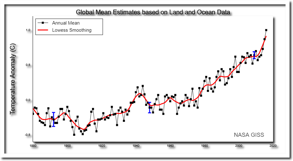
NASA publishes maps and graphs like these ones, purporting to show very detailed trends in global temperature back to 1880, with very small error bars. Their maps are based on NOAA GHCN data.
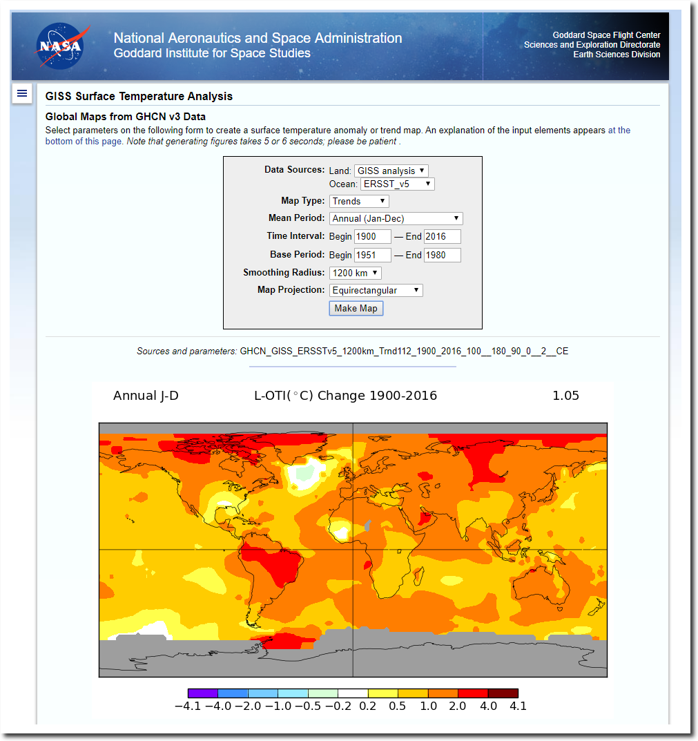
Data.GISS: GISS Surface Temperature Analysis: Global Maps from GHCN v3 Data
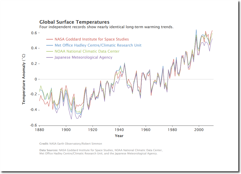
Then NASA claims that multiple data sets agree very closely.
It all looks so convincing, until you look at the actual data. The maps below show the locations of all NOAA GHCN stations which had daily min/max temperature data in the year 1900. As you can see, the US had very good coverage, and the rest of the world had almost no coverage.
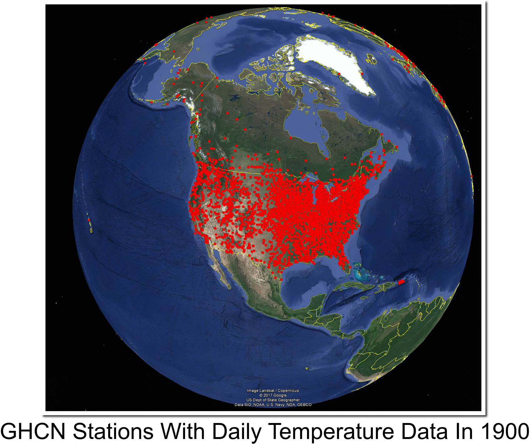
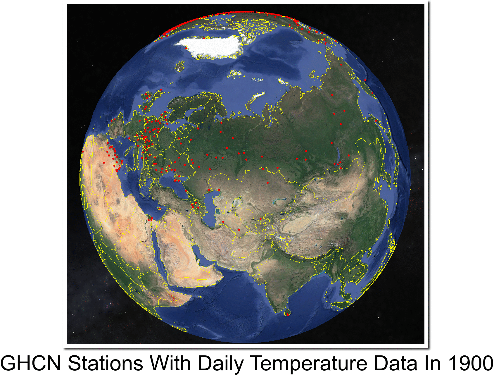
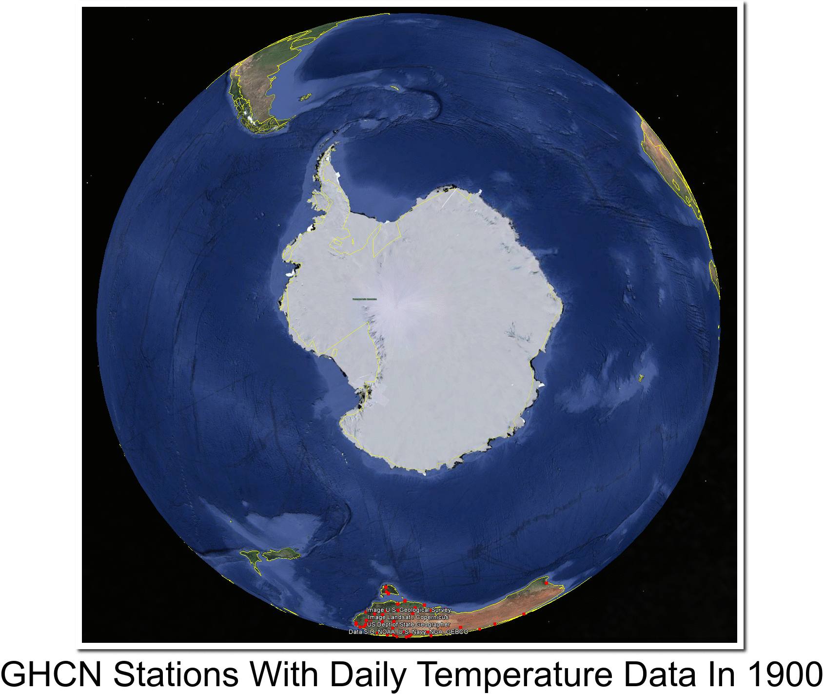
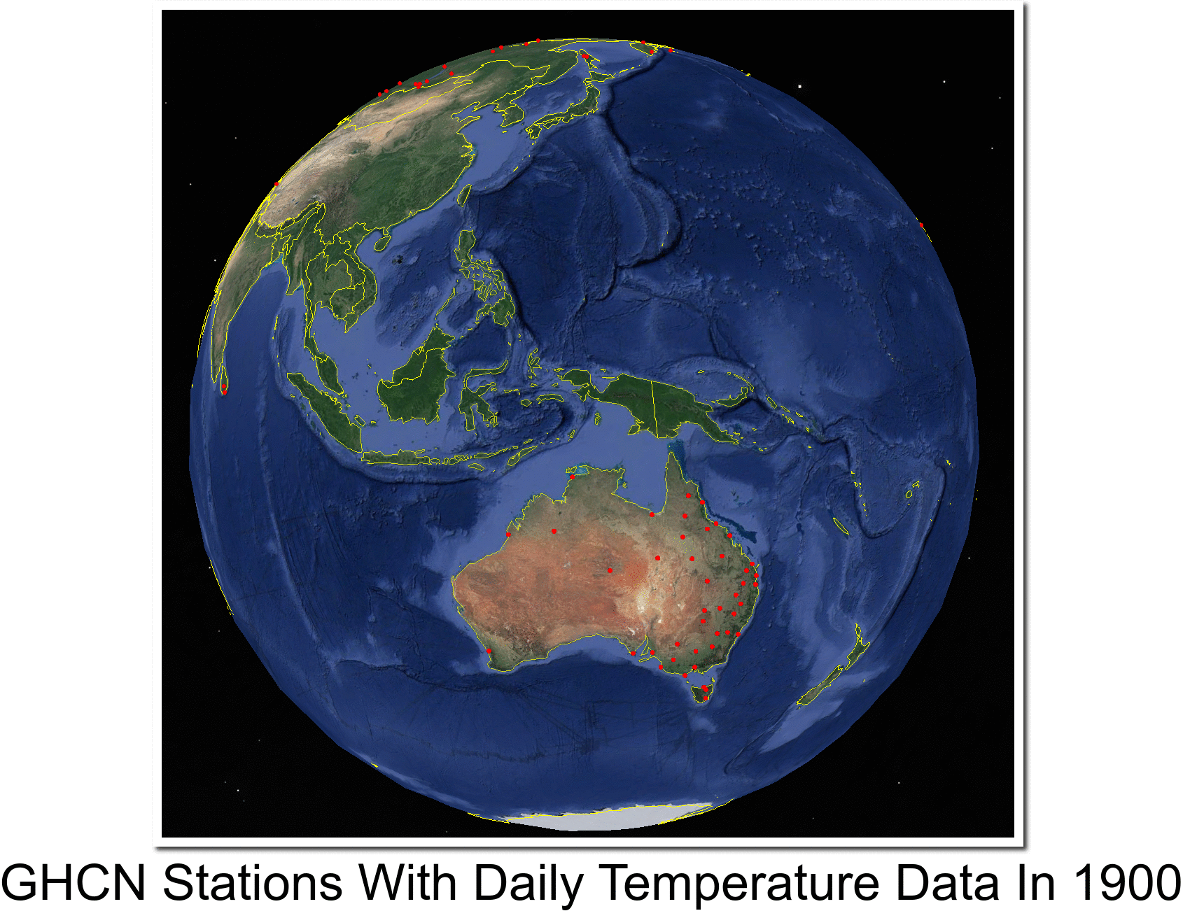
They have no idea what temperatures outside the US were in the year 1900. The global temperature record from NOAA/NASA/CRU/JMA is a complete fake, and the only reason that they come up with the same graph is because they are colluding to defraud the public.
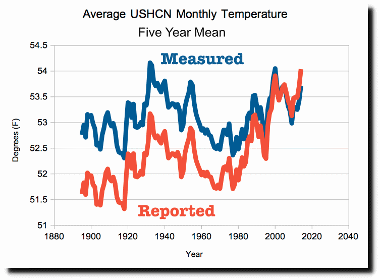
The only place which has good data back to 1900 is the US, and NOAA massively tampers with the US data to cool the past and create fake warming.
This is the biggest scam in history. Global warming is a complete fake.
…and then there’s this
This is every asphalt paved road in North America…that’s been added since 1900
http://i.dailymail.co.uk/i/pix/2017/08/25/16/438CF4F000000578-4823464-image-a-28_1503675897650.jpg
I don’t think it’s possible to ever come up with an accurate GMT. Which reduces the whole thing to politics.
As was once said, “A global average temperature is about as useful as a global average phone number”. It is ismply not possible at this time to measure the “global temperature”.
Thank you for that.
I’ve argued this for years but never had such a clear presentation.
Meanwhile:
“Record low temps in seven states – OH, CT, PA, NY, IL, NJ and RI”
https://www.iceagenow.info/record-low-temps-seven-states-oh-ct-pa-ny-il-nj-ri/
There is going to come a time when a majority of the people are going to wise up and understand that the man behind the curtain is full of shit!
More and more are starting to
With all of the coverage in the U.S. there should be plenty of whistle blowers. Where are they and what are they doing; drawing big saleries? what branch of congress oversees climate results? We need a writing revolution. Seems everything reverts back to congress anyway.
With all the coverage in the western world there should be plenty of whistle blowers in the main stream media.
Their lies are very well known and even wikileaks leaked some month ago documents proving that the arabs are paying tons of money to the mainstream media for positive news about them((for not mentioning their fascist laws,legal pedophilia,support of terrorist,legal pedophilia,head chopping,for saying crap that islam is a religion of peace,cultural enrichment etc)
Still there are only very few whistleblower out there and either unknown or people never heard of their whistleblowing(like Amber Lyon).
The reason is simple:
These people are well paid and they know that they are done after whistleblowing and will never get a well paid job in their business,and usually they are incompetent and not willing to do something else=real job,real work.
+inside every criminal group there exists some hidden/unwritten agreement.The mafia calls it Omerta- the wall of silence.
People have huge problems to turn against their.((that’s why the communists in charge in russia and those who ran the concentration camps in russia(gulags) were not russians-as russians were not good enough in killing their own.
Neither Stalin was russian nor his angel of death=gendrich yagoda((a guy who looked liked Hitler,dressed like him and was responsible
for the death of millions during the same timeframe Hitler killed millions.
But the impossible happened= he was forgotten(on purpose) by history.
All the best Tony! The hits keep on comin! Imagine if they were financial investors? Can you say JAIL?
First snow in Canada on Aug 31st, Thursday night in Labrador City on Quebec / Labrador border. https://www.theweathernetwork.com/news/articles/summer-snow-blast-of-winter-labrador-newfoundland-quebec-photos/85750/
The BoM of Australia has released their 2017 winter data and report
“Overall, winter national mean temperature very much above average; fifth-warmest on record for winter”.
BUT, if you look at the maps closely at SE Australia (Adelaide, Melbourne, Canberra, Sydney & Brisbane) and the SW corner (Perth), where most of the people live SE Australia, it has been a cold winter. Nowhere do they say recognize this fact.
Maps here.
Sorry.
http://www.bom.gov.au/climate/current/season/aus/summary.shtml
BOM homogenisations and data revisions make it difficult to take anomalies seriously.
Anomalies are garbage, they are misdirection and a fools errand.
Using “anomalies” to study an insignificant blip of time on Earth, and using this incredibly small set of numbers to understand an almost incomprehensible reality, is simply nonsense.
a·nom·a·ly əˈnäməlē/ noun
1. -something that deviates from what is standard, normal, or expected.
1- There is no such thing as “normal” in climate or weather.
2- What exactly am I supposed to expect in the future, based upon the range of possibilities we see in the geologic record? Are the changes we see happening “extreme” in any way?
3- No.
Anomalies are created by the definers of “normal”.
Probably doesn’t help that they now use small time-step readings on thermometers that register spikes very quickly.
There was that German study that showed these could add nearly a whole degree C to the overall readings
http://joannenova.com.au/2017/09/bom-scandal-one-second-records-in-australia-how-noise-creates-history-and-a-warming-trend/
From your link, it is evident that the SE experienced a winter with less moisture in the air and less cloudy days, hence the warmer days and cooler nights. That’s the way it works. This is confirmed by their claim that June was the coldest minimums and also the driest.
The claim that mean Ts have been warmer is where the scam kicks in. They have adjusted up the very cold night Ts to arrive at the warmer mean meme.
…yes that in combination with the rapid response temperature readings.
This is a good page to show to climate cultists who say the US is not the world and swear we have measured long term global temperature rise caused by CO2.
Next you tell them to counter it or shut up.
In my experience it doesn’t work because they are morons and they’ll keep going but it triggers them. They will yell at you.
Many of them suffer from what I call cognitive diarrhea and will go on to something else without being phased by the evidence. Many call the problem cognitive dissonance but that it not what I see most of the time. What I see is a flow of half baked ideas spewed forth. They fail to connect and to even see the conflicts in their ideas because they have never taken the time to digest any one of them.
Past temperatures are modelled – Tony’s correlation between temperature adjustments
to historical data and CO2 concentration looks like the ‘smoking gun’.
So next time they splutter….’but the US is only 2% of earth’s surface…’
PS. Nice use of warmer colours on NASA charts too. All that orange and red….we must be burning up, right?
Google the words: Sea Level NOAA Battery. The graph there shows no trend change back to 1850-The onset of the Industrial Revolution. Such a linear trend implies the absence of any pronounced influence on climate outside of nature. If there were a correlation between warming and CO2 in the atmosphere, an obvious disturbance of this linear trend would be present.
http://linkis.com/noaa.gov/WREJm
I don’t suppose those different 1900 images of the Earth’s Continents with the GHCN stations comes in a simple black and white format? I’m trying to use the images in a book I’ve just written, but the red dots won’t show up on a black and white printing. I need the same info on a simple outline of the Continents on a white background with the dots in black. If you can help it would be most appreciated
stephen wells: try downloading GIMP and looking up how to convert to black and white, than adjust the contrast. you’ll get it.