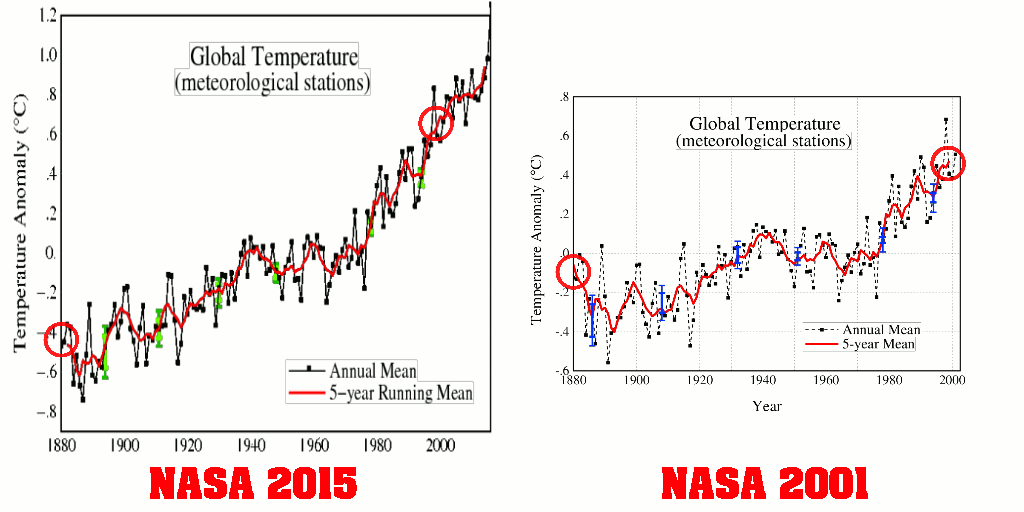
Between 2001 and 2015, NASA doubled 1880-2000 warming, via good old-fashioned data tampering.
2001 version : Fig.A.ps 2015 version: Fig.A.gif
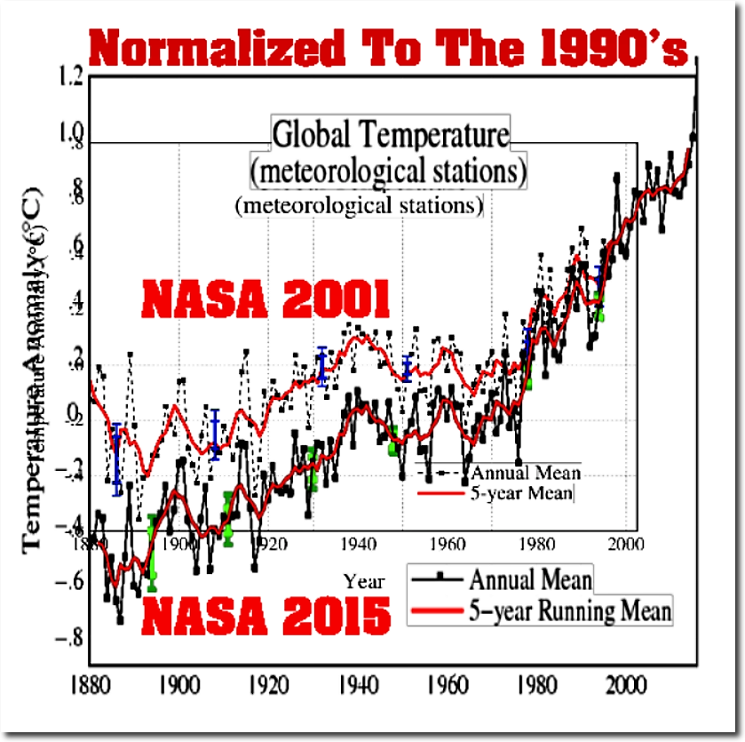
The next graph normalizes the two NASA graphs to the most recent common decade. It shows the magnitude of the tampering.
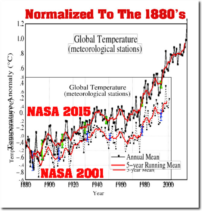
Alternatively, we can normalize the graphs to the earliest decade, the 1880’s. This shows very clearly how total warming from 1880 to 2000 has doubled since 2001.
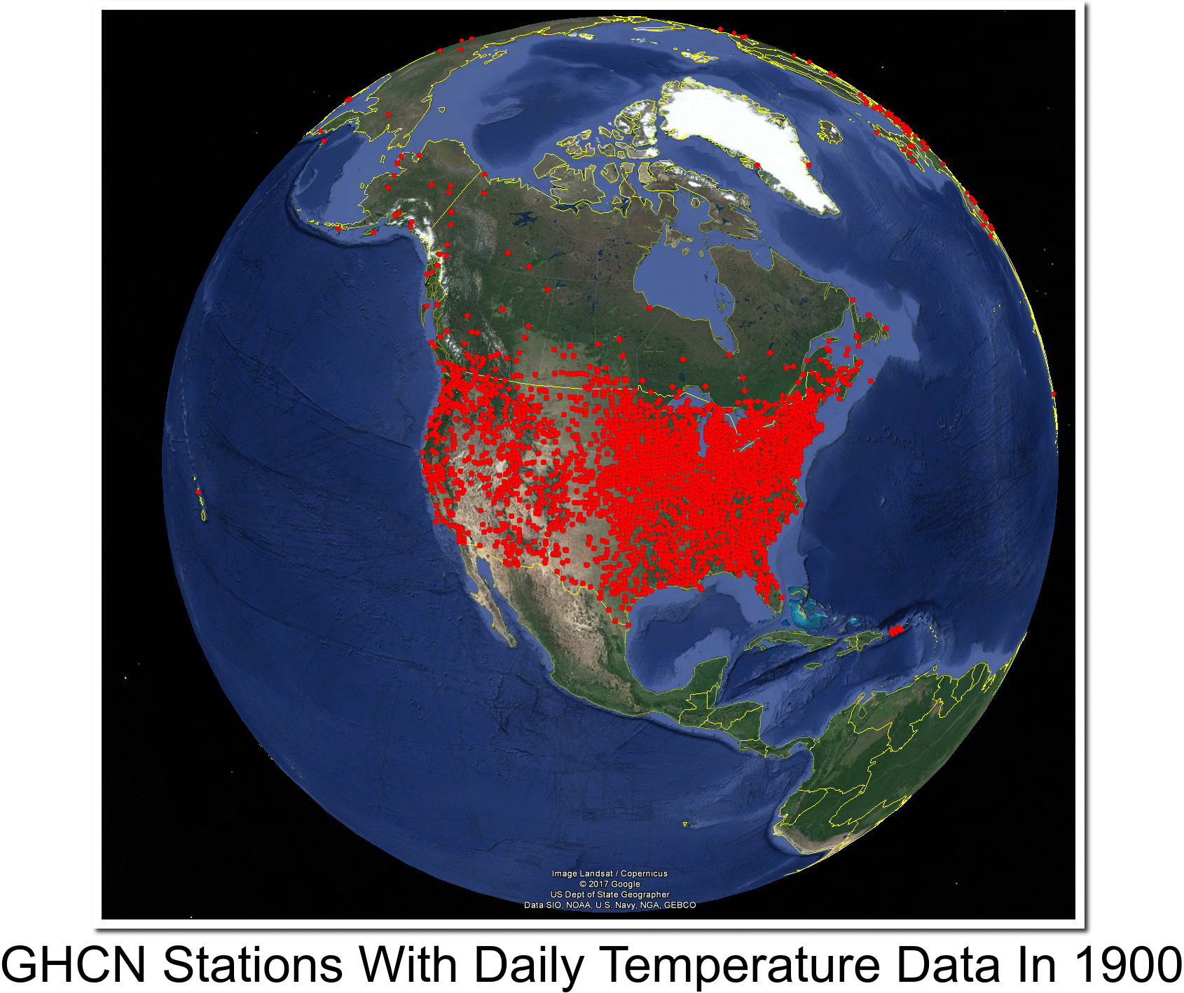
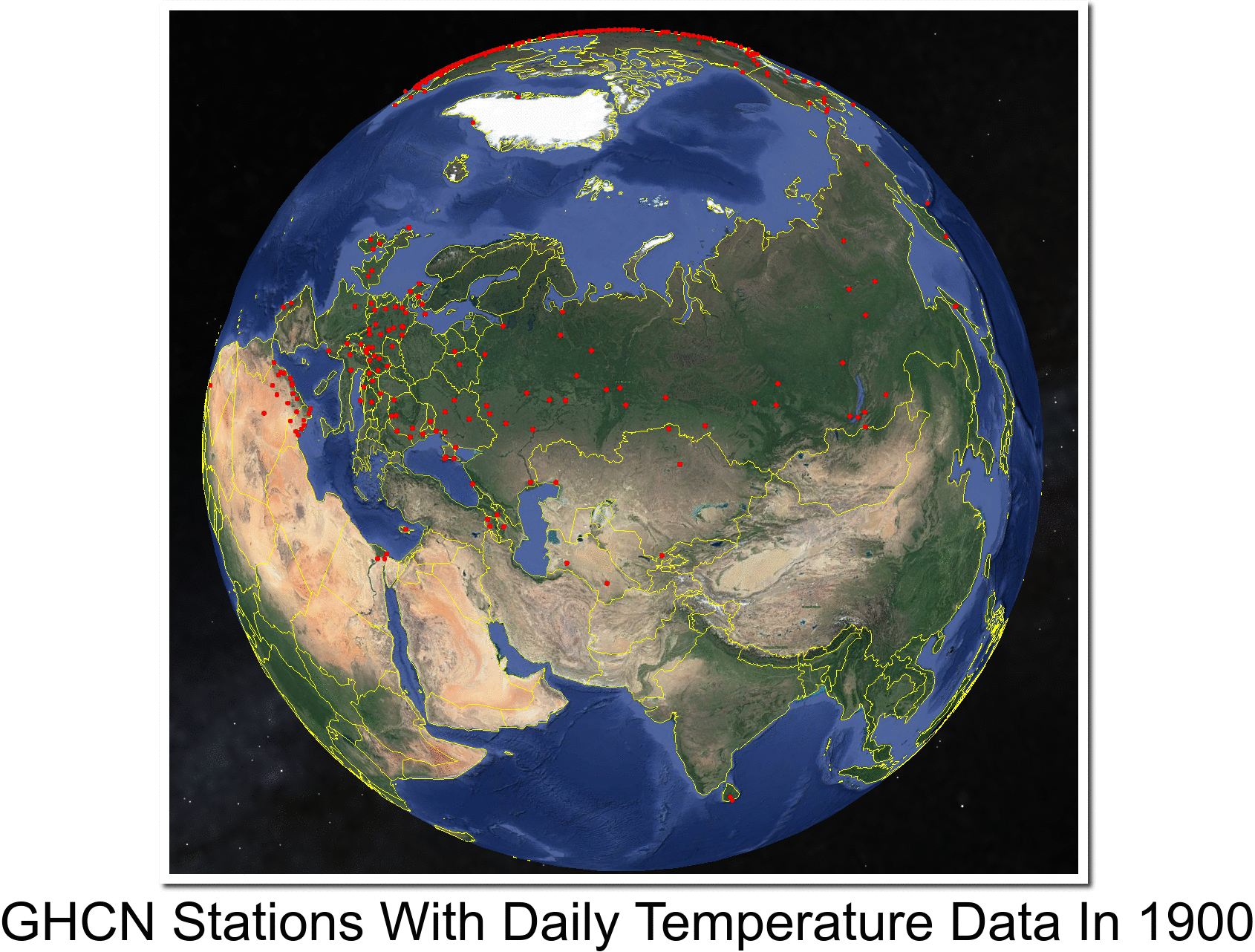
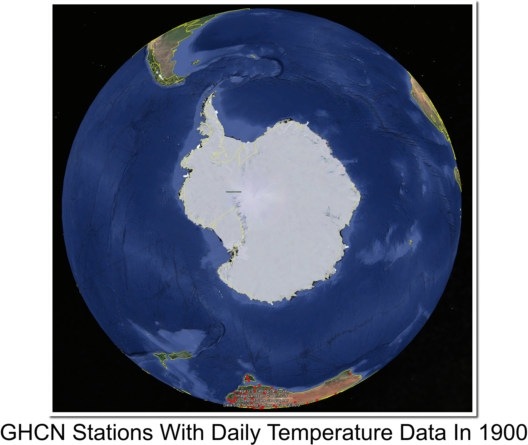
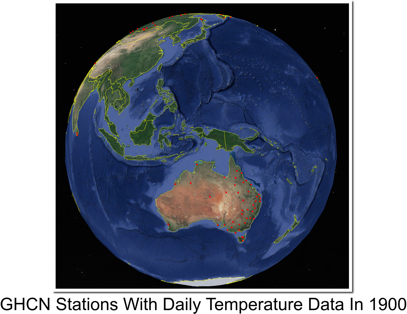
NASA, NOAA, Zeke, Mosher and Nick can generate any shape graph they want – because they don’t actually have any verifiable historical data for most of the Earth,.
Bottom line is that NASA/NOAA/CRU/Berkeley Earth global temperature graphs are meaningless garbage, put out by fake scientists.

