
In part 2 of this series, I took down Nick’s claim :
Steven Goddard produces these plots, and they seem to circulate endlessly, with no attempt at fact-checking, or even sourcing. I try, but it’s wearing.
He said that there was no attempt at fact checking or sourcing. I pointed out that all of the source code and executables have been available on line for years, and that he or anybody else could have checked them any time they wanted to. Perhaps Nick lacks basic computer skills or can’t follow simple instructions? Lots of other people have run the code.
So after being shown wrong, he has changed his story and made an idiotic statement that he bets no one circulating the graphs has done any fact checking.
There are so many things wrong with this statement, it is difficult to know where to begin. Lots of people have run my easy to use software – but I can guarantee that close to 0% of people circulating NOAA and NASA graphs have done any fact checking. If they had, they would know that NASA and NOAA graphs are complete garbage. People who read my blog are very informed about this topic.
Then Nick accidentally stumbles to the heart of what is wrong with NOAA data tampering.
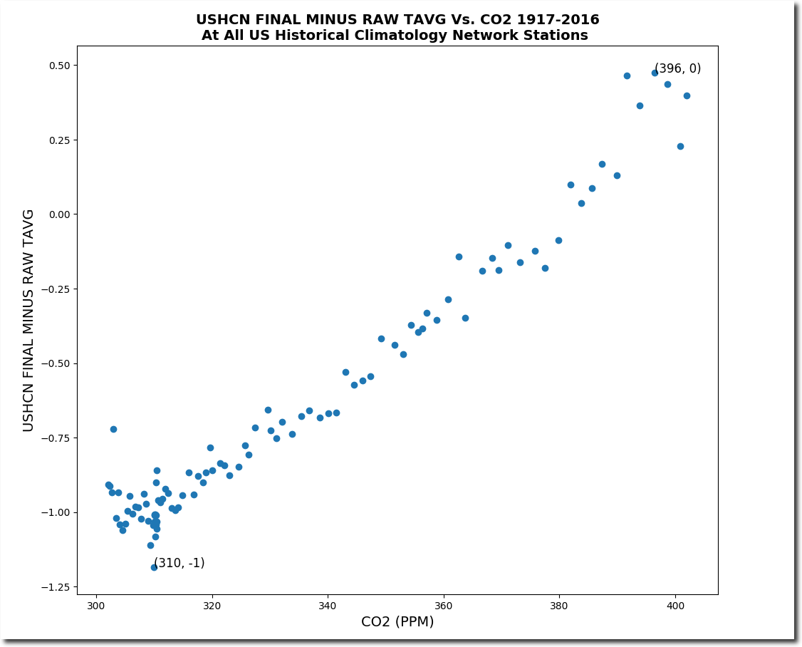
It’s simple, and just wrong. There were (USHCN has been obsolete for years) 1218 stations in the final set. There were a varying number, usually somewhere around 900, in the raw set.
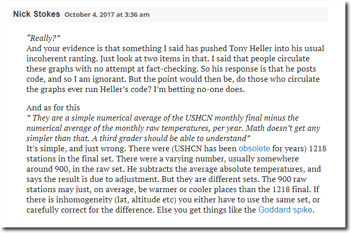
What Nick is saying is that, on average, the final data set contains 1218 – 900 = 318 fake monthly temperatures, or more than 25% of the data is fake each month. The raw data set is the measured temperatures. The extra 318 temperatures in the final data set, are simply made up. There is no underlying data. Is Nick too dense to understand his own words?
But it is worse than that. In recent years, the percent of fake data has skyrocketed to close to 50%.
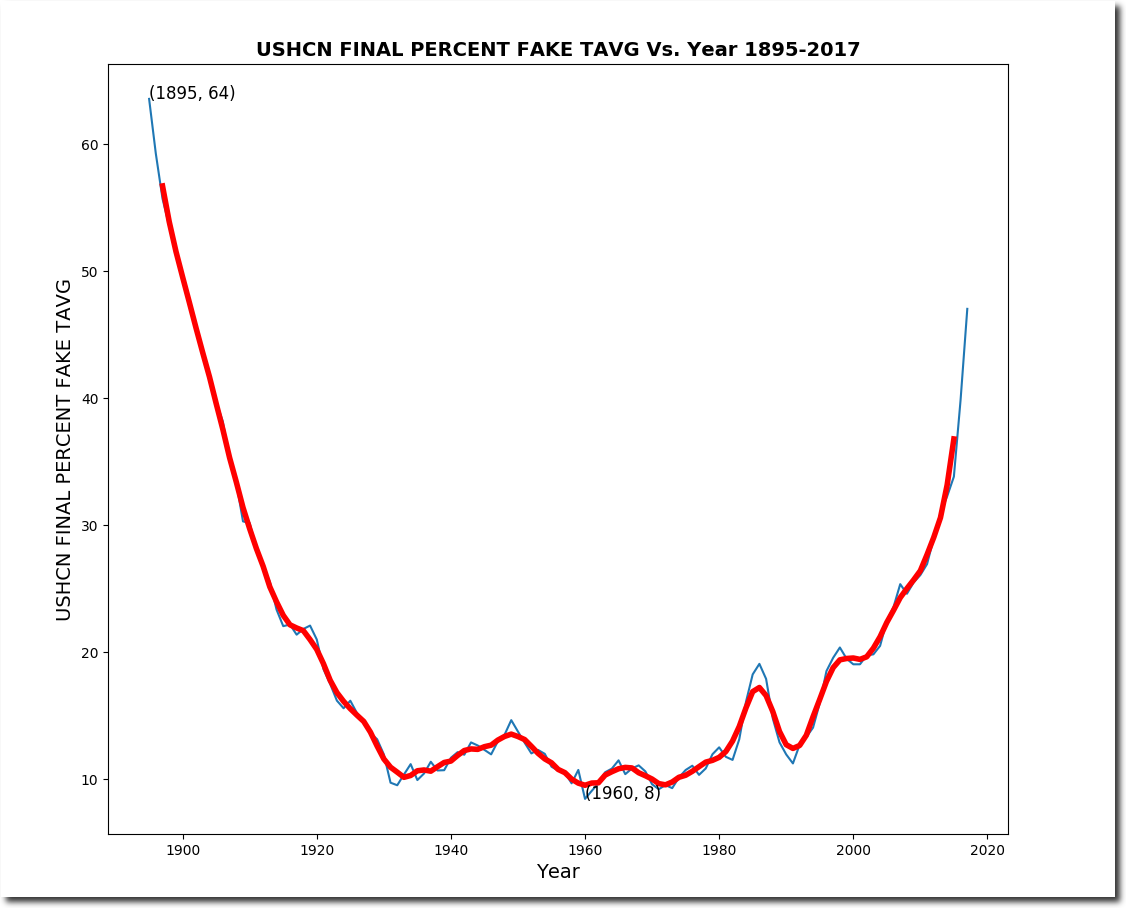
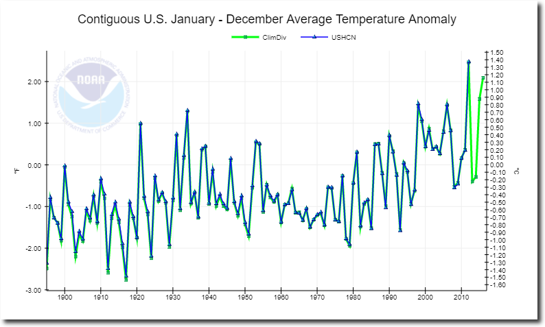
Nick claims that USHCN is obsolete, which is also complete BS. USHCN makes up almost the entire NOAA/NCDC US temperature record. Here is the current NCDC graph :
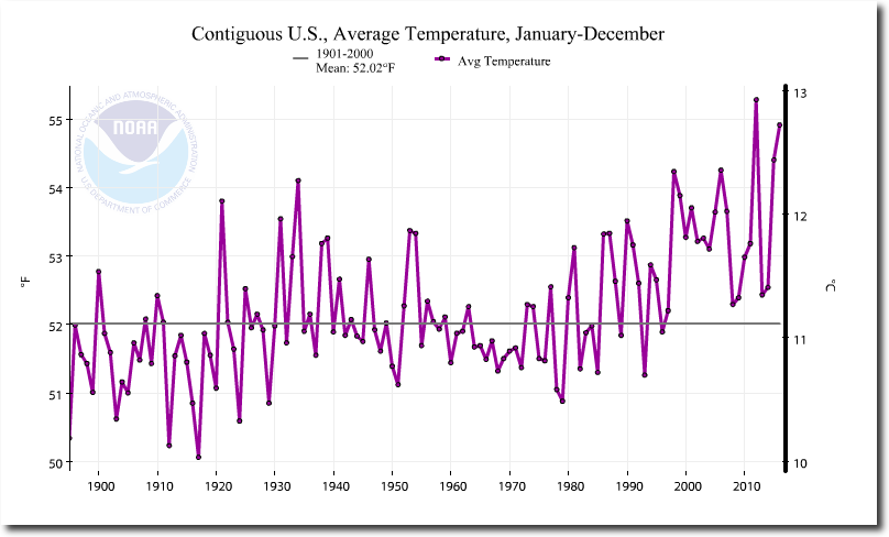
Here is the current USHCN Final graph
The two graphs are almost identical.. The graph below plots both USHCN final and NCDC temperatures.
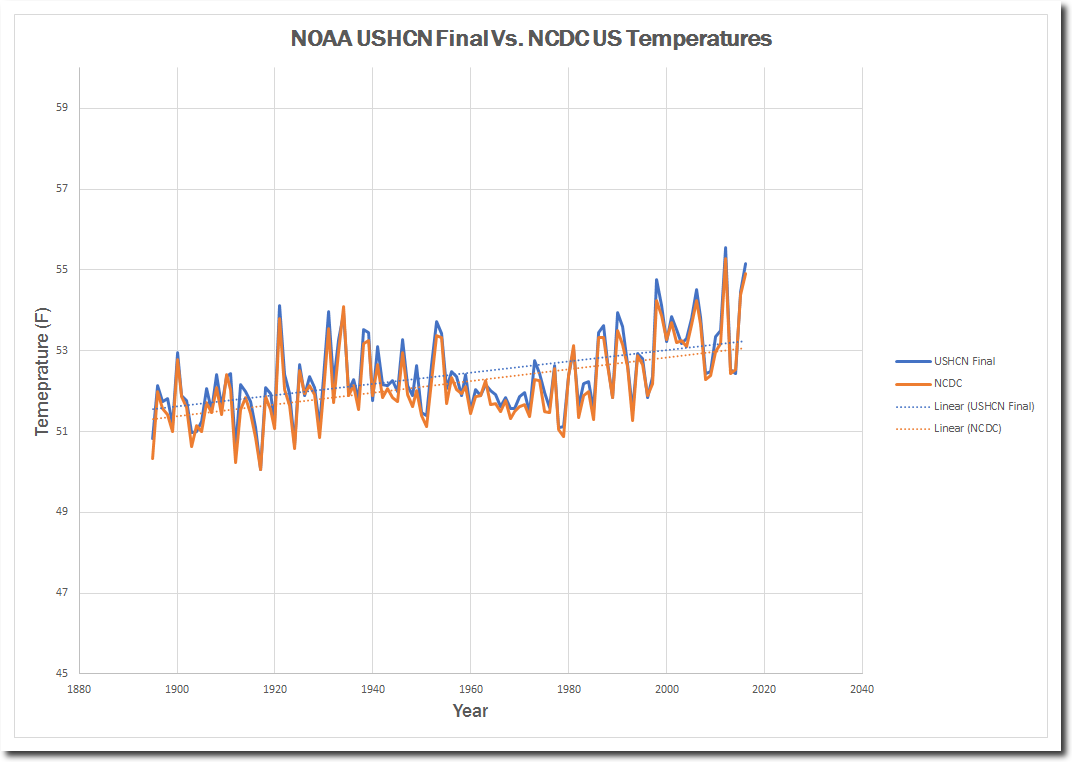
There is no meaningful difference between the two data sets.
NCDC data is a minor variant of USHCN. Nick is trying to make it sound like an important point, but it is close to meaningless. He is just kicking up dust.
Bottom line is that NOAA and all of their apologists are committing fraud. The data is being adjusted to match CO2 theory.
People like Nick will kick up as much dust as they can to obscure this fact, but Nick has nothing intelligent to say on this topic. It is wearing listening to his endless BS. Nick and his scam are obsolete. He calls the NOAA fraud a “Goddard Spike.” All I am doing is reporting the data and making it accessible to millions of more intelligent people than Nick Stokes.
Note that Nick is now changing his idiotic story from “Goddard is wrong” to “USHCN is no longer used.” Looks like a tacit admission that my graphs are correct.
