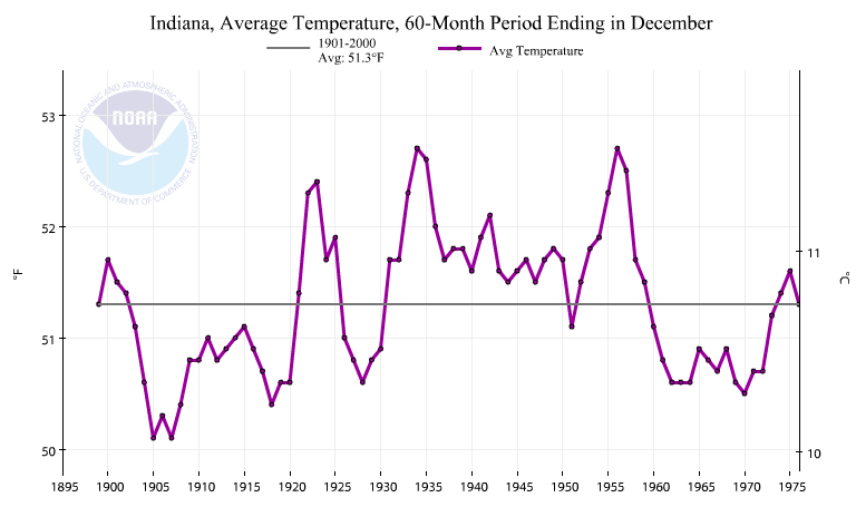
In 1976, Indiana University produced this graph of Indiana temperatures, showing three degrees cooling from 1935 to 1970

19 Nov 1976, Page 9 – at Newspapers.com
This didn’t suit NOAA’s agenda, so they reduced all pre-1955 temperatures and made it only two degrees cooling instead of three. NCDC simply made the hot 1930’s disappear.
 Climate at a Glance | National Centers for Environmental Information (NCEI)
The next graph shows the two at the same scale, normalized to the 1955-1970 period.

This graph shows the magnitude of NOAA’s data tampering.
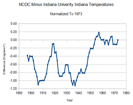
So what is NCDC is trying to hide in the pre-1955 period?
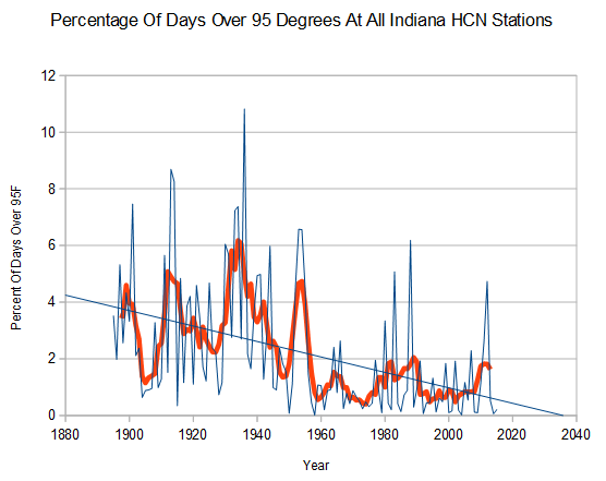
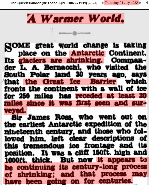
Indiana was very hot prior to 1955. Ninety-five degree days occurred four times as often in Indiana a century ago, as they do now.
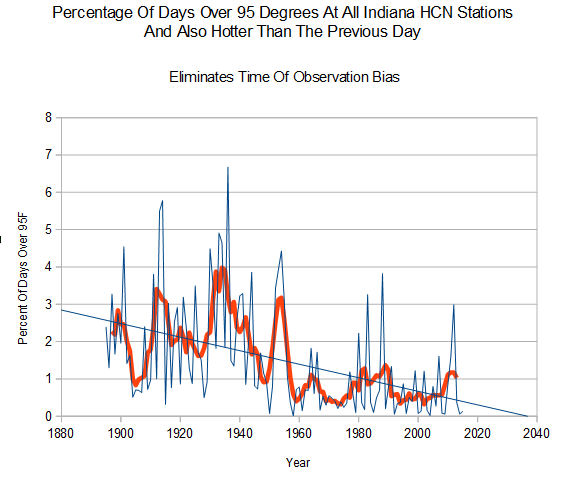
Climate fraudsters will claim that the graph above is skewed due to Time Of Observation Bias (TOBS) double counting, so I created the next graph to eliminate that argument. It shows only 95 degree days which were also hotter than the previous day. This greatly reduces any possibility of double counting. It shows that the alarmist TOBS argument is bankrupt.
Indiana’s hot past wrecks their climate scam, so the fraudsters at NOAA simply altered the data.
It doesn’t matter how beautiful your theory is, it doesn’t matter how smart you are. If it doesn’t agree with experiment, it’s wrong.

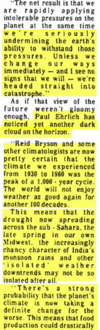
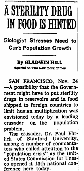
Biologist Paul Ehrlich gives dire prediction for global civilization


