
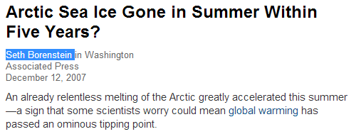
The area of sea ice on Earth on August 14 was 8th highest on record, and the highest in 14 years.
arctic.atmos.uiuc.edu/cryosphere/timeseries.global.anom.1979-2008
The area of sea ice on Earth on August 14 was 8th highest on record, and the highest in 14 years.
Texas Governor Rick Perry was indicted by the usual band of Austin criminals, for threatening to use a veto. The Democratic scum in Austin have a long history of abusing the legal system to target political opponents, along the same lines as Obama targeting conservatives via the IRS and DOJ.
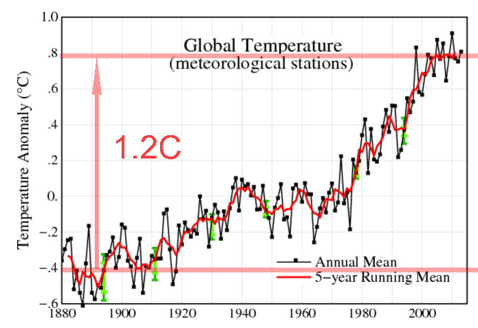
We are all familiar with this NASA graph, which forms the basis of the hockey stick. It shows about 1.2C warming from 1880 to 1998.
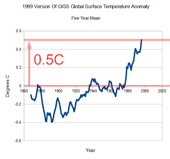
But their graphs didn’t always look like this. In 1999 they showed no net warming from the 1870’s to the 1970’s, and a total of 0.5C warming from the 1870’s to 1998. NASA has more than doubled hockey stick warming since 1999. Clever of them to not show warm pre-1880 temperatures in their current graph.
The only goal so far this season was scored by a Korean, who was raised in Australia and plays in Wales.
And Rooney’s hair transplant is falling out.
The graph below shows alterations to the GISS global surface temperature record, just since July 2012.
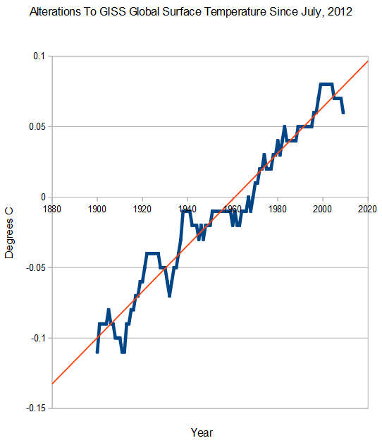
web.archive.org/web/20120724222431/……..Fig.A.txt
data.giss.nasa.gov/gistemp/graphs_v3/Fig.A.txt
Ezra is blowing away the competition, capturing almost as many votes as everyone else combined.
You can cast your vote here :
Who’s the biggest name in Canadian broadcasting? – The Globe and Mail
Here is a great piece Ezra did on Obama last year
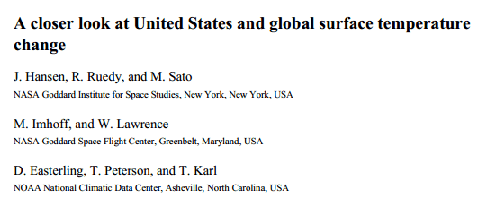
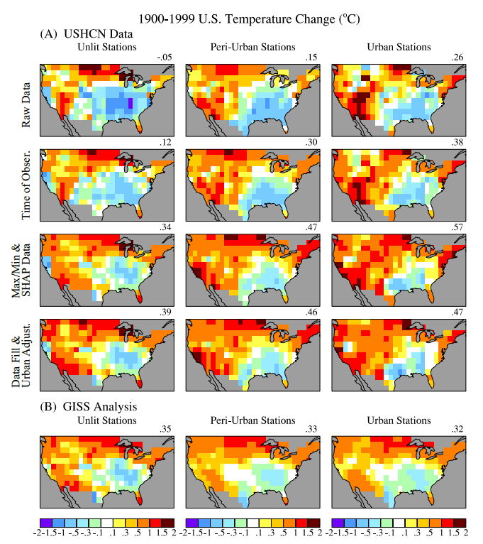
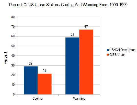
Hansen’s 2001 paper exposed how NOAA and NASA massively corrupt the US temperature record. The image below shows the various steps of data tampering..
Before they start tampering with data, 47% of US rural stations cooled from 1900 to 1999, and 42% warmed. But after NOAA and NASA were done hacking the data, only 22% of stations were cooling and 69% were warming. They effectively contaminated rural stations with urban data.
Similar story for urban stations. After adjusting for UHI, the US apparently gets hotter. Note that after contaminating the rural data with urban data, both rural and urban stations appear nearly identical at 67-69% warming.
As awful as this 2001 data tempering was, they have continued to tamper with it since the 2001 paper was written. This graph shows the additional hockey stick of data tampering. Particularly note the spike after 1990, and hiding the warmth of the 1930s and 1940s.
.
2001 version : wayback.archive.org/……/FigD.txt
Current version : data.giss.nasa.gov/gistemp/graphs_v3/Fig.D.txt
Temperature graphs and press releases from NASA and NOAA grossly misrepresent the measured thermometer record, and in the case of the US actually reverse a long-term cooling trend into a warming trend.
Sensible adjustments would make urban stations look like rural, but NOAA/NASA do the exact opposite and make all stations look like the urban ones.
Scientists love of decimating raptor populations extends back to long before they discovered wind farms.
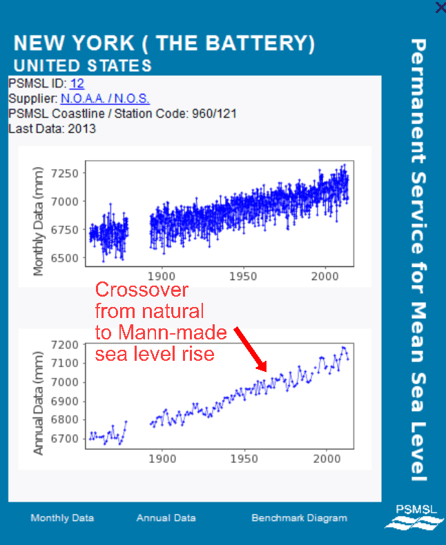
For the first time in science history, I have been able to distinguish between natural sea level rise, and Mann-made sea level rise.
I accomplished this through careful research into the standard practices used by climate scientists looking for attention and future funding. My approach uses the tried and true technique of “just making shit up, to blame humans for something which has always happened”

