

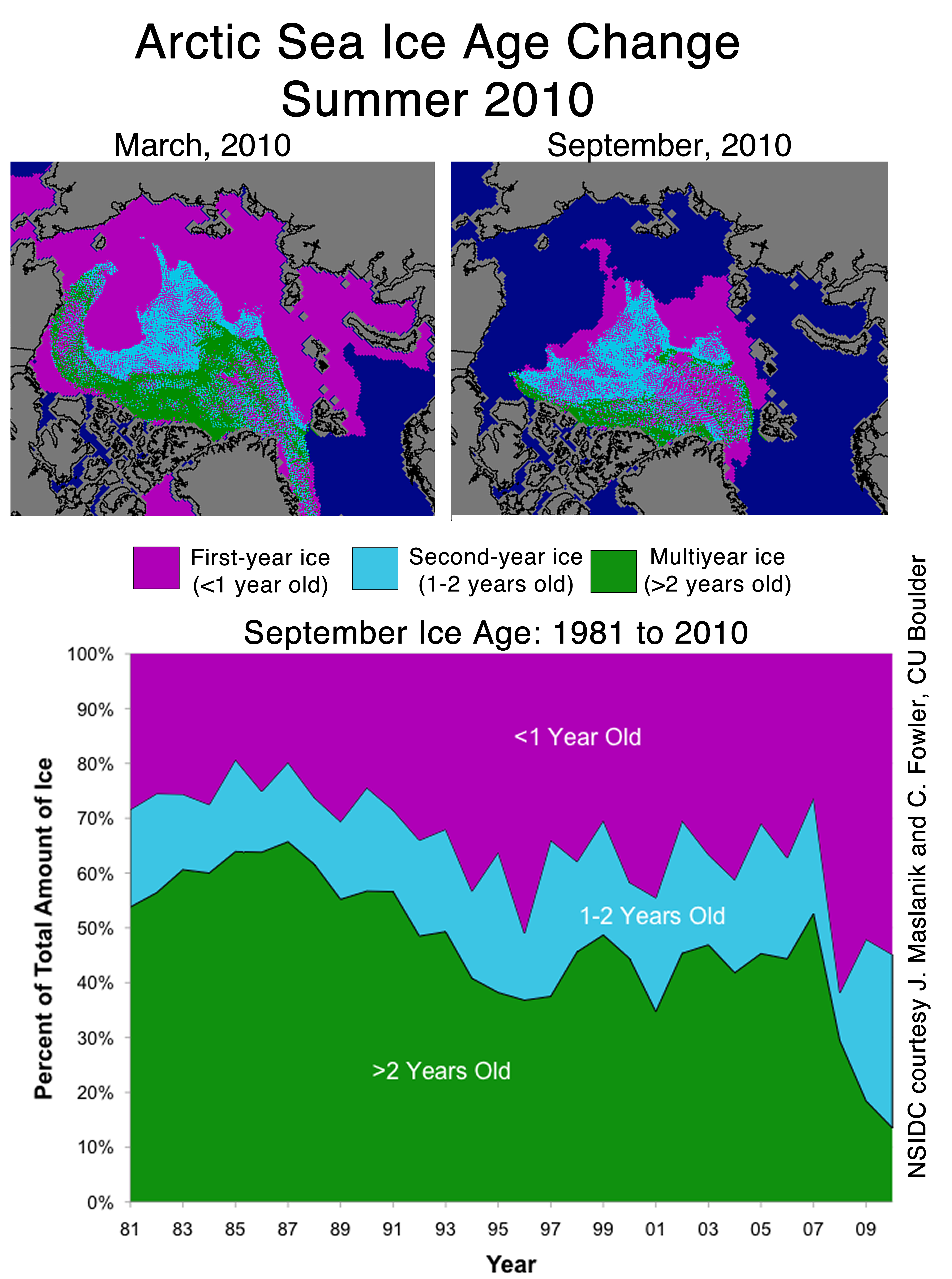
The blink comparator overlays the NSIDC mid-September ice age map on the most recent PIPS map. As you can see, the thick green PIPS areas correspond well with multi-year ice. The ice has moved some over the last three months, so it is not an exact match.
Yes, there is a lot more old, thick ice than there was two years ago.


Five meters / 15ft in Northern Greenland? Is that true???
The ice piles up against the shore of Greenland
http://biocab.org/Holocene-Delta_T_and_Delta_CO2.jpg
2500 years ago was the last bigger greater warming, lots of great civilisations lived then, all forgotten by the 150 year old Satellite record and dumbed down public that waits for the next installment of New Moon
http://www.npr.org/templates/story/story.php?storyId=129652464
i thought they were watching dancing with the stars
Is the polar gyre mostly caused by wind?
Are there any significant and relatively constant oceanic currents that play a role in ice loss or movement?
When hurricane Igor spent time near the Davis strait (Baffin Island and Greenland) did it influence the water temps thereabouts?