
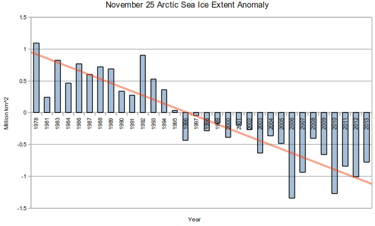
NSIDC cleverly starts their graphs in 1978, the year of peak Arctic ice. This creates the impression that there is a linear downwards trend.
Index of /DATASETS/NOAA/G02135/north/daily/data/
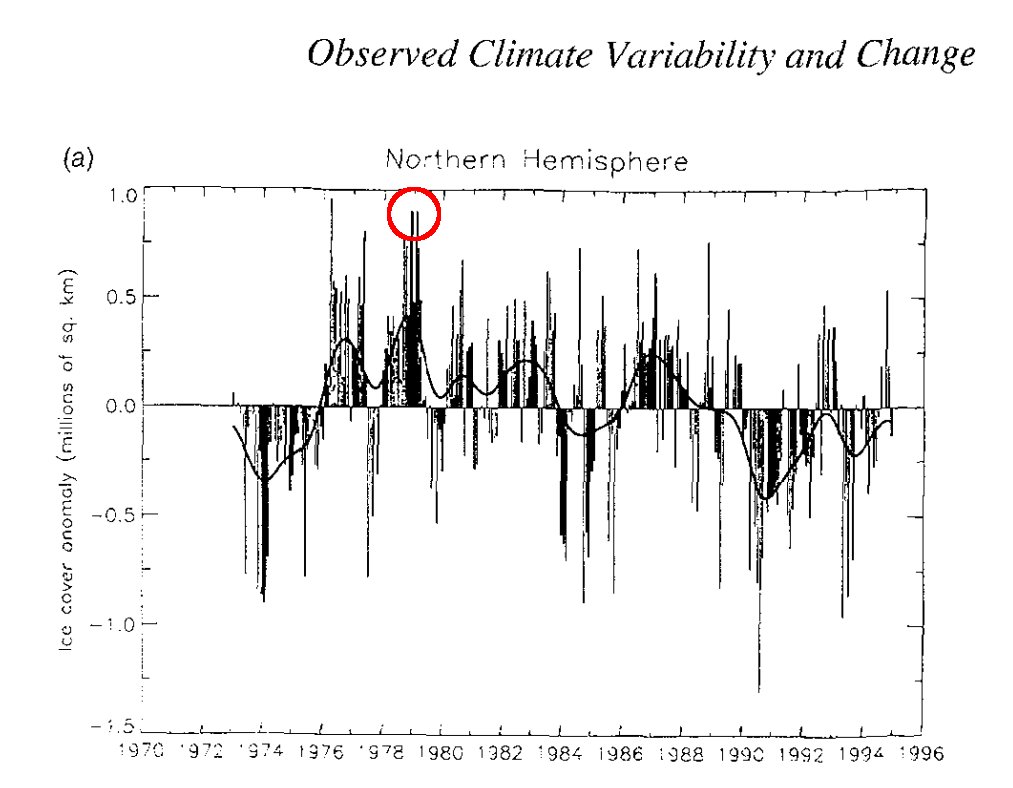
What NSIDC is hiding is that there were satellite measurements much earlier than 1978, which showed that 1978 was the peak ice extent. The graph below is from the 1995 IPCC report. I added the red circle to show NSIDC’s misleading start date.
Note that 1974 had about the same anomaly as the current value (top graph) indicating that there has been no long term change in Arctic sea ice extent through the entire satellite record.
Most people who made it past high school would understand that you can’t claim a linear trend based on a plot of one leg of a cyclical function.

“Most people who made it past high school would understand that you can’t claim a linear trend based on a plot of one leg of a cyclical function.”
Wanna bet, Steve?
Agree. Unfortunately, most people who made it past high school or even college are clueless about science, math, and statistics. The CAGW alarmists prey on the ignorant and appeal to their emotions, hence the images of drowning islands and dead polar bears.
Claiming it’s cyclical is also a guess or assumption. Sea ice extent might just be a random walk.
You must have missed the lecture where they discussed ice ages and interglacials.,
I’d say that whenever solar radiations go up and down the Arctic ice extent tend to go down and up, respectively.
In this case, the cyclic nature comes mainly from this feature in the radiations.
Randomness could be present during very small periods (few years) or very long ones (above 100k years), or even as a “noise” modulating the cycles.
That second chart is not measuring extent. It’s measuring total area.
..and when the cycle comes back it will be another hammer blow to AGW!
Well…. I don’t think you could beat the stupid out of alarmists with a double jack.
See the peaks at 1978 and 1992 in the first graph, now look at the NAO for those years:
http://www.cpc.ncep.noaa.gov/products/precip/CWlink/pna/nao.timeseries.gif
The accelerate ice loss since 1996 is due to increasingly negative NAO conditions. That means that global cooling warms the Arctic.
Was there arctic sea ice is the 1930s? I hear the polar bears all drowned in the 30’s.
http://wattsupwiththat.com/2012/05/02/cache-of-historical-arctic-sea-ice-maps-discovered/
Probably similar oscillations of ice extent in the 1930’s as happened in the recent years.
Arctic temperatures back then used to be warm too,
http://www.climate4you.com/images/MAAT%2070-90N%20HadCRUT4%20Since1900.gif
If sea ice extent were at it’s largest in 1978 and at a minimum not long ago; that would suggest that the PDO is the biggest driver of Arctic sea ice extent. The NW Passage was open in the 40’s giving us another point on the chart showing that the PDO is driving ice extent and not CO2.
Yes indeed.
In addition, it’s clear from the data (IMO)
http://jisao.washington.edu/pdo/img/pdo_latest.jpeg
that the PDO (and also the AMO, ENSO, etc.) are strongly modulated by solar radiations.
All these factors are pointing to increasing cooling from now on.
Also the recovery we’re seeing of the Arctic ice this year *was expected*, having in sight the all these forcings pointing in the same direction.
The strong positive AMO of recent years has been the main cause of the very low ice during the summer, especially 2007 and 2012, because it is enhancing the geographic vulnerability of the Arctic ice in the N. Atlantic region.
Once this “wound” is healed (AMO becomes positive) the ice extent should rebound very quickly to the highest levels of the 1970’s, 1950’s and beginning of XX century.
… AMO become negative…
Steven this is a very important graph. Why dont you send it off to the Daily mail ect with references etc
700 years ago the eskimos were fishing on the northernmost coast of Greenland.
https://en.wikipedia.org/wiki/Greenland#Norse_settlement
Then the Little Ice Age started.
When the north coast of Greenland is ice free, then I’ll……no actually I won’t worry. Why worry about the end of the Little Ice Age? Bring on global warming!
Steve, see #ClimateThanks on Twitter… @tan123 is having a blast posting your stuff over there. I’ve done it many times too, but mine is not showing up. This is a good one too. Like this:
“#ClimateThanks the Arctic Sea Ice Extent is the Same As 40 Years Ago: http://stevengoddard.wordpress.com/2013/11/27/arctic-sea-ice-extent-same-as-40-years-ago/”
BTW, the firefox add-in “Shortly URL Shortner (sic) 1.04” works great to shorten things like the above URL http://bit.ly/17Uo3VZ for twitter
Everybody join the fun!!! The wailing and gnashing of teeth is palpable.
Interesting that in the old graphic (above) of Arctic sea ice extent, the low point is in 1974.
Hmm – but the ice had been expanding from 1968. Recall the infamous 1974 Time Mag article and the graphic representation of the then expanding Arctic sea ice? What was presented was how much the ice extent had expanded from May of 1968 to May of 1974. Interesting that the month of May was the reference point; however, would be great to see the 1968 extent plotted on the above graphic, as obviously it was much smaller than 1974.
From the Time Mag article:
Newsweek, in 1975, confirmed that the trend continued:
And here we are, once again.
“Climatological Cassandras” – Too funny. Sure miss the ol’ days when at least some of the media ‘got it’….and accurately reported it.
Cassandra 1: a daughter of Priam endowed with the gift of prophecy but fated never to be believed . 2: one that predicts misfortune or disaster
Goodness, I think we’ve latched upon it. No more of this “alarmists – warmists” stuff. From now on, they’re to be called, “Climatological Cassandras.”
Not so sure. Cassandra was correct in her prophesies, but no one believed her. We have the opposite scenario here. Here we have high capacity for belief among the populous, with religious zeal among a small proportion of true believers. Our Cassandra certainly has limitless capacity to create prophesy, but very few, if any of these predictions actually ever come true. So it seems the worse the prediction’s outcome is, the more belief is instilled into the masses, despite overwhelming evidence to the contrary.
That’s a whole new class of greek mythology, dumbed down for modern times.
Sharon was Cassandra’s sister who was also a prophet. She told the future, was believed by 97% of the ancient Greeks but was always 100% wrong. She said that Pompeii was the best holiday destination in the Mediterranean and real estate there would always go up in value. She said Troy was the city most likely to succeed Athens as Capitol of the free world. And she said Kid Alexander was gonna be flipping lamb kebabs for the rest of his life. Sharon is James Hansen’s patron saint. Unfortunately “Sharon climatologists” just doesn’t have the same ring to it.
Thanks Andy Oz, I never was much for Greek Mythology. I never knew that Sharon was Cassandra’s sister. Great contrast. I guarantee you that every Sharon I know has never heard the part about themselves being 100% wrong. Or even 1%.
Michael D Smith,
I have previously tried to use the inverse Cassandra analogy with respect to the alarmism but we need to make it more catchy. A few ideas – Bizzarro Cassandra? Looking Glass Cassandra? Then again, maybe the inverse analogy is just too obscure and esoteric to register with the alarmist lumpenproletariat.
I think I’ll steal a famous phrase around these parts:
We did indeed.
In ‘Up Pompeii’, Senna the Soothsayer’s favorite expression was “Woe, woe and thrice woe!” – constantly seeing doom in Lurcio’s future, except that she was usually wrong …
http://en.wikipedia.org/wiki/Up_Pompeii!
The advantage to using Senna the Soothsayer as a reverse Cassandra is that the Chief Scientist of the UK Met Office (Professor Julia Slingo) will also be listed on the first page of search results with most search engines.
Go on, try it .. you know you want to.
Thanks Robert… I had to look up lumpenproletariat. Getting the Marx angle on this is a very useful perspective. The idea of “worth” being related to class consciousness is in itself amazing as Marx relates “worth” to one’s susceptibility to propaganda about class differences. In other words, if the propaganda does not persuade the subject, then the subject is worthless to the cause and the subject is a part of the underworld. So “worth” in Marx’s mind, is related to the inability to discern factual information / data / scientific results from propaganda. In other words, the underworld, being impervious to unscientific propaganda, is US. Not the alarmists. Good stuff.
That’s why this new Epoc of Global Warming starts in 1978 … at the peak of the FREEZE… thus it looks like everything is getting warmer fast .. rather than in part just getting back to normal..
@ Gary H …
remember the infamous BusinessWeek cover “the death of equities” … ?
that was a great time to buy them …
🙂
Take the series back a bit farther and you get all sorts of interesting things:
ice free north pole 1962 http://www.britishpathe.com/video/atom-subs-meet-at-north-pole
1958: http://wattsupwiththat.com/2009/04/26/ice-at-the-north-pole-in-1958-not-so-thick/
1987: http://www.john-daly.com/polar/arctic.htm
As you showed, it’s cyclic and the wise men of skeer want to take advantage of the cycle.
This fraud is very much in the same vein as this one presented to the public on UsaToday back in October 2010, purporting to show that the global temperature had increased with increasing CO2. At that time (and since then, any number of times on various sites, even in comments to this blog), I commented:
“The graph shown here arbitrarily puts the CO2 curve on top of the temperature record so that the two curves rise together after 1979–but only after 1979, note. As an independent scientist, I do not hesitate to call this what it is: fraudulent science. This is very ugly, raw political propaganda in the name of science. All scientists should be repulsed, and ashamed, by the breadth and depth of the incompetence in their midst, and the foisting of that incompetence upon the public.”
Note how both that fraud and this one are tied to very nearly the same date, 1978 or 1979–and the official global temperature records show warming starting in about 1976. I have been trying to point this out since 2010.
…that is, global temp records show the officially promulgated “late 20th century unprecedented warming” starting in 1976.
“Unprecedented” means never done or happened before. So how does this temperature increase be the only one in 3.5 billion years or so? Maybe they mean unprecedented since 1976. The use of this word is scientific fraud.
The rate of warming after 1976 was not even unprecedented in the same century. The rate from 1908 to 1943 was the same. (roughly .5 C in 35 years, both times)
@Morgan Wright,
Yes, and look at the steady increase in solar radiations in that period (1900-1960: the cooling in the 1950’s was a modulation due to the negative PDO) ,
http://www.appinsys.com/GlobalWarming/AAIndex_files/image009.jpg
and how they stabilized at high levels after the “dip” of the 1960’s and 70’s (cycle SC20).
Oddly enough, in the spring of 1974, the ice near shore was so thick that polar bears were starving in the Eastern Beaufort:
http://polarbearscience.com/2013/02/21/where-were-the-appeals-to-feed-starving-polar-bears-in-1974/
Shows (again) how little summer ice extent actually matters to polar bears.
Susan
Thanks Susan, what you’re saying agrees with Gary H’s post above.
Interesting, because it seems to conflict with the very low ice in 1974 of the 2nd graph of Steve’s post.
The strong negative anomaly of the graph must be the extent at the peak of the summer, but after a “very cold spring”?
It’d be interesting to investigate this further, maybe by collecting anecdotal and newspapers’ information, to have a more precise idea of what happened with the Arctic ice in that period, which seems to be similar to what is happening now.
It doesn’t conflict. It’s just that extent and volume aren’t the same thing. Thicker, older ice means greater volume. What we’ve seen over the past few decades is a disappearance of the old ice and a severe loss of volume. The extent is, quite appropriately, just the tip of the iceberg.
Unfortunately the use of satellites to measure the arctic ice just happened to coincide with the most recent peak. 99.9999% of humanity doesn’t happen to know that however.
Just reprinting something Steve came across a while back,
http://seagrant.uaf.edu/nosb/2005/resources/arctic-explorers.pdf
So I did an overlay of those two graphs”
http://oi39.tinypic.com/24ovknd.jpg
Looks like there’s some data correction/adjustment/editing/manipulation has been going on.
I know Steve has some cool tricks to do that. Are there tools mere mortals can use also? How’d you do that?
Excel has very easy to use graphics, even on the hideously “improved” Excel 2013 that I now have. Paste your images as a bitmap and then: Under colors there’s a “Set Transparent Color” button and the images have “ears” that allow you re-size things so you can match the X&Y axis. Select all and then with “fill color” choose white to get rid of Excel’s grid lines grid lines. Use print screen and process like any other image. Saving as a GIF works best for drawings.
You are correct I did the same kind of plot in Excel. It is obvious that NISDC intended to deceive the reader because in addition to omitting the early years of satellite data from their bar chart they also excluded the data from years 1979, 1980, 1982 and 1985 yet they left no spaces on the abscissa for this missing data! This is even worse as these were years within the time span they choose to examine. FRAUD!
The reason they don’t match up is that they are measuring two different things. The first chart is measuring sea ice extent. The second is measure sea ice area. They are two different things.
You should send the graph to Cryosphere today and insist that they put it on their site
+1
Reblogged this on pdx transport.
We see it again and again and again … the global warming establishment determined to deceive the world by producing dangerous man-made global warming propaganda disguised as science. In the corporate world this sort of behaviour is called “engaging in misleading and deceptive conduct” for which there are harsh penalties.
The first graph is ARCTIC sea ice. The other is total NORTHERN HEMISPHERE ice. Big difference.
Moron alert