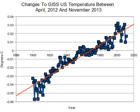
The graph below shows changes to the US temperature record made by NASA since April 2012.
2013 version : data.giss.nasa.gov/gistemp/graphs_v3/Fig.D.txt
2012 version : data.giss.nasa.gov/gistemp/graphs_v3/Fig.D.txt
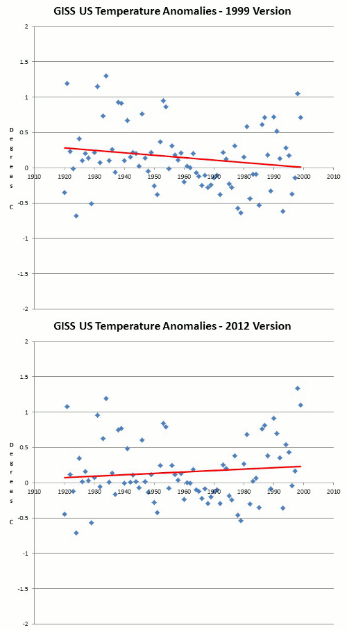
In 1999, Hansen wrote that the US was not warming or getting more extreme.
Empirical evidence does not lend much support to the notion that climate is headed precipitately toward more extreme heat and drought. The drought of 1999 covered a smaller area than the 1988 drought, when the Mississippi almost dried up. And 1988 was a temporary inconvenience as compared with repeated droughts during the 1930s “Dust Bowl” that caused an exodus from the prairies, as chronicled in Steinbeck’s Grapes of Wrath.
in the U.S. there has been little temperature change in the past 50 years, the time of rapidly increasing greenhouse gases — in fact, there was a slight cooling throughout much of the country
But since then, NASA has dramatically rewritten US history, to turn an actual cooling trend into a reported warming trend. Note that the animation below does not include the latest tampering in the top graph.
1999 version : www.john-daly.com/usatemps.006
2013 version : data.giss.nasa.gov/gistemp/graphs_v3/Fig.D.txt


I remember teeter-totter as a kid.
What is NASA’s explanation for this? Do they even try to explain the changes or do they just change it without saying anything?
They don’t even acknowledge that they are doing it.
Reblogged this on Edonurwayup's Blog and commented:
Why are we paying for NASA’s existence?
Reblogged this on CraigM350.