
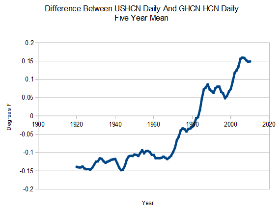
This graph shows the difference between USHCN daily and GHCN HCN daily temperature. USHCN created a hockey stick just by selectively picking US stations which show more warming.
This graph shows the difference between USHCN daily and GHCN HCN daily temperature. USHCN created a hockey stick just by selectively picking US stations which show more warming.

Call me dumb, uninformed, not up to date, but, don’t these ppl ever chart or plot these differences for publication on their own sites? How about other authors – anybody in academia ever take a look at, and most importantly, publish any charts or graphs showing these kinds of differences?
Seems to me that some of the orgs would take time once in awhile to stand back and see where all their ‘data jockeying’ is taking them. This is little different from say looking at the historical ‘lot’ yields for wafers coming out a semiconductor front end, a facet of close, tight process control procedures …
“…don’t these ppl ever chart or plot these differences for publication on their own sites? ”
Oh Jim, that would derail the gravy train….
It’s funny, when you deliberately eliminate stations that don’ t show warming you get warming. Oh well, I guess it’s just Peer Reviewed Science™.
They show only LA sites. NOT Wisconsin or Michigan…funny, how one of the several Ice Ages is named ‘the Wisconsian’.
USHCN (The U.S. Historical Climatology Network) = United States temperature data offered by the NOAA (National Oceanic and Atmospheric Administration), a government body.
GHCN HCN (The Global Historical Climatology Network / Historical Climatology Network) = global temperature data offered by the National Climatic Data Center, another government body.
In my search for this background info, I discovered that skeptic Lucia claimed that two independent approaches nearly exactly matched, thus validating USHCN adjustments:
http://rankexploits.com/musings/2012/a-surprising-validation-of-ushcn-adjustments/
But this is only for raw/adjusted within the US data, wheras Steve’s post is about global being selectively parsed into that US data. It would be appropriate to also include a plot of both the average of all the US data within the global archive and also one of just the excluded stations that didn’t make it into the US series.
http://www.youtube.com/watch?v=58mDaK9bH5o&feature=player_embedded
It would seem that a “hockey stick” is a signature indicator of data fiddling.
+1