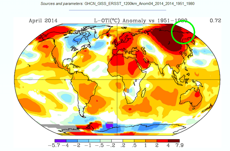
Gavin made up a fake 4-8 degree April anomaly across a region of Siberia and the Arctic where he had no data. Note the green circle.
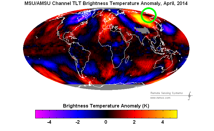
Now compare vs. the green circle in satellite data, which was actually measured. Gavin missed by 4-8 degrees in that region, and thus was able to declare that April was 2nd hottest ever.
It doesn’t take a very large area of fake +8 anomaly to bump global temperatures up by 0.3C.


Only with the government is it ok to lie about data.
Termed, from a lay perspective: government indemnity from prosecution, termed legally as “Sovereign immunity” (from: crown immunity), the ‘legal doctrine’ by which the sovereign or ‘state’ cannot commit a legal wrong and is immune from civil suit or criminal prosecution.
From wiki:
Federal sovereign immunity
In the United States, the federal government has sovereign immunity and may not be sued unless it has waived its immunity or consented to suit. The United States has waived sovereign immunity to a limited extent, mainly through the Federal Tort Claims Act, which waives the immunity if a tortious act of a federal employee causes damage, and the Tucker Act, which waives the immunity over claims arising out of contracts to which the federal government is a party.
The United States as a sovereign is immune from suit unless it unequivocally consents to being sued. The United States Supreme Court in Price v. United States observed: “It is an axiom of our jurisprudence. The government is not liable to suit unless it consents thereto, and its liability in suit cannot be extended beyond the plain language of the statute authorizing it.”
Federal sovereign immunity leaves Defenestration or tar ‘n feathers or Madame Guilotine as options.
‘Torches and pitchforks’ is the operative codephrase to cover that I believe …
That is the phrase Dr Robert Brown used. I have been collecting feathers, being in North Carolina and all.
Don’t overlook the heavy lifting it took to turn South America, particularly the northern half, and the section of the Atlantic off it’s southeast coast from a negative anomaly to strong positive. Plus adding in the rapidly melting Antarctic. And fixing the northern half of Africa; everybody knows the Sahara is always hot. It takes some real genius to smear around the adjustments to get a result you need.
Indeed South America and Africa count for a lot of “adjustments”.
Also huge difference just west of Scandinavia, in NW Russia. They are arrogant, pathological liars. Yet they claim to be intellectually and morally superior. What a joke.
yep, they are showing +1…when the satellites are showing -2
and that’s an even bigger area
Gavin’s got a portion of Novaya Zemlya at 2-4° above whereas the satellite has it at >1° below.
This 1200km temperature smearing really works to gin up some warming!
Reblogged this on Climatism.
It is so easy to tamper with data, and so easy to justify it for any of a dozen reasons. Especially when your paycheck depends on the result.
All of Siberia is >4 on GISS, only a tiny portion is >4 on RSS, most is >2. That is a huge area * 2°C.
Steve, when I click on the first chart to cut and paste the url it comes up as the second chart.
Re-blogged on DTT dot com.
One of the most amazing blind spots in climate “science” is how the satellite data has not been used to quantify the actual urban heat island (UHI) effect versus population size of areas. Hansen/Schmidt simply ignored satellite temperature data while using satellites only as cameras to estimate urban area influence. Instead, satellite data is used to bizarrely raise the Arctic’s trend in a way that the satellite data used itself falsifies. Well, that new SkepticalScience.com kiddie plot didn’t exactly become a standard despite loud hockey stick team support.
I found a blink comparison of the GISS empty areas being ridiculously extrapolated into data free areas:
http://plasmaresources.com/ozwx/climate/globaltemp/images/gisstemp250kmMollweide-sm.gif
[Source: http://wattsupwiththat.com/2008/03/08/3-of-4-global-metrics-show-nearly-flat-temperature-anomaly-in-the-last-decade/#comment-7461 ]
A bit OT, but I just ran across this comment in a recent open letter from a scientist in New Zealand. It confirms what some of us in the northern hemisphere have noticed – that over the past few years it’s been getting generally colder.
see kear on joannenova
Thanks. Drier and colder, I have the same impression.
Don’t think of this as Gav tampering with the data. You have to look at it from his perspective. When he got started in all this, Hansen convinced him they were they were great scientists about to save the world.. They would be heroes! Jor-El lives! Then their great theory went all wrong, the data refused to comply with their computer models and they have been scrambling ever since.
Now he knows the jig is up but he and his career are so deep into the scam he could never recover from such a revelation that he has been betting on the wrong pony for so long.
So he has to just brazen the scam out until he gets his full pension time in. Then he’ll fade away and be forgotten like we have forgotten about the Alchemists, Lyskenoists and the Eugenicists.
The only explaination for the ‘Make Up Fake Data For NASA’ is that Gavin use the UN’s Infinite Improbability Drive’s bistromathic to calculate that data.
See https://en.wikipedia.org/wiki/Bistromathics#Bistromathic_drive
Using my computer model… I collected all the temp data … Multiplied times pie…. Then divided by three… Over 20 years the Earth is getting so hot … It will become uninhabitable “the day after tomorrow”… Floods, massive heat, wilting crops, disease, famine, fires..
Doomsday is here by consensus!!