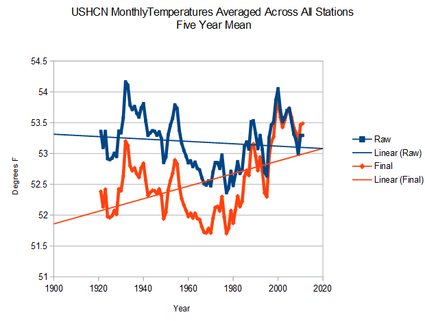
As mentioned earlier, I changed my USHCN methodology to match my GHCN methodology – averaging by month for all stations, and then averaging all months for the year. This fixed the discrepancy between my 2014 spike and Anthony’s.
Nick Stokes keeps talking about anomalies, which are necessary when trying to do an absolute comparison of partial years. I wasn’t attempting to do that – I was measuring temperature differences, so his point is irrelevant to what I am doing.
Here are the USHCN final and raw temperatures using the new method. It is almost identical to the old method. They are turning a 95 year cooling trend into a warming trend.

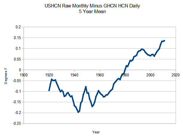
But it is worse than seems. The USHCN “raw monthly data” isn’t really raw. The graph below shows the discrepancy between GHCN monthly “raw” and actual GHCN HCN daily station data – which is truly raw. As you can see, USHCN “raw” data is already adjusted to create a warming trend, and then they do their own adjustments on top of that.
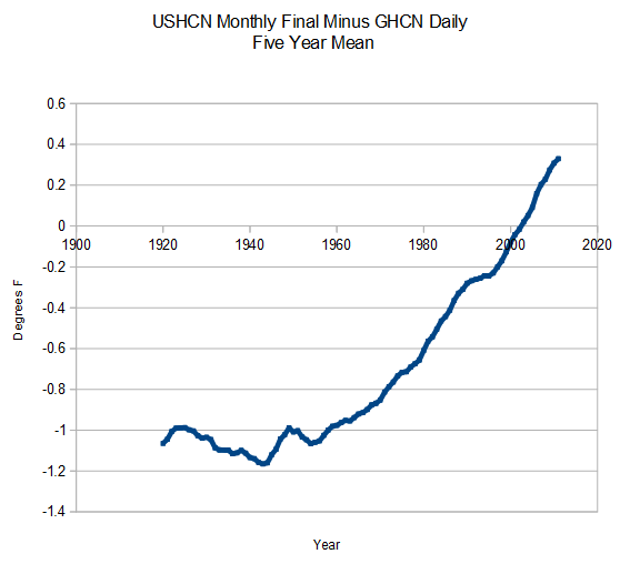
The next graph shows the total adjustments from GHCN HCN daily to USHCN final.
But it is worse than even that seems. NCDC adds additional warming on to the USHCN adjustments. Unfortunately their web site is dead, so I can’t generate that graph right now.


So, it would seem that even the knitpicking against you was not justified. Yet the alarmists still try to kill the messenger.
The large 2014 spike I showed originally was not the best way to do the calculation for a partial year with USHCN fabricated final data. I changed the algorithm to make a more realistic comparison between final and raw.
Steve,
Is the new code in the GHCN code link in your site’s header links at the top of the page?
Just asking….
No, this is USHCN code rather than GHCN. I haven’t released that yet.
Andy go to WUWT and read the blog & comments and Steven’s replies. It wasn’t really nitpicking but trying to unmuddy the slightly muddied waters.
At least that is the way I see it.
Also Andy for your info …. When finishing a knitting project, there are ends of yarn that stick out. “Knitpicking” is the act of removing these ends of yarn.
There now I’m nitpicking 😉
However maybe we are all incorrect since Merriam-Webster wants to hyphenate the word like this …. nit-picking. Usually I see it as a single word … who knows … who cares!
So your final (for now) graph implies that everything before 2001-2 was adjusted downwards, which makes sense if (for example) they were adjusted for UHI effects. What still doesn’t make sense to me is adjusting the earlier temperatures more than the later ones.
The ‘adjustments’ only make sense if you start from the wanted curve – a hockey stick – and plan your adjustments accordingly. They do the same with the CO2 measurements.
The entire hoax is based on selection of data to fit the wanted curve, whether the data is CO2 measurements or temperature measurements.
I pointed out the same issue about Mauna Loa CO2 measurements over 4 years ago. there was a shouting match and a lot of nagging simply for questioning it.
And it’s interesting that there have been complaints and protests about Leif Svalgaard’s Sunspot reconstruction for increasing past sunspot numbers.
So we have
1. a systematic cooling of the past through “adjustments” to the temperature records.
2. a systematic increase of past solar sunspot numbers reducing the influence of the primary driver of earths temperatures.
3. a systematic curve fitting of an “artificial” CO2 measurement.
You nailed it.
There is zero change CAGW is not a scam of mind boggling scope.
Nice Stokes. AGW apologist in chief. Any thing he comments on is surely a lie or an obfuscation of the truth.
I asked Gavin Schmidt for his opinion this “data tampering”.
“ClimateOfGavin What is your opinion on “data tampering” where the past is cooled? I understand it idea is based on time of recording.”
He replied with this link!
http://data.giss.nasa.gov/gistemp/FAQ.html
He might just as well have said ‘The whole thing is an absolute mess!
I know :).
Wow, there was a solid claim a few years ago that GISS used raw data, with software code being presented as proof. Now this FAQ reveals that they use auto-adjusted data instead:
“Q. Why use the adjusted rather than the “raw” data?
A. GISS uses temperature data for long-term climate studies. For station data to be useful for such studies, it is essential that the time series of observations are consistent, and that any non-climatic temperature jumps, introduced by station moves or equipment updates, are corrected for. In adjusted data the effect of such non-climatic influences is eliminated whenever possible. Originally, only documented cases were adjusted, however the current procedure used by NOAA/NCDC applies an automated system that uses systematic comparisons with neighboring stations to deal with undocumented instances of artificial changes. The processes and evaluation of these procedures are described in numerous publications — for instance, Menne et al., 2010 and Venema et al., 2012 — and at the NOAA/NCDC website.”
Examples of the urban myth of raw data use abound: http://www.google.com/url?q=http://wattsupwiththat.com/2010/03/08/on-the-march-of-the-thermometers/&sa=U&ei=a65vU5L5K8qtsQTthoDABw&ved=0CEQQFjAI&sig2=u-W3f77ohecGBavJR0KSUw&usg=AFQjCNHSN80pmg8K3kpfxwaPdGKTREiCJg
…or did they change it?
It means NASA isn’t an independent plot after all.
Fixed link: http://www.google.com/search?q=+GISS++%22uses+raw+data%22+code+nasa&num=100&safe=off&filter=0&oq=+GISS++%22uses+raw+data%22+code+nasa&gs_l=heirloom-serp.3…297645.299160.0.299674.5.1.0.4.0.0.196.196.0j1.1.0….0…1ac.1.34.heirloom-serp..5.0.0.buzcZGg3ndM
It’s obvious, when taking a simple task of measuring a known “state” and by doing so (measuring) you are making the analysis so overly complex (intentionally or not) that even the most basic principle of inquiry is obscured, then I’m sure you can say “the game’s afoot”.
Reminds me of this
“Whoever is careless with the truth in small matters cannot be trusted with important matters.”
🙂
It was changed 14 Dec 2011, with the change to v3, and announced here.
Unfortunately Steve is unable to bully people and threaten to blackball them from being published in science journals in order to get his hockey stick (in the last graph) accepted by warmmongers. 🙂
Unfortunately their web site is dead, …
Accessible in a slightly round-about way … see thread on same further down for details. (one must use the IP address directly due to a DNS problem somewhere in “the internets”)
The IP addresses that will get one to the ncdc website (the main page anyway) as of 10:40 AM CDT Sunday morning:
http://205.167.25.171/
http://205.167.25.172/
.
The USHCN data process – Much like taking a choice cut of prime Kobe beef, marinating it for the proper time, cooking it to exact instructions and savoring every bite. In the end, it comes out as a useless turd.
Stokes has a hammer, & he knows how to hit things with it, so he’s pretty sure everything he sees is a nail. Try telling him otherwise & see how far you get.
You’re still doing it wrong. The right way is to take all stations that have both raw and final readings and for each station, get the difference. You know that difference is due to adjustment, so you can average them. This was the method suggested in the query by David A (why no answer?).
When you average a bunch of finals and a bunch of raws, those averages include data from different times/places. Your original spike was caused by the fact that final readings were equally spread over months, but raw were weighted towards winter, because there were less in April. You got the same in Illinois. You would have got the same in any state.
Averaging by month fixes the month issue, but not the selection of stations. If it happens that the extra stations in your final average are from warmer places, you’ll have a similar problem. You may be lucky and they will even out. But why not do it right?
Your orange/blue plot is misconceived. It isn’t a good idea to average absolute temperatures, rather than anomalies. USHCN gets away with it because, with FILNET, they ensure that every month in “final” contains the same stations. For raw readings, that isn’t true. You’ll get variations between months depending purely on which stations report. And if there is a trend in where trends report from, you’ll get a spurious trend in temperature.
“Nick Stokes keeps talking about anomalies:
I explicitly said here that anomalies are not the issue. I didn’t use them.
My objective is to show the difference between the average final temperature and the average raw temperature for the US, and that is exactly what I have done. You are suggesting selective use of the data, and that is precisely what I want to avoid doing.
The method you suggest would lose information about the infilling adjustments. My method retains it.
“The method you suggest would lose information about the infilling adjustments. My method retains it.”
There is no information about infilling adjustments to be retained. They have no corresponding raw, and there is no difference available in the data you have subtracted.
The infilling affects the final temperature, which is what I am calculating. Throwing out the infilling data would give an incorrect result.