
Climate scientists love 1979, and normally begin their graphs there – because it was the coldest winter in US history and had peak Arctic sea sea ice. I am often accused of cherry-picking for including data prior to 1979.
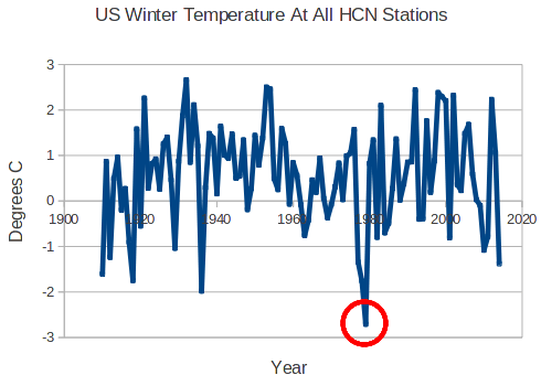
Climate scientists love 1979, and normally begin their graphs there – because it was the coldest winter in US history and had peak Arctic sea sea ice. I am often accused of cherry-picking for including data prior to 1979.

THis is a real good one. Lets keep it fpr posterity LOL
This is a major iceberg the unsinkable global warming ship has hit. The “pause” is another, but as i wrote, this ship is a unsinkable nightmare!
The warmist’s beliefs will eventually hit those ice bergs that shouldn’t be there, and sink under the weight empirical evidence. It’s no co-incidence that they believe in the ‘True ideology of Temperature’s Anthropogenically Negative Influence on Society,’ or Titanic for short.
If only you could spell Society with a c 🙂
Easy fix—
True Ideology of Temperature’s Anthropogenically Negative Influence on Climate.
Yes, if it is warmer than the coldest year in history, we definitely have a climate crisis (sarc). We are all going to die!
We are all going to die. If we all don’t die the population crisis would certainly be upon us.
Life is Lethal.
We all have our sell-by date, as none of us get out of this life alive……..!!! I just don’t want my expiry date to be pushed forward by any warmist’s draconian and deindustrializing legislation.
When I was young, I spent all my time saving the world, now I’m older, I spend all my time just trying to save myself. 🙂
It was the year I graduated from high school. The March break was balmy, warmer than I had ever seen with temperatures hitting the low 20Cs. Records were set that held till March 2012.
The global warmers certainly talk as though time began in 1979.
Including data over a *longer* period is “cherry picking”? That can only be alarmist logic.
What about this ?
NASA repeatedly state – “Greenhouse gases absorb some of the energy and trap it in the lower atmosphere. Less heat radiates into space, and Earth is warmer.”
Then in 2005 on the 40th anniversary of the operations of the Nimbus satellites they produce a graph proving that statement is nonsense –
http://earthobservatory.nasa.gov/Features/Nimbus/nimbus2.php
Of course they begin the graph in 1965 – like hell they do it begins in – you guessed it -1979.
What happened to 1965 – 1979 ? A third of the data ignored.
Why bother with the anniversary ?
Rosco– it is the above average emission of IR from 79 to 83.on the first graph that interests me It stands to reason that emissions would be higher after El Nino’s and lower after LaNina’s and volcanic activity, but why was that period higher? – It might be an indication of what came before it.
Could be the Solar Grand Maximum the earth is just coming out of. A History of Solar Activity over Millennia.
“Greenhouse gases absorb some of the energy and trap it in the lower atmosphere. Less heat radiates into space, and Earth is warmer.”
One of several violations of physics by our “climate scientists”.
Steve, I would appreciate it if you can give the source of the info for the two graphs above.
I would use them and give you credit by name as you see fit.
I´m very happy that I dig up and posted that ice concentration picture from IPCC first report to you,
itse been usefull so many ways. 🙂
Steve, the reason the Warmies accuse you of cherry picking is because as far as they’re concerned, you pick the wrong cherries!
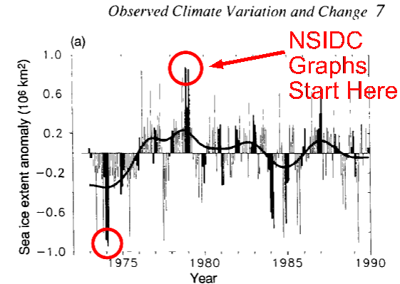
Where do you get this chart Tony?
It is from the 1990 IPCC report