
ice extent stays on the long-term downward trajectory that will eventually lead to seasonally ice free conditions as the Arctic continues to warm in response to rising atmospheric concentrations of Greenhouse gases.
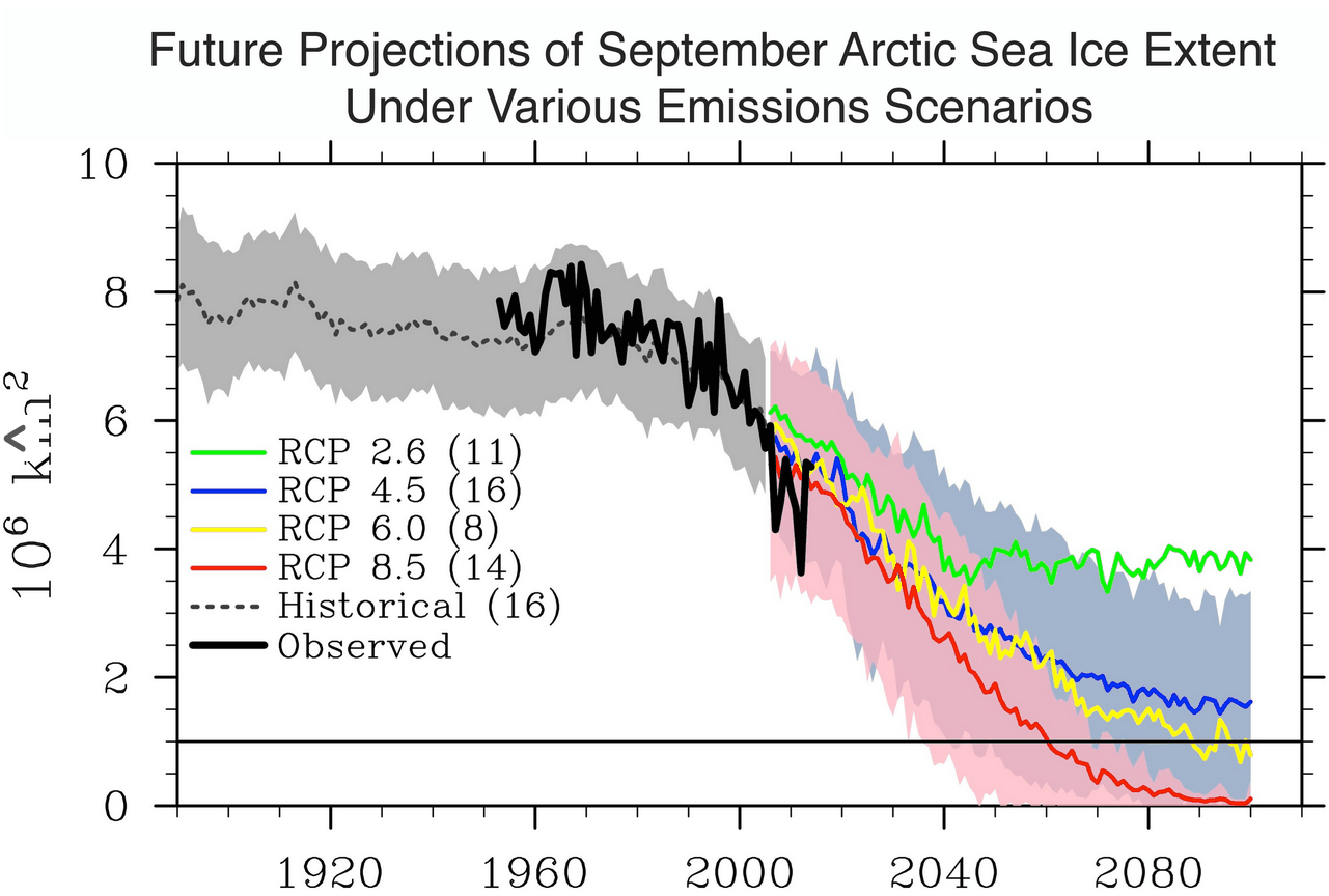
Besides the fact that they don’t present any evidence tying greenhouse gases to Arctic ice extent, their graph of historical data doesn’t match the historical record. NSIDC shows very little ice loss prior to 1940, but scientists at the time reported that the ice had lost one third of its area and half its thickness. Obviously this loss was not due to rising greenhouse gases, making NSIDC’s bogus graph even more misleading.
Papers Past — Auckland Star — 14 December 1940 — WARMER ARCTIC
31 May 1947 – TEMPERATURES RISING IN ARCTIC REGION LOS ANGELES…

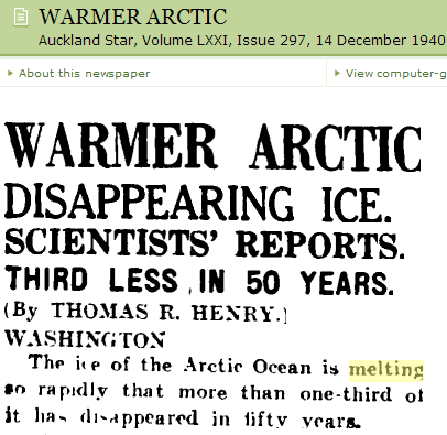
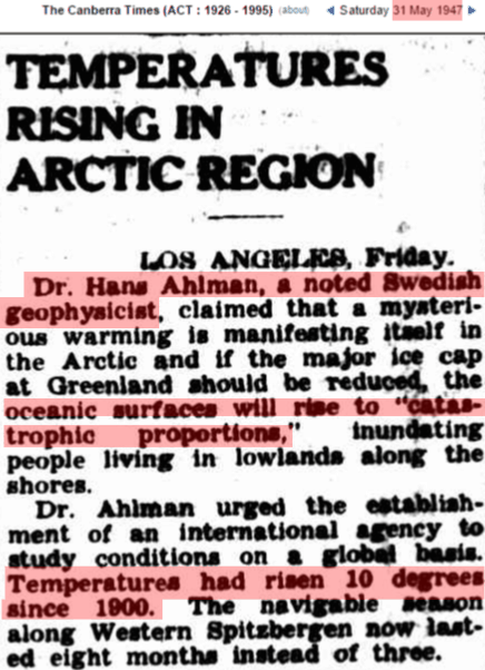
They can’t explain the pre-1940 warming and ice loss, and don’t even acknowledge that it happened. Junk science at its worst. NASA gave them a boost in this propaganda effort by making the 1940 Arctic warmth disappear.

This also makes a good animated GIF.
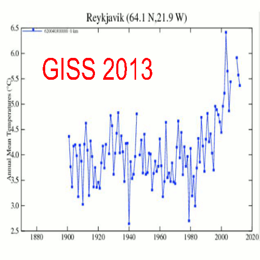
The adjustments done to Reykjavik in just the last 11 months by the NCDC. Quality-controlled temps from the Icelandic Met Office in the top panel (just 0.3C of warming since 1900). NCDC adjusted temperatures reported to the public in the second panel (shows +2.0C of warming since 1900 – +1.7C worth of total adjustments?). Last February, 21, 2014, it was only +1.1C so something happened in the last 11 months that made Reykjavik 0.5C colder in 1900 – 1925 which because of the way linear trendline math works, increased the warming trend by 0.9C over the period.
February 21, 2014 quality-controlled and adjusted.
http://s17.postimg.org/v8rjasxfj/Reykjavik_62004030000.gif
January 17, 2015 quality-controlled and adjusted.
http://s12.postimg.org/3zv0kfn0d/Reykjovik_2015_62004030000.gif
“Junk science at its worst”
How dare you insult junk science! This crap has absolutely nothing to do with science, junk, or otherwise. This is pure leftist propaganda, meant to scare the masses into servitude.
Since when do NSIDC graphs show “observed” Arctic coverage running back to 1960? The world began in 1979 for Mark and company. And of course the largely flat “historical” dotted line is nothing but fantasy.
Also notice that they’ve got the magical “one million equals zero” line marked on there.
Not to mention that the error bars are about the same width on the modern, accurate part (satellite observations), as the “historical”. One should be able to steer a Star Destroyer through the latter by comparison to the former.
I just love how they built noise into their models, as well as moving the “ice-free” goalposts many decades into the future.