
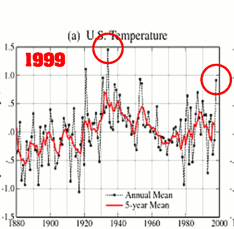
As of 1999, NASA GISS showed the US in fairly strong cooling trend since the 1930s. That didn’t suit the global warming agenda, so they have repeatedly cooled the pre-1960 years, and warmed the years after the 1960s – in order to create a warming trend which doesn’t exist and didn’t happen.
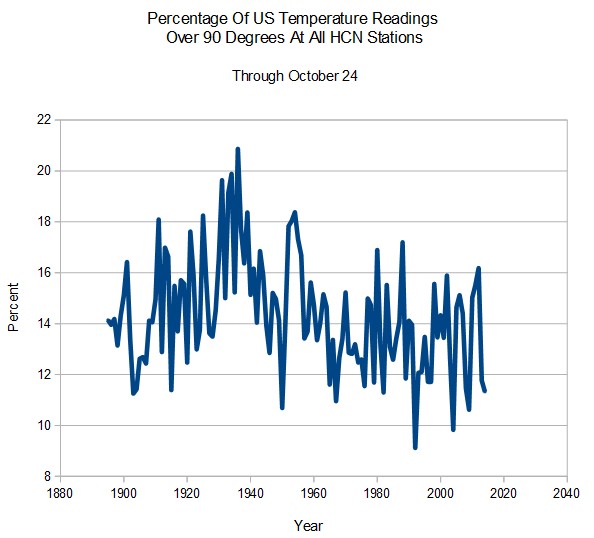
The frequency of hot days in the US has plummeted since the 1930s.
The people at NCDC and GISS are defrauding Americans with their data tampering.

There are several different “brand” name temperature indices, e.g. GISS, HadCRUT4, RSS, etc. How difficult of a task is it to construct a new brand using unadjusted or more properly adjusted temperature data?
Offering up a new brand that could be considered untainted by tampering would be a mechanism for refuting the credentials of anyone who uses the tainted ones. It would also be a good way to point out the taint which is in other temperature indices, and thereby show the fraud being foisted on the public. But I have no idea of the magnitude of this task I am proposing.
Thanks for continuing to enlighten all of us about the tampering that is going on.
It is impossible to do a legitimate global surface temperature. The data is much too irregular to do any meaningful analysis within the narrow range of variation that has occurred over the past 150 years. People who claim they can do it are fooling themselves. By picking the right set of stations, you can get any result you want.
I understand your point. The problem from a propaganda standpoint is that when agencies publish global temperature indices, they are making an implicit statement that it can be done. And that is tough to refute to those who have little or no understanding of the complexities which you have brought to light for all of us.
The assertion by the NCDC that 2014 was the warmest year ever could be more easily shot down if the (not yet real) ABCDXYZ Index could show graphically that it was actually not the warmest year. Uncertainty bands, UHI, station movements, instrument precision, and other issues which matter a lot to the calculations tend to fly right over the heads of the public. But a graph with one line going up and another line going flat or down is much more digestible information. When confronted with such data, the guy who uses the “going up” plot must defend his choice.
If someone could construct an alternate index that shows a different conclusion about AGW, then the pro-warmists would be forced into the position of having to defend their bogus claims and their manipulated indices. And adding that proposed index to the satellite indices would constitute more evidence against the carbonistas’ arguments. Right now, the skeptics are on the defensive, so we should turn the tables on the warmunists and put THEM on the defensive.
Perhaps it could be done by just backing out all of the adjusted cooling of the data from prior decades.
Use the satellite data then.
or the two I really like:
http://jonova.s3.amazonaws.com/graphs/lappi/65_Myr_Climate_Change_Rev.jpg
http://www.climate4you.com/images/GISP2%20TemperatureSince10700%20BP%20with%20CO2%20from%20EPICA%20DomeC.gif
Plus these two papers:
From the Royal Society: Carbon dioxide starvation, the development of C4 ecosystems, and mammalian evolution
Carbon starvation in glacial trees recovered from the La Brea tar pits, southern California
There are a couple other studies that if you think about it are a real wake-up call.
wheat is a C3 plant
Carbon dioxide measurements above a wheat crop, 1. Observations of vertical gradients and concentrations
CO2 depletion
Plant photosynthetic activity can reduce the CO2 within the plant canopy to between 200 and 250 ppm… I observed a 50 ppm drop in within a tomato plant canopy just a few minutes after direct sunlight at dawn entered a green house (Harper et al 1979) … photosynthesis can be halted when CO2 concentration aproaches 200 ppm… (Morgan 2003) Carbon dioxide is heavier than air and does not easily mix into the greenhouse atmosphere by diffusion… Source
At ~ 200-220 ppm you may be able to keep a C3 plant alive but it is not going to have the energy to fruit. It will also be very sensitive to drought. C3 plants include more than 95 percent of the plant species on earth.
The earth is darn close to CO2 starvation. Way too close for comfort. We need to kick CO2 back up to ~1500 ppm not lower it!
I think that’s the meaningful analysis, right there: the signal-to-noise ratio is too low. There’s no there there.
By the way: did any of these geniuses ever have to pass a calculus class?
I am sure that they had to pass a calculus class. I suspect, however, that they were not required to understand or to remember their calculus class.
N.B. If you know any student who is struggling to get started in calculus, this textbook (over 100 years old) is still the best:
http://djm.cc/library/Calculus_Made_Easy_Thompson.pdf
Thomas, George B. (1951). Calculus and Analytic Geometry. Addison Wesley, got me through 4 semesters of college Calc. without going to a single lecture.
An excellent text book
Try Frank Lansner & co.
The Original Temperatures Project
http://hidethedecline.eu/pages/who-are-we.php
One of the problems is most honest scientists realize that temperature is a really rotten measure since it does not include the energy incorporated in the latent heat of vaporization of water or in the wind or in the oceans.
Physicist Nir Shaviv wrote a 2009 paper The oceans as a calorimeter
That is his discussion on his blog. It has a link to the actual paper.
Also by Shaviv The worst of the BEST
Reblogged this on Climatism.
All known versions of that data (GISS lower-48 surface temperatures) are archived here:
http://www.sealevel.info/GISS_FigD/
So people are dying from heat in the 1930s when it is freezing, and dying of cold in the 21st century when it is sweltering.
Yes. Because these rocket surgeons apparently never had to pass first-year calculus.
Dr Phil Jones can’t even use an excel program! And he is one of the top ClimAstrologists.
Are they the same ones that flew the toy onto the whitehouse lawn? 😉
I’m glad everyone isn’t totally brain washed. The global warming is classic propaganda. Most people in the US don’t know how to critically think , they believe the prepackaged bull shit, and it’s very unfortunate. Some of the most intelligent information on the web , thank you .
Robert/Nick: Many thankssuggestions. I may be interested to hear involving almost any benefits towards your SEARCH ENGINE OPTIMIZATION promotions after this is certainly integrated.
Reblogged this on The Road to Revelation and commented:
The nefarious and corportist-fascist u.s. government misleading and defrauding the WORLD…
And 2016…
http://data.giss.nasa.gov/gistemp/graphs/graph_data/U.S._Temperature/graph.html