
The frequency of very hot days in New South Wales has dropped off sharply since the 19th century. During January 1896, Bourke had 18 days over 110F (43C)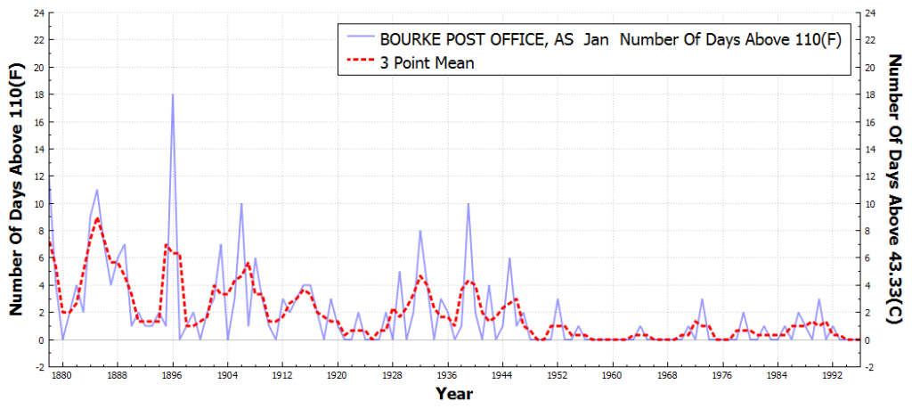
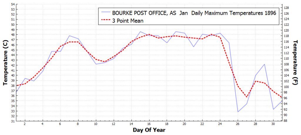
The graph below shows the daily maximum temperatures at Bourke during that month, which peaked at almost 49C.

so what happened here after 1996?
No data from NOAA after 1996
can we find out anything from BOM?
http://www.tutiempo.net/clima/BOURKE_AIRPORT_AWS/01-2013/947030.htm
seems to me average max. temp. in January in Bourke was 40.6.
at least 6 days above 43?
that should read: January 2013.
According to the BoM, Bourke had 22 days of +40C during Jan, 1896 – average monthly max mean of 43.4C and still the highest ever Jan MMM (do NOAA adjustments account for the difference?).
Find here at this site and click on 1896 for daily temps.
http://www.bom.gov.au/jsp/ncc/cdio/weatherData/av?p_display_type=dailyDataFile&p_nccObsCode=122&p_stn_num=048013&p_c=-461046057&p_startYear=1896
Henry, since then:
Bourke’s weather station site changed in 1995 from the PO to the airport using an AWS rather than manual recording system.
http://www.bom.gov.au/jsp/ncc/cdio/weatherData/av?p_nccObsCode=36&p_display_type=dataFile&p_startYear=&p_c=&p_stn_num=048239
It was shifted again within the AP in 1999 but data was missing until 2001.
http://www.bom.gov.au/jsp/ncc/cdio/weatherData/av?p_nccObsCode=36&p_display_type=dataFile&p_startYear=&p_c=&p_stn_num=048245
BTW, Bourke also had 17 consecutive days of +40C in Jan 1939. If that happened today, it would be unprecedented. Even in Aust’s so-called ‘angry summer’ of 2013, Bourke only had 6 consecutive +40C days.
Data is the same. My graph is for 43C rather than 40C
Looks like the station is currently reporting data today on the Weather Underground map:
http://wxug.us/1tc3d
The WU history for today shows hourly observations. Maybe NOAA dropped it because they did not like the temperature trend?
Hi Ian
I am counting 13 days above 40 in January 2013.
[we are talking maxima here]
generally we can say the world is cooling down, if Bourke was a fair sample of the world…
Yes but I was talking consecutive days.
mind you
must tell you that the SH has been cooling down for a long time now
It is just funny that nobody seemed to have noticed..
https://i1.wp.com/oi58.tinypic.com/2mnhh74.jpg
Still that childish 4 points in 38 years..
MEANINGLESS.
I suggest you do you points at a maximum 4 year spilt. Give yourself something worthwhile to graph.
Readers should note that in a previous graph Henry used 7,10,10 splits.
In this case he uses 4, 10, 10.
Its almost as if he were choosing the last point to match as close to his parabola as possible. (who thinks parabolas have anything to do with climate, anyway ! !.)
He can get around this major cherry-picking by using more points, say at an equal 4 year split. (although yearly points would be better)
He strenuously refuses to do this, because he knows it wouldn’t fit his predetermined curve.
Well, not parabolas, but there is plenty of hyperbolic stuff in official climate science …
I know exactly what Henry is trying to show, but 4 points is meaningless on a parabola.
3 points will always define a parabola, so the whole thing rests on ONE extra point.
I have suggested how he can remedy this major issue, but he steadfastly refuses to.
He needs to get at least 8 point, although yearly would be best.. Sure this will drop the R² value, but it is the only way he can show that his theory has any meaning.
Andy says,
Its almost as if he were choosing the last point to match as close to his parabola as possible. (who thinks parabolas have anything to do with climate, anyway ! !.)
He strenuously refuses to do this, because he knows it wouldn’t fit his predetermined curve.
Henry says
you have got to be kidding me if you think I can “arrange” the data in such a way….
I have tried to explain the way I work but it seems you still do not get it. Let me try again.
[in this case] 11 weather stations, going back to 1976,on average, one recording of a minimum temperature every day = 152570 measurements in total for the longest period from the start.
It looks to me you don’t understand what each black figure in the table stands for? Each black result is the result of a linear regression, giving me the speed of warming/cooling at the station in K/annum, i.e. the value before the x.
You can take more regression points to give you more points on the parabola, but with the same sample that would be stupid, because what with Rsquare>0.999 it is not going to make much of any difference. The sample of all the measurements taken has defined the function. What you are looking in the graph at is K/annum per annum, i.e. that is acceleration / deceleration.
It is the same as when you throw a ball: the speed depends on the initial force thrown and thereafter the function for the acceleration in m/s per s can be figured out if you know the g force.
As to the relevance of quadratic functions in climate science: my finding is that they do well in giving the approximation for rate of change in T for half the Gleisberg cycle, the whole 87 curve being a sine wave, like here, where I had reliable data on maxima for one station in Alaska going back to 1942.
http://oi60.tinypic.com/2d7ja79.jpg
You can fix your problem with basic understand of mathematics by plotting several point, not just 4. A point every 4 years… you can do it.. stop hiding.
The regression of 0.99 etc is MEANINGLESS with only 4 points on a parabola.. end of story.
FIX IT.. or keep running.
Your continued REFUSAL to do so, says so, so much !!
What are you hiding from.????????????
You could, of course , PROVE me wrong, by producing a graph and calculations every 4 years or even every 1 year.
The balls in your court…. do you have the balls?
i am giving you all some clues to work with…
Like it’s some sort of a game …
like cluedo?
https://stevengoddard.wordpress.com/2016/02/10/the-incredible-heatwave-of-january-1896-in-australia/#comment-571918
Reblogged this on Climatism and commented:
Not hard to see why Australia’s warmist Bureau of Meterology (BoM) start the AU temperature record post 1916.
Any data pre 1916, that includes record breaking temps from the “federation drought” era (1895-1902), would simply destroy their late 20th century warming narrative.
mind you, just to be clear on what my [actual] point was:
there appear to be a number of places on earth, where we never had any warming, whatsoever for the past 40 years or so;
Southern Africa seems to be one such spot.
Victoria, Black Saturday February.2009, 47C, devastating fires. Ash Wednesday February 1983, 44C, 4,100km2 burned in 12 hours, Black Friday January 1939, 44C, 20,000km2 burned. Black Thursday February 1851, 47C, 50,000km2 burned.
Over 160 years nothing has changed.