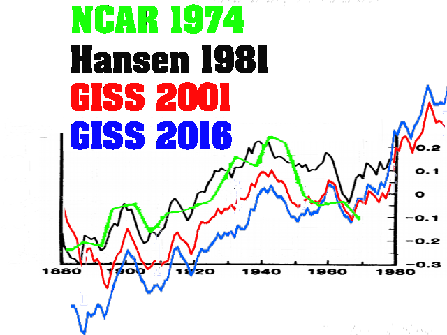
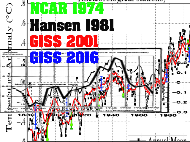
I frequently use overlays like the one below, showing how NASA has successively altered global temperature data to make the 1940’s warmth and the 1940s-1970’s global cooling disappear.
1974: NCAR 1981: Hansen_etal_1.pdf 2001: Fig.A.ps Current: Fig.A.gif
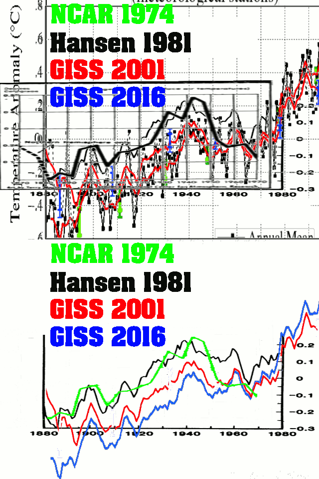
However, when I start, the overlay is not very readable and I do a lot of image processing (chroma keying and color correction) – to make the image more intelligible.
The animation below shows before and after.
I do this using proprietary software I wrote about 10 years ago for a startup I founded in London. I’m thinking about making a simpler version for public release.
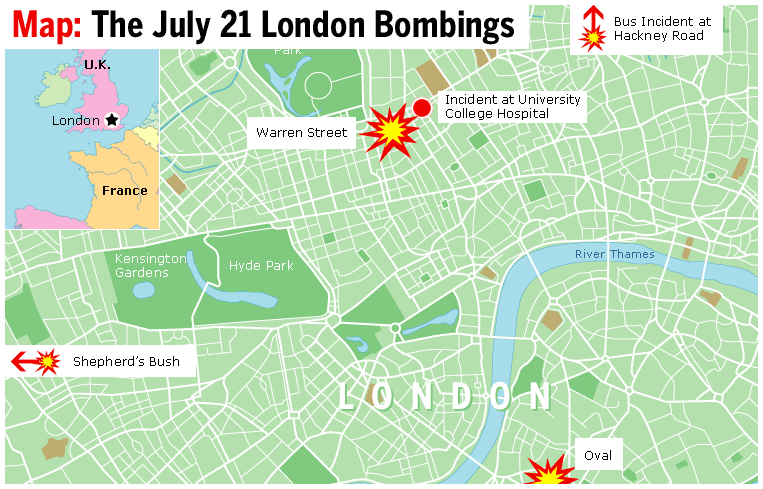
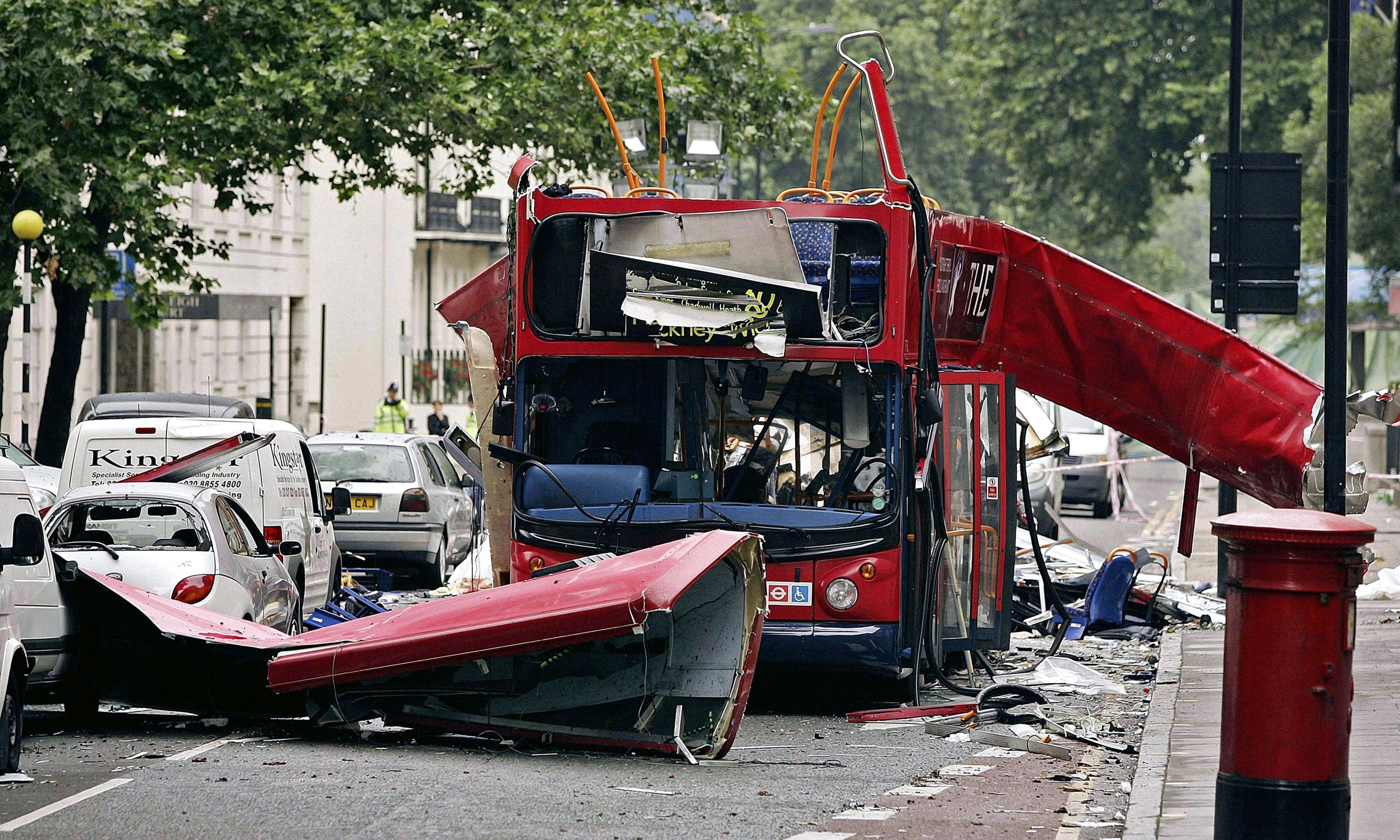
Speaking of which, I had just left London on the Underground on July 21, 2005 – when the Religion of Peace did this:
This was two weeks after the July 7 “Rivers of Blood” bombings.
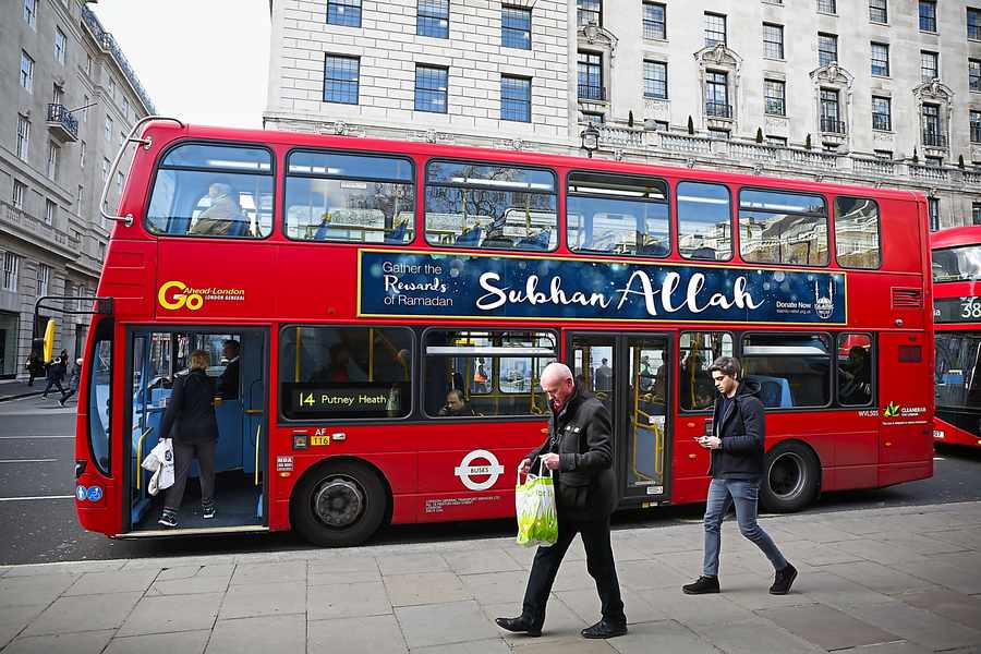
This week London elected an Islamic mayor, and now they have “glory be to Allah” written on London buses.

