
The Danish Meteorological Institute continues to show less Arctic sea ice than last year.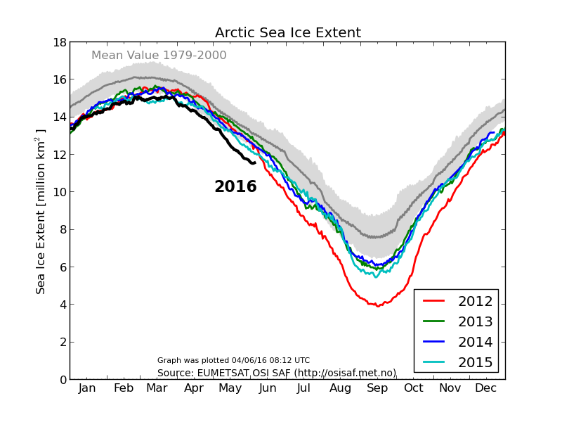
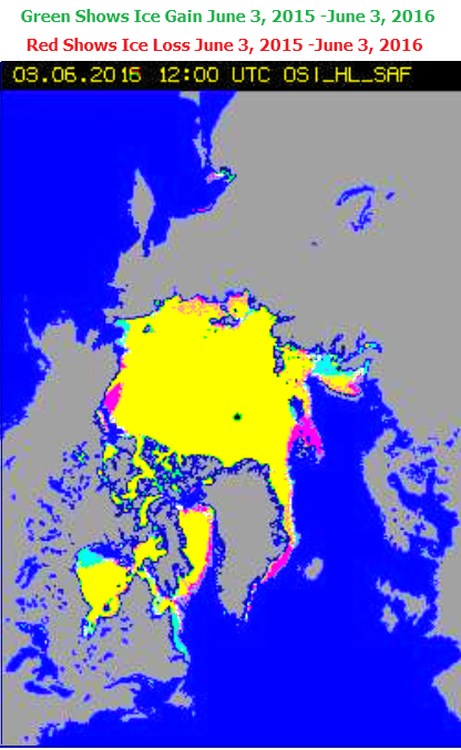
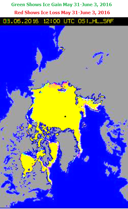
However, their maps show slightly more ice than last year.
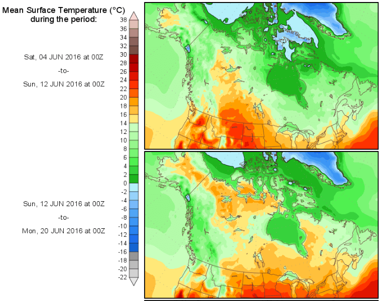
Due to very cold temperatures, there is almost no melting going on in the Arctic.
It is surprising that there is any melt occurring at all, because our top scientists say that the Arctic is ice-free.
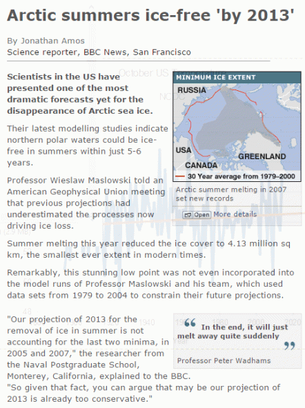
BBC NEWS | Science/Nature | Arctic summers ice-free ‘by 2013’
