
Gavin uses this smear graph to fool people into thinking he hasn’t changed the data very much over time.
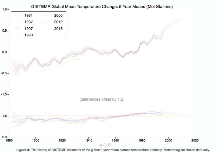
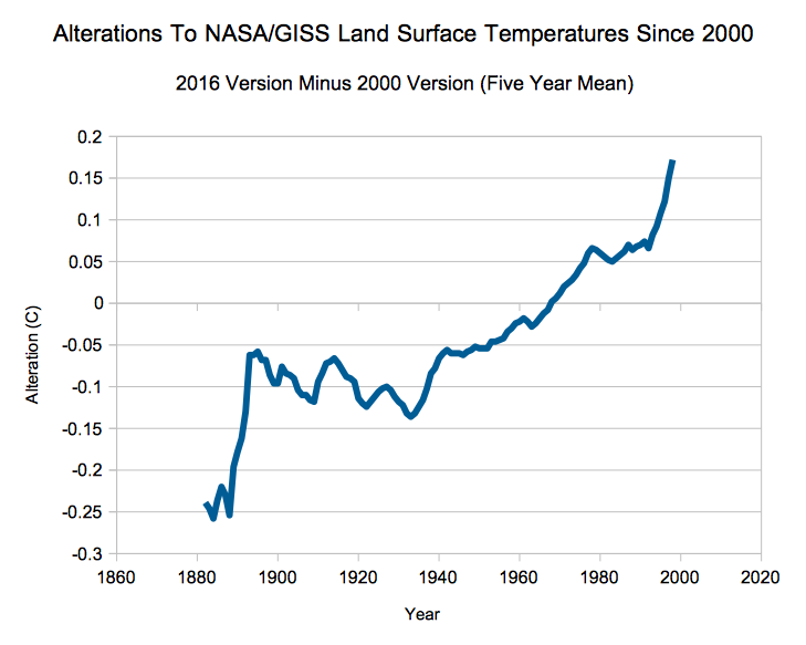
As I showed yesterday, a more detailed analysis indicates that the changes are huge.
Link to NASA files 2016 2012 2000
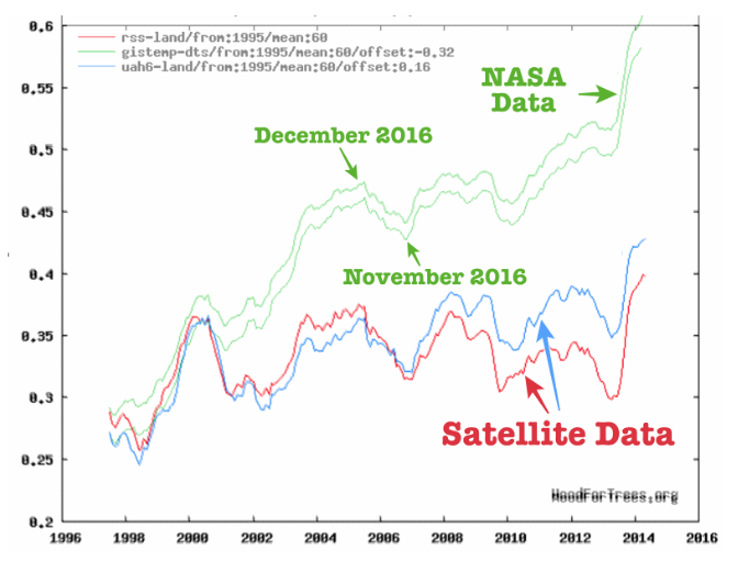
Since the year 2000, the problems continue. Gavin’s surface data does not even vaguely match satellite temperatures.
Wood for Trees: Interactive Graphs
Satellites show land temperatures declining from 2000 to 2015.
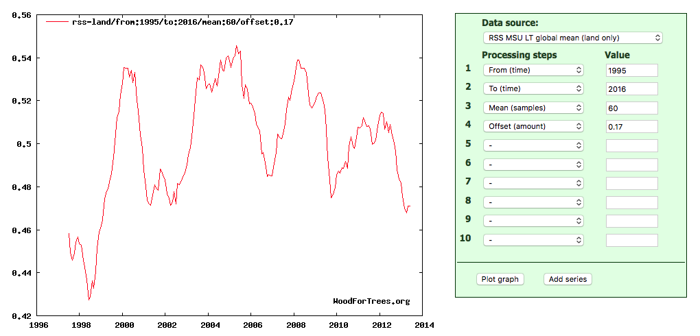
http://www.woodfortrees.org/plot/rss-land/from:1995/to:2016/mean:60/offset:0.17
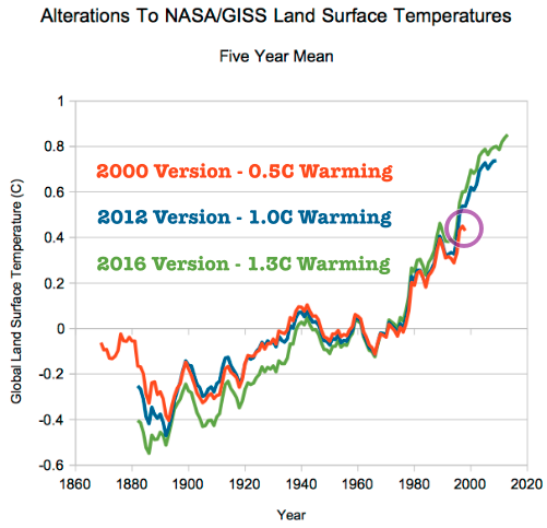
If we tack the satellite data on to the the 2000 GISS version we see a total of 0.6C global warming, but the 2016 GISS version shows more than double that, 1.3C warming.
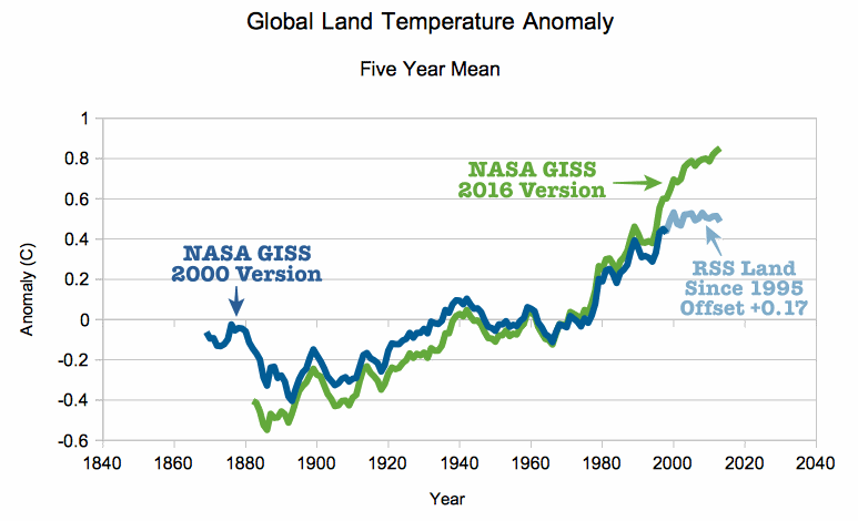
The 0.6C warming number doesn’t frighten anyone, but a mythology has been created around the 1.3C number that is supposed to terrify people.
However, the problem is much worse than that. By the year 2000, NASA had already erased half of the 1940 to 1970 cooling indicated by NCAR in 1974. In the 2016 version, Gavin has completely erased it. It is likely that the total warming since 1940 is less than 0.3C. Hardly a hockey stick.
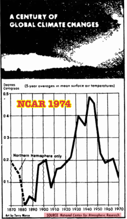
14 Jul 1974, Page 1 – Lincoln Evening Journal
The surface temperature record constantly changes and is garbage. The people handling the data are climate scientists, who are continuously introducing confirmation bias into the data set. Handling of the temperature data needs to be moved to independent agencies which have no vested interest in the outcome.
