100% Of US Warming Is Fake

Zeke and Nick and all the other apologists for NOAA data tampering claim that adjustments to US temperature are due to Time Of Observation Bias or some other sciencey sounding reason, But the reality is that the data is simply fake.

In 1989, NOAA reported no US warming since 1895.

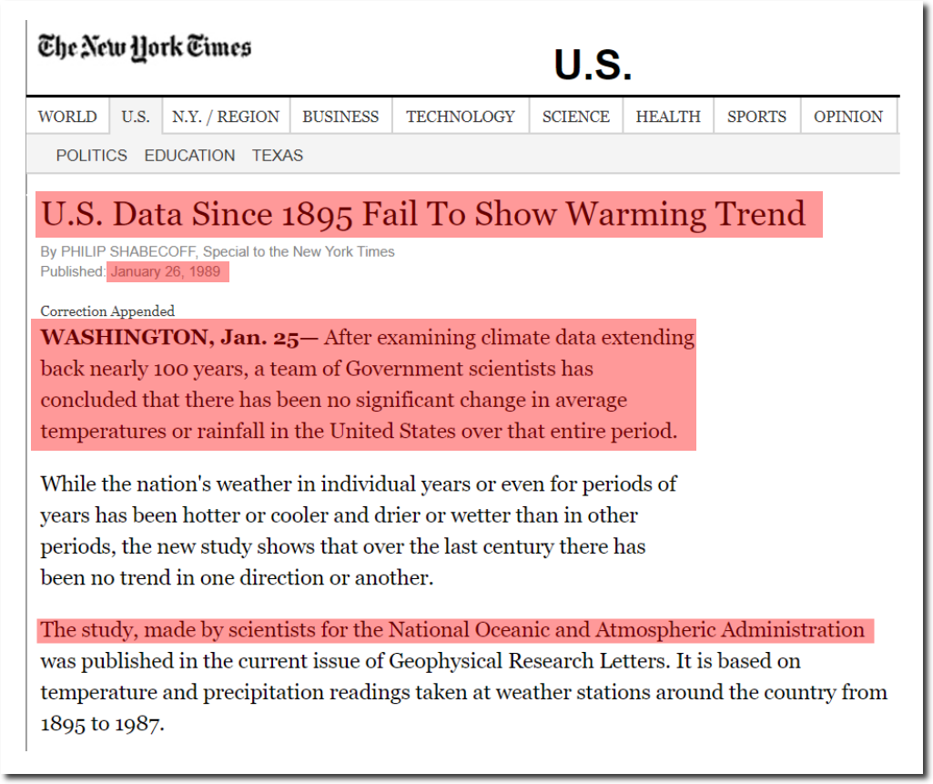
U.S. Data Since 1895 Fail To Show Warming Trend

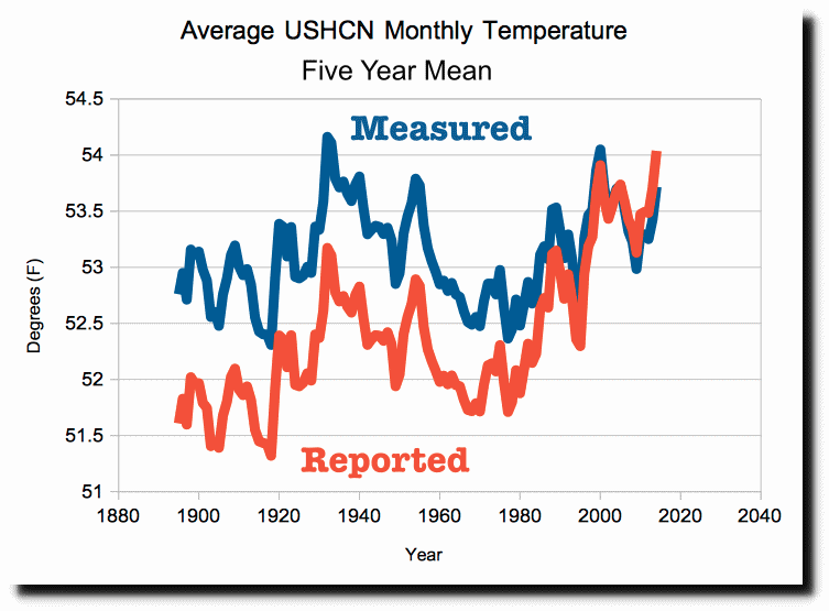
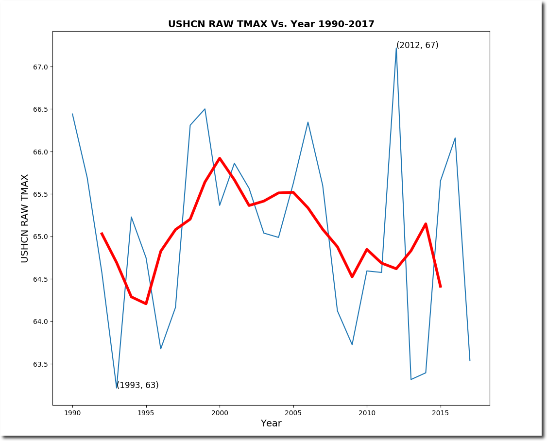
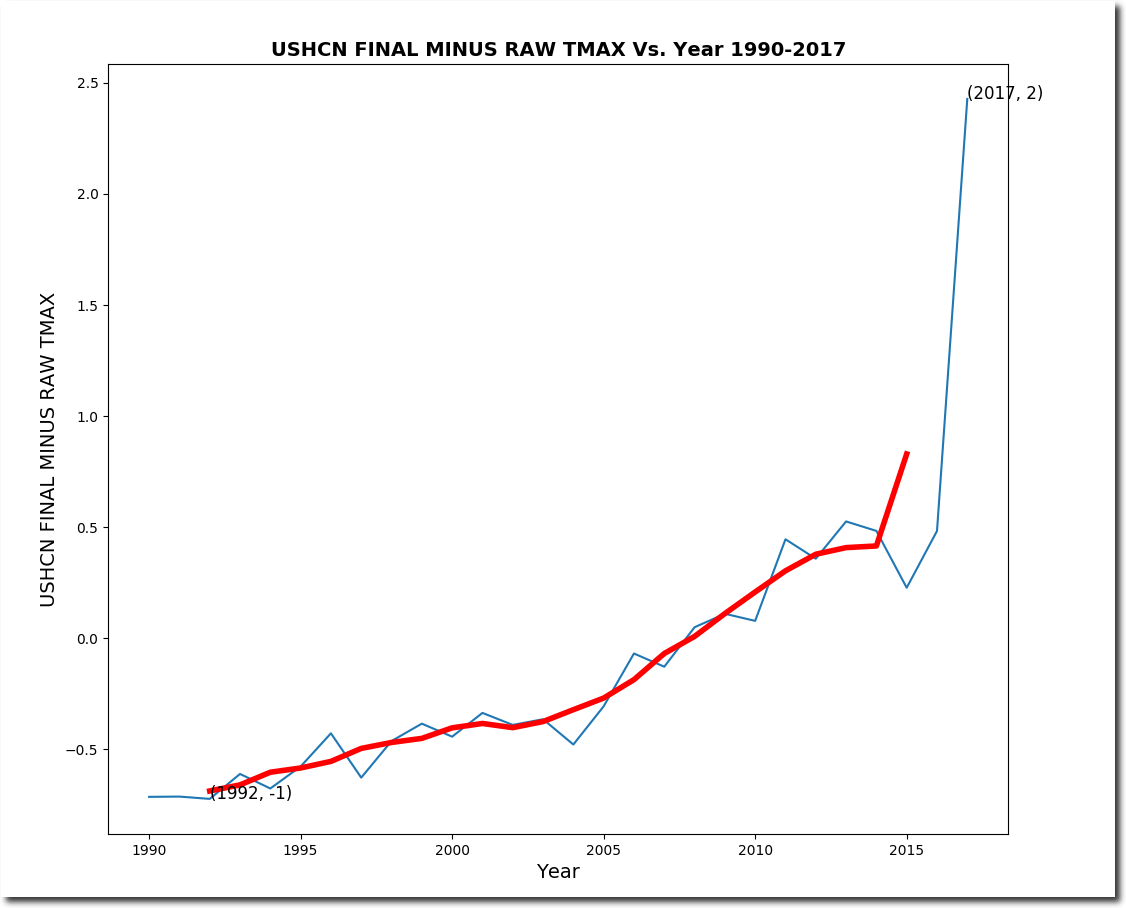
So what has been happening since 1990? The measured NOAA data shows no warming.

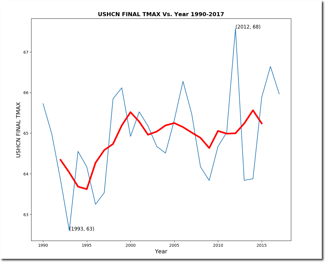
But the adjusted data shows a lot of warming.

The adjustments form a familiar hockey stick of data tampering.

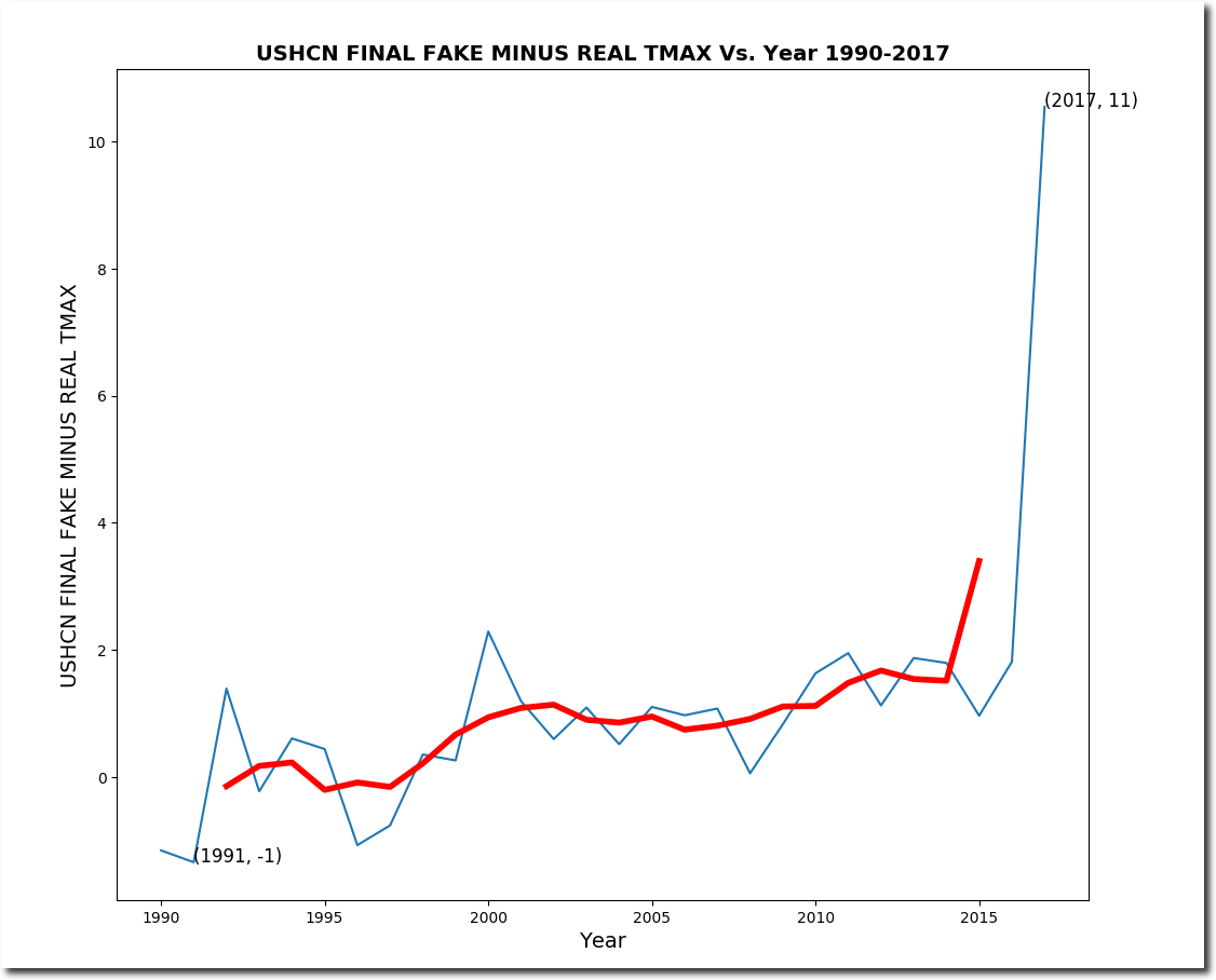
Let’s look at what NOAA is doing to make this happen. Since 1990, NOAA has been losing monthly temperature data at a phenomenal rate. When they don’t have real data, they simply make up fake data. Almost 50% of their “adjusted” data is now fake, but in 1991 it was only 16% fake.

I split up the NOAA adjusted (Final) data into two categories – “real” data has underlying thermometer data, and “fake” data has no underlying thermometer data. The “real” adjusted data shows very little warming.

Bu the fake adjusted data shows lots of warming.

The infilling of fake adjusted data (no underlying thermometer data) corrupts the US temperature data in a spectacular hockey stick.

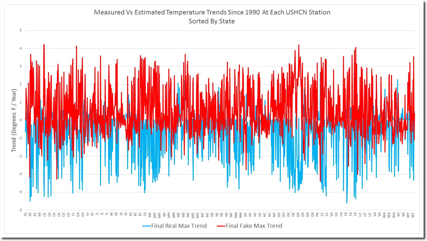
But it is much worse than it seems. The graph below plots the real adjusted (blue) and fake adjusted (red) trends for all 1200 USHCN stations. NOAA is consistently infilling missing cold temperatures with fake warm temperatures, across the board and across the country. How cynical can they get?

When confronted about their data tampering, they say “our algorithm works exactly as designed.”

In other words, the fraud is intentional. But I’m not done yet. The fraud is worse than it seems (if that is possible.)  Almost 50% of USHCN adjusted data is now fake, but they have only lost 25% of their data. So  they are throwing out a large percentage of their measured data.

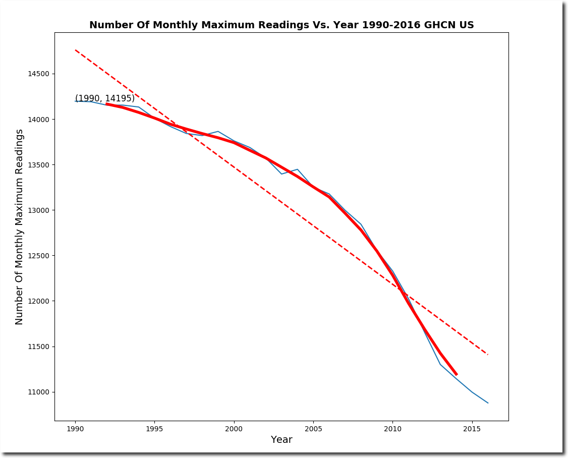
The next phase of my discovery process will be to find out what type of measured data they are throwing out and replacing with fake data. But it seems a safe bet that they are tossing measured cold data, and replacing it with fake hot data.

This is the biggest and most cynical scam in science history.

This entry was posted in Uncategorized. Bookmark the permalink.

35 Responses to 100% Of US Warming Is Fake

  1. Eric Barnes says:

    Great work Tony!

  2. Kris Johanson says:

    This is what investigative journalism looks like! This is how you go from merely “cursing the darkness” to actually kicking butt and taking names. God bless you, and please protect yourself

    • Kris Johanson says:

      I don’t want to be misunderstood…. by that last comment I mean make copies of every important thing you own and don’t be surprised if you’re raided and all your personal & business files & equipment carted off. I have witnessed that happen to 2 previous employers, and they take it ALL and you don’t get it back

      • Andy DC says:

        The next thing that is liable to happen is that deep state authorities will plant child porn and NAMBLA literature in Tony’s apartment and then conduct a raid.

        In some sense, I am trying to be funny, but in another sense, I am dead serious and worried. These people are that psychotic and dangerous.

        Tony has brilliantly taken the alarmists apart with their very own irrefutable data, and I sense they are getting increasingly crazy and desperate.

  3. dave g says:

    Tony,
    You should also start tracking the USCRN data since 2005 which also shows no warming… and you will notice they know that USCRN data they can’t mess with (yet)
    I think the CRN data spiked high in 2015 but should be coming down hard after this summer.

  4. Mark Fife says:

    That is exactly what the folks at Berkeley Earth do via a different method. Their raw data sets, for whatever reason, appear to be laced with artifact (bogus) data designed to create the illusion of warming. This data appears in two different forms. One is partial annual data. Stations only reporting a few months out of the year. The other involves duplicate data. One station reported 99 monthly averages in one year. When I separated the partial and duplicate averages out and charted them against the remainder of the data two things became apparent. All of the post 1980’s warming – all of it – was contained in the partial and duplicate data. The graph of the partial and duplicate data described a nearly perfect linear plot with a slope approximately the same as the tail end of the infamous hockey stick. Removing the partial and duplicate data removed around 30% of the stations reporting since 1900 entirely, because all of their reporting consisted of partial or bogus records.

    In my blog I steered clear of calling it fraud. I opted to call it, well, stupidity. But it is clearly fraud. Undetectable unless you go to the trouble of counting readings amongst the megabytes of data – or if you do as I did and create a SQL database to parse an analyze the data. That is one of the first things I did, count the number of readings per station per year. That ranged from 1 to 99.

    If you are looking at creating a plot of annual averages, of what value would records consisting of just one month out of the year be?

    Scientists. Could they really be that stupid by accident? And if they really are that stupid why would you listen to a thing they have to say?

    • Ari Saltiel says:

      Scientists. No they aren’t all that stupid. A few at the top know this information but the rest (97%…hehe) take it for granted that the data they are presented with is reliable because, you know, science.

    • ItsGettingHotinHereSo says:

      Mark could you provide a link to your blog? Thanks.

      • Mark Fife says:

        No problem. This is the latest posting. My blog is not dedicated to anything in particular except for two things. My Dad, who passed a few years ago. My first post explains that tie in. The second thing is what ever I feel like talking about. That is it. Feel free to read and enjoy anything I have written.

        http://bubbaspossumranch.blogspot.com/

  5. Edmonton Al says:

    Why is it that Zeke and Nick are not being ordered to provide proof that their “adjustments” are legitimate. and accurate?
    How can they steadfastly be believed by the new US Administration?
    Trump should get Pruitt [or whomever], to call these guys up to the carpet.
    They must prove their calculations or resign.
    IMO.

    • ItsGettingHotinHereSo says:

      Zeke works for Berkeley Earth who publishes the BEST climate data set. Not sure of Nick’s affiliation. Private company. Not government or university.

  6. Anon says:

    Tony… Don’t forget, if you suspect fabricated data, there are forensic tools out there that can possibly expose it. eg: https://en.wikipedia.org/wiki/Benford%27s_law

  7. Adamant de-Nye-er says:

    Statements like “…our [software] works exactly as (we) [designed, intended]…” is an acknowledgement of confirmation bias and of deliberately lazy, low-quality, programming. Look at commercial and government software failures over the last 40-ish years, and you will see thousands of similar claims and excuses, often by organizations that are about to fail, and too seldom, about to be exposed and prosecuted. Red flag.

  8. prollynot says:

    I have been looking up and making a database of temperatures for cities in the US, (have about 50 now from all over the country) checking the maximum high temperature for July 1 for decades from 1957 to 2017 to see if there is any perceptible trend in warming. So far, there is not. I am getting the data from the commercial weather site ‘Weather Underground’, looking at the historical records posted there. I am also noting the maximum high temperature ever recorded as show on this site, and most of them are from years long past, especially the 1930s and late 1800s. Only a few in the last two decades.
    Then I found a piece of disturbing fraud in how the record high temps are listed: For Anchorage, Alaska the site shows the record high as 75F in 1997. But when I went decade by decade I found it also shows 75F in 1977! So it appears that, instead of requiring a ‘record breaker’ to be at least one degree above the previous record, they simply make the more recent year new record if it matches the past record. I also found a similar deception in records for St. Louis, Missouri where Weather Underground shows the record high at 102F in 2012, but when I went through NWS data it showed a recorded high of 105F in 1980.

    • Andy DC says:

      I noticed something fishy about St. Louis during this past July. They somehow got up to 108 degrees, when none of the surrounding stations got over 104.

      • gator69 says:

        St Louis is often 7-10 degrees warmer than the surrounding countryside, it has a massive UHI. The official station is at Lambert International Airport, which was located far from the city (in the middle of farm fields), and had grass runways until the late 1930’s. Lambert is now in the middle of miles and miles of concrete, metal, and asphault.

  9. gofer says:

    Alarmists are all over this, calling him an unqualified liar. Seems that a panic might be forthcoming or is happening. Pure vitriol being spewed.

    http://www.breitbart.com/big-government/2017/08/23/delingpole-all-of-recent-u-s-warming-has-been-faked-by-noaa/

    • AndyG55 says:

      And not one of them has a single counter argument,

      Just baseless ad homs.

      Thing is, that anyone can now access the GHCN data and get the same results.

      NOWHERE to run !!! :-)

      • sunsettommy says:

        Just read a number of comments there,warmists have nothing to counter with.

        What is scary is they don’t seem to realize how they look to rational people reading them.

  10. Daniel Zielinski says:

    Wow! Just… wow! Bravo, Sir.

  11. sunsettommy says:

    Notice that warmist goofballs such as Steve “mathless” Mosher,doesn’t come here to make a detailed challenge to Tony’s presentation?

    Neither Jim Hunt,Martin Lack,Griff,Barry and more.

    They seem to stay far away from this kind of postings altogether,gee I wonder why……..

  12. Bev says:

    Hansen refused to release his “proprietary” data — you know, the stuff we paid for. Did you guys succeed in getting it?

  13. Ned Nikolov says:

    They keep faking data, because the “Greenhouse” theory, which underlies all climate projections of human impact through carbon emissions has remained unchallenged until now. However, our recent paper:

    Nikolov N, Zeller K (2017) New Insights on the Physical Nature of the Atmospheric Greenhouse Effect Deduced from an Empirical Planetary Temperature Model. Environ Pollut Climate Change 1: 112. doi:10.4172/2573-458X.1000112
    (see: https://www.omicsonline.org/open-access/New-Insights-on-the-Physical-Nature-of-the-Atmospheric-Greenhouse-Effect-Deduced-from-an-Empirical-Planetary-Temperature-Model.pdf)

    reveals for the first time that the physical nature of the atmospheric thermal effect (aka “greenhouse effect”) has been misunderstood (and misconstrued) for 190 years! The atmosphere warms Earth’s surface not through the radiative action of “greenhouse gases”, but through the force of air pressure. The “Greenhouse effect” is in reality a Pressure-induced Thermal Enhancement (PTE) that is independent of atmospheric composition. This is the conclusion suggested by results from an objective analysis of vetted NASA planetary data spanning nearly the entire range of physical environments in the solar system. Earth’s climate is a part a cosmic thermodynamic continuum defined by solar irradiance and total atmospheric pressure. The LW radiative transfer in the atmosphere is a CONSEQUENCE of atmospheric thermal effect, not a cause for it. This is paradigm shift in our most fundamental understanding of the climate system.

    There is no more need to fake temperature & CO2 data, because new science shows that no physical mechanism exists in reality that can alter the average surface temperature of a planet by changing the planet’s atmospheric composition.

  14. MrZ says:

    Hi!
    Recognizing this graph? I have downloaded all NOAA data and put it into a MySQL. It confirms what Tony is saying is true, using only NOAA data and standard MySQL tools.

    I have only included months that has successful raw readings and across stations that still provides readings 2017.

    Cheers, MrZ

  15. Reasonable Skeptic says:

    Here is a simple question. Why?

    There is a substantial difference between raw and homogenized data. It is clear that there is a non random pattern to the changes. Since this is obvious and can’t be disputed, there must be an overriding reason for the pattern. The people that own the dataset must be capable of explaining why this pattern exists.

    Quite clearly there is a reason and it can’t be simply due to hundreds of small reasons because mathematically speaking it would be impossible to have this pattern caused by many small corrections that move the data in one direction consistently.

    Perhaps the sun is slowly changing in the horizon or perhaps invisible elves have been using magic to cool the sites. Beats me, but there is reason why the sites are showing a fake cooling trend that is getting worse over time.

    • Ned Nikolov says:

      @ Reasonable Skeptic
      The reason is simple – to match real-world data to the “greenhouse” theory, because such an action was bringing funding and promotions to scientists in the past. This also created a grand illusion in the public mind about the magnitude and drivers of climate change, which fueled a new religion (moral norm) in society toward “saving” Earth’s climate from an “imminent” catastrophe. This public opinion further reinforced the $$ umbilical cord feeding the scientific community. The Obama Administration was spending $2.5 B a year for climate research alone. The total climate-related spending amounted to about over $22 B per year!! We are talking serious bucks here …Virtually all government climate funding prior to 2017 was directed toward supporting an AGW agenda… We do need solid funding for climate research, but it should be in support of a free inquiry and must be free of political influences!

    • gator69 says:

      … and Zeke confidently dismissed concerns of malfeasance by saying that there was a sensor change which I guess supposedly has a cooling bias?

      tonyheller says:
      August 26, 2017 at 2:04 am
      The “fake data” sensor has a cooling bias? Who knew?

      Hmmm… Reasonable Zeke?

  16. MrZ says:

    Agree 100%!

    They say:
    “The algorithm starts by forming a large number of pairwise difference series between serial monthly temperature values from a region. Each difference series is then statistically evaluated for abrupt shifts, and the station series responsible for a particular break is identified in an automated and reproducible way. After all of the shifts that are detectable by the algorithm are attributed to the appropriate station within the network, an adjustment is made for each target shift. Adjustments are determined by estimating the magnitude of change in pairwise difference series form between the target series and highly correlated neighboring series that have no apparent shifts at the same time as the target.”

    How this can end up so linear beats me. Would be interesting to read the SW source files. Anybody knows if those are available? They do have a SW folder but with no structure.

    MrZ

    • neal s says:

      It occurs to me, that a simple test of the fairness of these algorithms, would be to run it on existing data, only time-reversed. If when run on time-reversed data, the end result is an overall warming trend, then you know for sure that the algorithms are rigged to produce warming, no matter what the input data.

      I am also sure that this simple test will never be done, because it would prove the fraud that has been taking place among all those who claim to produce global temperature records.

  17. MrZ says:

    Here are the TOB and ADJ components individually. I have read Zeke H states that Homogeneity Adjustment actually slightly heats the past. When comparing TOB and ADJ it is clear both cools the past and both are very linear…

  18. Gary Palmgren says:

    Thank you for the graph of trends. Finally someone has done the only valid method of using measured temperatures at different sites and different climates to say something about the climate. One simply cannot average temperatures from humid tropical regions, turbulent temperate zones, and the desiccated antarctic wasteland. Water vapor is levels are vastly different and control a lot of the energy in any given vertical column of air.

    Averaging trends from from different regions to get some idea of the global climate trend actually has some validity. There is no need to “infill data” if there is a gap in the record for a given site. No need to homogenize data from nearby thermometers. The trend at each station can be determined independently of other stations. One could still look for station changes and start a new trend calculation at the date of the station change. A lot of mischief in making up the data would be much harder to justify when each station can easily be checked against trends in real measured values.

    The only downside is it looks like we are getting colder.

Leave a Reply

Your email address will not be published. Required fields are marked *