
Griff’s point is correct, but is irrelevant in the context of my graphs.
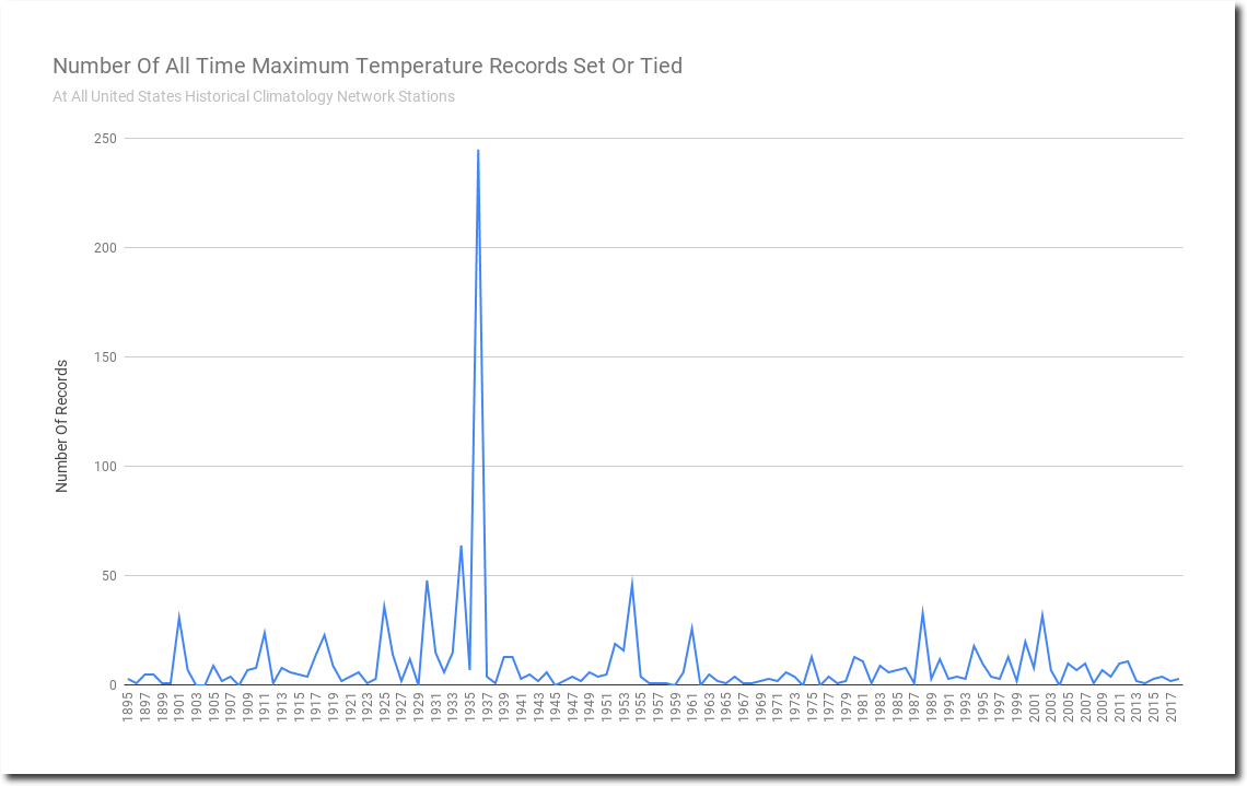
This is the graph as of August 22, 2018. It is clear that 1936 was the hottest year.
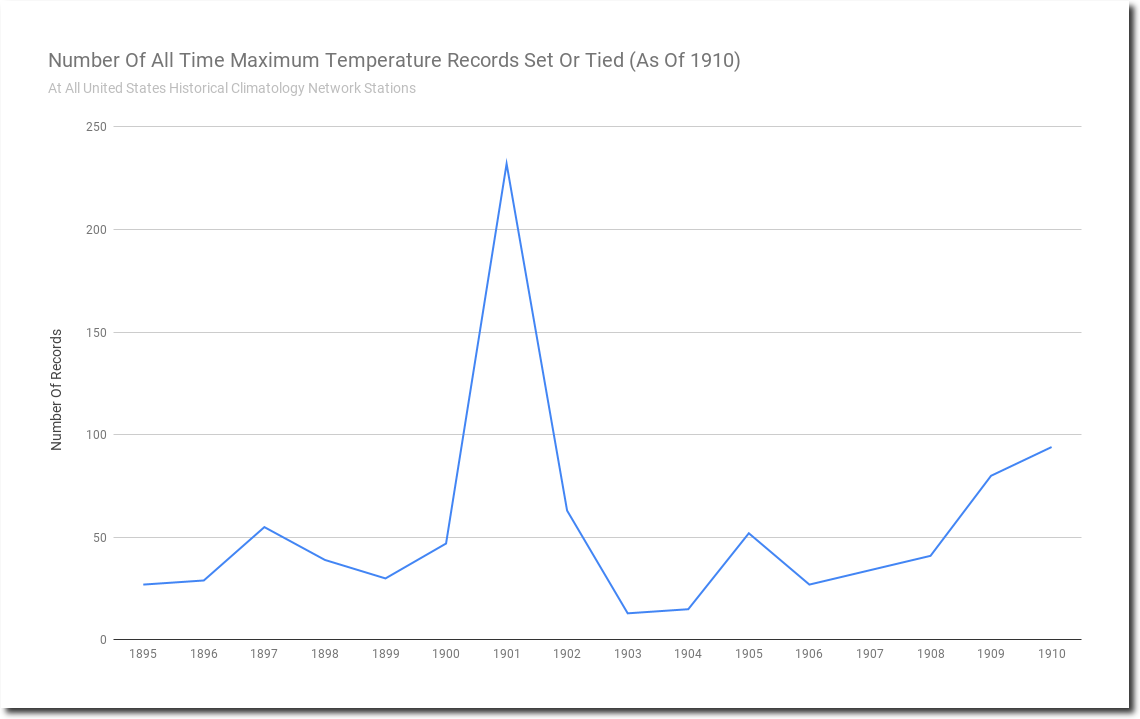
If instead of being 2018, this was 1910 – my Google spreadsheet graph would look like this. Almost all of the records would have been set during the very hot year of 1901, instead of 1936.
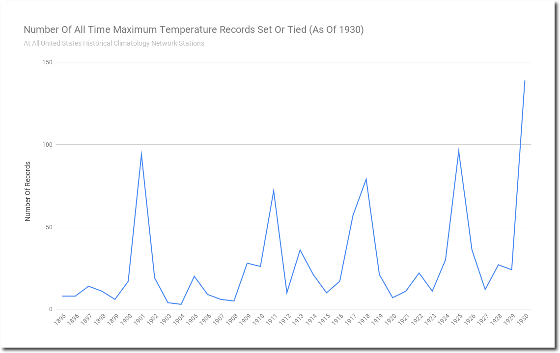
This is what my Google graph would have looked like when Bernie Sanders was a teenager in 1930.
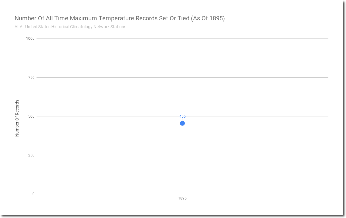
If instead of being 2018, this was 1895 (when Arrhenius invented junk climate science) – my Google spreadsheet graph would look like this. Every single record would have been set that year.
As new years are added, some of the old records are beaten. There is no time bias to my graphs, and it is silly that US cooling deniers continue to beat this dead horse.
