
In 1989, NOAA said that there was no evidence of warming in the US
February 04, 1989
Last week, scientists from the United States Commerce Department’s National Oceanic and Atmospheric Administration said that a study of temperature readings for the contiguous 48 states over the last century showed there had been no significant change in average temperature over that period. Dr. (Phil) Jones said in a telephone interview today that his own results for the 48 states agreed with those findings.
Global Warmth In ’88 Is Found To Set a Record – New York Times
NASA’s James Hansen wrote this in 1999 :
in the U.S. there has been little temperature change in the past 50 years, the time of rapidly increasing greenhouse gases — in fact, there was a slight cooling throughout much of the country
.
But that wasn’t going to scare anyone out of their money, so they simply altered the data. The graph below shows the difference between today’s NCDC published US temperatures, and the thermometer data which it is based on.
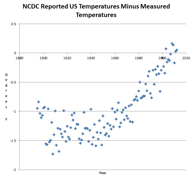
They claim that 2012 is the warmest year by almost a degree, and they accomplished that by subtracting a degree from the hot years of the 1920s and 1930s.

In the business* we call this ‘very creative accounting’
.
.
* The fraud business.
And even more damning:
US Temperatures Have Been Falsely Adjusted
According to the Level of Carbon Dioxide in the
Atmosphere
Holy cow… Nice match.
Steve, notice how in the Jan to Aug series the variation in reported – raw data is very small, but in the new chart on this post, it is very wide. I was thinking Harry has a good match here but now that I look closer I’m not sure. I have the CO2 data de-seasonalized in a special way that can use the monthly data but it removes the monthly seasonality anomalies extremely well. Then you can take the derivative and you get a dCO2/dt curve that is very responsive (extremely responsive) to temperature, i.e. dCO2 and T are extremely well correlated and T causes dCO2 virtually instantly (no lag). With dCO2, you can see the 1998 super el-nino very clearly (CO2 outgassing caused the dCO2 to increase) and you can also see most other global temperature blips. If the blips on the Treported-Traw charts match the blips on the dCO2 chart and we can prove that to a high confidence… Well… That would prove to be exciting. Let’s see if we have that.
To get high confidence, obviously the series with the least variation will have a better result, so now I wonder why Jan to Aug has low variation and why the annual has high variation. Could you could do the analysis and post or email as a .csv for each month so I could play with this and see if the blips match?
Steve,
What I can’t understand is why this sort of thing is never mentioned except by a few under-read bloggers. Please, no offense intended, you have more readers in a day than I do in a year I bet — but this is important, national news and you will never see this on TV.
Even worse, I don’t see things like this often enough at a place like WUWT where sometimes the media pays a little attention.
How can we get the word out to the masses? Beats me.
— Mark
To paraphrase comrade Stalin. “It doesn’t matter what the temperature is. It’s WHO IS measuring the temperature, that matters….”