
[Update : Further checking shows that NOAA has not included the last four days of December in the data set, which were very cold. This could alter the outcome]
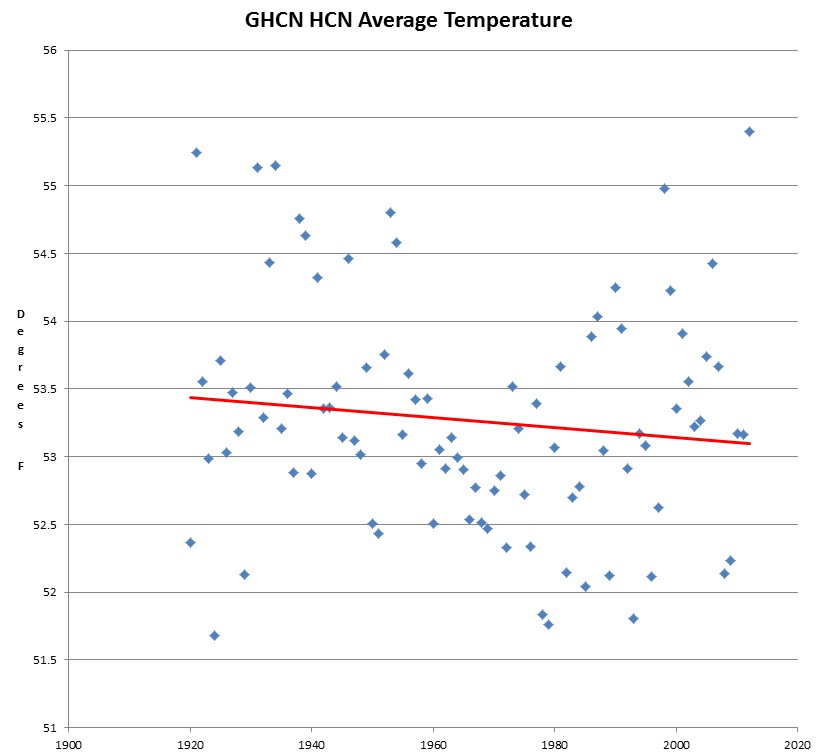
I just checked over my graph and found a major mistake. Maximum temperatures were warmer in 1934 than 2012, but average temperatures were warmer in 2012 than 1934 and 1921. I had previously mistakenly graphed the maximum temperatures as averages.
The graph below shows the correct average temperatures.

http://www.youtube.com/watch?v=9wFVSsFEEAQ
Probably since max temps were warmer in 1934, the higher min temps in 2012 were largely a result of the UHI effect.
Can you do max, min, and average on one chart?
I have my program so I can get any “element” or elements I want from any station in the world, download everything, summarize by month, etc. Next I need to get all the data from chosen countries, states, regions, radius from lat/lon or whatever, then determine what to do with the annual averages I’m getting. I’m thinking a grid approach might be good where for each grid point a few stations are used to calculate an average, with closest ones being most important. Once I get it to state level I guess an area weighted average would be fine. This probably should really be done for every day first since missing data is all over the place. I’m just testing with any old station now, will start doing specific areas next.
It might be good to check mine against yours once I get the station filtering for states / regions / HCN only etc working. Cool so far, but it has taken LOTS of code to extract this data and check it. I hope US data is better than what I am setting up with, you can’t take anything for granted with it. Missing data could be a real issue, though errors tend to cancel so maybe it’s not a huge deal. There has to be a better way than making up data like FILNET does.
The bottom line for me has nothing to do with comparing 2012 to 1934 or 1921; it is that the data is so noisy as to qualify all the variation as garbage. Those years vying for “warmest” are all outliers in the data anyway, and hence mean nothing to me.
Steven, just to cheer you up:
Take a look at this temp chart of The Netherlands of this morning. You couldn’t make it up.
http://i1324.photobucket.com/albums/u604/Scarface-2013/ScreenHunter_130_zps8065df17.jpg
Coldest (-8,0 C) and warmest (-0,9 C) at the coast, least coldest in the East and most cold in the middle! And this is just a piece of land at the North Sea, between the UK and Germany, of about 200×300 km.
How ingenious of the Alarmists that they can measure temps at the poles with just a couple of thermometers! The temps don’t vary there as they do here, I guess…
Interesting that the coldest place is very near the coast (and the relatively warm sea) at Haarlem.
There is another huge error that you and nearly everyone in the climate game makes. it is only by the merest of technicalities that the sum of max/min divided by two can be called an average. By definition any two temperatures taken at any two random times could be used to compute an “average” temperature. It is by no means the average of a day’s temperature except by accident. One must take the sum of many temperatures taken at very short intervals over the full 24 hour day and divide it by the number of measurements before one can have a close approximation of a true average daily temperature.
I know the blah blah blah argument is that such measurements and calculations are not practical because the data does not exist. I also know that the current practice is a damn lie that leads to many accidental and intentional false conclusions. It additionally causes the plots of so called average daily temperature to be noisier than they need be. That noise enables nearly anyone to see almost anything they wish to see. All they have to do is just a little bit of cherry picking of the data. Then they can pretend the cherry picking was accidental, they didn’t mean it, and that it won’t really change the results all that much. Bilge!
In spite of what many/most people think, the reality behind the words IS important. What things ARE is vastly more important and relevant than a convenient, easily misrepresented, and sloppy lets pretend. Many hundreds of billions of dollars have been needlessly spent and tens of millions of real people have died because of this kind of sloppiness.
I am hard pressed to view that it is an innocent mistake on the part of anyone committing it. It is too fundamental of a mistake with such monumental consequences for it to be innocent. It is rather equivalent to picking up a gun, pointing it at someone, and pulling the trigger. Then, when that person dies from the gun shot wound, claiming innocence because you didn’t know the gun was loaded and really didn’t intend to hurt anyone. You willfully picked up the gun, you willfully aimed the gun, and you willfully pulled the trigger. Claims of ignorance and lack of intent does not absolve you of being responsible for the consequences.
A bit over the top don’t ya think Lionell.
NO. Using the max and min as the bases for a so called average daily temperature gives a wrong result from the get go. To continue to pretend that it is a physically meaningful value IS pulling the trigger. Words mean things. Pretending they mean something they don’t is neither honest nor innocent no matter what the so called intent.
A brazen example of word abuse is found in many standard sea level studies such as the works of White and of Rahmstorf: graphs are labeled “sea level” but really plot not sea level but a virtual one that does not exist in the real world, based on massive hand waving adjustments claiming that human made damns and reservoirs require that a pretend sea level (higher of course!) can be shown to policy makers.