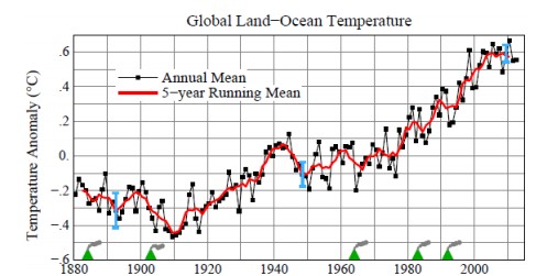
Hansen just released this graph
www.columbia.edu/~jeh1/mailings/2013/20130115_Temperature2012.pdf
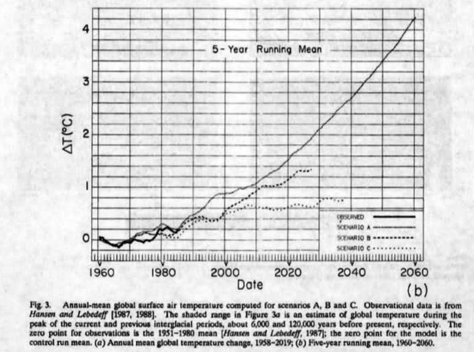
Compare that to his 1988 forecast
http://pubs.giss.nasa.gov/docs/1988/1988_Hansen_etal.pdf
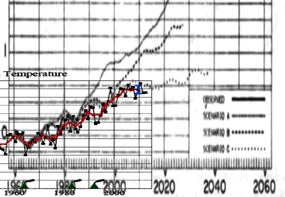
The image below overlays Hansen’s current temperature graph on his 1988 forecast, normalized to the 1960s and 1970s. Note that temperatures are running well below Scenario C. Scenario C assumed that no more CO2 is added to the atmosphere after the year 2000.
scenario C assumes a rapid curtailment of trace gas emissions such that the net climate forcing ceases to increase after the year 2000.
Hansen has thus proven that man-made CO2 has little or no impact on the climate. Why is this scam continuing?


I noticed this years ago, and if you talk to a climate wannabeliever they will tell you that Hansen’s predictions were absolutely right and CO2 has everything to do with warming and it will be catastrophic!
As Joseph Goebels is reputed to have said,
“If you repeat a lie often enough, it becomes the truth. ”
Could we have detail on what exactly the scenarios consisted of? I’m assuming it’s different amounts of co2 emissions, but what are the figures?
I wonder because I’m pretty sure we have emitted more co2 than scenario A assumes, and as this is one of the oldest global warming projections, it’s failure is one of the strongest pieces of evidence against the theory.
Actual CO2 levels today fairly closely match scenario B.
Show some evidence top back up that assertion
Steve, I don’t tend to need to “prove” assertions that should be common knowledge among sceptics.
What CO2 levels does scenario B estimate circa 2013?
What are the actual CO2 levels today?
“December 2012: 394.28 ppm ”
http://www.esrl.noaa.gov/gmd/ccgg/trends/
For Scenario B calculations see:
“I think that Scenario B is close enough to observed emissions that, in the absence of NASA being able or willing to re-run the actual 1988 model with actual forcings, one can be reasonably use Scenario B for comparisons.”
http://climateaudit.org/2008/07/28/hansen-update/
http://climateaudit.org/2008/01/24/hansen-1988-details-of-forcing-projections/
His 1988 paper says “Scenario B assumes a reduced linear growth of trace gases” Obviously that did not occur.
If you read the links carefully you can see how the temperature to CO2 forcing is calculated in ppm. Scenario B is closest. You can criticise Hansen’s economic forecasting but that’s hardly interesting is it? It’s his climatological forecast we should focus on. Anyway, scenario B is way out. Hard to see what the fuss is about. The forecast was looking way out back in 2008. Now it looks utterly absurd in 2013.
I’m reading his original 1988 paper. I’m not real interested in how anyone might have tried to change the rules later.
I’ve noticed when you have to concede a small point you tend to start mumbling… 😉
Cut the crap please. CO2 has increased exponentially, not “reduced linear”
Are you having reading comprehension issues?
“I’m reading his original 1988 paper. I’m not real interested in how anyone might have tried to change the rules later.”
The way I read it, the rules haven’t changed; he just got it wrong back in 1988. That’s the thing about Hansen: he gets things wrong; often. Apparently scenario C still fits zero emissions since 2000, so he’s even more wrong about CAGW.
The trouble with today’s society is that if you’re spectacularly wrong, you tend to receive more praise and attention, just as long as what you’re saying is really scary.
Actual CO2 levels today fairly closely match scenario B.
Will – it’s a meaningless statement. The graph clearly states that it is for “Temperature.”
This is how this whole AGW scam started – someone noticed that the gradient of the CO2 graph and the gradient of the temperature graph at one point were “sorta the same” – and it became received wisdom.
A more accurate statement would, perhaps, be:
“A graph of CO2 levels over the same period fairly closely match the temperature projections in scenario B.”
It would still be a meaningless statement, as Scenario B is only a temperature “projection” – i.e. the ramblings of a deranged mind – and bear no relation to any observed reality.
“Cut the crap please. CO2 has increased exponentially, not “reduced linear””
My definition of someone who wants to talk crap, is someone who wants to focus on the semantics of a particular sentence while ignoring the actual mathematical calculations of the Hansen model.
@Ivan
“The graph clearly states that it is for “Temperature.”
Don’t understand what your ramble is about. The Hansen model is about the relationship between CO2 versus temperature. If CO2 increases by quantity X then the temperature will be Y. He was predicting the temperature in 2013 based on that relationship. His model doesn’t predict how much *actual* CO2 will be in the atmosphere in 2013. That’s why he provided scenarios A, B and C as *estimates.* That’s because his time machine was broken at the time. 😉
Don’t understand what your ramble is about.
My ramble was about your ramble.
If you missed the point that I directly copied part of your ramble, then we are probably both going around in circles.
@Ivan.
I’m not the one rambling here. If the model calculates that @ 394ppm the temperature will be X, you see how well the model did by checking it against the global average temperature. It’s a factual statement that’s true or false.
“Scenario B assumes a reduced linear growth of trace gases” is as clear as “the right to keep and bear arms shall not be infringed”
It’s a bit of a moot point as to whether you are rambling or just confused.
What you said was:
Actual CO2 levels today fairly closely match scenario B.
What I interpreted this statement to mean is:
“My graph of apples (CO2 levels) fairly closely matches your graph of oranges (temperature).”
Here are your three choices:
Scenario A – exponential growth.
Scenario B – near linear growth
Scenario C – no growth
Here is a pretty picture:
http://upload.wikimedia.org/wikipedia/commons/thumb/6/64/Exponential.svg/718px-Exponential.svg.png
Here is what actually happened:
http://upload.wikimedia.org/wikipedia/commons/thumb/5/51/Mauna_Loa_Carbon_Dioxide-en.svg/800px-Mauna_Loa_Carbon_Dioxide-en.svg.png
What one is closest?
You can whine about it all you like, but scenario B was fairly close to what actually happened. It’s the closest of the three possibilities by a wide margin.
“reduced” linear growth. The graph you included for scenario b is exponential, not linear.
the correct answer is scenario a
Will – what are you smoking?
but scenario B was fairly close to what actually happened
On what planet did a temperature increase actually happen according to what is represented by the temperature graph of Scenario B??
@Ivan
Steve and I are not arguing that Hansen got his model wrong.
@Steve
I presume you acknowledge that the CO2 increase has been linear.
But from that you declare that expotential growth (scenario A) is actually closer to what happened than something near to linear. That’s a stupid argument. You know it. I know. You’re just being pig headed. 🙂
The increase has been exponential. Joe Romm called it “super-exponential” What are you talking about?
“The increase has been exponential. Joe Romm called it “super-exponential” What are you talking about?”
So Joe’s a great source of credible information when it suites you?
If you say CO2 increase has been exponential, then prove it. If you don’t like the Mauna Loa data set (I’ve linked to it multiple times) then tell me which one I should be looking at. If you can back up your claim with data I’ll be the first one here to change my mind.
Will,
The scenarios deal with emissions (CO2 released into the atmosphere) which have been rising exponentially. The Mauna Loa data is atmospheric concentration (CO2 in the atmosphere) which has been rising linearly. They are two different things.
This is very similar to the situation which exists in relation to the IPCC AR4 “commitment” scenario, which also assumes zero growth in greenhouse emissions since 2000.
In that case, the 5 year averages of NASA/GISS, NCDC/NOAA, UAH, RSS, HADCRUT3 and HADCRUT4 are between 0.07c and 0.14c below the 5 year average scenario multi-model mean.
Otherwise, global temperatures are below what they were projected to be if greenhouse emissions had not increased, even though, as we all know, such emissions have continued to increase.
I wonder why more publicity has not been given to this “inconvenient truth”.
Given this fact, I also don’t understand how anyone can say that the situation is worse than expected.
I’m experiencing a long stretch of freezing nights.
In the past, we’d get a breather.
No break yet.
This global warming is killing my plants.
The online forecasts state safe temps but my thermometer keeps freezing.
Their wishing and stating it warmer doesn’t make it so.
Somebody’s messin’ with the numbers.
The logical contortions I had thrown at me by readers of RealClimate.org to explain away this gross failure of Hansen’s prediction told me there was no hope of changing the views of “true believers,” so I stopped debating such people and merely used their barrage of communal link bombing on news sites as a natural excuse to post more info-graphic content designed for a lay audience with the strategy of reaching those few science buffs in any community’s collection of politically active friends. I did this sixteen hours a day for eight months back in 2009/2010, covering all news stories from Tom Nelson’s blog and finally adding Google News too in order to reach every local news site on the planet.
Today, gratifyingly, a Harvard policy study claims that Republican opposition to energy rationing was forced by newly elected libertarians:
“Environmental groups overlooked growing opposition to environmental protections among conservatives voters and, underestimated the rising force of the Tea Party, believing – wrongly, as it turned out – they could still somehow win over Republican members of Congress through “insider grand bargaining”.
That fatal misreading of the political realities – namely, the extreme polarisation of Congress and the Tea Party’s growing influence among elected officials – doomed the effort to get a climate law through Congress. It will also make it more difficult to achieve climate action in the future, she added.”
http://www.guardian.co.uk/environment/2013/jan/14/environmental-groups-climate-change-inaction?intcmp=122
“Now, as then, I can assert that these conclusions have a certainty exceeding 99%.”
– James Hansen.
http://www.guardian.co.uk/environment/2008/jun/23/climatechange.carbonemissions
(It could have been worse. He could have asserted, “I will bet my testicles…”)
I’d rather collect on the testicle bet and put him up for a Darwin award…..
Methinks Jimmie H put this out during cocktail hour forgetting to do his ‘adjustments’ . Shame on him.
Will Nitschke says: January 17, 2013 at 8:13 pm
Actual CO2 levels today fairly closely match scenario B
————————————————————————————–
Yes, however emissions are well above scenario A. You know what the whole claim is about is emissions, and the demand to tax everyone to cut emissions. Also the real T is well below scenario C. Hansen, wrong wrong and wrong.
No, Hansen’s model is based on atmospheric CO2, not emissions.
Hansen’s model is now shown to be wrong. Why some people want to confuse this with unnecessary bullshit is absurd. Alarmists will focus on the part where you are bullshitting, and not the important part, which is that the model is wrong.