Another MWP Smoking Gun

It turns out that Hansen 1981 is based on a paper in Nature from 1975

2016-01-15-20-57-47

24 May 1975, Page 12 – at Newspapers.com

Hansen 1981 matched the 1990 IPCC report

2016-01-14-11-40-54

Briffa’s trees (green) matched the 1990 IPCC report.

2016-01-05-05-27-33

Despite overwhelming evidence to the contrary, climate fraudsters continue to insist that the 1990 IPCC graph (which is clearly marked as global) was based only on temperatures from central England.

Posted in Uncategorized | 13 Comments

Our Brave Commander In Chief

CYzI9ifUMAQK5jm

Posted in Uncategorized | 20 Comments

The Leaders In The Fight Against Global Warming

images (7) images (8) CYy5e-EUsAEZToy

Posted in Uncategorized | 12 Comments

Reggie Lives!

2016-01-15-11-17-03

I thought Blowtorch Reggie was gone, but he lives on.

Posted in Uncategorized | 40 Comments

The 52% Consensus

The 97% consensus quoted daily by Barack Obama is based on a few fraudulent studies of a handful of published papers.

The only study which actually asked the scientists was done by the American Meteorological Society in 2013. It showed that only 52% of professional members believed the cause of global warming was “mostly human.” Among professional forecasters, the number was closer to 38%.  No group came anywhere close to 97%.

2016-01-15-05-19-51

2016-01-15-05-21-43

http://journals.ametsoc.org/doi/pdf/10.1175/BAMS-D-13-00091.1

Posted in Uncategorized | 38 Comments

“If the facts don’t fit the theory, change the facts.”

“If the facts don’t fit the theory, change the facts.”

  • Albert Einstein

Einstein was just joking, but that is exactly what the Climategate team has done to the surface temperature record.
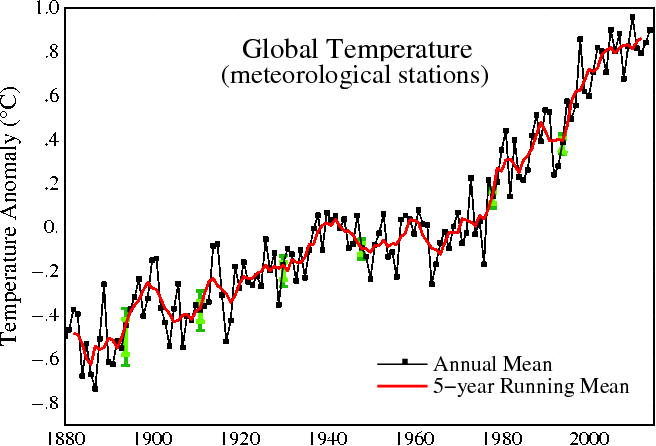
 

Fig.A.gif 

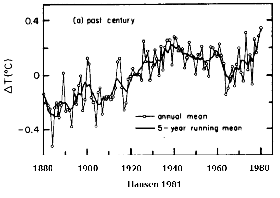
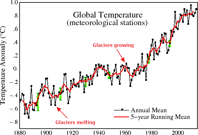
We have all grown used to seeing graphs like the one at above from NASA, showing nearly continuous global warming over the last 135 years – with a flat period between 1940 and 1980, and 1.2C warming from 1880 through 2000.

Much of climate science, journalism and public policy is based around the belief that these NASA graphs are an accurate representation of the temperature record, and that the apparent warming which is shown in the graphs is due to an increase in atmospheric CO2. It is therefore very important to understand the accuracy, consistency and integrity of these graphs.

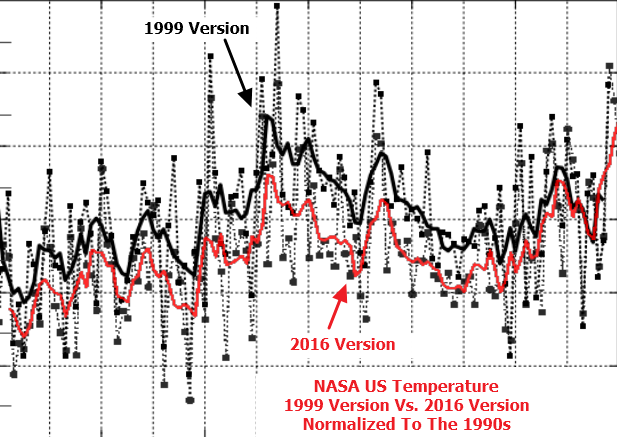
However, if we look at earlier versions of the same graph, we see something very different. The graph below was published by NASA in 2001, and showed 1975 as barely warmer than 1880 – with less than 0.6C warming from 1880 to 2000. The 2001 version showed only half as much warming from 1880 to 2000 as the 2016 version of the same graph above.
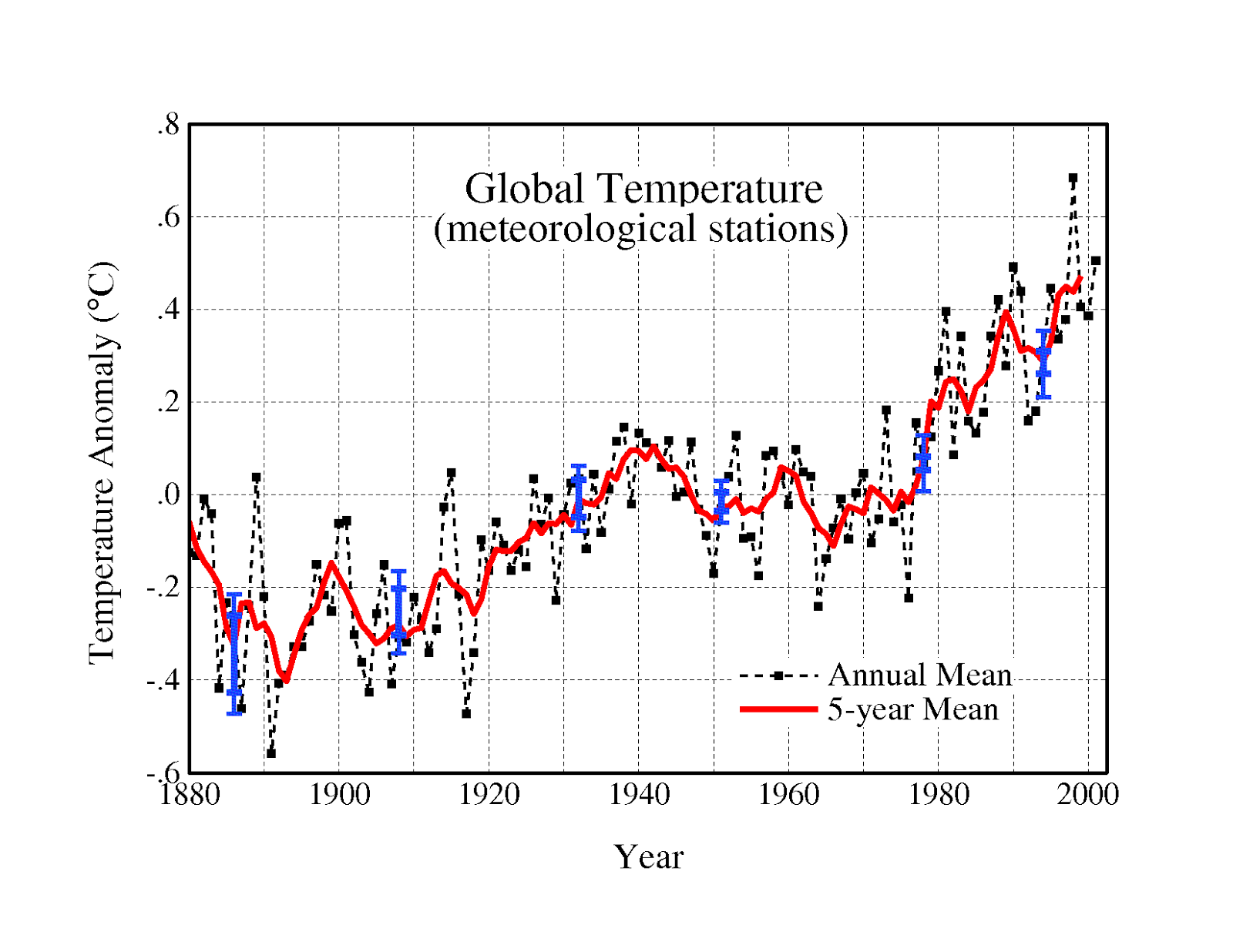
Fig.A.ps

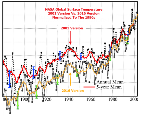
The recent increase of 0.6C in NASA’s reported warming over the 1880-2000 time period, is particularly troubling because the recent alterations extend far outside of their own error bars. The graph at right shows the 2001 version and the 2016 versions at the same scale, normalized to the most recent common decade. The blue lines represent the 2001 error bars, and the green lines represent the 2016 error bars. Note how the alterations are about three times as large as NASA’s reported error. This indicates a scientific process which is completely broken.

2016-01-12-06-41-10

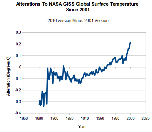
The graph below shows the changes which have been made to the NASA 1880-2000 temperature trend since 2001, a total of more than half a degree. The alterations have been almost as large as the entire trend reported in 2001, indicating a signal to noise ratio of close to zero. In other words, the NASA temperature graph is meaningless from a scientific point of view.

2016-01-10-10-51-29.png

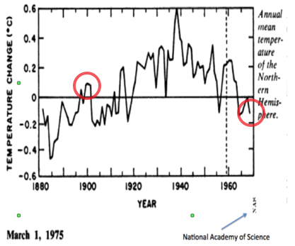
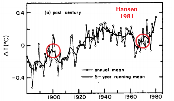
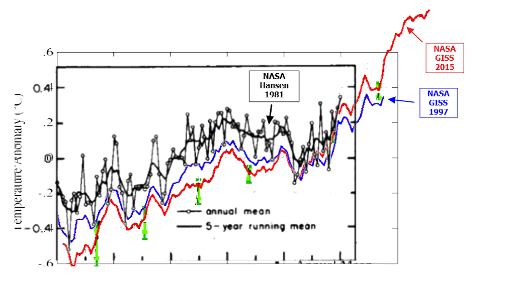
Going further back in time with published NASA temperature record, we see even larger discrepancies. NASA’s James Hansen in 1981 (below) showed a spike in temperatures around 1940, followed by nearly 0.3C cooling until the late 1960’s. This spike and cooling has been almost completely erased from the NASA temperature record.

Challenge_chapter2.pdf

The image below overlays Hansen 1981 graph on the current NASA surface temperature record, and shows how pre-1980 temperatures have been cooled. By cooling the past, NASA increased the total amount of warming, removed the 1940’s spike, and removed the post 1940’s cooling.


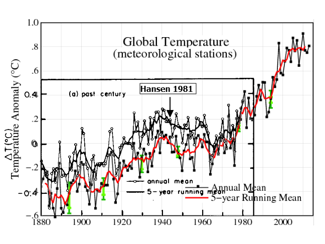
 These alterations did not occur all at once, but rather have occurred in successive stages, where the past is made cooler to create the appearance of more warming. The amount of warming from 1880 to 1980 has been doubled since Hansen 1981.

2015-12-07-08-37-47

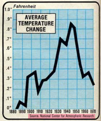
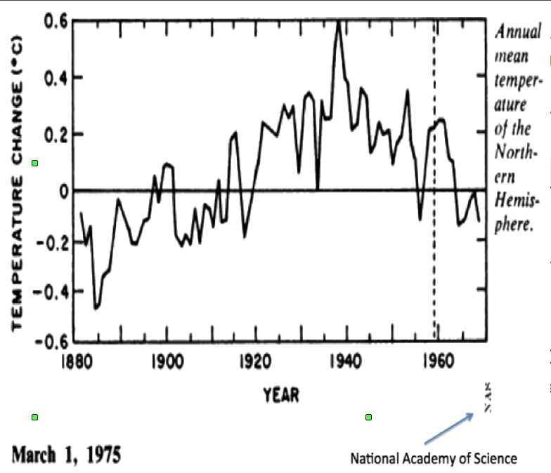
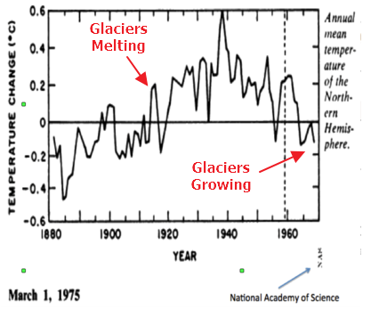
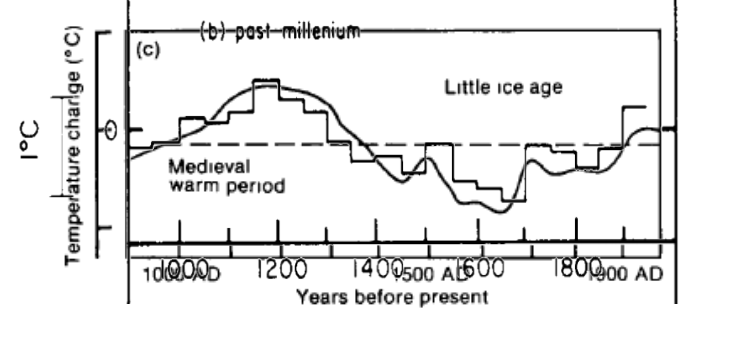
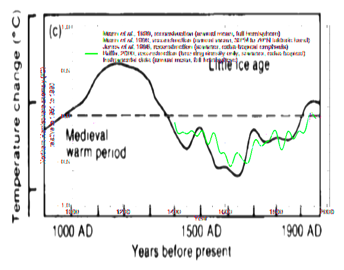
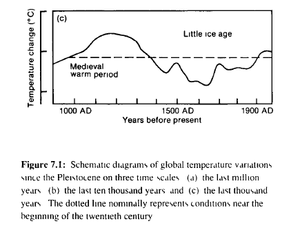
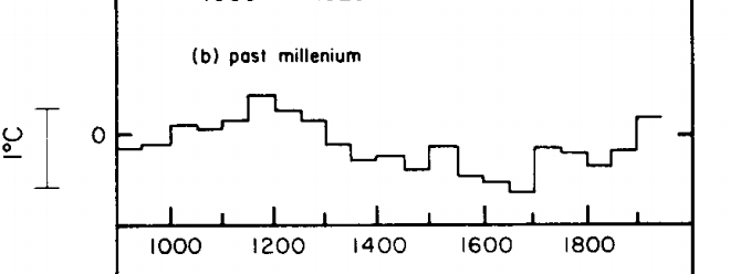
 Before NASA was involved, the National Academy of Sciences and NCAR both showed even more post-1940’s cooling, and that Northern Hemisphere temperatures were no warmer in the late 1960’s than they were at the beginning of the 19th century. These graphs are completely different from the current NASA graph.

CTdUc4vWEAAxgDt.png

coolingworld.pdf                                       Page 148 : understandingcli00unit.pdf

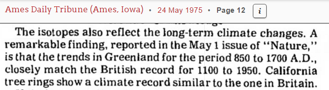
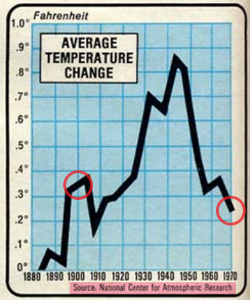
In 1974, the US Science Board reported a sharp cooling since World War II. The image below is from the November, 1976 issue of National Geographic

  2016-01-10-12-26-45.png

That same issue of National Geographic included the graph below, and the following text.

“Downward trend of temperature since 1938 has come nearly halfway back to the chill of the Little Ice Age 300 years ago”

This downwards trend has been nearly erased by NASA and NOAA.

2016-01-10-12-37-06.png

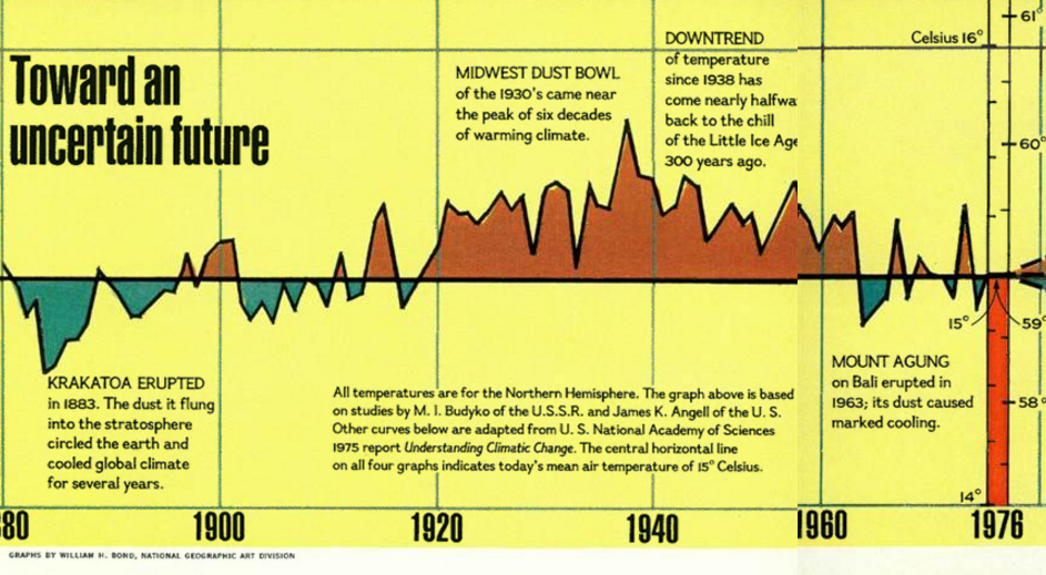
National Geographic : 1976 Nov, Page 614

 During the 1970s, the American Association For The Advancement of Science reported a global cooling trend since 1940 – as did Columbia University

CRodhLAVAAADroE.pngCRsGcKMUwAEFsAJ (1).png

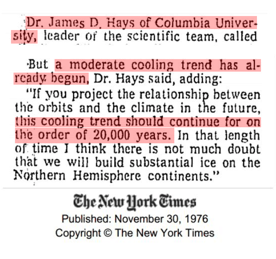
TimesMachine: November 30, 1976                    4 Mar 1974, Page 1 – at Newspapers.com

In 1961 there was “unanimous agreement” among climate experts that Earth was getting colder. In 1979, the cooling was considered “indisputable” and NOAA reported about 1 degree F cooling since World War II

CQ1prlDU8AAILQx (1).png 2016-01-10-13-05-43.png

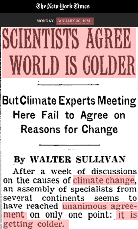
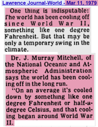
SCIENTISTS AGREE WORLD IS COLDER   Lawrence Journal-World

The CIA warned that the cooling trend threatened political stability. The US and Russia mounted ‘large-scale investigations to determine why the Arctic climate is becoming more frigid” and the ice was getting thicker.

CRwiEAwUkAEMVsS.png  2016-01-10-15-32-14.png

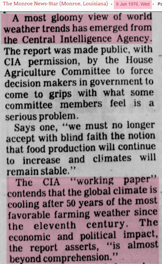
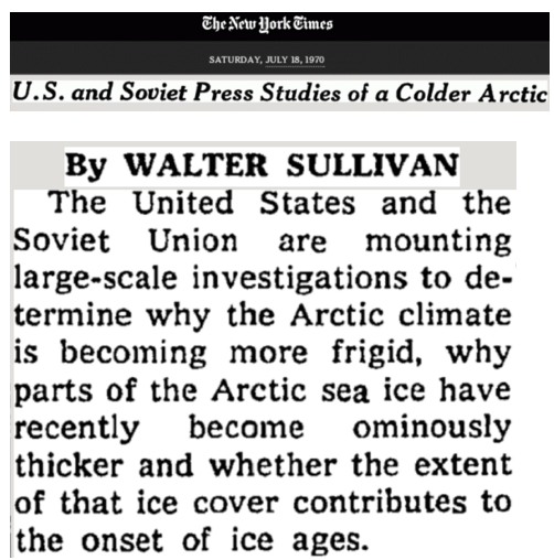
9 Jun 1976, Page 4                                     U.S. and Soviet Press Studies of a Colder Arctic;

Sixty theories were put forward to explain the cooling

CSngEl1UkAA5FiT.png

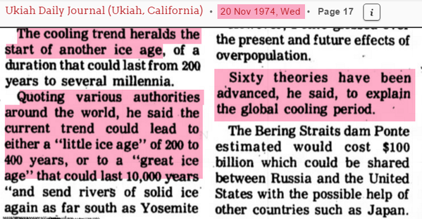
20 Nov 1974, Page 17 – at Newspapers.com

 Further evidence for the cooling was that during the late 1950s and 1960s, glaciers were advancing for the first time in over a century.

ScreenHunter_3425-Oct.-08-15.20.gif   PaintImage471.png

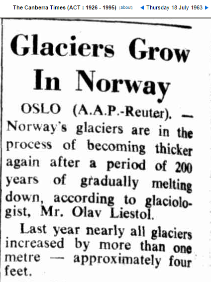
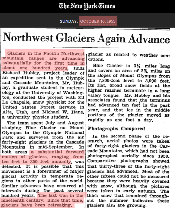
Glaciers Grow In Norway                Northwest Glaciers Again Advance

This cooling was a big change from the previous decades. Glaciers were disappearing in the early part of the century, and many had vanished by 1923.

CVeJXGtUAAAZ-J6.png    CRrqyZAVEAIZ0v4.png

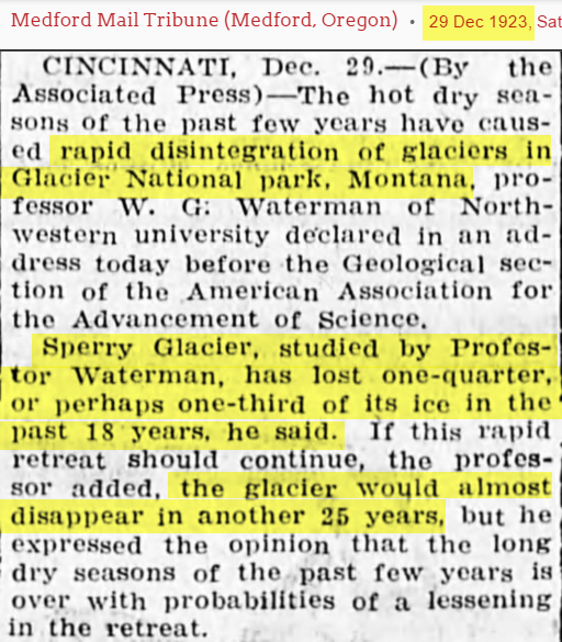
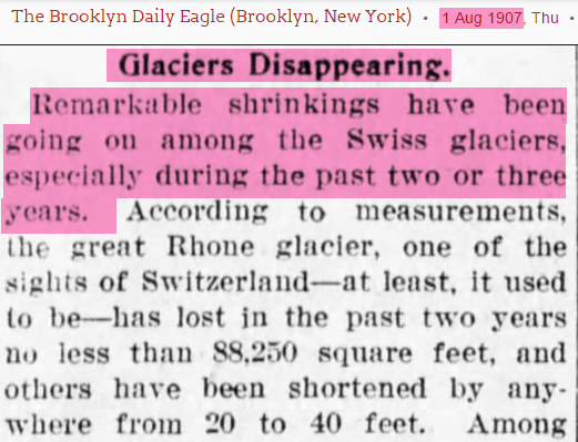
29 Dec 1923, Page 5                                       1 Aug 1907, Page 4

2016-01-11-10-40-30.png   CWmFv2UVAAEIqBi.png

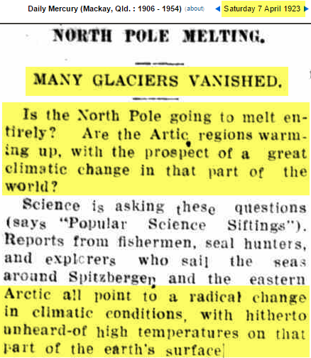
07 Apr 1923                                               Retreat of the Ice Rivers in the Alps

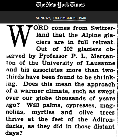
During the 1930s and 1940s, the glaciers of Norway and Greenland were rapidly melting and faced “catastrophic collapse.” By 1952 the glaciers of Norway and had lost half of their mass.

CWGy27DUkAEFL7L.png

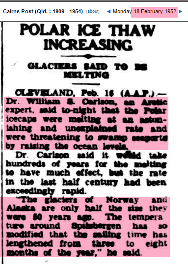
18 Feb 1952                                                  17 Dec 1939, Page 15

National Geographic showed images of rapid glacial retreat in the Alps by 1940.

2016-01-11-11-16-41.png2016-01-11-11-16-56.png

National Geographic : 1976 Nov, Page 594

Evidence for the earlier warmth and post WWII cooling is very compelling . So why does it no longer appear in the NASA temperature record? NASA shows the period during the 1960s when glaciers growing as warm, and the earlier period when they were melting earlier as cold. The NASA temperature record does not appear consistent with the evidence on the ground, whereas the 1975 National Academy of Sciences graph is consistent.

CVtF82NU8AAcUb7.pngCYcpL6gWcAEyTEz.png

This Climategate E-mail provides a big hint as to what has happened to the data since 1975. Climate scientists wanted to get rid of the “1940s blip”

From: Tom Wigley <[email protected]>
To: Phil Jones <[email protected]>
Subject: 1940s
Date: Sun, 27 Sep 2009 23:25:38 -0600
Cc: Ben Santer <[email protected]>

So, if we could reduce the ocean blip by, say, 0.15 degC,
then this would be significant for the global mean — but
we’d still have to explain the land blip.

It would be good to remove at least part of the 1940s blip,
but we are still left with “why the blip”.

di2.nu/foia/1254108338.txt

Removing the 1940s blip is exactly what NASA did. This is particularly evident in Greenland, Iceland and United States temperature data.
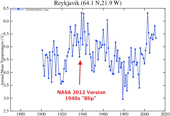
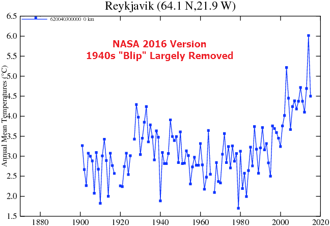
station (2).gifReykjavik01112016.gif

Data.GISS                                                               Data.GISS

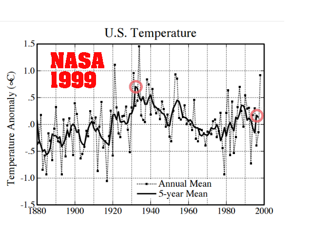
In 1999, NASA’s James Hansen reported that the US cooled half a degree since the 1930’s.

GISS_US_2016

pubs.giss.nasa.gov/docs/1999/1999_Hansen_etal_1.pdf

Whither U.S. Climate?

By James Hansen, Reto Ruedy, Jay Glascoe and Makiko Sato — August 1999

in the U.S. there has been little temperature change in the past 50 years, the time of rapidly increasing greenhouse gases — in fact, there was a slight cooling throughout much of the country (Figure 2)

NASA GISS: Science Briefs: Whither U.S. Climate?

NASA now shows warming during that same period. NASA US temperature data is based on  NOAA USHCN data, which is massively altered to create the appearance of warming.
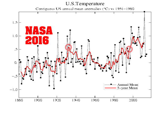
GISS_US_1999

Fig.D.gif (525×438)

GISS_US_1999-2016

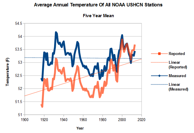
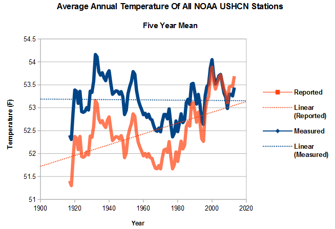
The graph below shows how the NOAA data is altered. The blue line shows the averaged measured temperature at all USHCN stations, and the red line shows the average adjusted temperature. The warming trend over the last century is entirely due to “adjustments” by NOAA. Note how the “1940s blip” has been largely removed.

2016-01-10-06-45-38.png

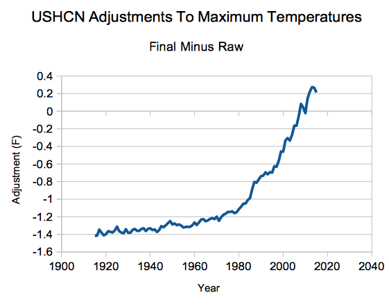
The image below shows the adjustments made by NOAA to the US temperature record – a total of 1.6 degrees F.

2016-01-10-06-45-08.png

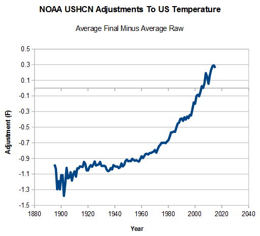
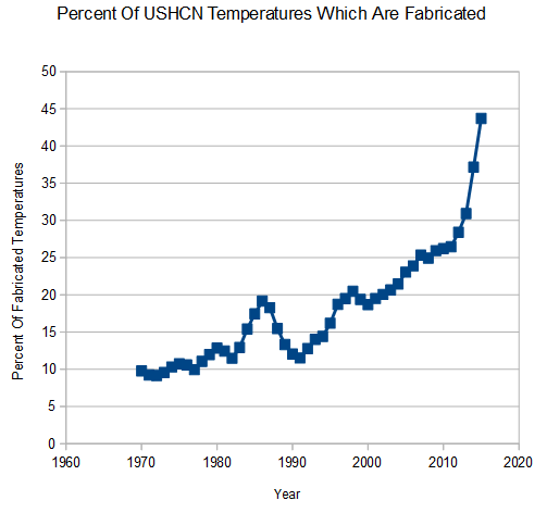
A large portion of these adjustments is due to NOAA simply making up data. If they are missing data at a particular station one month, they use a computer model to fabricate the temperature for that month. Since 1970, the percent of fabricated data has increased from 10% to almost half of the data. The US temperature record from NASA and NOAA is thus a completely meaningless fabrication, which bears no resemblance to the thermometer data it is derived from.

2016-01-08-07-32-57.png

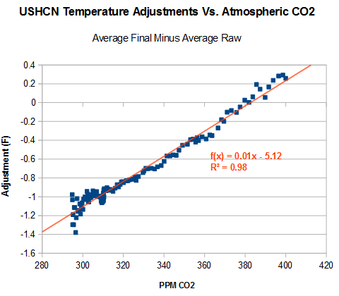
The data has been adjusted to match the increase in carbon dioxide. In other words, it is being forced to fit to greenhouse gas theory.

2016-01-14-04-18-24

In summary, the NASA global and US temperature records are neither accurate, nor credible representations of reality.

“With four parameters I can fit an elephant, and with five I can make him wiggle his trunk”

  • John von Neumann
Posted in Uncategorized | 37 Comments

Hansen Confirmed The MWP In 1981

Climate fraudsters frequently claim that the 1990 IPCC temperature graph below showing the Medieval Warm Period (MWP) was only a representation of Central England Temperatures (CET) and was not global.

2016-01-14-10-57-47

This is nonsense. The graph was derived from James Hansen’s 1981 study, which was taken from temperatures in England, California and Greenland.
2016-01-14-10-54-272016-01-14-10-52-31

Global temperature trend for …. (b) is based on temperatures in central England, the tree limit in the White Mountains of California, and oxygen isotope  measurements in the Greenland ice (W. Dansgaard of the Geophysical Isotope Laboratory, University of Copenhagen, pers. comm.), with the  temperature scale set by the variations in the last 100 years

Challenge_chapter2.pdf

The overlay below shows that the 1990 IPCC graph is essentially the same graph as Hansen 1981.

2016-01-14-11-40-54

Hansen’s paper was based on study in Nature from 1975.

2016-01-15-20-57-47

24 May 1975, Page 12 – at Newspapers.com

The MWP was real, and no matter how many different ways climate criminals find to lie about it, they can’t make it disappear.

Posted in Uncategorized | 52 Comments

Eisenhower Warned Of Government Science Corruption in 1960

In 1960, Eisenhower saw the roots of corruption in science, which has led to the farce which climate science has become under Barack Obama.

In this revolution, research has become central; it also becomes more formalized, complex, and costly. A steadily increasing share is conducted for, by, or at the direction of, the Federal government.

Today, the solitary inventor, tinkering in his shop, has been overshadowed by task forces of scientists in laboratories and testing fields. In the same fashion, the free university, historically the fountainhead of free ideas and scientific discovery, has experienced a revolution in the conduct of research. Partly because of the huge costs involved, a government contract becomes virtually a substitute for intellectual curiosity. For every old blackboard there are now hundreds of new electronic computers.

The prospect of domination of the nation’s scholars by Federal employment, project allocations, and the power of money is ever present and is gravely to be regarded.

Yet, in holding scientific research and discovery in respect, as we should, we must also be alert to the equal and opposite danger that public policy could itself become the captive of a scientific technological elite.

Military-Industrial Complex Speech, Dwight D. Eisenhower, 1961

Posted in Uncategorized | 86 Comments

The History Of NASA/NOAA Temperature Corruption

In 1974, The National Center For Atmospheric Research (NCAR) generated this graph of global temperatures, showing a large spike in the 1940’s, rapid cooling to 1970 and net cooling  from 1900 to 1970.

CTdUc4vWEAAxgDt

denisdutton.com/newsweek_coolingworld.pdf

In 1975, the National Academy of Sciences published a very similar graph for Northern hemisphere temperatures, which also showed net cooling from 1900 to 1970.

CVtF82NU8AAcUb7-1

Page 148 : understandingcli00unit.pdf

By 1981, the graph had started to tilt to the left. Temperatures in 1970 were now about 0.1C warmer than 1900.

2016-01-13-05-51-45

Not surprisingly, this change coincided with James Hansen’s interest in demonstrating a CO2 driven warming trend.

2016-01-13-06-31-15

Challenge_chapter2.pdf

This pattern of NASA making the past cooler and the present warmer has occurred repeatedly since NASA became chartered with proving global warming. The past keeps getting colder.

2015-12-07-08-37-47-1024x584-1024x584

1981: Challenge_chapter2.pdf
2001: Fig.A.ps
current: Fig.A.gif 

The next graph shows how 1880-2000 global warming has been doubled since 2001, simply by altering the data. This graph is normalized to the most recent common years of the 1990’s.

2016-01-12-06-41-10

The NASA temperature data is based on NOAA GHCN (Global Historical Climatology Network) data.  The map below shows where their stations are located, with gray representing no data. They are missing data for about half of the Earth’s surface including most of Africa, Antarctica and Greenland.  The only places with complete coverage are the US and Western Europe.  The gray areas are filled in with computer modeled temperatures, meaning that about 50% of the global data used by NASA and NOAA is fake.

201511201511.gif (990×765)

The US temperature record has been similarly altered. In 1999, James Hansen reported 0.5C US cooling since the 1930’s.

GISS_US_2016

pubs.giss.nasa.gov/docs/1999/1999_Hansen_etal_1.pdf

Whither U.S. Climate?

By James Hansen, Reto Ruedy, Jay Glascoe and Makiko Sato — August 1999

in the U.S. there has been little temperature change in the past 50 years, the time of rapidly increasing greenhouse gases — in fact, there was a slight cooling throughout much of the country (Figure 2)

NASA GISS: Science Briefs: Whither U.S. Climate?

In 1989 NOAA also reported no warming in the US over the past century.

2015-12-18-12-01-35

U.S. Data Since 1895 Fail To Show Warming Trend – NYTimes.com

The current NASA graph has eliminated the 1930-1999 cooling.

GISS_US_1999

Fig.D.gif (525×438)

The animation below shows how NASA has altered their own data to make the post-1930’s cooling disappear.

GISS_US_1999-2016

The graph below overlays the 1999 and 2016 versions, normalized to the most recent common years in the 1990’s. It shows how the past has been cooled to create a fake warming trend.

2016-01-14-03-33-21

NASA US temperatures are based on NOAA USHCN (United States Historical Climatology Network) data. The graph below shows the average of their measured temperatures in blue, and the average of their “adjusted” temperatures in red. The entire US warming trend over the past century is due to data tampering by NOAA and NASA.

2016-01-12-06-46-13

The graph below shows the hockey stick of adjustments being made to US temperatures since 1980. This is calculated as the red line in the image above minus the blue line above.

Screenshot 2016-01-02 at 01.07.45 PM

The bulk of the data tampering is being done by simply making temperatures up. If NOAA is missing data for a particular station in a particular month, they use a computer model to calculate what they think the temperature should have been. In 1980 about 10% of the data was fake, but now almost half of it is fake.

2016-01-08-07-32-57

And here is the smoking gun of fraud. The adjustments being made correlate almost perfectly to the rise in atmospheric CO2. The data is being tampered with to match greenhouse gas warming theory.

2016-01-14-04-18-24

Evidence is overwhelming that the US used to be much hotter. Prior to 1960, the frequency of hot days in the US was much larger. The graphs below were generated from the same NOAA data sets used in the graphs above.

Screenshot 2015-12-31 at 07.26.55 PMScreenshot 2015-12-31 at 08.12.35 PM

The areal coverage of hot weather in the US was also much larger prior to 1960.

2016-01-08-07-12-41-1

The surface temperature record presented by NASA and NOAA have little or nothing to do with reality. They are tools used by the White House to push their political agenda.

Posted in Uncategorized | 169 Comments

25 Years After Freddy Mercury’s Death

https://www.youtube.com/watch?v=YoDh_gHDvkk

And still no global warming

CWxou2-UwAEmHxx

Posted in Uncategorized | 48 Comments