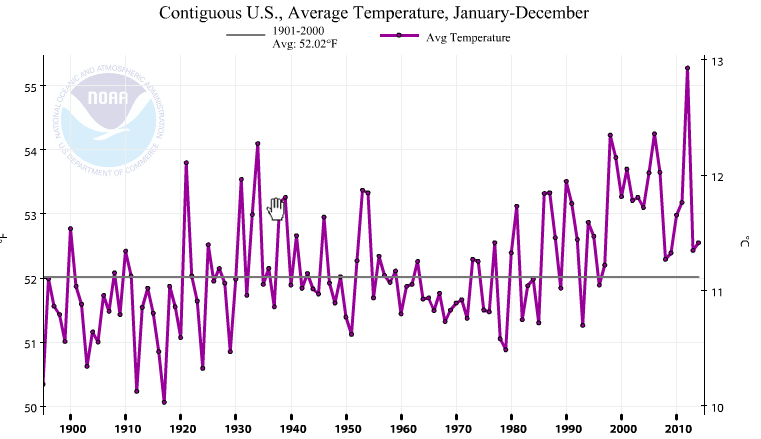
Driving to work on Thursday, I heard NCDC announce that 2014 was hotter than normal in the US for the 18th consecutive year, and that it was an extreme climate year.

State of the Climate | National Climatic Data Center (NCDC)
This is nonsense. Before data tampering, the US was below normal, as were four of the last seven years.
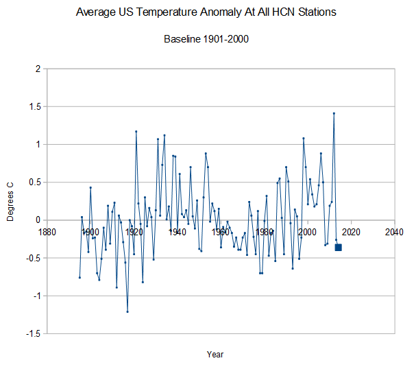
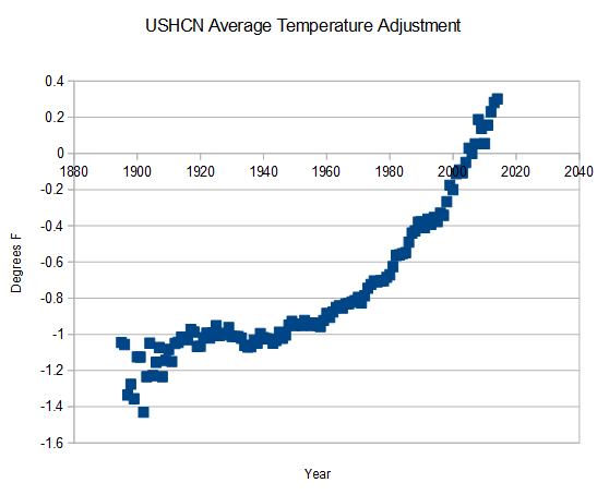
In order to create their fake US temperature graph, they massively alter the data
Including completely fabricating 30% of the monthly data, which they say is missing.
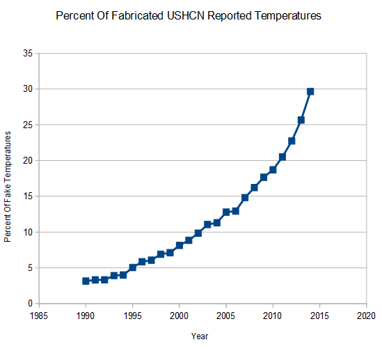
The net result of their tampering is to create a warming trend which does not exist in the data – as seen in the animation below.
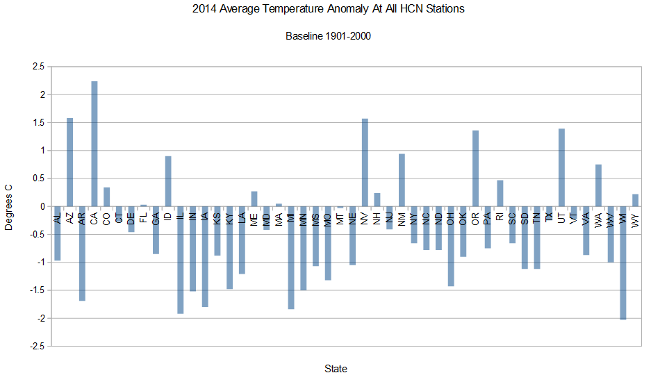
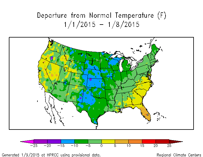
More than two thirds of the states were below normal temperature. West Virginia was 2C below normal.

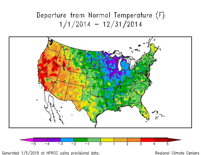
Current Climate Summary Maps – Powered by ACIS – High Plains Regional Climate Center
The ratio of record lows to record highs was the highest since the volcano cooled year of 1993, and one of the highest on record.

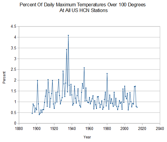
The percentage of days over 100 degrees was one of the smallest on record.
The number of tornadoes was the lowest on record.
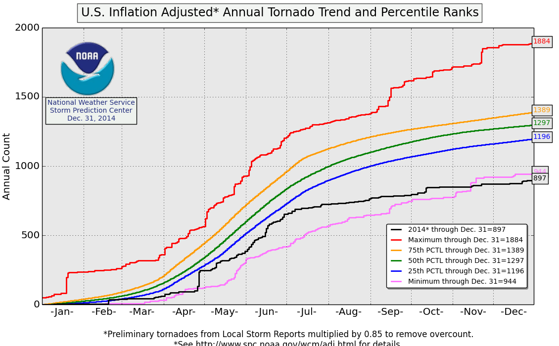 torgraph-big.png (1130×700)
It has been ten years since the last major (category 3-5) hurricane strike in the US. The longest such period on record.
The US was wetter than normal in 2014, with droughts diminishing over the past 80 years.

Forest fire burn acreage was well below normal
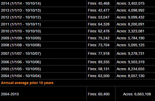
National Interagency Fire Center
Bottom line is NCDC is producing climate propaganda, not science. They have wildly misrepresented the 2014 US climate, as well as the trend.
And 2015 is also getting off to a spectacularly cold start.
Disclaimer : all data in this post is from official US government web sites. The temperature data uses the entire NCDC US data sets – i.e. I am using their raw data, without any of their tampering.


