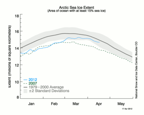
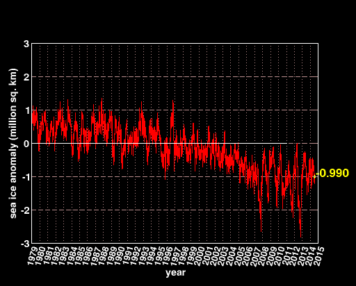
Two years ago, I caught NSIDC pulling a fast one in their sea ice graphs. A few hours before the Arctic extent line was about to cross the 1979-2000 mean line, they changed their plotting scheme to use a five day trailing average for the current ice and a nine day trailing average for the climatology. This moved the extent line away from the mean line, and narrowly avoided the immediate death of the death spiral.
I pointed out to them they can’t do that because it puts a two day relative shift in the data – and after arguing with me about it they admitted they can’t do that and fixed it the next day.