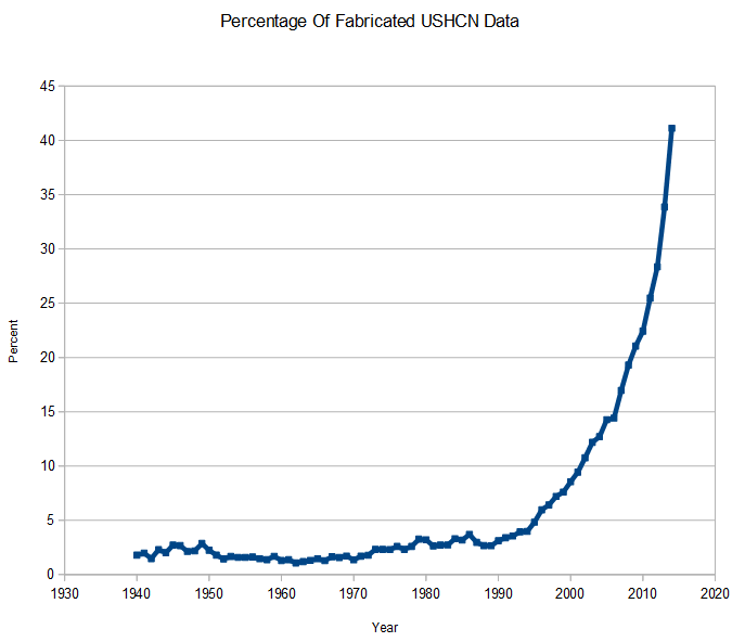
The use of anomalies in calculating temperature data allows NOAA/NASA to shift the baseline years undetected.
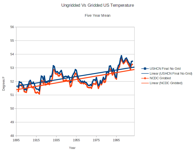
The graph below shows how NCDC tampers with the US temperature record, to create a non-existent warming trend.
Here is NCDC’s 1991 version of US temperatures in absolute temperatures.
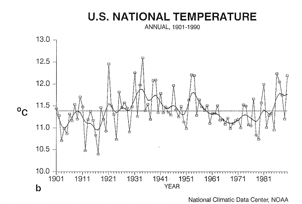 www1.ncdc.noaa.gov/pub/data/cmb/bams-sotc/climate-assessment-1981-1990.pdf
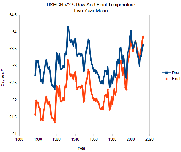
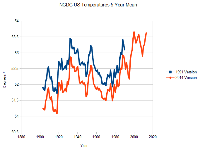
The next graph shows the NCDC 1991 version and 2014 version in absolute temperatures. They have cooled the past. This has nothing to do with station loss. It is about altering the data.
Now look what happens if I use temperature anomalies, as some people on both sides of the debate demand. As long as they cool all of the years during a baseline period (in this example 1951-1980 – the one used by NASA) by an approximately equal amount, most of the data tampering during that period is hidden.
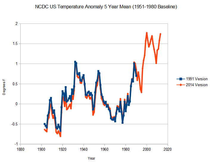
The trick NCDC pulls is to stop cooling temperatures after the end of the baseline period. This allows them to create a huge fake warming in recent years, which is largely hidden using anomalies.
By using the anomaly method, the data tampering becomes invisible. Is it the goal to hide the tampering, or do they just not understand what they are doing?
Additionally, it is utterly absurd to believe that station loss since 1990 has selectively targeted warmer stations, and particularly doing so increasingly over time. That is statistically impossible.