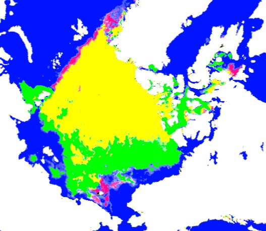
The map below compares August 5, 2013 vs. August 7, 2012 Arctic ice coverage.
Green represents area of ice present in 2013, but not present in 2012. Red shows the opposite.
The trajectory continues to closely track 2006.
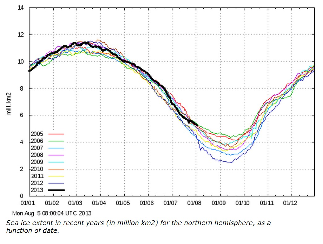
COI | Centre for Ocean and Ice | Danmarks Meteorologiske Institut
All that thin, rotten decayed ice is giving Arctic alarmists the one fingered salute.